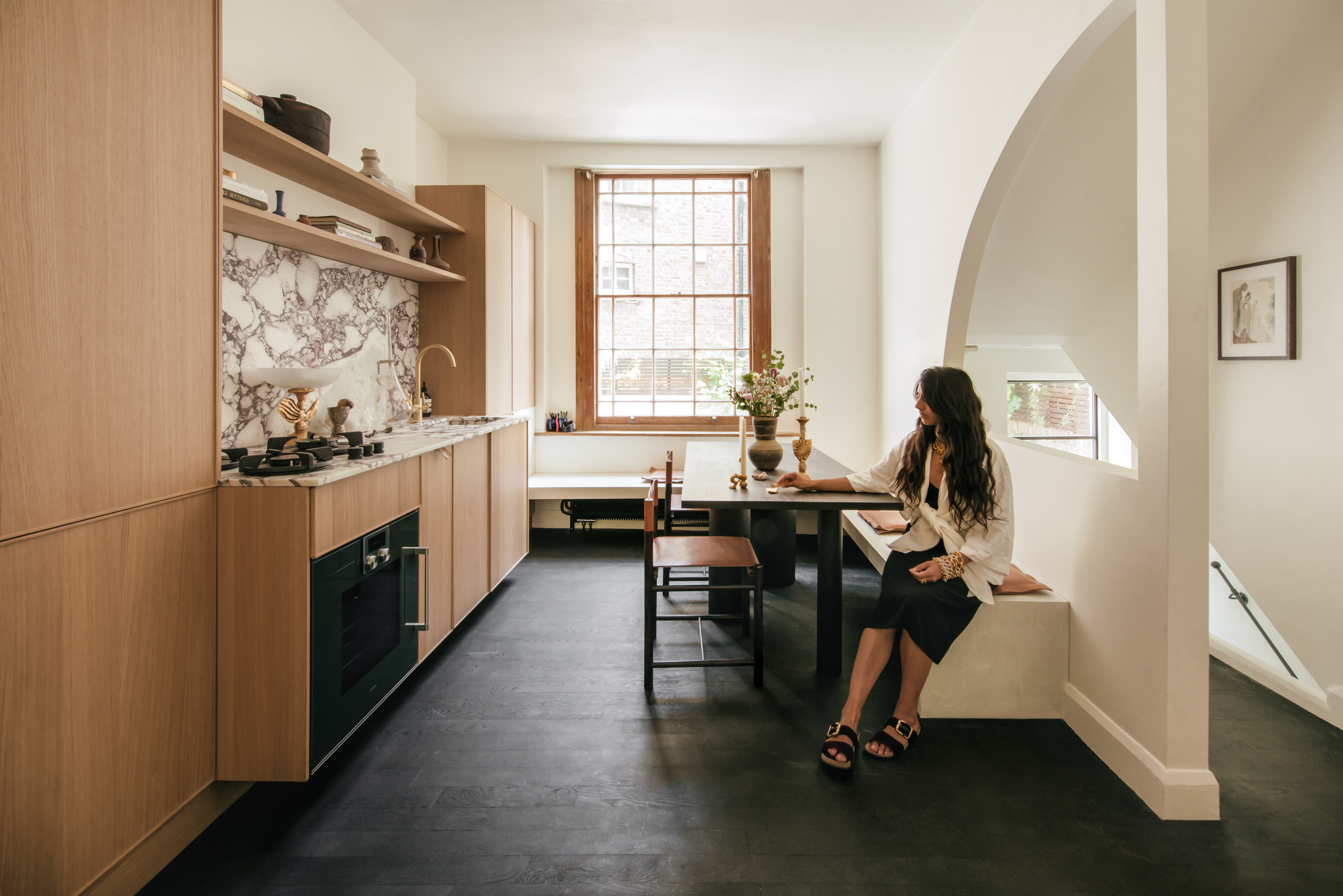
Some homes arrive with a drumroll: glossy marble, a chandelier the size of a small satellite, and enough decorative pillows to require their own zoning permit. Fred Rigby’s work in a Clerkenwell apartment takes the opposite route. It whispers. Then, before you know it, you are staring at a curved arch, a sculptural fireplace, and a perfectly placed limestone sink wondering why your own hallway suddenly feels emotionally underdeveloped.
Designed by British furniture and interior designer Fred Rigby for jewelry designer Rosh Mahtani, this London apartment proves that a calming home does not need to be sterile, beige, or so minimal that it looks like nobody is allowed to own a charging cable. Instead, it combines soft curves, dark flooring, pale walls, vintage finds, natural materials, and quietly theatrical architectural details to create a home that feels intimate, collected, and deeply personal.
The result is not simply a beautiful apartment. It is a lesson in how curvaceous interior design can make a space feel more open, more human, and a great deal more relaxing.
A Home Designed as a Retreat, Not a Display Case
The apartment occupies the lower two levels of a late-19th-century terrace near a leafy London garden square. Its owner, Rosh Mahtani, is the founder of the jewelry brand Alighieri, known for poetic, imperfect, and story-rich pieces. That sensibility matters because this is not a home designed to look like a furniture catalog. It is designed to hold collections, memories, objects, books, sculpture, and the occasional wonderfully odd treasure found in an antique market.
Rigby approached the renovation with the idea of a boutique-hotel hideaway. That phrase can inspire fear in anyone who has seen a hotel lobby with seven kinds of brass, but here it means something more grounded: comfort, atmosphere, privacy, and a feeling that every object has earned its place.
The home is calming because it avoids visual shouting. It does not rely on loud color blocking, aggressively polished surfaces, or an army of matching accessories. Instead, it uses a disciplined palette and lets texture, shape, light, and carefully chosen objects do the talking.
That is an important distinction for anyone interested in organic modern interiors. A calming home is not necessarily empty. It is edited. There is a difference between a room that feels peaceful and a room that feels like the furniture moved out without leaving a forwarding address.
Why Curves Make This Interior Feel So Relaxed
The star of the apartment is its curvaceous architectural language. Rigby cut a generous arch into the partition wall near the stairs, allowing natural light to travel farther through the ground floor. It is a relatively simple gesture, but it changes the personality of the space completely.
A rectangular opening says, “Please proceed efficiently.” An arch says, “Take your time; perhaps notice the light.” That may sound dramatic, but architecture has always had a quiet psychological effect on how people move through rooms. Curves soften transitions, interrupt the stiffness of straight lines, and create visual flow from one area to the next.
In Rigby’s design, the arch is not a random decorative flourish pasted onto an otherwise rigid layout. It belongs to a larger composition that includes rounded furniture, a curved fireplace, softened edges, and a sense of rhythm between rooms. Your eye catches one curve and then finds another. The effect is subtle, but it creates continuity.
This is why curved furniture and arched openings continue to appeal in contemporary interior design. They feel welcoming without being overly precious. A rounded sofa, an oval table, or a sculptural fireplace can take the edge off a room full of right angles. Literally and emotionally.
Curves Should Be Intentional, Not Everywhere at Once
The practical lesson is not to turn every doorway in your home into a Roman aqueduct. Curves are most effective when they have room to breathe. In a smaller space, one architectural arch, one rounded mirror, or one curving upholstered chair may be enough to establish softness.
Rigby’s apartment works because its organic forms are balanced by restraint. The curves are expressive, but they are not competing for attention like contestants on a reality show about furniture.
Natural Light Does the Heavy Lifting
One of Rigby’s first priorities was improving the flow of natural light. The apartment’s architecture had potential, but enclosed stair elements and interior divisions limited how daylight moved through the rooms. By opening the stair partition with a large arch and replacing some interior doors with steel-framed glass doors, the design allowed light to travel more freely.
This is a useful reminder that a brighter home is not always about adding more lamps. Sometimes it is about removing obstacles. A dark hallway may not need brighter bulbs; it may need a clearer visual path toward an existing window. A closed-off kitchen may not need white cabinets alone; it may benefit from a glazed opening, a wider threshold, or a more reflective surface.
Rigby also removed a modern balustrade from the staircase, leaving a more open stairwell painted in white. The contrast with the dark floorboards makes the staircase feel sculptural rather than heavy. It also prevents the central circulation zone from becoming a visual barricade.
Light in this home is not treated as a decorative bonus. It is part of the layout. That is the difference between a room that looks nice in photographs and one that feels good at 4:30 on a gray afternoon.
How to Borrow the Light-Flow Strategy
In a typical home, improving light flow can be less dramatic than rebuilding a staircase. Consider replacing a solid internal door with a glazed door, using a transom window above a doorway, choosing open shelving over a bulky upper cabinet, or positioning mirrors where they reflect daylight rather than merely reflecting your collection of unopened mail.
Consistent wall color can help, too. Rigby used a warm white throughout the home, allowing changes in daylight to create variation naturally. Rather than assigning every room a different shade of white, the palette lets the changing light do its own quiet decorating.
Dark Floors, White Walls, and the Art of Visual Balance
Black floorboards run through the living spaces, grounding the apartment with a strong visual base. Dark flooring can intimidate homeowners because many people assume it automatically makes a room feel smaller. Used carefully, though, it can create contrast and depth.
In this apartment, the dark floors work because they are surrounded by pale walls, soft upholstery, natural light, and reflective surfaces. Instead of swallowing the room, they anchor it. Think of the floor as the bass line in a song: it gives everything else structure without demanding to be the singer.
The white-painted walls help bounce light through the rooms and keep the atmosphere airy. But this is not a cold, clinical white-box interior. The warmth comes from material choices: bouclé upholstery, wood paneling, aged objects, marble, limestone, microcrete, and textiles.
This blend is a useful formula for anyone who wants a moody-yet-light interior. Choose one dark grounding element, such as flooring, cabinetry, a fireplace surround, or a large rug. Then offset it with warm pale walls, layered lighting, and tactile materials. The room will feel composed rather than gloomy.
Texture Keeps Minimalism from Feeling Like a Dentist’s Office
A neutral palette can go wrong quickly. Without texture, it can look flat. Without personal objects, it can look rented. Without warmth, it can feel like the waiting room of a luxury dental practice, where everyone is somehow too polished to have eaten lunch.
Rigby avoids that trap through material contrast. Pale wool bouclé upholstery softens the living room. Original wood paneling and coving retain the apartment’s historic character. Microcrete adds a matte, mineral quality in the bathroom. Limestone introduces irregularity and visual depth. Italian marble gives the kitchen a more luxurious edge without making it feel overly formal.
These materials are not used as separate design moments. They work together because they share an earthy, tactile quality. The palette may be restrained, but the sensory experience is rich.
This is one of the strongest lessons from the home: calm does not mean smooth. In fact, too many polished, flat, shiny surfaces can make a space feel impersonal. A calming interior often benefits from materials that show grain, weave, pores, veins, or a little gentle irregularity.
Easy Ways to Add Texture Without Starting a Renovation
You do not need microcrete walls or custom limestone plumbing fixtures to create warmth. Add a wool rug, linen curtains, a handmade ceramic lamp, a vintage wood stool, a textured throw, or a stone bowl. One or two tactile items can make a simple room feel more lived-in.
The goal is not to create a texture scavenger hunt. Pick materials that feel related. For example, oak, linen, ceramic, aged brass, and wool tend to sit comfortably together because they all carry a natural, low-gloss character.
A Sculptural Fireplace That Solves a Problem Beautifully
The living room’s decorative fireplace is one of the most memorable elements in the apartment. Rather than restoring a missing original fireplace, Rigby created a sculptural surround that conceals an unattractive wall opening. It looks like an intentional work of art, not a cover-up job.
The fireplace was made from a plywood structure coated in microcrete. That construction method matters because it shows how expressive forms do not always require extravagantly expensive materials. The effect comes from proportion, silhouette, finish, and placement.
A sculptural feature like this gives the room a focal point. It also reinforces the apartment’s recurring language of curves. The arch, fireplace, furniture, and accessories all feel connected, even though they are not identical.
For homeowners, this is a reminder that problem areas can become design opportunities. An awkward chimney breast, unused niche, strange alcove, or patch of damaged wall does not always need to disappear. Sometimes it needs to become the reason the room has character.
Built-In Shelving That Feels Like a Small Gallery
Rigby used custom shelving and plaster niches to display Mahtani’s objects, sculptures, and collected pieces. These displays give the home a gallery-like quality, but not in a stiff museum sense. The objects remain part of daily life rather than becoming precious artifacts behind glass.
This approach is especially effective in a calm interior because it creates focal points without adding clutter everywhere. Instead of scattering decorative objects across every horizontal surface, the design gathers them into intentional zones.
Built-ins also make a room feel more integrated. Freestanding shelves can be useful, but custom or semi-custom storage helps architecture and furniture speak the same language. It can also solve the eternal question of where to put the strange little stone head you bought at a flea market because “it had a face.”
Display Fewer Things, More Thoughtfully
A collected home does not need to show every object at once. Choose a few pieces with visual weight: a ceramic vessel, an antique lamp, a framed sketch, a small sculpture, a stack of beautiful books, or a found object with a story. Give them breathing room.
Rigby’s shelves work because they do not try to prove that the owners have been to every antique shop in England. They let each object have a moment.
The Bathroom: Raw Materials, Soft Edges, and a Little Surprise
The lower-level bathroom continues the apartment’s material story with microcrete floors and walls, a simple integrated shelf, glass, and a reclaimed limestone sink. The sink reportedly came from an unexpected garden discovery, which is exactly the kind of sentence that makes a design story feel more romantic than ordering a basin from page 42 of a catalog.
The bathroom’s appeal comes from its restraint. There is no unnecessary ornament. The material itself provides the drama. Microcrete creates a seamless, tactile backdrop, while limestone adds age and irregularity. The glass partition keeps the room open without sacrificing function.
Elsewhere, a freestanding bathtub sits near the bed, separated by an undulating room divider inspired by Alvar Aalto. That choice may not be practical for every household, particularly anyone living with a toddler, a golden retriever, or a roommate who asks too many questions. Still, it captures the project’s central idea: domestic spaces can be functional and poetic at the same time.
The Kitchen: Proof That Practical Can Still Be Elegant
The kitchen had a large chimney breast that could have become an awkward obstacle. Instead, Rigby integrated it into the design by using standard IKEA cabinetry in a more tailored way. The units were positioned so they appear to float from the wall, with recessed plinths creating a lighter visual effect.
Tall cabinets hide larger appliances, keeping the kitchen clean and uncluttered. Italian marble covers the countertop, backsplash, and sink area, giving the ordinary cabinetry a more elevated setting. The gas hob is integrated directly into the stone surface, which keeps the composition streamlined.
This is a valuable lesson for anyone planning a kitchen renovation on a real-world budget: not every element needs to be custom. The magic often lies in how standard components are detailed, arranged, and paired with better materials.
A modest cabinet can look intentional beside beautiful stone. A simple layout can feel architectural when appliances are concealed. The trick is to spend where the eye and hand notice most: the work surface, hardware, lighting, and the proportions of the cabinetry.
Five Design Lessons to Take from Fred Rigby’s Curvaceous Home
1. Use One Strong Curve to Change a Room
An arched opening, rounded fireplace, curved sofa, or oval dining table can soften an entire room. Pick one feature and let it lead.
2. Let Light Travel, Not Just Enter
Think beyond window size. Open sightlines, glazed doors, reflective surfaces, and uncluttered thresholds help daylight move deeper into a home.
3. Mix Dark and Light Instead of Choosing Sides
Dark floors or furniture can make pale walls feel brighter. The contrast creates depth and prevents a neutral room from becoming bland.
4. Favor Materials That Feel Good Up Close
Wool, oak, linen, limestone, ceramic, aged metal, and matte plaster create a home that feels as good as it photographs.
5. Give Personal Objects a Proper Stage
Curate shelves and niches like small exhibitions. A few meaningful objects displayed with space around them have more impact than dozens of decorations competing for attention.
Experiencing a Calming, Curvaceous Home: What It Feels Like to Live with Soft Architecture
Looking at photographs of a curvaceous home is one thing. Living in one is another. The experience begins before you consciously identify the furniture, the finishes, or the color palette. You simply notice that the rooms feel less abrupt. There is less visual stopping and starting. Your eyes move around the space in a softer rhythm.
That may sound suspiciously like something a candle label would say, but it is real. Straight lines organize a room efficiently. Curves make it feel more fluid. In a home like Fred Rigby’s Clerkenwell apartment, the arch near the staircase does not merely open a wall. It changes the journey through the house. You move from one room to another with a sense of invitation instead of passing through a hard-edged frame.
There is also a subtle emotional difference between looking at a sharp corner and looking at a rounded edge. A curve feels less demanding. It does not ask you to stand at attention. It encourages you to settle in. That is why a curved sofa can feel more sociable, why an oval dining table can make a meal feel less formal, and why an arched doorway can make even a narrow hall feel a little more generous.
The best calming interiors are not quiet because they lack personality. They are quiet because the personality is controlled. In Rigby’s home, the dark floorboards, sculptural fireplace, marble kitchen, vintage lighting, and collected objects all have presence. Yet none of them is screaming over the others. It feels like a good dinner party where everyone has something interesting to say, but nobody is standing on a chair explaining cryptocurrency.
Texture plays an equally important role in the lived experience. Pale bouclé upholstery asks to be touched. Limestone feels ancient and irregular. Microcrete has a velvety, mineral appearance. A vintage lamp brings the soft unpredictability of age. These materials make a home richer because they offer more than visual novelty. They create atmosphere through touch, shadow, and imperfection.
Then there is the matter of light. A home with good light flow changes throughout the day. Morning may make the pale walls look crisp and open. Afternoon may bring softer shadows across a curved fireplace. Evening lighting can turn the same room into something more intimate and cocoon-like. The architecture becomes a stage for daily life rather than a fixed backdrop.
That is perhaps the most appealing part of a calming, curvaceous interior: it does not demand constant attention. It supports ordinary rituals. Drinking coffee at the dining table feels more pleasant. Reading in a quiet corner feels more intentional. Taking a bath feels marginally more cinematic, even if your actual soundtrack is a neighbor’s leaf blower.
Rigby’s design also shows that serenity does not require buying an entirely new life. It comes from making thoughtful choices about what stays, what goes, what softens, and what deserves to be displayed. A single arch can change a room. A darker floor can ground pale walls. A vintage object can give a minimalist space a pulse.
Ultimately, a home like this feels calming because it gives you permission to slow down. It is not perfect in a showroom way. It is composed in a human way. And that may be the most luxurious design feature of all.
Conclusion
A Calming, Curvaceous Home by British Designer Fred Rigby is a compelling example of how interior design can feel both sculptural and comfortable. The Clerkenwell apartment balances dramatic shapes with quiet materials, dark floors with pale walls, contemporary finishes with vintage discoveries, and practical needs with a sense of poetry.
Its most valuable lesson is not that every home needs a custom microcrete fireplace or a limestone sink found in a garden. It is that calm comes from cohesion. When light, materials, curves, storage, and personal objects all work together, even a compact apartment can feel expansive, restful, and entirely its own.
Note: This article is an original editorial interpretation based on publicly documented details of Fred Rigby’s Clerkenwell apartment renovation and broader interior design principles.