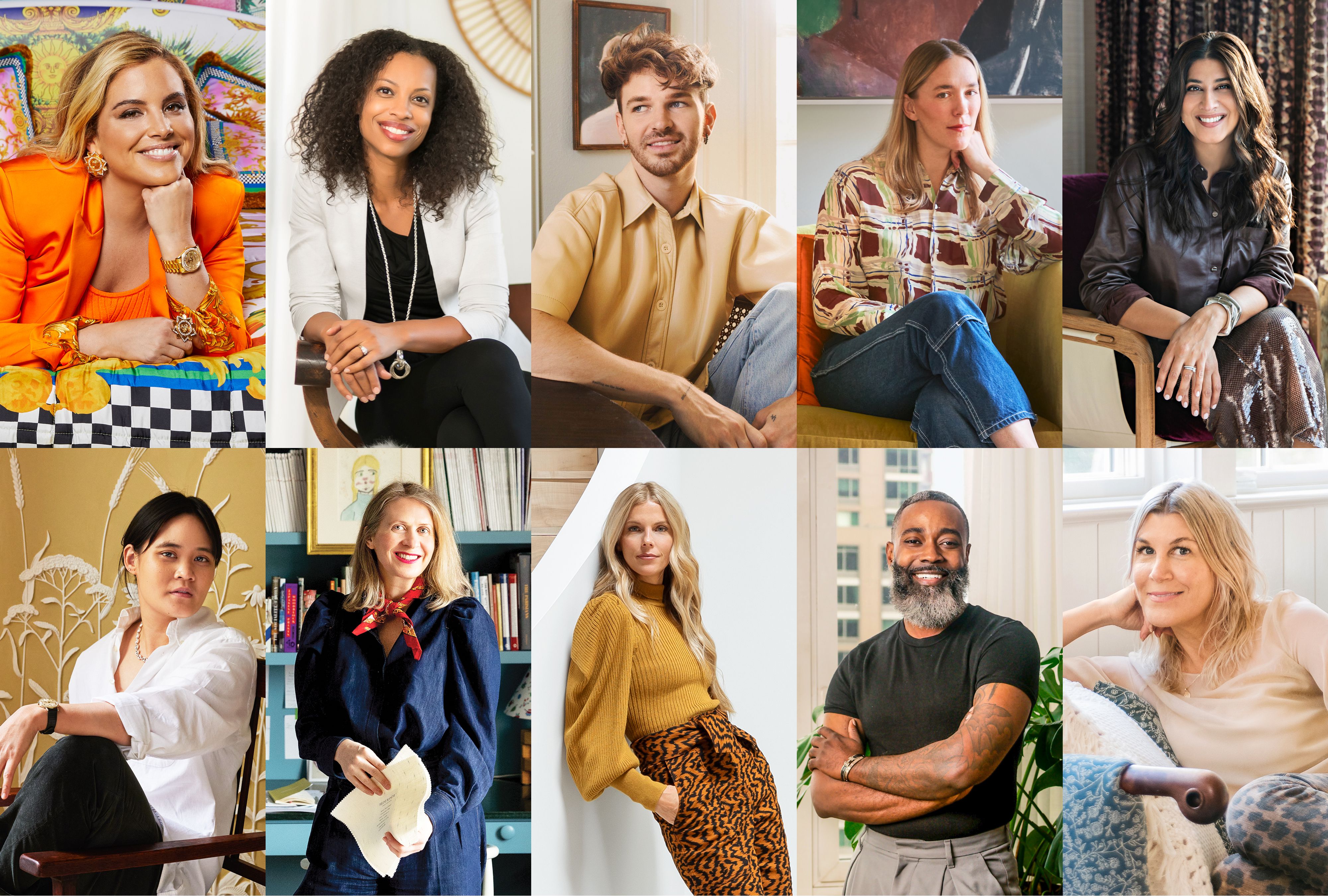
If 2024 was the year people flirted with color from a safe distance, 2025 is the year they finally asked it out to dinner. Better Homes & Gardens’ 2025 Color Stars roundup captures that shift beautifully: color is no longer being treated like a risky design stunt. It is being used as a mood setter, a personality marker, and, in some homes, the main character with excellent lighting.
What makes BHG’s 2025 Color Stars especially interesting is that the feature is not just about one trendy paint chip or one flashy room on social media. It is about a group of designers whose work shows how color can be bold, quiet, earthy, nostalgic, polished, playful, and deeply livable all at once. That range matters. It tells us that the biggest color trend of 2025 is not one exact shade. It is confidence.
In other words, the question is no longer, “What color should I use?” It is, “What kind of feeling do I want my home to have?” The stars in BHG’s 2025 class answer that question in very different ways, from kaleidoscopic jewel tones and muddy undertones to enveloping drenched rooms and nature-inspired greens. Together, they paint a picture of where home design is heading next: toward spaces that feel personal, layered, and refreshingly less obsessed with playing it safe.
What BHG’s 2025 Color Stars Reveal About the Year Ahead
BHG’s 2025 Color Stars class works because it does not force a single formula onto every room. Instead, it celebrates a lineup of designers with distinct points of view. Sasha Bikoff brings a “rainbow of hues” mindset, Alvin Wayne champions clever contrasts, Landed Interiors leans into muddy hues, Cortney Bishop softens coastal color with earthy nuance, Drew Michael Scott makes neutrals feel dramatic, Avery Cox embraces enveloping color, Tina Ramchandani uses metallics as glow rather than glitter, Meta Coleman makes primaries feel artful, Sarah Sherman Samuel keeps returning to green, Laura Hodges layers naturals and warm whites, and Rising Star Sara Charlesworth reminds people to trust their instincts.
That is a lot of personality in one lineup, but there is a common thread: color works best when it has context. Bikoff looks to art, rugs, and gardens for inspiration. Wayne balances vivid tones with black or white so the eye has somewhere to land. Landed Interiors uses hues with shared muted undertones to keep spaces cozy and cohesive. Charlesworth encourages people to begin with colors that genuinely make them happy instead of copying what is trending on someone else’s feed.
That may sound simple, but it is actually a sharp correction to the all-beige, all-the-time era. The BHG message is not “throw caution to the wind and paint the dog lavender.” It is more thoughtful than that. The lesson is to use color with intention, repetition, balance, and emotional clarity.
The Biggest Color Themes Inside BHG’s 2025 Color Stars
1. Bold color works best when it starts with inspiration
Sasha Bikoff’s advice is one of the most useful takeaways in the whole feature. Instead of picking random bold shades and hoping they get along, she starts with a source that already contains a strong palette: a rug, a painting, a tapestry, a printed fabric, even a garden. That approach matters because it removes the guesswork. It also makes daring combinations feel less chaotic and more collected.
This is why colorful homes that feel amazing rarely look accidental. They usually echo something larger. A floral fabric can become the blueprint for an entire floor. A patterned vintage rug can suggest wall color, upholstery, trim, and accents. Suddenly, orange and pink do not look wild; they look intentional. The room has a reason for existing.
2. Contrast is the secret weapon
Alvin Wayne’s perspective is especially practical for homeowners who like color but fear visual overload. His trick is not to tone everything down until it is boring. It is to ground stronger colors with neutrals, particularly black or white. That contrast gives the eye a place to rest and keeps the room from feeling noisy.
This is a major 2025 lesson. Color is in, yes, but successful rooms still need structure. Even the boldest palette becomes more livable when paired with a framing device: crisp trim, a black lamp, creamy upholstery, dark wood, or a soft neutral backdrop. Think of contrast as the design equivalent of punctuation. Without it, the room just keeps talking.
3. Muted undertones are doing a lot of heavy lifting
Landed Interiors and several other designers in BHG’s orbit point toward a softer, more sophisticated type of color story. Muddy hues, shared undertones, and nuanced versions of familiar colors are everywhere. These are not candy-coated brights that scream across the room. They are colors with a little dust on their boots and a little history in their bones.
That is one reason 2025 shades feel richer than the cool grays and stark whites that dominated for years. Earthy seafoam, warm terra-cotta, heathered plum, olive-toned greens, and brown-inflected reds all feel more rooted. They create comfort without becoming bland. They are colorful, but they are grown-up about it.
4. Neutrals are still here, but they have better stories now
Drew Michael Scott and Laura Hodges both prove that neutrals are not dead; they just got a personality transplant. In 2025, the strongest neutral rooms are layered with warmth, contrast, texture, wood tones, and a hint of mood. Beige is no longer doing the whole job by itself. It has backup singers now.
Warm whites, sandy beige, soft taupe, rich brown, mushroom tones, and wood-driven palettes are all part of this evolution. The result is a home that feels calm without feeling sterile. This shift is especially important for people who are not ready for a scarlet dining room but still want their rooms to feel current.
5. Color drenching is no longer a niche move
Avery Cox’s embrace of washing a room in one hue fits perfectly with wider 2025 design momentum. Color drenching is no longer reserved for maximalists with nerves of steel. It has become a mainstream way to make rooms feel immersive, cozy, and intentional. Walls, trim, ceiling, and millwork all working in the same color family can make a space feel tailored rather than timid.
The magic is in commitment. A room painted halfway into a concept often looks hesitant. A room fully color drenched tends to look designed. When the hue is right, the result is less “look at me” and more “stay a while.”
How BHG’s 2025 Color Stars Fit the Broader 2025 Color Landscape
BHG’s designer advice does not exist in a vacuum. It lines up with what major paint brands and design publications have been saying across the United States throughout the 2025 cycle. Sherwin-Williams moved away from choosing a single hero shade and instead introduced a nine-color capsule, signaling that versatility and curation matter as much as any one trending color. Benjamin Moore leaned into Cinnamon Slate, a sophisticated blend of heathered plum and velvety brown. Behr went bold with Rumors, a deep ruby red. Pantone selected Mocha Mousse, a warming brown with comforting richness. Valspar’s Encore and Dutch Boy’s Mapped Blue kept blue firmly in the conversation, while HGTV Home by Sherwin-Williams highlighted Quietude, a soft sage-green with a blue whisper.
Put all of those together, and a clear picture emerges. The year is defined by five major color currents: earthy browns, softened greens, grounding blues, richer reds, and tinted neutrals that carry warmth instead of chill. That broader market consensus helps explain why BHG’s Color Stars feel so timely. Their advice mirrors what the brands are forecasting, but in a more lived-in and designer-driven way.
It also explains why 2025 does not feel like a one-color year. It feels like a multi-mood year. Some people want cocooning brown. Some want sage serenity. Some want berry depth. Some want a yellow-green shot of weird, wonderful energy. The real trend is freedom within a thoughtful palette.
How to Bring the Color Stars Look Into Your Own Home
Start with one anchor piece
If you are intimidated by color, do what Bikoff suggests and begin with something already finished: a rug, textile, artwork, or wallpaper swatch. Let that piece choose the room’s supporting cast. This makes the process easier and creates instant cohesion.
Use one grounding neutral
Wayne’s black-or-white balancing act is gold. Every colorful room needs something that settles it down. That could be ivory upholstery, black iron lighting, dark stained wood, or warm plaster. Your bright colors will actually look better with a strong neutral beside them.
Choose colors by feeling, not just popularity
Sara Charlesworth’s advice deserves to be framed and possibly embroidered on a pillow: trust yourself. Start with the colors you naturally gravitate toward. Then look at how they behave in your light, with your architecture, and with your materials. A trend report can point the way, but it cannot live in your house for you.
Try color in smaller private moments
One of the smartest BHG tips is to put color where it can surprise and delight: a pantry interior, a powder room, the inside of a cabinet, a bookshelf backing, or a laundry nook. These areas are lower risk, higher charm, and weirdly satisfying. Nothing says “someone thought this through” like opening a plain door and finding tangerine joy inside.
Don’t forget texture and finish
In 2025, color is not just about hue. Finish matters. Matte, limewash, gloss, plaster, metallic sheen, woven textiles, stone, and wood grain all change how color feels. A brown can read cozy in velvet, sophisticated in lacquer, rustic in limewash, and moody in a low-light matte room. Same family, completely different personality.
Common Mistakes to Avoid
The first mistake is copying a color without copying the logic behind it. A designer room rarely works because of one exact shade alone. It works because of balance, undertones, lighting, repetition, scale, contrast, and materials.
The second mistake is assuming color must always be loud. Some of the strongest 2025 palettes are actually very restrained. They use soft sages, warm whites, muted pinks, earthy greens, and brown-based neutrals with just enough tonal variation to keep things interesting.
The third mistake is treating wood as an afterthought. Laura Hodges’ approach is a helpful reminder that wood tones carry undertones too. Warm woods often play beautifully with blues and greens, while lighter or grayer woods can handle burgundy, soft yellow, pink, or muted blue-green. If your wall color fights your flooring or cabinetry, the room will feel off no matter how trendy the paint may be.
Why BHG’s 2025 Color Stars Matter
Design trend coverage often falls into one of two traps: it becomes either too abstract to use or too literal to enjoy. BHG’s 2025 Color Stars avoids both. It gives readers vivid personalities, practical lessons, and a broader permission slip to stop treating color as a household threat.
That may be the most refreshing part of this feature. It makes the future of color feel accessible. You do not need a Park Avenue budget or a staff member whose only job is fluffing velvet pillows at golden hour. You just need a little courage, a little context, and a willingness to choose colors that make your home feel more like you.
And honestly, that may be the most 2025 idea of all. Homes are becoming less generic, less algorithm-approved, and more emotionally specific. They are moving away from sterile perfection and toward comfort with character. BHG’s Color Stars are not just forecasting a palette. They are forecasting a mindset.
Experiences That Make “BHG’s 2025 Color Stars” Feel Real
One reason this topic resonates so strongly is that color is not experienced like furniture measurements or tile specs. It is emotional. You feel it before you fully analyze it. A hallway painted in a warmer tone can make coming home feel softer after a long day. A kitchen with muted green cabinets can feel calmer at 7 a.m. when the coffee is still negotiating with your personality. A powder room in a dramatic burgundy or deep blue can make guests pause for a second and think, “Okay, this house has range.”
That is where BHG’s 2025 Color Stars really lands. The feature is not just about how a room photographs. It is about how color changes the rhythm of living in a space. A rug with strong floral tones can become the thing that quietly organizes an entire room. A pantry painted tangerine can turn an ordinary daily task into a small design reward. Layered greens can make a dining room feel fresh at lunch and enveloping by evening. Warm whites paired with wood can make a room feel breathable instead of bare.
There is also a very practical experience many homeowners are having right now: they want change, but they do not want chaos. That is why the 2025 Color Stars message works. It gives permission to move past all-white safety without demanding instant maximalism. Maybe you start with pillows, then an accent chair, then a painted bookcase, then one bold room. Color tends to build confidence that way. Once people see one successful move, they become more willing to make the next one.
Another experience tied to this trend is nostalgia. Many of the shades showing up in 2025 have a familiar, slightly memory-soaked quality. Brown does not feel boring when it recalls wood-paneled warmth in a more polished form. Buttery yellows, muddy pinks, olive greens, and berry tones all feel like they have lived before, just with better styling and fewer unfortunate window treatments. That emotional familiarity is powerful. It makes a room feel current without feeling cold.
Then there is the experience of light, which is where color becomes almost theatrical. A heathered plum-brown can look grounded in the morning and romantic at night. A sage with blue undertones can shift from airy to moody over the course of a day. A navy used as a grounding neutral can make bright accents feel sharper, richer, and more intentional. This is why so many designers talk about undertones and finishes. They know color is never static. It performs.
Perhaps the most relatable experience of all is the moment when someone stops asking, “Is this trendy enough?” and starts asking, “Do I love living with this?” That shift is all over BHG’s 2025 Color Stars. It is in Sara Charlesworth’s emphasis on trusting your instincts, in Alvin Wayne’s belief that color can be balanced rather than feared, and in Sasha Bikoff’s reminder that inspiration is often already right in front of you. The result is not just a prettier room. It is a home that feels more expressive, more memorable, and a lot less afraid of itself.
Conclusion
BHG’s 2025 Color Stars does more than spotlight stylish designers. It captures the broader truth of the year: color has become more personal, more nuanced, and more livable. The standout palettes of 2025 are not just chasing attention. They are building atmosphere. Some do it with ruby reds, moody blues, and chartreuse energy. Others do it with muddy undertones, soft sages, warm woods, and sophisticated browns. All of them point to the same destination: a home with more feeling, more identity, and fewer generic “safe” choices.
If there is one lesson to carry forward, it is this: the best color is not the one everyone else says is trending. It is the one that makes your home feel unmistakably yours. BHG’s Color Stars just happen to give you a very stylish place to start.
SEO Tags
Note: This HTML includes only clean body content for publishing and removes unnecessary placeholder elements or citation artifacts.