Packaging is supposed to protect a product, explain what it is, and help shoppers carry it home without needing a forklift. Somewhere along the way, however, a few marketing departments apparently added another objective: make twelve ounces look like twenty, make four cookies feel like a family feast, and place the phrase “eco-friendly” beside enough plastic to build a small kayak.
Deceptive packaging design can take many forms. A carton may contain a suspicious amount of empty space. A transparent window may reveal the only generously filled portion of a sandwich. A newly redesigned bottle may look familiar while quietly holding less. Product photography may show decorative details that the actual item never received. Even an environmentally themed label can create a green halo without providing much useful information.
Editorial note: This roundup discusses packaging decisions criticized in consumer posts, news reports, regulatory actions, or lawsuits. Inclusion does not mean that every company was found legally liable. Some allegations were disputed, some cases were dismissed, and certain empty spaces serve legitimate purposes such as protecting fragile food.
Why Misleading Packaging Works So Well
Shoppers rarely carry measuring cups, digital scales, and forensic accountants through the supermarket. We make rapid decisions based on box height, container shape, product photography, familiar colors, and words such as “family,” “giant,” or “value.” Packaging designers know this, which is why a small visual adjustment can change how much product we believe we are buying.
Not all empty space is deceptive. Potato chip bags need gas to prevent crushing, powders settle during shipping, and irregular products may require protective room. The problem is nonfunctional slack-fill: space that appears to serve no practical purpose while making a container look more generous than it is. Federal rules also prohibit food containers from being made, formed, or filled in misleading ways.
Shrinkflation is subtler. Instead of raising the displayed price, a manufacturer reduces the weight, count, length, or volume. The package may remain almost identical, forcing shoppers to notice that 16 ounces became 14.5 or that 264 sheets became 244. Apparently, grocery shopping now includes a surprise mathematics exam.
50 Packaging Designs and Labeling Decisions That Angered Shoppers
Candy, Snacks, and the Fine Art of Selling Air
-
Mondelēz International: Boxes of Sour Patch Kids and Swedish Fish have faced slack-fill complaints alleging that opaque cartons concealed a large amount of empty interior space. The candy may be sweet, but the box-to-fish ratio left a sour aftertaste.
-
Just Born: The maker of Mike and Ike and Hot Tamales has faced litigation over allegedly underfilled candy boxes. The company argued that net-weight disclosures and functional packaging considerations gave shoppers sufficient information.
-
PIM Brands: Sour Jacks packaging became the subject of a lawsuit alleging substantial nonfunctional slack-fill. Buyers expected a box of gummies and reportedly discovered a cardboard studio apartment with a few candies living downstairs.
-
The Hershey Company: Reese’s seasonal packages showed pumpkins, footballs, and other shapes with detailed faces or stitching. Lawsuits alleged that the actual chocolates were comparatively blank; Hershey disputed the claims and pointed to decorating-suggestion language.
-
Mars Wrigley: Snickers and other candy products have appeared in shrinkflation reports after changes in bar or multipack sizes. The wrapper remains confident and muscular even when the candy inside has apparently skipped leg day.
-
Kellanova’s Zesta: Zesta crackers were among name-brand products identified in packaging-industry coverage of reduced net weights. Because boxes can retain similar shelf dimensions, shoppers must inspect the tiny numbers rather than trust familiar proportions.
-
Kellogg’s Corn Flakes: Consumer advocates documented changes in which smaller cereal boxes inherited labels such as “Family Size,” while previously larger packages were renamed “Giant Size.” The family did not shrink; the marketing vocabulary expanded.
-
General Mills: The company’s large cereal boxes have been cited in broader shrinkflation discussions. A tall carton can continue projecting breakfast abundance even after the net weight changes quietly near the bottom.
-
Post Consumer Brands: Post cereals have also appeared in reports about smaller family-size packages. The most reliable comparison is not the front-panel adjective but the unit price and net weight.
-
PepsiCo: Lay’s, Doritos, Ruffles, and Tostitos have been central to the shrinkflation conversation. PepsiCo later offered temporary bonus bags containing more chips, indirectly confirming that customers had become extremely attentive to the air-to-snack balance.
Bottles, Boxes, and Containers With Secret Inner Lives
-
Coca-Cola: Mini cans, slim bottles, multipacks, and other configurations are part of an industry strategy called price-pack architecture. These options offer convenience, but they also make value comparison harder when every package uses a different size.
-
Kraft Heinz’s Velveeta: One package drew online mockery for promoting a ten-minute preparation time while its printed directions appeared to require substantially longer. Perhaps ten minutes referred to the time needed to accept disappointment.
-
Procter & Gamble’s Dawn: Consumer investigators documented a Dawn bottle reduction from seven ounces to 6.5 ounces while the container retained a familiar appearance. A half-ounce sounds small until it disappears from millions of bottles.
-
Procter & Gamble’s Charmin: Charmin roll counts and sheet dimensions have changed repeatedly over the years. Labels such as “Mega” and “Super Mega” make comparison particularly difficult because there is no universal scientific unit called one mega.
-
Georgia-Pacific’s Quilted Northern: Quilted Northern has appeared in reports tracking reduced sheet counts and roll dimensions. The package still displays enormous, cloudlike rolls, while the meaningful measurements wait patiently in smaller print.
-
Kimberly-Clark’s Kleenex: Tissue-box counts have been reduced in documented packaging changes. Because the carton can maintain its recognizable dimensions, the missing tissues do not become obvious until cold season launches a full investigation.
-
Georgia-Pacific’s Sparkle: Sparkle paper towels were cited in shrinkflation coverage after package quantities changed. Bright graphics and bold roll claims can easily distract from the sheet count, which is the number that actually wipes the counter.
-
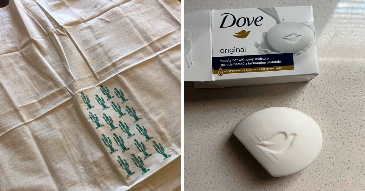
Unilever’s Dove: A consumer photo of multipack Dove bars showed deeply curved or scooped shapes that made the individual bars appear substantially smaller after unwrapping. The bar count was present, but the missing soap was hiding in the geometry.
-
Dr. Squatch: Users who dismantled deodorant containers reported a noticeable internal gap between the outer case and the usable product. The package looked rugged enough to chop wood; the deodorant stick inside had other plans.
-
Sergeant’s Pet Care Products: A pet-shampoo bottle shared online appeared to use a large exterior shell surrounding a much smaller internal reservoir. The label disclosed volume, but the silhouette encouraged a considerably more generous first impression.
Beauty Products: Where the Jar Gets More Product Than You Do
-
L’Oréal: Cosmetic containers sold by L’Oréal have been challenged in slack-fill litigation involving allegedly oversized jars or compacts. Beauty products frequently use thick walls, raised bases, and false bottoms that make exterior dimensions unreliable.
-
Maybelline: Maybelline products have faced similar criticism over packages that appeared large relative to the amount of makeup inside. A compact may look ready for a yearlong world tour while containing enough powder for several determined Tuesdays.
-
Estée Lauder: Consumer posts have shown small Estée Lauder containers presented inside surprisingly spacious retail boxes. Premium packaging can create a luxurious unboxing ritual, although shoppers may question whether they purchased serum or luxury cardboard.
-
Aveeno: Aveeno lotion appeared in shrinkflation reporting after bottle sizes decreased. Familiar branding and a similar bottle profile can make a volume reduction difficult to detect without comparing the old and new labels side by side.
-
Colgate-Palmolive: Toothpaste packaging often combines long cardboard cartons with tubes whose sealed ends or empty upper sections reduce usable volume. The net weight remains the dependable metric, even when the tube looks unchanged.
-
Tide: Tide has been tracked by consumer advocates for package downsizing dating back many years. Concentrated formulas can justify smaller containers, but shoppers need clear dosage information to determine whether “smaller” actually delivers equivalent washing power.
-
Iams: Consumer reporting documented Iams dog-food bags dropping from 44 pounds to 38.5 pounds in one size transition. The bag remained enormous, but a 5.5-pound disappearance is less shrinkflation and more missing terrier.
-
Pedigree: Pedigree dog food has appeared in reports comparing smaller bags with earlier versions. Pet owners who shop by bag color rather than net weight may not notice until the scoop reaches the bottom sooner.
-
Thomas’ Bagels: Six-packs of Thomas’ bagels have reportedly moved from 24 ounces through 22 and 20 ounces to smaller totals. The count remained six, proving that a package can preserve every bagel while quietly putting each one on a diet.
-
Oscar Mayer: Consumer advocates reported certain Oscar Mayer beef franks dropping from 16 ounces to 15. The classic one-pound reference disappeared, but the package retained enough familiarity to avoid shouting about the change.
Frozen Foods, Cookies, and “Family Size” Philosophy
-
Häagen-Dazs: The brand famously reduced some U.S. ice-cream cartons from 16 fluid ounces to 14. The container looked nearly identical, creating one of shrinkflation’s most recognizable lessons: never trust a pint-shaped object to contain a pint.
-
Breyers: Breyers faced consumer scrutiny over front-label nutrition comparisons on a light ice-cream product. The dispute illustrated how large benefit claims can dominate a carton even when important qualifications require closer reading.
-
Keebler’s Vienna Fingers: Shoppers have reported smaller Vienna Fingers packages and cookies that disappear faster than remembered. Nostalgic graphics are powerful because buyers recognize the design long before checking the updated weight.
-
Oreo: Limited-edition Oreo packages have been criticized for offering less product at higher unit prices. New flavors, resealable pouches, and collectible graphics provide enough novelty to keep the net weight safely out of the spotlight.
-
Wheat Thins: Photos of partially filled “family size” boxes have circulated online. Some headspace may protect crackers, but a bag ending far below the top of a tall box is unlikely to inspire warm family togetherness.
-
Manischewitz: The introduction of four-pound matzo packages alongside traditional five-pound formats required shoppers to look carefully at weight and bundle count. Familiar seasonal packaging can make a missing pound surprisingly easy to overlook.
-
Yehuda Matzos: Yehuda also introduced four-pound options in a category long associated with five-pound bundles. The packages were labeled, but established shopping habits can be stronger than a small weight declaration.
-
Amazon: Customers have repeatedly shared photos of tiny products shipped inside enormous boxes padded with paper or plastic. This is usually a fulfillment-efficiency problem rather than deception, but it remains packaging design’s most popular impression of a Russian nesting doll.
-
Walmart: The FTC challenged Walmart over textile products marketed as bamboo when they were actually rayon derived from bamboo. Labels are part of packaging, and an earthy plant word can create a sustainability impression stronger than the material description.
-
Kohl’s: Kohl’s resolved similar federal allegations involving bamboo-related environmental claims. The lesson is simple: green leaves and natural language cannot substitute for accurate fiber identification.
Green Halos, Ingredient Illusions, and Labeling Acrobatics
-
Williams-Sonoma: The FTC reached a settlement over allegedly misleading “Made in USA” claims on certain product lines. Origin statements influence buying decisions, so patriotic packaging needs evidence stronger than an enthusiastic flag graphic.
-
Kmart: The FTC challenged degradable claims associated with disposable products sold by Kmart. A package saying something will biodegrade is not very helpful when ordinary landfill conditions prevent that process from occurring as shoppers expect.
-
gDiapers: The FTC alleged that certain gDiapers refills and wipes carried misleading biodegradable and compostable claims. The case highlighted the importance of explaining where, how, and under what conditions a product can actually break down.
-
AJM Packaging: AJM faced federal action concerning unsupported degradability claims for paper plates and bags. Calling disposable tableware “Green Label” sounds reassuring, but a comforting brand name is not a municipal composting facility.
-
Starbucks: The company’s strawless lid was promoted as a sustainability improvement, yet critics noted that some versions used more plastic than the previous lid-and-straw combination. Starbucks emphasized that the polypropylene lid could be recycled where infrastructure existed.
-
Country Crock: Litigation questioned whether Country Crock Plant Butter packaging overemphasized olive oil even though palm and canola oils made up more of the formulation. Front-label imagery can make a featured ingredient feel like the main character when it has a supporting role.
-
Fanta: Berry-flavored Fanta became part of litigation over whether flavor names and fruit imagery accurately conveyed the source of the taste. “Berry” may describe flavor rather than ingredient composition, a distinction shoppers do not always make in three seconds.
-
Pop-Tarts: Lawsuits targeted strawberry-themed Pop-Tarts packaging, arguing that images and flavor descriptions exaggerated the role of strawberries relative to other ingredients. Several such cases struggled in court, but they sparked useful debate about reasonable consumer expectations.
-
Fireball Cinnamon: Small Fireball Cinnamon bottles resembled Fireball Cinnamon Whisky but could contain a malt-based beverage without whisky. Lawsuits alleged that the shared dragon, coloring, and bottle design created confusion despite differences in the printed wording.
-
Kroger: Apple-juice “cocktail” labeling has drawn criticism because shoppers may focus on large apple imagery while overlooking the significance of the word “cocktail.” In grocery packaging, one small noun can perform more legal labor than the entire design department.
How to Spot Deceptive Packaging Before Paying
Start with the net weight, fluid volume, sheet count, or number of pieces. Ignore adjectives such as “mega,” “party,” and “family” until you have checked the numbers. These terms often describe a position within one brand’s lineup rather than a standardized size.
Compare unit prices whenever the shelf label provides them. A smaller package may cost less while still charging substantially more per ounce. For paper products, compare total sheets and sheet dimensions instead of relying on imaginary equations claiming that six rolls equal thirty-seven regular rolls.
Look through transparent areas from several angles. A strategically placed window may reveal the only decorated cookie, the fullest section of a sandwich, or the three slices of pepperoni assigned to public relations duty.
For environmental claims, look for specific percentages, disposal instructions, and credible certifications. “Recyclable” does not guarantee that a local program accepts the material, and “biodegradable” means little without information about the conditions and expected timeline.
What It Feels Like to Shop in the Packaging Funhouse
The most frustrating packaging experiences rarely begin with a dramatic scam. They begin with a small moment of confusion. A shopper lifts a familiar cereal box and thinks it feels lighter. A lotion bottle runs out two weeks earlier than usual. A frozen pizza emerges from its carton with toppings clustered around the visible window like actors who left the stage after the promotional photograph.
Then comes the investigation. The old container is retrieved from the recycling bin, assuming recycling day has not already carried away the evidence. The shopper compares net weights and discovers that 18 ounces became 15.4. The front design is nearly identical. The price is unchanged. Somewhere, a decimal point has committed a perfect little robbery.
Beauty packaging creates a particularly theatrical version of this experience. A heavy jar, polished lid, thick glass wall, and elevated inner cup communicate abundance and luxury. After the jar stops dispensing product, an adventurous customer pries it apart and discovers that most of the impressive structure was architecture. There is a tiny cosmetic apartment inside a luxury high-rise.
Gift boxes create another familiar disappointment. The recipient removes a ribbon, opens a beautiful lid, lifts a decorative layer, and finds chocolates arranged around a large plastic center. The box looked suitable for feeding a conference. Its actual contents could barely support a tense committee meeting.
Online shopping adds scale to the absurdity. A memory card may arrive in a box large enough for winter boots. Inside are air pillows, paper padding, a smaller carton, a plastic shell, and finally an object approximately the size of a thumbnail. The package protects the product, but it also creates the impression that the warehouse was trying to mail an empty room.
These encounters change buying behavior. Shoppers begin checking unit prices, taking photographs of old and new packages, reading ingredient lists, and distrusting words that once sounded useful. “Natural” becomes a mood. “Family size” becomes a philosophical question. “New and improved” begins to sound like a warning that either the recipe, the quantity, or both have been quietly adjusted.
The strongest emotion is not always anger about the missing ounce. It is irritation at being underestimated. Most consumers understand that ingredients, labor, shipping, and energy cost money. Many would prefer a visible price increase over a redesign intended to make a smaller quantity look unchanged. Honest bad news is still bad news, but at least it does not arrive wearing the old package as a disguise.
There is also an environmental cost. Oversized boxes, false bottoms, thick cosmetic shells, unnecessary plastic trays, and excessive shipping materials require resources and occupy transportation space. A package designed mainly to exaggerate size can waste material twice: first by manufacturing it and again by making trucks carry more volume than the product requires.
Fortunately, public scrutiny works. Side-by-side photographs can spread quickly, consumer advocates maintain records of product changes, and companies sometimes restore quantities or introduce bonus packages after customers push back. The simplest defense remains wonderfully unglamorous: read the weight, calculate the unit price, save receipts, and photograph anything spectacularly ridiculous. Packaging may be persuasive, but arithmetic is difficult to charm.
Conclusion
Great packaging earns attention by communicating value honestly. Bad packaging attempts to manufacture value through hidden cavities, ambiguous claims, misleading images, or familiar containers that quietly hold less. The difference matters because packaging is not decoration alone; it is part of the information shoppers use to make financial, nutritional, and environmental decisions.
The next time a box promises “giant,” “green,” or “family size,” turn it around. The truth is usually printed somewhere near the barcode in a font that appears to have been designed for highly literate ants.