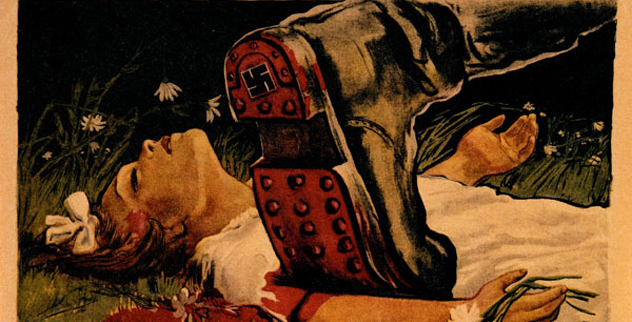
Soviet revolutionary posters did not believe in whispering. They shouted from factory walls, train stations, schoolrooms, shop windows, and street corners with the graphic equivalent of a brass band marching through your breakfast. Their colors were loud, their angles were dramatic, and their slogans had the subtlety of a hammer landing on an anvil.
Yet these posters were more than propaganda artifacts. They changed the history of graphic design. Soviet artists mixed typography, photography, collage, geometry, illustration, and political messaging into images that still feel startlingly modern. The same visual language that once encouraged people to read, work, fight, build, stay silent, or admire the state now appears in album covers, advertising campaigns, movie posters, streetwear, editorial layouts, and social media graphics.
This guide explores 15 revolutionary posters of the Soviet Union and the early Soviet period. Some were created before the USSR was formally established in 1922, but they helped invent the visual vocabulary that defined Soviet poster art for decades. They are remarkable as design objects, historical documents, and reminders that a powerful image can inspire, persuade, pressure, or all three before you have even finished walking past it.
Why Soviet Revolutionary Posters Still Matter
Soviet propaganda posters were designed for mass communication. Many viewers had limited access to newspapers, books, or formal education, so images had to work quickly. A red triangle could stand for revolution. A raised fist could signal resistance. A worker with oversized shoulders could represent collective strength. A villain with a tiny body and a suspiciously pointy nose could represent everything the state wanted people to dislike before lunch.
Artists working in the revolutionary period developed a visual system based on contrast: red against black, workers against capitalists, movement against stagnation, and the future against the past. Constructivist design used diagonal lines, sharp geometry, bold sans-serif lettering, and photomontage to make political messages feel urgent and technologically advanced. Later posters moved toward Socialist Realism, favoring heroic workers, glowing farms, soldiers, scientists, and leaders presented with the kind of lighting normally reserved for movie stars and very confident sandwiches.
It is important to view these works with context. Their visual achievements do not erase the authoritarian systems, censorship, coercion, political repression, and personality cults that often surrounded their production. Soviet poster art is compelling partly because it reveals how beauty, optimism, pressure, and power can occupy the same sheet of paper.
15 Revolutionary Posters of the Soviet Union
1. Beat the Whites with the Red Wedge by El Lissitzky, 1919
Few political posters have said so much with so little. El Lissitzky’s famous composition uses a red triangle thrusting into a white circle. The red wedge represents the Bolsheviks, while the white circle symbolizes anti-Bolshevik forces during the Russian Civil War. There are no muscular heroes, no fluttering flags, and no long lecture about policy. There is simply geometry behaving like a political fist.
The poster became a landmark of Constructivist design because it transformed abstract shapes into a readable political narrative. It proved that propaganda did not have to look like a painting or a speech. It could look like an equation with consequences.
2. The Red Army Is the Strongest by Dmitry Moor, 1919
Dmitry Moor’s poster turns the Red Army into an almost mythic force. The design uses a forceful red figure and military symbolism to suggest that the revolutionary army is organized, unstoppable, and morally certain. The message is simple: history has picked a side, and it is wearing red.
What makes the image memorable is its economy. Moor did not need a battlefield crowded with details. He used a powerful silhouette, a restricted color palette, and a direct slogan to make the army feel larger than life. It is propaganda built like a punchy headline.
3. Have You Volunteered? by Dmitry Moor, 1920
This recruitment poster is one of the most recognizable images of the revolutionary era. A stern Red Army soldier points directly at the viewer, making the question impossible to ignore. The composition is a Soviet cousin of the famous “I Want You” recruitment image, except the expression suggests that declining may not be a relaxing option.
The poster works because it removes distance between the state and the individual. Instead of speaking to a crowd, the figure appears to speak directly to one person. The point of the finger is visual punctuation. It turns a slogan into a demand for action.
4. Help! by Dmitry Moor, 1921
Help!, created during the famine crisis of the early 1920s, is among the bleakest Soviet posters. A skeletal, exhausted figure stands beneath a stark appeal for aid. Unlike heroic recruitment posters, this work does not celebrate strength. It confronts viewers with vulnerability, hunger, and urgency.
The design is striking because of what it refuses to decorate. The background is sparse, the figure is gaunt, and the message is direct. Moor showed that revolutionary poster art could also communicate tragedy. It is a difficult image, but that difficulty is exactly why it remains powerful.
5. Books in All Branches of Knowledge by Alexander Rodchenko, 1924
Often called the Lengiz Books poster, this design features Lilya Brik shouting into a hand-shaped megaphone. Alexander Rodchenko framed her face with sharp diagonals, bold lettering, and a photographic collage style that makes the image feel like a visual alarm clock.
The poster advertised books, which may sound less dramatic than recruiting soldiers or building factories. Rodchenko made it look like reading was an extreme sport. The design helped establish photomontage as a major tool of Soviet graphic art and remains one of the most copied images in modern design history.
6. Long Live the Komsomol! by Alexander Samokhvalov, 1924
This poster celebrates the Komsomol, the Communist youth organization. Its young figures appear energetic, forward-looking, and almost allergic to standing still. The message is not merely that youth should support the revolution; it is that youth itself is the revolution’s engine.
Samokhvalov’s composition reflects an early Soviet fascination with movement, education, labor, and collective purpose. The bodies are active, the lines are energetic, and the future appears to be arriving at a brisk jog. It captures the idealized image of the “new Soviet person” before later state imagery became more rigid and ceremonial.
7. We Will Build a Mighty Soviet Blimp by Alexander Deineka, 1931
Alexander Deineka’s poster turns aviation into a national dream. The airship becomes a symbol of industrial progress, technological ambition, and collective achievement. In Soviet visual culture, machines were rarely just machines. A tractor was a promise. A factory was a promise. A giant blimp was apparently a promise with excellent overhead storage.
Deineka’s modernist approach makes the machine feel sleek and dynamic rather than clunky. The poster celebrates the belief that technology could transform daily life and place the Soviet Union at the front of modern civilization.
8. The USSR Is the Shock Brigade of the World’s Proletariat by Gustav Klutsis, 1931
Gustav Klutsis was one of the masters of Soviet photomontage, and this poster is a textbook example of his style. A worker appears monumental, carrying the red flag while photographs, typography, and geometric forms collide around him. The worker is not portrayed as one person. He is portrayed as an entire economic system wearing overalls.
The phrase “shock brigade” referred to workers expected to exceed normal production targets. Klutsis translated that idea into an image of momentum. The design makes work look athletic, heroic, and globally significant. It also shows how photomontage could make political claims feel modern, factual, and almost scientifically inevitable.
9. Long Live the USSR, Model of Brotherhood Among the Workers of All Nationalities by Gustav Klutsis, 1935
This poster presents the Soviet Union as a multinational project united by labor and socialism. Klutsis combined photographic figures with dynamic typography to create an image of collective identity. Different peoples are represented as part of one grand political family, standing beneath a shared ideological roof.
The work is visually sophisticated and historically complicated. It promotes unity while also reflecting a state that increasingly centralized authority. That tension makes the poster valuable today. It is both an ambitious vision of solidarity and a reminder that official images often present a cleaner story than lived reality.
10. Cadres Decide Everything by Gustav Klutsis, 1936
In this vertical photomontage, Klutsis turns political leadership and trained specialists into a towering visual hierarchy. The poster argues that the success of Soviet development depends on skilled personnel, discipline, and organized human resources. It is a recruitment ad for competence, but with the intensity of a rocket launch.
Klutsis used scale brilliantly. Figures appear to rise upward through the composition, suggesting that the Soviet state is a machine powered by trained people. The work is a strong example of how Soviet posters merged modern design with centralized political messaging.
11. The Motherland Calls! by Irakli Toidze, 1941
Created after Nazi Germany invaded the Soviet Union, The Motherland Calls! became one of the best-known World War II posters in Soviet history. A woman in red faces the viewer, holds up a military oath, and raises her hand in command. Behind her, rows of bayonets create a wall of armed resolve.
Toidze’s figure is not a distant allegory. She feels immediate, severe, and personal. The poster turns the nation into a human presence that demands defense. Its emotional force comes from the combination of maternal symbolism and military urgency. This is not a gentle invitation to participate. It is a national emergency with excellent composition.
12. Red Army Soldier, Save Us! by Viktor Koretsky, 1942
Viktor Koretsky’s wartime poster uses a much more emotional approach than the bold geometry of Constructivism. A mother and child appear threatened beneath a Nazi weapon, while the text appeals directly to a Red Army soldier. The image is designed to provoke protection, anger, and moral urgency.
Its power comes from narrative. Rather than presenting an abstract political struggle, the poster gives viewers a specific emotional scene. It asks the soldier to imagine what is at stake in personal terms. That method made it especially effective during wartime, when propaganda needed to connect military sacrifice with civilian survival.
13. Don’t Chatter! by Nina Vatolina and Nikolai Denisov, 1941
This poster features a woman pressing one finger to her lips, warning citizens not to reveal military information carelessly. The message is concise: loose talk can help the enemy. It is the Soviet version of “loose lips sink ships,” but with a facial expression that could stop an entire office meeting.
The design shows another side of wartime poster culture. Not every poster called for heroism through battle. Some asked people to monitor their behavior, control information, and treat ordinary conversation as part of national defense. The image remains visually recognizable because its gesture is universal.
14. Peace Will Be Victorious! by Viktor Koretsky, 1950
After the devastation of World War II, Soviet visual culture increasingly used peace imagery to frame the country’s role in the world. Koretsky’s poster presents peace as a political promise, moral victory, and public aspiration. The design is warmer than wartime mobilization posters, but it remains unmistakably ideological.
Peace posters from the early Cold War era often used children, doves, flowers, sunlight, and optimistic families. These symbols helped create a contrast between peaceful Soviet life and the threats associated with war, capitalism, or foreign militarism. The message was calm on the surface, but it still carried the volume knob of a propaganda campaign.
15. The Immortality of Lenin Is in Our Achievements by Viktor Koretsky, 1964
This poster connects Lenin’s legacy to Soviet accomplishments in industry, science, education, and public life. Rather than presenting Lenin as a figure from the past, the design treats him as a permanent presence inside the state’s achievements. The message is clear: progress itself is evidence of ideological continuity.
By the 1960s, Soviet posters often combined portraits of leaders with visual signs of modernization, including factories, space exploration, scientific research, and urban development. The result was a form of political memory-making. Lenin became less a historical person and more a visual brand with very serious approval standards.
What These Soviet Posters Teach Modern Designers
The lasting influence of Soviet poster art comes from its ability to make messages visually unavoidable. Modern designers can learn from its clarity without copying its political coercion. The strongest lessons include using contrast with purpose, limiting the color palette, making typography part of the image, and building a composition around one dominant idea.
These posters also demonstrate the power of visual rhythm. Diagonal lines create motion. Oversized type creates urgency. Photomontage adds realism and energy. A tightly cropped face can feel more immediate than an entire crowd. Soviet designers understood that a poster had only a few seconds to work. It had to survive bad lighting, fast walking, noisy streets, and viewers who might be late for work.
For today’s creators, the best takeaway is not “make everything red and add a stern worker.” It is to make the message clear enough that the audience understands the emotional point before reading every word. Great poster design does not merely decorate an idea. It gives the idea a pulse.
A 500-Word Viewing Experience: Encountering Soviet Revolutionary Posters Today
Seeing Soviet revolutionary posters in a book is interesting. Seeing them in a gallery, archive, classroom, or large online collection is a different experience entirely. On a screen, it is easy to admire the graphics and move on. In person, the scale changes everything. A poster that looks like a clever design exercise on a laptop can suddenly feel like it is taking up all the oxygen in the room.
Imagine standing in front of Beat the Whites with the Red Wedge. At first glance, it may look almost too simple: a red triangle, a white circle, a few supporting forms. Then the design starts to work on your brain. The wedge is not just red. It is moving. The circle is not just white. It is under attack. You begin to understand how the image could make sense even to someone who never read a political manifesto. The poster is fast. It does not wait for permission.
Then you move to Rodchenko’s book poster, and the experience changes. The shouting woman, Lilya Brik, seems to call across a century. The typography rushes from her mouth like sound made visible. You can almost hear the poster before you read it. The image feels familiar because modern advertising, fashion photography, music videos, and internet graphics have borrowed from it for years. Standing near it can feel like meeting the grandparent of half the visual internet.
Wartime posters feel different again. The Motherland Calls! is not simply bold; it is confrontational. The raised hand stops you. The eyes hold you in place. You are no longer looking at a design trend. You are looking at an image created during an invasion, when fear, grief, patriotism, propaganda, and survival were tangled together. The poster’s beauty does not make its message harmless. In fact, its beauty makes the emotional pressure stronger.
That is the strange experience of studying Soviet poster art. You can admire the precision of the layout while questioning the political system behind it. You can appreciate the inventiveness of photomontage while recognizing that the same tools were used to sell impossible promises, demand sacrifice, and elevate leaders into symbols. The posters ask viewers to feel first and think later. A modern viewer has the advantage of doing both.
There is also something unexpectedly human about the best examples. The faces shout, warn, plead, command, smile, or stare. The workers are idealized, but their gestures remain readable. The mothers and children in wartime images make abstract conflict painfully personal. The youth posters glow with the energy of people who believe the future can be built by hand, even if the historical outcome was far messier than the artwork suggests.
After spending time with these posters, the red, black, cream, and white palette begins to linger in your memory. You notice how often the artists used diagonal lines to create forward motion. You notice how a single raised arm can organize an entire composition. You notice that the posters rarely leave room for uncertainty. Their design says, “Here is the problem. Here is the answer. Please do not wander off and compare notes.”
That confidence is precisely why Soviet revolutionary posters remain fascinating. They are visually fearless, historically loaded, and impossible to separate from the world that produced them. A good viewing experience does not ask you to praise them or dismiss them. It asks you to look carefully, understand how they worked, and recognize how often powerful images still try to do the same thing today.
Conclusion
The 15 revolutionary posters of the Soviet Union explored here show how graphic design can become a public force. From El Lissitzky’s geometric red wedge to Viktor Koretsky’s emotional wartime appeals, these images used color, scale, typography, photography, and symbolism to shape public feeling at extraordinary speed.
They remain essential to the history of propaganda, Constructivism, political art, photomontage, and modern visual communication. Their artistic influence is undeniable, even when their political messages deserve scrutiny. Soviet poster design reminds us that images do not just illustrate history. Sometimes, they try to command it.
Note: English translations of Soviet poster titles may vary by archive, museum collection, publisher, or exhibition catalog. This article treats the posters as historical design works and does not endorse the political repression or authoritarian practices associated with the Soviet state.