The Disability Pride Flag is not just a pretty arrangement of stripes. It is a compact, colorful, and surprisingly thoughtful visual essay about access, identity, grief, community, and the everyday art of getting through a world that was not always designed with disabled people in mind. In other words, it is doing a lot of work for a rectangle.
Seen most often during Disability Pride Month in July, the flag has become a growing symbol of disabled identity and disability rights. Its colors represent different disability experiences, while its diagonal design speaks to the barriers disabled people are often forced to cut across. The current version, redesigned in 2021 by disabled writer and advocate Ann Magill, also tells an important accessibility story: even a pride symbol should listen, adapt, and become more inclusive.
That last part matters. The Disability Pride Flag is not about pretending disability is always easy, cheerful, or inspirational in a greeting-card way. It is about rejecting shame. It is about saying disabled people belong in public life, in schools, workplaces, families, media, leadership, art, jokes, arguments, bad parking-lot design reviews, and every other corner of society.
What Is the Disability Pride Flag?
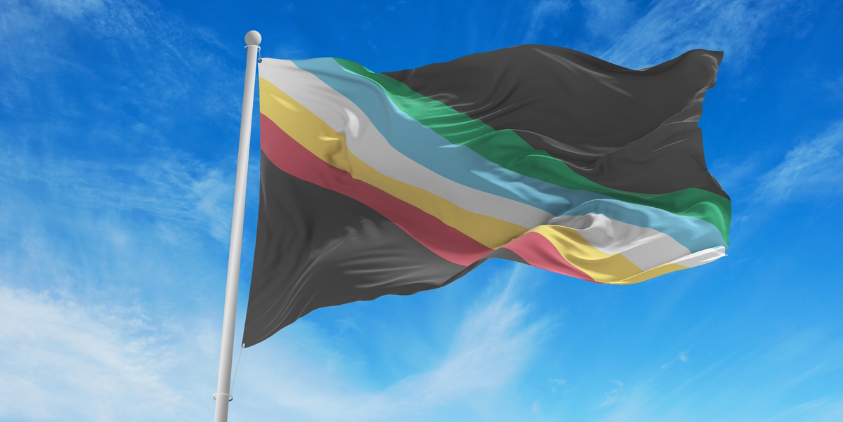
The Disability Pride Flag is a symbol of the disability community and the disability rights movement. It is commonly recognized by its charcoal gray background and five muted diagonal stripes: red, gold, white, blue, and green. Each stripe represents a broad category of disability, while the background and diagonal layout carry their own meanings.
The flag is especially visible in July because July is widely celebrated as Disability Pride Month in the United States. The month is closely connected to the anniversary of the Americans with Disabilities Act, signed into law on July 26, 1990. The ADA is a major U.S. civil rights law that protects people with disabilities from discrimination in many areas of public life, including employment, transportation, public accommodations, communications, and government services.
That connection gives the flag extra weight. Disability Pride is not only a vibe, although it definitely has one. It is also tied to decades of organizing, protest, legal advocacy, and daily resistance by disabled people who demanded access instead of politely waiting for someone to “think about adding a ramp someday.”
Who Created the Disability Pride Flag?
The Disability Pride Flag was created by Ann Magill, a disabled writer and advocate with cerebral palsy. Her work grew from a desire to make disability pride visible in public, not tucked away in the background like an afterthought. The flag was designed as a community symbol: something people could use at events, online, in classrooms, in campaigns, and in personal expressions of pride.
The early version of the flag used brighter colors and a zigzag, lightning-like stripe pattern across a dark background. The idea was powerful: disabled people often have to navigate barriers, detours, and social systems that seem to have been assembled by someone who lost the instructions. However, community feedback revealed an accessibility problem. The high-contrast zigzag design could be visually uncomfortable or triggering for some people with photosensitivity, migraine disorders, and other visually triggered disabilities.
So the flag changed. In 2021, Magill redesigned it with muted colors and straight diagonal stripes. That redesign is part of what makes the flag so meaningful. It did not just symbolize accessibility; it practiced accessibility. It listened to disabled people and adjusted accordingly. That is basically the opposite of a “Sorry, we’ve always done it this way” policy, which, unfortunately, is still the unofficial mascot of too many institutions.
Why Was the Disability Pride Flag Redesigned?
The 2021 redesign made the Disability Pride Flag more visually accessible. The original zigzag pattern could create a strobe-like effect on screens, especially when reduced in size, animated, or viewed on mobile devices. For some viewers, that was not merely annoying. It could worsen symptoms or make the design hard to look at.
The updated flag uses a straight diagonal band instead of a zigzag, and the colors are softer. This makes the flag easier for more people to view and share. It also reflects a central principle of disability inclusion: accessibility is not a decorative bonus. It is part of the design brief from the beginning, or it should be.
No symbol can be perfect for everyone, but the redesign shows the value of community feedback. The flag became stronger because people spoke up and because the designer took those concerns seriously. That is a good lesson for schools, brands, event planners, website owners, and anyone who has ever said, “But we already printed the posters.”
The Meaning of the Disability Pride Flag Colors
The Disability Pride Flag uses six total colors when the background is included. These colors show the diversity of disability experiences across bodies, minds, senses, diagnoses, cultures, and communities. Disability is not one single story. It can be visible or invisible, lifelong or acquired, stable or changing, physical, cognitive, sensory, psychiatric, or a combination of several experiences at once.
Charcoal Gray or Faded Black: Mourning, Protest, and Memory
The charcoal gray background represents mourning and remembrance for disabled people who have been harmed or lost because of ableism, abuse, neglect, exclusion, and systemic injustice. It also represents protest against a world that too often treats disabled lives as less valuable, less urgent, or less visible.
The dark background is not there to make the flag gloomy. It gives the colors something to cut through. That contrast matters. Disability Pride does not erase pain, discrimination, or grief. It makes room for them while still insisting on dignity and joy. Pride without honesty would be a motivational poster. Disability Pride is deeper than that.
Red: Physical Disabilities
The red stripe represents physical disabilities. This can include mobility disabilities, limb differences, chronic pain conditions, neuromuscular conditions, paralysis, fatigue-related disabilities, and many other experiences involving the body’s movement, structure, strength, stamina, or physical function.
For many people, physical disability is the most familiar image of disability because wheelchairs, canes, braces, walkers, prosthetics, and service dogs are visible. But even physical disability is more varied than the public often assumes. Not every mobility aid user uses the same aid every day. Not every disabled person who can stand can walk long distances. Not every person who “looks fine” is fine. Human bodies are not phone batteries; you cannot always tell the percentage from across the room.
Gold: Neurodivergence and Cognitive Disabilities
The gold stripe represents neurodivergence and cognitive or intellectual disabilities. This may include autism, ADHD, Down syndrome, learning disabilities, intellectual disabilities, traumatic brain injury, and other ways that people think, learn, process information, communicate, focus, remember, or solve problems differently.
Gold is a fitting color because neurodivergent and cognitively disabled communities have contributed enormously to culture, science, creativity, problem-solving, and social change. The point is not to turn every disabled person into a “secret genius” character. That is its own tired script. The point is simpler and better: different minds deserve respect, support, and access, whether or not they produce a world-changing invention before lunch.
White: Invisible and Undiagnosed Disabilities
The white stripe represents invisible, non-apparent, and undiagnosed disabilities. These can include chronic illnesses, autoimmune conditions, pain conditions, fatigue disorders, mental health disabilities, learning differences, neurological conditions, and many other disabilities that may not be obvious to strangers.
This stripe is especially important because many disabled people are doubted precisely because their disability cannot be seen. They may hear comments like “You don’t look disabled,” which is rarely the compliment people think it is. A better approach is to believe people about their access needs. Nobody should have to perform suffering convincingly enough to earn a chair, a break, a caption, a flexible deadline, or basic respect.
Blue: Psychiatric and Emotional Disabilities
The blue stripe represents psychiatric and emotional disabilities. This can include mental health conditions and psychosocial disabilities that affect mood, perception, stress response, social interaction, attention, energy, or daily functioning.
Including psychiatric disabilities in the flag is important because mental health conditions are often separated from disability conversations, even though they can substantially affect major life activities. Disability Pride challenges the idea that only some disabilities are “real enough” to count. There is no velvet rope outside the disability community guarded by a clipboard-wielding bouncer named Norm.
Green: Sensory Disabilities
The green stripe represents sensory disabilities. This includes blindness, low vision, Deafness, hearing loss, auditory processing differences, sensory processing disabilities, and other experiences involving sight, sound, touch, smell, taste, balance, or sensory regulation.
Sensory accessibility is often overlooked until someone points out the obvious: a video without captions excludes people, a website that does not work with screen readers excludes people, a public space filled with flashing lights and roaring sound excludes people, and a meeting where everyone talks over one another excludes nearly everyone eventually. Green reminds us that access is not just about entrances and elevators. It is also about information, communication, and sensory safety.
What the Diagonal Stripes Mean
The diagonal band represents disabled people cutting across barriers. Those barriers can be physical, like stairs without ramps; digital, like inaccessible forms; social, like stigma and low expectations; economic, like workplace discrimination; or medical, like not being believed. The diagonal movement suggests momentum, creativity, and resistance.
The stripes do not sit quietly in a neat horizontal stack. They move. They cross the field. They interrupt the darkness. Visually, the design says disabled people are not waiting politely at the edge of society. They are already here, moving through, reshaping the route, and occasionally asking why the “accessible entrance” is next to the dumpster behind the building. Again.
Why Disability Pride Matters
Disability Pride matters because disability has often been framed through pity, fear, awkward silence, or “inspiration” stories designed mainly to make nondisabled people feel uplifted. Disability Pride offers a different frame. It says disability is a natural part of human diversity. It says disabled people are not broken versions of nondisabled people. It says access is not charity; it is civil rights.
That does not mean every disabled person must personally identify with the word “pride.” Some people do. Some do not. Some feel proud, angry, tired, joyful, complicated, or all of the above before breakfast. Disability Pride is spacious enough for complexity. It is not a demand to smile through barriers. It is an invitation to reject shame and claim visibility on one’s own terms.
The flag helps make that message visible. A flag cannot fix inaccessible transit, underemployment, medical bias, school exclusion, or badly designed websites. But symbols can gather people, start conversations, and remind communities what they are fighting for. They can turn a personal experience into a shared language.
How to Use the Disability Pride Flag Respectfully
Using the Disability Pride Flag respectfully starts with understanding what it represents. It should not be treated as a trendy July decoration with no connection to disabled people, accessibility, or disability justice. If an organization posts the flag online while its website cannot be navigated by keyboard or read by a screen reader, the internet may have questions. Fair questions. Possibly spicy ones.
When sharing the flag digitally, include alt text. A simple description might say: “Disability Pride Flag with a charcoal gray background and five muted diagonal stripes in red, gold, white, blue, and green.” If you are creating graphics, avoid flashing animation, extreme contrast effects, or tiny unreadable text placed over the flag. Accessibility should not be hidden in the footnotes of a design project.
Organizations can also use the flag as a prompt for action. Review hiring practices. Caption videos. Check event accessibility before invitations go out. Offer quiet spaces. Provide materials in accessible formats. Listen to disabled employees, students, customers, and community members. The flag is a symbol, but the real pride is in changing conditions.
Common Misunderstandings About the Disability Pride Flag
“Is the Disability Pride Flag official?”
The Disability Pride Flag is a community-created symbol, not a government-issued emblem. Its power comes from use, recognition, and shared meaning across disability communities. Like many pride flags, it is rooted in identity and activism rather than official paperwork. Fortunately, paperwork has never been the most exciting part of liberation.
“Does one color represent every disability perfectly?”
No. The color categories are broad. Many people live with multiple disabilities, and some disabilities could fit into more than one category. The flag is not a diagnostic chart. It is a symbol of solidarity.
“Can nondisabled allies use the flag?”
Yes, but with care. Allies can share the flag, support Disability Pride Month, and promote disability rights. The key is to center disabled voices, avoid speaking over disabled people, and pair visibility with action. In short: wave the flag, but do not use it as a curtain to hide inaccessible behavior.
Experiences Connected to the Disability Pride Flag
One of the most powerful things about the Disability Pride Flag is how differently people may experience it depending on where they encounter it. Online, it might appear as a profile banner during July, a small diagonal flash of color that tells someone, “You are not the only one here.” In a school hallway, it might be part of a bulletin board that finally names disability as an identity instead of treating it only as a private paperwork category. At a community event, it might hang near an accessibility table, quietly doing more emotional labor than half the committee.
For someone with a visible disability, the flag can feel like recognition without the usual stare. It says disability is not something to hide, apologize for, or constantly explain to strangers in grocery store aisles. For someone with a non-apparent disability, the white stripe can feel especially personal. It acknowledges the exhaustion of being doubted, the weird pressure to disclose private information, and the relief of being believed without having to submit a full medical documentary.
For families, friends, teachers, and coworkers, the flag can become a conversation starter. A student may ask what the colors mean. A parent may realize that disability pride is not the opposite of difficulty; it is the opposite of shame. A manager may notice that posting the flag is easy, but making meetings accessible requires actual planning. This is where the symbol becomes useful. It nudges people from awareness into responsibility.
In real life, the flag often shows up in small but meaningful ways: a sticker on a laptop, a pin on a backpack, a slide at the beginning of a training session, a poster in a clinic, a graphic in an employee newsletter, or a painted sign at a local Disability Pride event. These may seem minor, but visibility adds up. When people see disability represented with pride rather than pity, it can shift the emotional weather in a room.
There is also a lesson in the flag’s redesign. The fact that the original design changed after accessibility concerns is not an embarrassing footnote. It is the good part. It shows what inclusion looks like when people do not get defensive and cling to a first draft like it was carved onto a sacred tablet. The newer flag reflects a community process: someone created, others responded, and the design evolved. That is exactly how accessible culture should work.
The flag’s meaning becomes strongest when it is paired with everyday choices. A classroom using the flag can also normalize captions, flexible participation, and different communication styles. A workplace using it can review accommodations without treating them like suspicious luxury upgrades. A website displaying it can make sure disabled users can actually navigate the page. A public event flying it can provide seating, accessible restrooms, clear signage, quiet areas, and multiple ways to participate.
Ultimately, the Disability Pride Flag is experienced not only as fabric or pixels, but as a question: Are disabled people merely being acknowledged, or are they being included? The colors are beautiful, but the meaning gets real when access improves, assumptions change, and disabled people are treated as full participants in public life. That is when the flag stops being decoration and starts becoming a promise.
Conclusion
The Disability Pride Flag’s colors and meaning tell a layered story. The charcoal background remembers harm and protests ableism. The red, gold, white, blue, and green stripes represent physical disabilities, neurodivergence and cognitive disabilities, invisible and undiagnosed disabilities, psychiatric and emotional disabilities, and sensory disabilities. The diagonal band cuts across barriers, symbolizing movement, creativity, and resistance.
Most importantly, the flag reminds us that disability pride is not about pretending barriers do not exist. It is about refusing to let those barriers define the value of disabled people. It celebrates identity, demands access, and invites everyone to build a world where inclusion is not a special feature but the default setting. Honestly, society could use that update.