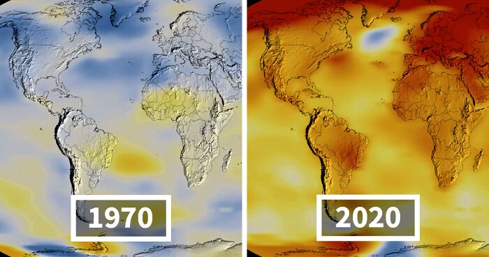
When NASA dropped its heat map video showing global temperatures in 2020, it was not just posting another pretty animation for science nerds and people who enjoy staring at angry-red globes. It was releasing a visual receipt. The map made one thing painfully clear: Earth was running a fever, and 2020 was right at the top of the chart.
According to NASA’s analysis, 2020 effectively tied 2016 as the warmest year on record in the agency’s dataset. That is impressive in the worst possible way, because 2016 had a strong El Niño event helping push temperatures upward, while 2020 ended under La Niña conditions, which usually have a slight cooling effect. In other words, the planet still turned in a record-level hot year even after nature lightly tapped the brakes. Not ideal. Not reassuring. Definitely not the kind of tie you celebrate with confetti.
This article breaks down what NASA’s heat map video showed, why scientists care so much about temperature “anomalies,” why 2020 stayed blisteringly warm, and what the video means for anyone trying to understand climate change without needing a Ph.D. or a bunker full of charts.
What NASA Actually Released
NASA’s video was a global heat map animation built from surface temperature anomaly data. That means it did not show the absolute temperature in every place. It showed how much warmer or cooler each region was compared with a long-term average, specifically the 1951–1980 baseline. In the video, white areas hover near normal, blue areas are cooler than that baseline, and red areas are warmer. By the final frames, the globe looks less like a balanced climate system and more like it needs a giant ice pack.
The visualization from NASA’s Scientific Visualization Studio also used a five-year view in its final frame, representing temperature anomalies from 2016 through 2020. That choice matters because it smooths out some short-term noise and highlights the long-term warming pattern. The message is not “one random hot year happened.” The message is “the climate system has been trending hotter for a long time, and now the hottest years keep showing up like uninvited guests who never leave.”
NASA paired that map with broader annual climate reporting showing that Earth’s global average surface temperature in 2020 was 1.84 degrees Fahrenheit, or 1.02 degrees Celsius, above the agency’s 1951–1980 baseline. NASA scientists also emphasized that the last seven years at the time were the seven warmest on record. That is not statistical fluke territory. That is trend territory.
How To Read a Heat Map Without Panicking at Every Red Blob
Heat maps can be visually dramatic, but they are also easy to misunderstand. The red zones in NASA’s 2020 map do not mean every one of those regions hit the same daily temperature or broke the same local record. They show departures from what is normal for that place over time. That is why a cold place can still appear bright red on the map: it may be warmer than usual even if it is still cold by everyday standards.
That is also why anomaly maps are so useful. Absolute temperatures vary naturally between deserts, oceans, mountaintops, and polar regions. But anomalies help scientists compare apples to apples, or at least apples to Arctic sea ice. They make it easier to see where the climate system is shifting, not just where summer feels sweaty.
In NASA’s 2020 map, the strongest warming stood out over the Arctic and large portions of northern land areas. That pattern fits a larger scientific reality: the Arctic is warming much faster than the planet as a whole. When the north lights up on a global map, scientists do not shrug and move on. They lean in.
Why 2020 Was So Hot Even With La Niña Hanging Around
One of the most important details in the 2020 story is that the year did not rely on a massive natural warming boost to end up near the top of the rankings. NASA noted that 2020 started with a slightly warm El Niño-Southern Oscillation setup and ended in a La Niña phase, which tends to cool global averages somewhat. Yet the year still tied for first place in NASA’s record.
That tells us something big. Natural cycles like El Niño and La Niña can shuffle temperatures up or down from one year to the next, but they are now operating on top of a much warmer background climate. The floor has risen. So even when one natural pattern nudges temperatures downward, the planet can still post a near-record year because greenhouse gas-driven warming keeps loading the dice.
Climate Central summed it up well in plain-English terms: despite La Niña emerging in the second half of 2020, the year still landed among the top two warmest years on record because human-caused greenhouse gas emissions continue to warm the planet. That is the larger story behind the video. The map is flashy, but the physics are stubborn.
Yes, NASA and NOAA Ranked 2020 Slightly Differently
If you ever see one headline saying 2020 was the hottest year on record and another saying it was the second hottest, do not assume scientists are arm-wrestling in a lab somewhere. NASA and NOAA use many of the same raw measurements, but they apply different methodologies and baseline periods. NASA’s analysis includes estimates for some sparsely observed polar regions, while NOAA’s traditionally has not inferred temperatures there in the same way. That matters because the Arctic warmed dramatically in 2020.
So NASA had 2020 effectively tied with 2016 for first, while NOAA ranked it just behind 2016. Both conclusions point to the same reality: 2020 was exceptionally hot, part of a sustained long-term warming trend, and absolutely not a normal year in climate terms.
What the Heat Map Looked Like in the Real World
Climate maps can feel abstract until you connect them to events people actually lived through. In 2020, the map’s red patches had real-world echoes all over the planet.
The Arctic and Siberia Sent Up Flares
Some parts of Siberia saw temperatures rise above 100 degrees Fahrenheit during a major heat wave in 2020. That is not a typo, and it is not the setup for a dark climate joke. NASA linked that Arctic heat to wildfire outbreaks and the re-emergence of “zombie fires,” which smolder underground through winter and flare up again when conditions allow. NASA also reported that the Arctic sea ice minimum in 2020 fell to the second-lowest extent in the satellite record, with the melt season getting an early push from Siberian heat.
When you see the far north smeared in deep red on a NASA heat map, this is what it means in practice: thinner ice, earlier melt, darker open water absorbing more solar energy, and a feedback loop that keeps making a vulnerable region more vulnerable.
Wildfires Turned Heat Into Headline Smoke
NASA’s review of 2020 climate events noted that the western United States experienced its most active fire season on record. Heat waves helped fires burn faster and hotter, while smoke spread across vast areas. NOAA has also explained the broader climate connection here: rising temperatures and a thirstier atmosphere dry out vegetation and make fire-friendly conditions more likely. A heat map can show the warming background; a fire season shows what that background can enable.
The result was not just a bad season. It was a season that made satellite imagery look apocalyptic and reminded millions of people that climate change does not only happen on graphs. Sometimes it happens in your lungs, on your windshield, and in the orange glow outside your window at noon.
Oceans Stored the Heat and Fed the Chaos
NOAA’s State of the Climate in 2020 reporting found that global upper ocean heat content reached record highs in 2020. That matters because oceans absorb more than 90% of Earth’s excess heat. They are not calmly “solving” the problem for us; they are storing enormous amounts of energy, with consequences.
Warmer oceans can help fuel stronger storms, worsen coral stress, speed ice melt, and push sea levels higher through thermal expansion. In 2020, the Atlantic hurricane season produced 30 named storms, making it one of the busiest ever recorded. Not every storm can be pinned neatly on global warming, but warmer ocean waters absolutely make intensification easier. The climate system does not separate neatly into tidy little folders labeled “heat,” “storms,” and “ice.” They interact. That is what NASA’s video hints at, and what the broader 2020 data confirms.
How NASA Knows This Stuff
NASA did not make the map by tossing a thermometer into the Pacific and hoping for the best. The agency’s temperature analysis combines measurements from more than 26,000 weather stations, thousands of ship- and buoy-based sea surface readings, and Antarctic observations. NASA also cross-checks the surface record with satellite observations, including data from the AIRS instrument aboard the Aqua satellite.
Scientists then analyze those measurements with methods designed to account for uneven station coverage, changes in equipment, station moves, and urban heat effects. NASA GISS explains that this type of adjustment is not data tampering; it is part of making long-term climate comparisons scientifically meaningful. Without that work, the record would be noisier and less trustworthy.
That is why the 2020 heat map matters. It is not a mood board. It is a visualization built on decades of observation, methodology, and repeated cross-checking. It gives the public a way to see the same underlying trend scientists have been documenting for years.
What NASA’s 2020 Heat Map Really Means
The biggest takeaway is not just that 2020 was hot. It is that extreme warmth no longer needs extraordinary help to reach the top of the rankings. A warming atmosphere, warmer oceans, shrinking ice, and repeated high-temperature years are becoming the baseline story, not the exception.
NASA’s heat map video works because it translates climate science into something instantly understandable. The reds spread, deepen, and linger. The cold patches do not vanish entirely, but they lose ground. Over time, the planet’s visual balance changes. And that is exactly the point. Climate change is not only about one awful week, one fire, one storm, or one summer that ruins your patio plans. It is about the long shift in the background conditions that shape all of them.
So yes, the video is striking. But the real power of it is not aesthetic. It is explanatory. It shows that 2020 was not an isolated freak event. It was part of a broader pattern that has been building for decades, measured carefully, debated rigorously, and now displayed in bright, impossible-to-ignore color.
The Human Experience Behind a Global Heat Map
There is also a more personal side to a video like this, and it is probably why NASA’s heat map resonated far beyond the usual science crowd. For many people, the experience of watching the 2020 animation was a little like seeing a private suspicion turned into public evidence. Maybe you had already felt that summers seemed meaner, smoke seasons longer, winter less reliable, or storms weirder. Then NASA comes along with a spinning globe and basically says, “No, you are not imagining things. The planet really is warming, and here is the replay.”
That experience matters because climate change often feels too large, too slow, or too abstract to grasp. A chart full of anomalies can look distant. A map that blooms red across the Arctic, across continents, and across oceans feels different. It gives shape to something people have sensed in fragments. The dry garden. The brutal heat wave. The air quality alert. The school day canceled by smoke. The hurricane season that somehow keeps using up the alphabet like it is speed-running weather.
For scientists, there is a different kind of experience baked into the 2020 map: the strange combination of validation and alarm. Validation, because the long-term warming trend is exactly what decades of research said would happen if greenhouse gas concentrations kept rising. Alarm, because being correct about a worsening climate is not exactly a victory lap moment. It is more like watching the check engine light you warned about turn into actual smoke from the hood.
For the general public, the emotional experience is often a mix of awe, unease, and recognition. Awe, because the Earth system is so vast that even a one-degree Celsius shift in the global average is enormous. Unease, because the map makes clear that this is not a local glitch. Recognition, because many people now have personal memories that line up with the science: a summer that felt endless, a city wrapped in haze, a news cycle full of fire maps and storm tracks.
That is why visual tools like NASA’s 2020 heat map video matter so much. They help bridge the gap between data and daily life. They turn climate change from a concept into something visible, trackable, and harder to dismiss. They also remind us that climate is not some far-off environmental subplot. It is the background system that shapes food, water, health, homes, insurance, infrastructure, and whether stepping outside in August feels mildly annoying or like opening the door to a giant hair dryer set to maximum.
In the end, the experience of watching NASA’s 2020 heat map is not really about watching one year win a grim contest. It is about realizing that the contest keeps getting harder to escape. The colors tell a scientific story, but they also tell a human one: people are living inside this trend now, not waiting for it to arrive someday. And once you see that red spread across the globe, it is very hard to unsee it.