Some planters whisper politely from the corner. Others enter the garden wearing two different shoes and somehow make the whole outfit work.
That is the appeal of planters with a split personality: containers that deliberately combine contrasting colors, materials, shapes, or planting styles. One half may look tailored and architectural while the other feels loose and organic. A smooth painted surface may stop abruptly at a band of raw wood. Two identical pots may hold dramatically different plantsone clipped into a neat geometric form, the other trained into an expressive fan of branches.
The result is not confusion. Done well, it is visual conversation.
This approach works especially well in small gardens, balconies, entryways, and patios where every object must earn its square footage. A thoughtfully designed planter can act as a plant container, sculptural accent, color bridge, and focal point all at once. That is a great deal of responsibility for something whose traditional job description was basically “hold dirt and try not to leak.”
What Is a Split-Personality Planter?
A split-personality planter uses contrast as its defining design feature. The contrast may appear within one container or between two neighboring containers.
One Planter, Two Visual Identities
The most literal interpretation is a two-tone planter. Its upper and lower sections might feature different colors, textures, or finishes. Think matte black above warm cedar, white ceramic interrupted by a terracotta-colored base, or ribbed concrete paired with a smooth painted band.
The dividing line can be crisp and geometric or deliberately uneven. A sharp horizontal split feels contemporary. A diagonal division creates movement. A hand-painted, irregular edge gives the piece a relaxed, crafted character.
Two Planters Acting as One Composition
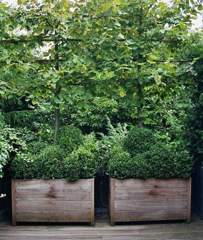
A more sophisticated version uses a matched pair of containers filled with contrasting plants. A classic example places a trained or espaliered fruit tree beside a clipped evergreen shrub. The tree introduces height, line, and seasonal change, while the evergreen provides density, permanence, and a disciplined shape.
The containers match, so the composition feels connected. The plants disagree just enough to make it interesting.
This pairing can also create an illusion of greater space. The eye notices the difference in form and reads the arrangement as a miniature landscape rather than two pots sitting beside a wall. It is a clever strategy for courtyards, narrow side yards, and compact urban gardens where adding depth is easier than adding acreage.
Why Contrasting Planters Look So Good
Successful contrast is not random. It usually depends on one element remaining consistent while another changes.
For example, two planters may share the same size and shape but use different finishes. They may share one color while presenting different textures. They may contain the same plant species pruned into two forms. This repeated element keeps the arrangement from looking like the garden center accidentally delivered half of two unrelated orders.
Contrast Creates a Focal Point
Human vision naturally notices differences. A light band against a dark base, polished metal beside weathered wood, or a spiky plant beside a rounded shrub immediately attracts attention.
In a large landscape, that contrast can identify an entrance or seating area. In a small space, it can become the central design statement, reducing the need for extra ornaments, signs, lanterns, and other objects that may turn a calm patio into an outdoor yard sale.
Repetition Restores Order
Contrast provides energy, but repetition supplies discipline. Matching planter dimensions, repeated leaf colors, or a shared finish prevents visual chaos.
Suppose one square planter contains a narrow espaliered apple tree and another contains a compact boxwood. The plant forms are very different, but the repeated square containers tie them together. If both pots also share the same wood grain or painted base, the arrangement feels intentional rather than improvised.
Texture Adds Depth Without Adding Clutter
A limited color palette can still feel rich when the materials differ. Smooth ceramic, coarse concrete, weathered timber, powder-coated steel, and woven fibers reflect light in different ways. Pairing two textures creates depth even when both sections are beige, gray, black, or another neutral color.
This is useful in minimalist, Scandinavian, industrial, and Japandi-inspired spaces, where the goal is often to add character without introducing a parade of competing colors.
How to Design a Planter With a Split Personality
Start With the Surrounding Architecture
Before choosing a planter, study the surfaces already present. Look at the siding, trim, paving, doors, outdoor furniture, and nearby walls.
A successful split design often connects two existing elements. A planter might repeat the charcoal color of a front door on its base while echoing a cedar fence above. Indoors, a cream-and-walnut planter may bridge pale walls and dark wood furniture.
The planter does not need to match everything perfectly. In fact, exact matching can feel overly cautious. The goal is coordination, not witness protection for your flowerpot.
Choose One Dominant Side
A fifty-fifty split can work, but an uneven ratio often feels more natural. Consider making approximately two-thirds of the planter quiet and one-third bold. A narrow painted rim, dark lower band, or exposed strip of wood can provide enough contrast without overpowering the plant.
If the plant itself is dramaticsuch as a red-leaf canna, sculptural agave, or variegated rubber plantkeep the container’s contrast relatively restrained. When the plant is simple, the pot can take a larger role.
Use the Color Wheel Without Becoming Its Employee
Complementary colors sit opposite each other on the color wheel and produce strong contrast. Blue and orange, violet and yellow, or red and green can create energetic combinations. These pairings are most effective when one color is muted or used in a smaller amount.
Analogous colors sit near one another, such as blue and violet or yellow and orange. They create a softer split personality, offering variation without a dramatic argument.
Neutral combinations are equally effective. Black with natural wood feels modern and warm. Cream with terracotta looks relaxed and Mediterranean. Charcoal with pale concrete suits contemporary architecture. Olive green with aged copper creates an earthy, established appearance.
Plant Pairings That Strengthen the Concept
The container provides only half of the story. The plants determine whether the finished composition looks balanced, lively, formal, or gloriously eccentric.
Formal and Free-Flowing
Pair a clipped evergreen with something looser and more seasonal. Boxwood is the traditional choice, although compact hollies, dwarf conifers, euonymus, and other locally suitable evergreen shrubs may provide alternatives.
Next to that solid form, use an ornamental grass, flowering perennial, trailing vine, or trained small tree. The structured plant acts like punctuation; the expressive plant supplies the sentence.
Vertical and Rounded
A narrow snake plant, upright grass, small columnar conifer, or trained vine can be paired with a rounded fern, mounded annual, or globe-shaped shrub. Repeating a foliage color between them creates unity.
For example, a tall blue-green grass can sit beside a rounded planter of silver-leaved plants. Their silhouettes differ, but their cool foliage tones keep the arrangement harmonious.
Evergreen and Seasonal
One container can remain constant while its partner changes through the year. Keep a dwarf evergreen in the first pot, then rotate tulips, summer annuals, fall grasses, and winter branches through the second.
This reduces seasonal replanting while preserving a fresh appearance. It also prevents the front entry from looking abandoned after the summer flowers clock out for the year.
Thriller, Filler, and SpillerWith a Twist
The familiar container-garden formula combines a tall “thriller,” a rounded “filler,” and a trailing “spiller.” A split-personality design can distribute these roles across two pots instead of forcing all three into one container.
One tall planter might hold the thriller, such as ornamental grass or canna. A lower neighboring pot can carry the fillers and spillers. The result feels more architectural and often gives each plant additional root room.
Choosing the Right Planter Materials
Appearance matters, but plant health must come first. The most stylish planter in the neighborhood loses some credibility when its contents resemble boiled spinach.
Wood
Wooden planters bring warmth and work especially well with painted geometric sections. Cedar, redwood, and other naturally durable woods are commonly chosen for outdoor containers. Untreated interior surfaces may deteriorate over time, so appropriate liners, exterior finishes, and construction details can extend the planter’s life.
Wood is also relatively easy to customize. A basic square planter can be stained on top and painted below, fitted with contrasting trim, or updated whenever the patio furniture changes.
Terracotta and Ceramic
Unglazed terracotta is porous, allowing moisture to evaporate through the planter walls. This can benefit plants that dislike persistently wet soil, but it also means more frequent watering during hot weather.
Glazed ceramic retains moisture longer and offers nearly unlimited color possibilities. Both materials can be heavy and may crack during freeze-and-thaw cycles unless specifically rated for outdoor winter conditions.
Metal
Metal creates clean edges and a modern or industrial appearance. Galvanized steel, aluminum, and powder-coated finishes can all contribute to a split-material design.
However, metal can become hot in direct sunlight. A liner or inner nursery pot may help protect roots, and drainage remains essential. Rust-prone surfaces should be sealed or selected with the expectation that weathering will become part of the design.
Concrete, Fiberglass, and Composite Materials
Concrete feels substantial and works beautifully with softer plants, but large concrete planters can become extremely difficult to move. Fiberglass and composite containers can imitate stone or concrete while weighing considerably less.
These lighter materials are practical for balconies, rooftops, rental homes, and spaces where containers must be moved seasonally. Look for products intended for outdoor exposure, particularly when sun, freezing temperatures, or strong winds are concerns.
Drainage: The Part Nobody Photographs
Every planted container needs a reliable way for excess water to escape. Without drainage, water can fill the air spaces in the growing medium, depriving roots of oxygen and increasing the risk of decay.
If a decorative planter has no drainage hole, place the plant in a slightly smaller nursery pot with drainage and use the decorative container as a cachepot. Remove the inner pot for watering, let it drain completely, and empty any water that collects in the outer container.
A layer of gravel beneath the soil does not replace drainage holes. Water can remain trapped in the soil above the gravel, leaving roots wetter rather than safer. Use a lightweight container potting mix instead of dense garden soil, and keep drainage openings unobstructed.
Indoor containers also need saucers or another method of protecting floors and furniture. Outdoors, planter feet can lift containers above wood decking, improving airflow and reducing prolonged contact with moisture.
Where Split-Personality Planters Work Best
Front Entrances
A pair of contrasting but coordinated planters can frame a doorway without relying on perfect symmetry. Use matching containers and different plants, or repeat the same planting while reversing the colors on each pot.
For example, place a black-over-wood planter on one side and a wood-over-black planter on the other. The effect is balanced, but not predictable.
Small Patios and Balconies
Use a tall, narrow planter to introduce height without occupying much floor space. Pair it with a lower container that carries trailing plants over the edge. This creates several visual layers while preserving room for chairs, drinks, and the person who inevitably insists on standing in the doorway.
Long, Blank Walls
Espaliered trees are particularly useful against walls because their branches are trained into a relatively flat plane. Pairing one with a dense shrub or seasonal planter creates a compact composition with the presence of a much larger garden bed.
Before training a fruit tree, verify that the species and cultivar suit the local climate, available sunlight, container size, and long-term maintenance plan.
Indoor Plant Displays
Indoors, two-tone planters can connect different furniture finishes. A black-and-walnut pot can sit between a black metal shelf and a wood cabinet. A cream-and-terracotta container can warm up a white room without overwhelming it.
Simple plants with bold silhouettessnake plants, ZZ plants, rubber plants, palms, and upright cactiallow the divided finish to remain visible.
A Simple DIY Two-Tone Planter Project
You do not need to replace a perfectly functional planter to achieve the look. A basic wooden, fiberglass, or paintable plastic container can be transformed with careful surface preparation.
- Clean the planter. Remove soil, dust, algae, and loose finish. Let the surface dry thoroughly.
- Repair damage. Sand rough wood, fill deep cracks when appropriate, and confirm that the drainage holes remain open.
- Choose the dividing line. Mark a horizontal, vertical, or diagonal boundary with painter’s tape.
- Prepare the surface. Use a primer recommended for the planter material and intended exposure.
- Apply the finish. Use exterior-rated paint for outdoor planters. Several thin coats usually produce a cleaner result than one heroic, dripping coat.
- Remove the tape carefully. Pull it away before the final coat becomes rock hard to help maintain a crisp line.
- Allow full curing time. Replant only after the finish has cured according to the manufacturer’s instructions.
A removable inner pot can protect the decorative shell, simplify seasonal changes, and make plant maintenance easier.
Common Design Mistakes to Avoid
Introducing Too Many Contrasts
A planter does not need two colors, three textures, four plant species, gold trim, rope handles, and a motivational quote. Choose one major contrast and let supporting details remain quiet.
Ignoring Mature Plant Size
A charming nursery plant may become a large shrub or top-heavy tree. Select a container that can accommodate the mature root system, and consider whether wind could tip the arrangement.
Pairing Plants With Conflicting Needs
Plants sharing one container should have compatible requirements for sunlight, moisture, and soil. A moisture-loving fern and a drought-tolerant succulent may look attractive together briefly, but their relationship has the long-term potential of a reality television marriage.
Choosing Style Over Drainage
Never assume a beautiful decorative pot is ready for direct planting. Check for drainage before adding soil. Correcting the problem is much easier while the planter is empty and still weighs less than a compact automobile.
Conclusion
Planters with a split personality prove that contrast does not have to create disorder. When color, material, shape, and planting style are balanced by repetition, a divided design can feel more unified than a completely matching arrangement.
Start with one controlled contrast. Pair raw wood with painted color, an upright plant with a rounded shrub, or an evergreen anchor with a changing seasonal display. Repeat one element to hold the composition together, then give the opposing element enough freedom to create surprise.
Most importantly, remember that a planter is both decoration and habitat. Proper scale, drainage, potting mix, weather resistance, and plant compatibility matter as much as the finish. A container should have a split personalitynot divided loyalties between looking good and keeping its plant alive.
Experience Notes: What the Design Is Like to Live With
The following experience is a composite scenario based on common container-gardening projects rather than a claim of personal ownership or firsthand testing.
Imagine beginning with two plain square wooden planters beside a narrow patio wall. They are functional but visually heavy, and placing identical shrubs in both would make the space feel formal in a way that is slightly too eagerlike the patio has put on a necktie for lunch.
The first improvement is surprisingly simple: paint the lower third of both planters charcoal while leaving the upper wood exposed. The dark base visually connects them to the nearby window frames, while the natural wood keeps the arrangement from looking severe. Even before planting, the horizontal division makes the containers appear lower and wider.
The next decision is to give the pair different jobs. One planter receives a compact evergreen with a rounded form. The other holds a young fruit tree trained against a freestanding espalier frame. Immediately, the arrangement feels larger than its actual footprint. The shrub reads as a dense foreground mass, while the tree’s visible branches create lines that pull the eye upward and outward.
During the first few weeks, the biggest practical lesson is about water. The exposed wood and sunny location allow the growing mix to dry more quickly than expected. The espaliered tree uses more water on warm, breezy days, while the evergreen remains comfortable for slightly longer. Matching planters do not automatically create matching watering schedules.
Checking the growing medium rather than watering both pots mechanically becomes essential. A finger test near the surface helps, but lifting a smaller inner pot or using a wooden skewer provides a clearer sense of moisture deeper in the container. When water is added, it must flow freely from the drainage openings.
The second lesson involves scale. At planting time, the evergreen looks almost too small. After a season of growth, however, it begins to occupy the container naturally. Filling every empty inch on the first day would have produced crowding later. Patience, while not sold in bags at the garden center, turns out to be a useful planting material.
Seasonal change makes the contrast more interesting. In spring, blossoms on the trained tree soften the formal evergreen. In summer, leaves create a broad green pattern against the wall. In fall, changing foliage gives the tree a brief starring role. During winter, its bare branch structure remains graphic while the evergreen maintains visual weight.
Maintenance also becomes part of the design. The clipped shrub needs occasional shaping so it remains dense without becoming an unnaturally perfect green meatball. The espalier requires selective pruning and gentle tying to preserve its horizontal structure. Neither task is especially difficult, but neglect changes the intended contrast from “formal versus expressive” to “organized versus asking for help.”
After living with the arrangement, the most valuable feature is its flexibility. Seasonal flowers can be tucked around the tree, the planters can be repositioned, and the painted section can be refreshed without rebuilding everything. The design feels distinctive, yet it relies on simple ingredients: two related containers, two different plant forms, one repeated finish, and enough restraint to let the contrast speak for itself.
The broader lesson is that successful split-personality planters are not about making two halves compete. They are about allowing differences to reveal each other. The clipped plant looks more disciplined beside loose branches. The raw wood feels warmer above dark paint. The modern line appears sharper against living foliage. Each side makes the other easier to seeand that is where the personality comes from.