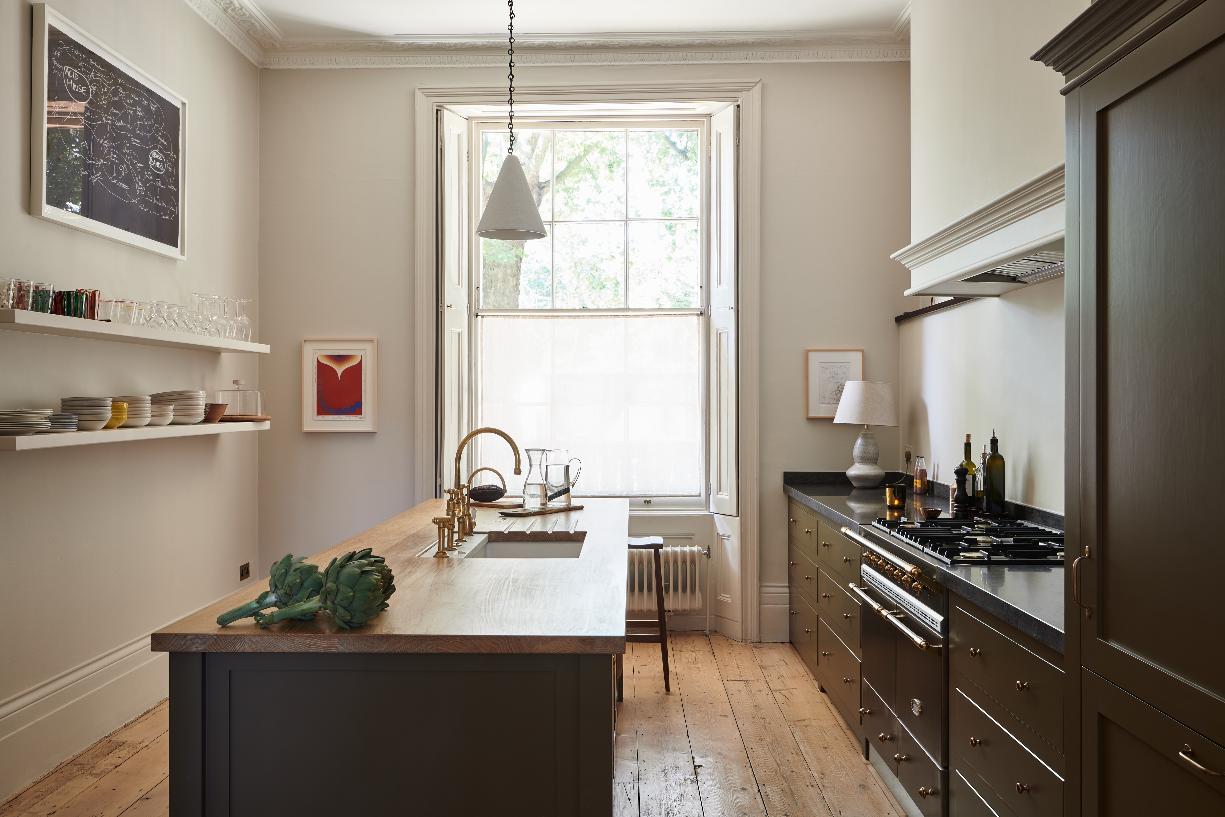
Chocolate brown does not usually receive top billing in a kitchen. It is more often assigned a supporting role: a walnut cutting board, an old leather stool, perhaps the handle of a wooden spoon that has survived several questionable dishwasher decisions. In this refined London kitchen, however, brown steps forward, straightens its jacket, and takes command.
Created by British kitchen company deVOL for a Georgian terrace near Regent’s Park, the room replaces predictable white cabinetry with a deep, custom-mixed chocolate shade. Pale walls, aged metal, expressive stone, and lightly finished oak keep the dark color from becoming heavy. The result is a warm brown kitchen that feels historical without becoming theatrical, modern without looking freshly unpacked, and luxurious without shouting about the invoice.
Why Chocolate Brown Feels So Unexpected
For years, mainstream kitchen design moved between crisp white, cool gray, navy blue, and various interpretations of sage green. Brown cabinetry was frequently associated with glossy espresso finishes, orange-toned wood, and builder-grade kitchens from the early 2000s. That reputation was not entirely fair to the color; it was mostly a problem of finish, proportion, and unfortunate granite partnerships.
This London kitchen demonstrates how different brown can feel when it is treated as a complex architectural color. The cabinetry is neither reddish cherry nor nearly black. Its muted chocolate tone has enough warmth to feel welcoming and enough depth to give the millwork visual authority.
Design publications have increasingly highlighted rich woods, warm neutrals, red-browns, and earthy cabinetry as alternatives to flat gray and all-white interiors. Brown works especially well when paired with natural stone, creamy paint, aged brass, and visible wood grain rather than other uniformly dark surfaces.
Inside the Regent’s Park Kitchen
A Georgian Setting With Room to Breathe
The kitchen occupies a Georgian terrace near London’s Regent’s Park. Generous proportions, tall windows, and surviving period features gave the designers a strong architectural foundation. Instead of competing with those qualities, the renovation was pared back so the original structure could remain legible.
That restraint is essential. Dark cabinetry can make a room feel crowded when every wall is filled with cupboards, decorative trim, and competing finishes. Here, the generous windows introduce daylight, pale walls create breathing space, and selected areas of open shelving prevent the cabinetry from becoming a continuous brown barricade.
The millwork comes from deVOL’s Classic English Kitchen collection. Traditional framed doors and carefully considered proportions connect the new cabinetry to the age of the house, while the custom color prevents the design from becoming a predictable period reproduction.
Cabinetry That Resembles Furniture
One of the kitchen’s smartest ideas is its use of furniture-like cabinetry. The integrated refrigerator and freezer disappear behind paneled doors, but the tall unit is composed to look more like an independent cupboard than a giant appliance garage.
This approach softens the room. A conventional stainless steel refrigerator would introduce a large reflective rectangle into an otherwise quiet composition. Concealing it allows the eye to focus on the proportions of the millwork, the natural materials, and the central worktable.
Furniture-style details also make a fitted kitchen feel as though it has evolved over time. Slight variations in cabinet height, visible feet, restrained moldings, and traditional hardware can produce a layered atmosphere without sacrificing modern storage. It is a useful reminder that “built-in” does not have to mean “visually welded to the wall.”
A Worktable Instead of a Conventional Island
At the center of the room is an island with a limed, wide-board oak worktop. Its pale, softly textured surface provides an important counterpoint to the chocolate cabinetry. Rather than repeating the dark stone used elsewhere, the oak makes the island feel like a substantial farmhouse worktable.
The difference is more than cosmetic. A furniture-like island creates a relaxed center for food preparation, conversation, and casual meals. It also introduces visible grain, which gives the eye a break from painted surfaces.
The light oak top prevents the room from looking overly coordinated. Perfectly matching every surface might have made the kitchen feel like a showroom display. The limed wood adds the small amount of visual disagreement that a memorable interior often needs.
Stone With Different Personalities
The kitchen does not rely on one countertop material everywhere. Belgian blue limestone flanks the substantial Lacanche range, while a Carrara marble inset appears behind the sink and brass faucet. These stones share a cool mineral character, but they are not identical.
Belgian blue limestone has a darker, quieter appearance that sits comfortably beside chocolate cabinetry. Carrara marble introduces a paler note and subtle movement around the sink, where reflected light helps keep the work area visually open. The combination creates depth without resorting to a busy multicolored backsplash.
Mixing stone successfully requires discipline. The materials should have a relationship in tone, age gracefully, and serve a clear purpose. In this kitchen, the darker stone anchors the cooking zone while the marble brightens the washing area. The materials are different, but they are not having an argument across the room.
How Brass, Plaster, and Sapele Warm the Palette
Polished Metal Without Excessive Sparkle
Brown and brass are natural companions, but the combination can quickly drift into themed restaurant territory. The London kitchen avoids that problem by using metal in small, functional doses.
Bronze knobs and pull handles punctuate the dark doors. A traditional brass faucet adds warmth at the sink. Because these pieces are modestly scaled, they read as useful objects rather than jewelry applied to every available surface.
The metal also provides contrast. Against chocolate paint, even a small knob becomes legible. That clarity makes the cabinetry easier to use while adding rhythm to the elevations. As the finish develops patina, the kitchen should become more relaxed rather than merely older.
Sculptural Plaster Lighting
Plaster cone lights by Rose Uniacke appear over the worktable and in the adjoining dining area. Their chalky surfaces echo the pale walls and offer a softer alternative to glass or polished metal pendants.
The simple forms are large enough to have presence but quiet enough not to compete with the range or cabinetry. They also reinforce the room’s balance of old and new: the material feels traditional and handmade, while the silhouette is clean and contemporary.
One Open Shelf, Carefully Considered
A stained sapele shelf introduces another shade of brown above the counter. Because the wood is visibly different from the painted cabinetry, it adds texture instead of disappearing into the background.
Open shelving is most effective when used selectively. A single shelf can display everyday glassware, ceramics, or a few useful objects while interrupting a wall of closed storage. Covering the entire kitchen in shelves, on the other hand, can turn breakfast into a daily exhibition titled Everything We Own, Featuring Dust.
The balance between concealed appliances, closed lower cabinets, and limited open display gives this kitchen both practicality and personality. Comparable design guidance also emphasizes natural fibers, stone, wood, ceramics, and restrained open shelving as effective partners for earthy cabinetry.
Why the Color Scheme Works
Brown Is Used as a Grounding Neutral
The cabinetry may be dramatic, but the room does not treat brown as an accent color. It functions as the main neutral, much as charcoal, navy, or dark green might in another kitchen.
That distinction matters. When brown is approached as a neutral, it becomes easier to combine with marble, oak, limestone, plaster, and aged metal. The palette feels collected from natural materials rather than assembled from paint chips.
Pale Walls Preserve Natural Light
Farrow & Ball’s Skimming Stone covers the walls. It is a warm, pale neutral rather than a sharp white, so it creates contrast without making the cabinets appear harsher or darker than they are.
Warm off-whites are especially useful with chocolate cabinetry because they share similar undertones. A cold blue-white could make the brown look muddy by comparison. A cream that is too yellow might create an overly sepia effect. The selected wall color occupies the comfortable middle ground.
Matte and Textured Finishes Control the Mood
The kitchen’s surfaces respond to light in different ways. Painted wood absorbs it, brass reflects it, marble softens it, limestone deepens it, and limed oak reveals its grain. This variation stops the restricted palette from becoming flat.
A dark kitchen needs these changes in texture. When the cabinets, counters, backsplash, floor, and appliances are all glossy, the room can feel commercial. When everything is matte and dark, it may feel lifeless. Combining reflective and absorbent finishes creates movement throughout the day.
How to Recreate the Look at Home
1. Test Brown Paint in Changing Light
Brown can shift dramatically according to daylight and surrounding materials. A sample that looks like rich cocoa in the morning may appear plum, gray, or nearly black after sunset. Paint large sample boards and examine them beside the intended countertop, floor, and hardware.
For a similar effect, look for deep browns with muted red, gray, or purple undertones. Avoid extremely orange shades unless the rest of the palette has been planned around them.
2. Balance Dark Cabinets With Light Above
Using the richest color below the countertop is a practical option for smaller or darker kitchens. Deep base cabinets visually ground the room, while pale upper walls or limited open shelving preserve a sense of height. Designers frequently use this distribution to gain warmth without overwhelming the room.
3. Introduce at Least One Natural Wood Finish
A pale oak island, walnut stools, or a solid wood shelf can prevent painted brown cabinetry from feeling artificial. The wood does not need to match the paint. In fact, a slightly lighter or warmer tone usually adds more dimension.
4. Choose Hardware With Character
Aged brass, unlacquered brass, bronze, or darkened metal can complement chocolate cabinets beautifully. Use simple knobs, traditional latches, or compact pulls rather than oversized bars on every door. Hardware should support the millwork, not resemble a collection of tiny towel rails.
5. Keep Countertops Visually Calm
Dark cabinets already provide strong visual weight. Countertops with subtle veining, soft movement, or a quiet honed finish allow the cabinetry to remain the focus. Pale marble creates contrast, while dark limestone offers a more enveloping look.
6. Conceal Large Appliances Where Practical
Panel-ready refrigeration and integrated dishwashers help traditional cabinetry read as furniture. When full integration is outside the budget, choosing appliances with simple fronts and minimizing competing finishes can create a similar sense of calm.
7. Leave Some Space Empty
Not every wall needs an upper cabinet. A painting, wall light, narrow shelf, or stretch of undecorated plaster can make the entire kitchen feel more generous. Restraint is not wasted space; it is what allows the expensive parts to look expensive.
Mistakes to Avoid With a Chocolate-Brown Kitchen
- Combining too many heavy finishes: Dark cabinets, black counters, dark floors, and a low ceiling can make even a large kitchen feel compressed.
- Ignoring undertones: Red-brown cabinets may clash with pinkish stone, yellow flooring, or cool gray walls unless the relationship is tested in advance.
- Using bright white everywhere: Severe white can exaggerate the darkness of the cabinetry. Warm plaster tones usually create a gentler transition.
- Installing insufficient lighting: Dark doors absorb more light than pale ones. Layer ambient, task, and decorative lighting instead of relying on one heroic ceiling fixture.
- Choosing a plastic-looking finish: High-gloss brown can recall dated espresso cabinetry. Satin, eggshell, hand-painted, or visible-grain finishes feel richer and more forgiving.
- Overdecorating the theme: Brown does not require beige tiles, copper pans, brown stools, brown curtains, and a chocolate-colored kettle. Even cocoa has limits.
Is a Brown Kitchen Timeless or Trendy?
Brown is currently enjoying renewed attention, but its durability as a design choice comes from something deeper than trend forecasting. It is already present in wood, leather, clay, stone, and aged metal. That connection to familiar materials gives it a visual stability that many brighter fashion colors lack.
The safest approach is to avoid copying a trend too literally. Select a brown that suits the home’s natural light and architecture. Pair it with durable materials rather than novelty finishes. Use cabinet proportions that belong in the building. When those decisions are correct, the kitchen can remain convincing even after social media moves on to chartreuse pantry doors or whatever surprise awaits next.
The Regent’s Park project has endured as a reference point because it does not depend on a single dramatic trick. Its appeal comes from the relationship among color, proportion, craftsmanship, lighting, and material variation. Those principles remain useful regardless of which paint shade happens to be collecting likes this month.
Experience Notes: What Living With a Chocolate-Brown Kitchen May Teach You
A kitchen can photograph beautifully and still behave like an uncooperative roommate. The real test begins when grocery bags arrive, pasta water boils, and someone places a wet spoon directly on the one surface you recently polished. From a day-to-day perspective, a brown kitchen offers several practical advantages, along with a few lessons worth learning before the paint order becomes nonrefundable.
The Room Changes Throughout the Day
One of the most rewarding experiences is watching a deep brown respond to changing light. In bright morning sun, gray or red undertones may become visible. On an overcast afternoon, the same cabinetry can look softer and more neutral. Under warm evening light, it becomes richer and more intimate.
This variation gives the room personality, but it also makes lighting choices important. Bulbs that are excessively cool can drain the warmth from the paint. Very yellow bulbs can turn chocolate into something closer to burnt caramel. Warm-white lighting with good color rendering generally allows stone, food, wood, and painted cabinetry to look natural.
Dark Paint Is Forgivingbut Not Invisible
Chocolate cabinets can disguise minor scuffs and everyday wear more gracefully than brilliant white doors. They also make small gaps between doors less noticeable. However, dark surfaces may reveal flour, dust, water spots, and fingerprints, particularly when the finish has a sheen.
A durable satin or low-luster finish usually offers a useful compromise. It can be wiped clean without reflecting every handprint like evidence at a crime scene. Keeping a soft cloth nearby becomes a simple habit, especially around handles and the sink.
Natural Materials Become More Noticeable
Against a dark background, the grain of an oak worktop, the veining of marble, and the changing patina of brass become more apparent. This encourages a slower, more tactile experience of the room. Instead of reading as one large fitted installation, the kitchen feels like a collection of distinct materials.
Those materials also require realistic expectations. Marble can etch, limestone can mark, brass can darken, and wood can acquire scratches. In a highly polished contemporary kitchen, such changes may feel like damage. In a warm brown room inspired by traditional craftsmanship, they often become part of the atmosphere.
Organization Matters More With Open Display
A limited shelf can make frequently used glasses and bowls easier to reach while creating a welcome decorative break. It works best when the displayed items share some visual relationship, whether through material, color, or scale.
The experience becomes less charming when the shelf turns into emergency storage for appliance manuals, vitamin bottles, and the mug nobody admits to buying. Rotating objects and leaving small gaps between groups helps the display remain useful rather than restless.
Brown Creates a Comfortable Social Space
Deep color gives a kitchen a sense of enclosure even when the room is large. Combined with warm lighting and natural materials, it can make an island or worktable feel like a gathering place rather than a laboratory bench.
That atmosphere is especially effective in kitchens connected to dining rooms. Repeating brown through wooden furniture, leather, woven shades, or artwork allows the cooking and eating areas to feel related without matching exactly. Guests may not identify the reason, but the transition feels calmer.
The Best Results Come From Restraint
The biggest experiential lesson is that dark color needs quiet company. When every object is decorative, the room loses the composure that made the palette attractive. Clear work surfaces, integrated appliances, carefully placed lighting, and a few useful objects allow chocolate cabinetry to remain the visual anchor.
Living with the scheme should not require turning the kitchen into a museum. A bowl of lemons, a stack of cookbooks, or a brightly colored mixer can provide welcome contrast. The goal is not perfection; it is a room sturdy enough for ordinary life and handsome enough to make washing dishes feel marginally more cinematic.
Conclusion: A Dark Kitchen With a Light Touch
This London kitchen succeeds because it uses chocolate brown with confidence and discipline. The color gives traditional cabinetry depth, but pale walls, tall windows, limed oak, expressive stone, plaster lighting, and measured flashes of brass prevent the room from feeling heavy.
Its most transferable lesson is not that every kitchen should be painted brown. It is that an unconventional color becomes convincing when architecture, materials, and daily function support it. Choose the right undertone, preserve areas of visual breathing room, vary the textures, and let useful objects provide the decoration.
Done well, a chocolate-brown kitchen can be warm, sophisticated, practical, and surprisingly timeless. It may even persuade lifelong white-kitchen loyalists to sample the darker sideno cocoa powder required.