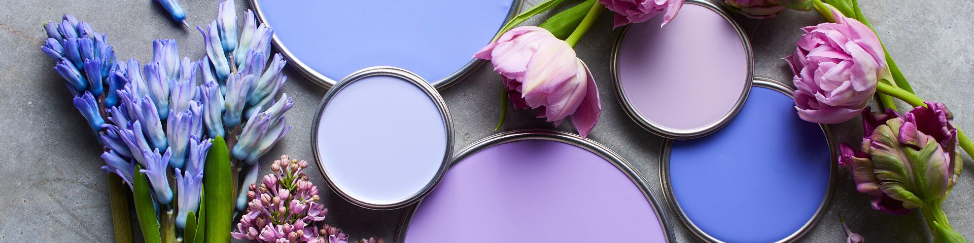
Decorating with color sounds easy until you stand in front of 374 paint chips with names like “Quiet Otter,” “Foggy Oat Milk,” and “Emotional Support Beige.” Suddenly, choosing a living room color feels less like home design and more like a tiny legal hearing in your brain. But color does not have to be scary. In fact, color is one of the fastest, most affordable, anthem, how furniture affects them, and how much of each color a room can handle before it starts looking like a birthday party hosted by a highlighter. When used well, color can make a small room feel cozy, a plain room feel layered, and a tired room feel like it finally got eight hours of sleep.
This guide to decorating with color breaks down practical color rules, room-by-room examples, common mistakes, and real-life experience from working with palettes in homes that are not showroom-perfect. Because let’s be honest: most of us are decorating around existing sofas, mystery wood tones, hand-me-down lamps, and at least one chair that has “sentimental value” but looks like it lost a fight with the 1990s.
Why Color Matters in Interior Decorating
Color is more than decoration. It influences mood, visual balance, perceived size, and the overall personality of a space. Soft blues and greens can make a bedroom feel calm. Warm terracotta or golden beige can make a dining room feel more welcoming. Deep navy, charcoal, or forest green can add drama without requiring you to wear a velvet cape, although nobody is stopping you.
In interior design, color works like background music. You may not always notice it first, but it changes the entire experience. A white room with black accents feels crisp and graphic. The same room with sage green, cream, and warm wood feels relaxed and organic. Swap those for coral, teal, and brass, and suddenly the room is ready to host cocktails and tell everyone it “studied abroad.”
Start with What You Already Own
One of the smartest ways to build a color scheme is to begin with fixed or favorite elements already in the room. Look at your sofa, area rug, artwork, tile, flooring, curtains, cabinets, or wallpaper. These pieces often contain the colors your room is already asking for. Paint is flexible; your expensive sofa is not. Unless you enjoy financial drama, do not choose paint first and then discover it makes your furniture look tired, greenish, or mildly offended.
For example, if you have a patterned rug with cream, rust, navy, and olive, you already have a palette. Use cream as the wall color, navy for accent pillows, rust in a throw blanket, and olive in plants or artwork. The room will feel intentional because the colors repeat naturally. Repetition is the little design trick that whispers, “Yes, I planned this,” even if you absolutely did not.
Use the 60-30-10 Rule Without Becoming a Robot
The 60-30-10 rule is a classic decorating guideline because it helps prevent color chaos. The idea is simple: use one dominant color for about 60 percent of the room, a secondary color for 30 percent, and an accent color for 10 percent. In a living room, that might mean warm white walls and a neutral rug as the 60 percent, blue upholstery and curtains as the 30 percent, and mustard yellow pillows or art as the 10 percent.
This rule is not a law. Nobody from the Color Police will kick down your door if your accent color reaches 14 percent. But it gives beginners a useful framework. It also helps bold colors feel controlled instead of accidental. A red vase looks stylish when red appears again in a piece of art or a patterned pillow. One lonely red object in a beige room looks like it wandered in from another house.
Example: A Balanced Living Room Palette
Imagine a living room with soft greige walls, a cream sofa, walnut furniture, dusty blue curtains, and burnt orange accents. The greige and cream create the base. The dusty blue adds personality. The burnt orange brings warmth and energy. Nothing fights for attention, but the room still has life. It is calm without being boring, colorful without requiring sunglasses.
Understand Warm Colors and Cool Colors
Warm colors include reds, oranges, yellows, terracotta, camel, coral, and many warm browns. These shades tend to feel cozy, energetic, and social. They are wonderful in dining rooms, family rooms, entryways, and spaces where you want people to gather. Cool colors include blues, greens, purples, cool grays, and blue-based whites. These usually feel calmer, fresher, and more spacious.
However, color temperature is not always obvious. A blue can feel warm if it has a rich jewel-tone quality. A white can feel cold if it has blue undertones. A gray can feel cozy if it leans taupe or mushroom. This is why undertones matter. They are the tiny hidden ingredients that determine whether your wall color looks elegant or like unseasoned oatmeal.
Pay Attention to Undertones
Undertones are the subtle colors hiding inside a color. Beige may have pink, yellow, green, or gray undertones. White may lean warm, cool, creamy, or crisp. Gray may contain blue, green, purple, brown, or beige. When undertones clash, a room can feel “off” even if every individual item looks beautiful on its own.
Here is a simple example: if your kitchen cabinets have a red oak tone, a cool blue-gray wall may exaggerate the orange in the wood. A warmer neutral or muted green may feel more harmonious. If your sofa is a cool charcoal, pairing it with creamy yellow walls may make both colors look strange. A cooler white, soft blue, or balanced greige may work better.
Quick Undertone Test
Hold your paint sample next to white printer paper, your flooring, your sofa fabric, and your trim. Look at it in the morning, afternoon, and evening. If the color suddenly turns pink, green, or purple in certain lighting, congratulations: you have met its undertone. It was there the whole time, lurking like a plot twist.
Test Paint Before Committing
Never judge a paint color only from a tiny chip under store lighting. Paint a sample on the wall or use a large peel-and-stick sample. Check it in natural light, artificial light, and shadow. North-facing rooms often make colors look cooler. South-facing rooms can make colors appear warmer and brighter. Light bulbs also matter. Warm bulbs can turn whites creamy; cool bulbs can make beige look gray or green.
Testing paint may feel like an extra step, but it is cheaper than repainting an entire room while muttering things that would disappoint your grandmother. Try samples near trim, flooring, furniture, and windows. A color does not live alone. It has roommates.
Create Flow from Room to Room
A home does not need to use the same color everywhere, but rooms should have a visual relationship. This is especially important in open floor plans, hallways, and small homes where you can see several spaces at once. One easy method is to choose colors from the same family or from the same paint strip. Another is to repeat a few accent colors throughout the home.
For example, a home might use warm white walls in the main living areas, sage green in the dining room, deep olive in the office, and soft cream in the bedrooms. These colors are different, but they share an earthy, calm feeling. The result is variety with rhythm, not a decorating identity crisis.
Decorating with Neutrals Without Making a Room Flat
Neutral color schemes are popular because they are flexible, timeless, and easy to live with. But neutral does not have to mean bland. A successful neutral room relies on contrast, texture, shape, and undertone. Mix linen, wood, leather, stone, woven baskets, ceramic lamps, and soft textiles. Layer ivory, taupe, tan, mushroom, charcoal, and warm white instead of using one flat beige across everything.
The best neutral rooms have depth. Think creamy walls, a camel leather chair, a black metal floor lamp, a textured wool rug, oak furniture, and white linen curtains. The palette is quiet, but the materials keep it interesting. Without texture, a neutral room can look like it is waiting for a personality delivery.
How to Use Bold Color Without Regret
Bold color works best when it has a job. A bold front door creates energy before guests even step inside. A deep blue powder room feels memorable. A red-orange chair can wake up a neutral living room. A chartreuse lamp can make a traditional space feel modern. The trick is intention.
If you are nervous, start small. Try colorful pillows, lampshades, art, stools, vases, or a painted side table. If you love the color after living with it for a few weeks, go bigger. Paint a bookcase, an interior door, a bathroom vanity, or the back of built-ins. Color confidence grows through experiments, not through staring at paint chips until your soul leaves your body.
Repeat Bold Colors Three Times
A strong accent color usually looks better when repeated at least three times. If you use emerald green in a pillow, repeat it in artwork and a plant pot. If you use coral in a lampshade, bring it back in a patterned rug and a small decorative object. Repetition makes bold color feel like a design decision instead of a decorative accident.
Monochromatic Color Schemes
A monochromatic room uses variations of one color. This can be elegant, dramatic, and surprisingly easy to manage. Instead of mixing many different hues, you play with lightness, darkness, texture, and finish. A blue monochromatic bedroom might include pale blue walls, navy bedding, denim-toned pillows, a blue-gray rug, and white trim for relief.
The key is contrast. If every item is the exact same shade, the room may look flat. Use lighter and darker versions of the color. Add texture through fabric, wood, metal, glass, and natural materials. A green room can include sage walls, moss velvet chairs, olive pillows, leafy plants, and brass accents. It feels layered, not like someone spilled one paint can over the entire house.
Color Drenching: Big Impact, One Color
Color drenching means painting walls, trim, doors, and sometimes ceilings in the same color. It can make a room feel cohesive, cozy, and designer-level dramatic. This technique works beautifully in powder rooms, studies, dining rooms, bedrooms, and small spaces where you want atmosphere.
Deep green, aubergine, navy, clay, chocolate brown, and smoky blue are popular choices for color drenching. Lighter shades can work too, especially if you want a soft, enveloping look. The result often feels more unified than using white trim against a dark wall because the eye moves smoothly around the space. It is like wrapping the room in one confident idea.
Choosing Colors by Room
Living Room
The living room should reflect how you actually live. For a calm family room, try warm white, soft taupe, sage, muted blue, or mushroom. For a lively entertaining space, consider deeper colors like teal, olive, rust, or charcoal with warm metallic accents. Use pillows, throws, art, and rugs to adjust the palette seasonally.
Bedroom
Bedrooms usually benefit from restful colors. Soft greens, blues, warm whites, lavender-gray, clay pink, and muted earth tones can create a relaxing atmosphere. If you prefer dark bedrooms, try navy, deep green, plum, or warm charcoal. Dark walls can feel cozy and sleep-friendly when paired with soft bedding and warm lighting.
Kitchen
Kitchens need color that works with cabinets, counters, backsplash, flooring, and appliances. White, cream, greige, sage, navy, black, and warm wood tones are reliable choices. If painting cabinets, sample carefully because cabinet colors look different vertically than they do on a small swatch. Also, remember that glossy surfaces reflect light and can intensify color.
Bathroom
Bathrooms are excellent places to experiment. Powder rooms can handle jewel tones, wallpaper, color-drenched walls, or dramatic contrast. Full bathrooms often look fresh in soft blue, green, warm white, sandy beige, or charcoal. Pay attention to tile undertones; white tile can be warm or cool, and it will absolutely reveal your paint color’s secrets.
Home Office
For focus, consider blue-gray, olive, deep green, warm white, or muted terracotta. If your work requires creativity, add a strong accent color through art or accessories. If your office appears on video calls, choose a background color that flatters you and does not make your face look like you have been living inside a fluorescent bulb.
Common Color Mistakes to Avoid
The first mistake is choosing paint before choosing furniture, rugs, or fabrics. Paint is easier to change than a sofa. The second mistake is ignoring lighting. A color that looks perfect online may look completely different in your home. The third mistake is using too many unrelated colors. Even colorful rooms need structure.
Another common problem is forgetting contrast. A room with all medium-tone colors can feel muddy. Include light, medium, and dark values. For example, pair pale walls with a dark table, medium upholstery, and bright accents. Contrast gives the eye somewhere to land.
Finally, do not decorate only with trendy colors unless you truly love them. Trends are useful for inspiration, but your home should not feel like it is wearing someone else’s outfit. If you love burgundy, use burgundy. If you love butter yellow, use butter yellow. If your heart belongs to beige, make it the most beautiful beige room possible and ignore the people who call it boring. Beige has feelings too.
Personal Experiences: What Decorating with Color Teaches You Over Time
After working with color in real rooms, one lesson becomes clear: colors are never just colors. They are relationships. A paint shade changes when it meets flooring. A pillow changes when it sits on a sofa. A wall color changes when the sun moves behind a tree at 4 p.m. The most successful rooms are not built from perfect individual choices. They are built from choices that cooperate.
One of the most useful experiences is learning to decorate slowly. Many people want to finish a room in one weekend, but color often needs time. You may paint a wall and love it in the morning, then question your entire existence under evening lamps. You may buy blue pillows and realize they make your gray sofa look purple. You may discover that the “neutral” rug you ordered online is actually peach, and now the room has developed a personality you did not approve.
That is normal. Decorating with color involves adjustment. In one living room, a homeowner wanted a cozy green palette. The first paint sample looked beautiful on the card but turned minty against the warm oak floors. The second was too gray and made the room feel dull. The third, a muted olive-sage, finally worked because it respected the floor tone, the cream curtains, and the brown leather chair. The winning color was not the trendiest one. It was the one that got along with the room.
Another experience: small accents can change everything. A mostly neutral bedroom with white walls, beige bedding, and oak nightstands felt unfinished. Nothing was wrong, but nothing was memorable either. Adding two dusty blue lamps, a patterned lumbar pillow, and a small landscape print above the bed made the room feel complete. The color was minimal, but because it repeated, it looked intentional. That is the magic of color repetition: it gives a room a rhythm.
Bold color also teaches bravery. Many people are afraid that a dark wall will make a room feel smaller. Sometimes it does the opposite. A deep navy office, for example, can feel focused and elegant, especially with warm wood, brass lighting, and cream artwork. A tiny powder room painted dark plum can feel luxurious instead of cramped. Small spaces often handle drama beautifully because they are already compact. Instead of pretending they are giant, you can make them jewel boxes.
Another practical lesson is that color should support the way you live. A white sofa and pale rug may look stunning in photos, but if you have pets, kids, snacks, hobbies, or a normal human relationship with spaghetti sauce, you may want deeper colors, washable fabrics, or patterned textiles. Color is not only about beauty; it is about maintenance. A medium-toned rug hides life better than a pure white one. Patterned pillows forgive more than solid pale fabric. Warm wood furniture can soften bold wall colors and survive daily use.
Decorating with color also becomes easier when you stop chasing universal approval. Not everyone will love your teal dining room or your coral front door. That is fine. A home is not a public vote. The best color choices reflect the people living there. If a room makes you feel calm, energized, welcomed, or delighted, it is doing its job. Design rules help, but joy matters too.
The most reliable approach is to combine planning with play. Start with inspiration, test samples, use a balanced palette, repeat colors, and pay attention to undertones. Then leave room for surprise. Sometimes the unexpected color is the one that makes the room sing. Sometimes the weird little orange vase from a flea market becomes the accent that ties everything together. Color rewards curiosity, patience, and a willingness to laugh when your first choice looks terrible. After all, paint can be changed. Pillows can be returned. And every decorating mistake is just a future “before” photo.
Conclusion: Make Color Feel Personal, Not Perfect
Decorating with color is not about following every trend or memorizing every design rule. It is about creating a home that feels balanced, expressive, and livable. Start with what you own, test colors in real light, respect undertones, repeat accent colors, and use contrast to keep the room visually interesting. Whether your style is soft and neutral, bold and dramatic, warm and earthy, or bright and playful, color can help your home feel more like you.
The best rooms are not the ones with the fanciest paint names or the most expensive furniture. They are the rooms where color, texture, light, and personality work together. So pick up the paint sample. Try the colorful pillow. Hang the art. Your home does not need to look perfect. It just needs to feel alive.
Note: This article is written for web publication and provides practical, experience-based decorating guidance using widely accepted interior design principles, paint-selection practices, and real-world color strategy.