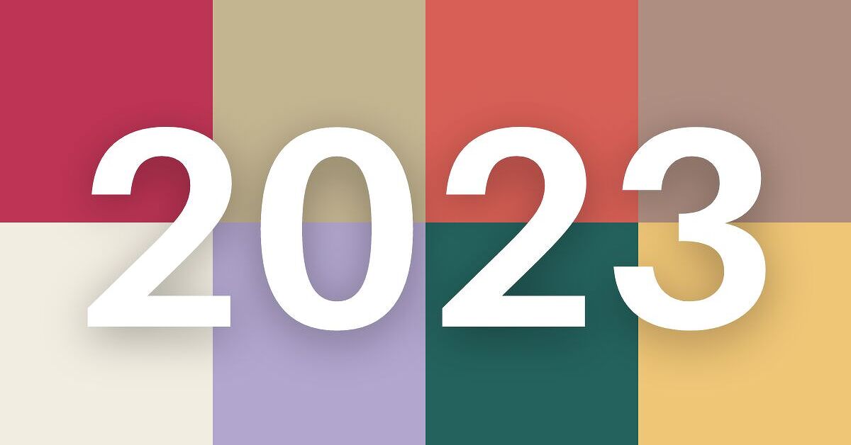
Color has officially stopped whispering politely from the corner of the room. In 2023, home decor color trends marched right through the front door wearing terra-cotta boots, a raspberry blazer, and just enough warm white to look effortlessly put together. After years of cool gray walls, sterile white kitchens, and interiors that looked like a very chic cloud forgot to pay rent, homeowners started craving color with warmth, personality, and emotional comfort.
The biggest home decor color trends for 2023 and beyond are not random paint-chip drama. They reflect a wider shift in how people want their homes to feel: grounded, personal, cozy, expressive, and flexible enough to survive changing trends. The best colors are no longer just “pretty.” They are mood-setters, conversation starters, and in some cases, minor household therapists.
Below are the top eight color trends shaping interiors, furniture, textiles, accent walls, cabinetry, and decor accessories. Whether you are repainting an entire living room or simply giving your throw pillows a promotion, these shades can help your home feel current without looking like it is trying too hard.
1. Warm Neutrals Replace Cold Gray
Warm neutrals are the quiet luxury of the color world. Think creamy white, soft beige, mushroom, greige, sand, oatmeal, stone, and barely-there blush. These shades are calm, practical, and much more flattering than the cool grays that dominated the last decade.
In 2023, paint brands and designers leaned heavily into warm neutral palettes because they make homes feel comfortable rather than clinical. Behr’s Blank Canvas, a warm white chosen as a 2023 Color of the Year, is a perfect example. It offers the brightness people still love from white interiors, but with a warmer undertone that feels welcoming instead of icy.
How to use warm neutrals
Use warm neutrals on walls, ceilings, trim, cabinetry, or large upholstered furniture. They work especially well in open-concept homes because they create visual flow without making every room look identical. Pair creamy walls with natural wood, linen curtains, woven baskets, brass fixtures, and black accents for contrast.
If your home currently has cool gray walls, you do not need to panic-paint at midnight. Start by adding warm elements: camel leather, ivory textiles, honey-toned wood, or beige area rugs. Your room will immediately feel less like a corporate waiting area and more like a place where humans happily eat snacks.
2. Earthy Pink, Clay, and Blush Beige
One of the strongest color stories of 2023 was the rise of earthy pinks and clay-inspired tones. These are not sugary nursery pinks. They are grown-up, dusty, sunbaked shades that sit somewhere between blush, beige, terra cotta, and rose-brown.
Sherwin-Williams named Redend Point its 2023 Color of the Year, describing a soft, earthy neutral with cozy warmth. Dunn-Edwards selected Terra Rosa, a brown-burgundy pink. These colors show how pink moved from “cute accent” to “sophisticated neutral with a passport stamp.”
Why this trend works beyond 2023
Earthy pinks are surprisingly versatile because they behave like neutrals while adding more emotion. They flatter wood tones, soften modern architecture, and bring warmth to rooms that feel too stark. In a bedroom, clay-blush walls can feel restful. In a dining room, they create intimacy. In a powder room, they say, “Yes, I have taste, and yes, I know what good soap smells like.”
Pair blush-beige walls with ivory, chocolate brown, olive green, muted navy, or aged brass. For a more modern look, combine clay pink with black-framed mirrors, sculptural lighting, and clean-lined furniture.
3. Terra Cotta and Desert-Inspired Orange
Terra cotta is the color equivalent of golden-hour lighting. It brings warmth, depth, and a relaxed Mediterranean or Southwestern feeling to a space. In 2023, orange-based earth tones appeared in paint forecasts, textiles, ceramics, rugs, and accent decor.
Unlike neon orange, which can make a room feel like a traffic cone got promoted to creative director, terra cotta is grounded. It has brown, red, and pink undertones, making it easier to live with. It works beautifully with natural materials like cane, rattan, jute, plaster, leather, stone, and unfinished wood.
Best rooms for terra cotta
Terra cotta is excellent for entryways, dining rooms, kitchens, patios, and bedrooms. It can be used as a full wall color if the room has good natural light, or as an accent through planters, tile, lamps, pillows, bedding, and artwork.
For a timeless palette, pair terra cotta with warm white, olive green, cream, walnut, and matte black. For something bolder, add cobalt blue or deep teal. This contrast feels fresh because blue and orange sit opposite each other on the color wheel, creating energy without visual chaos.
4. Blue-Green Jewel Tones
Blue-green shades became one of the most memorable color trends of 2023. PPG and Glidden chose Vining Ivy, a rich blue-green tone, as a Color of the Year. This type of color sits between teal, peacock, ivy, and deep ocean. It feels both calming and dramatic, which is a rare talent. Most colors can barely manage one personality before breakfast.
Blue-green works because it borrows the serenity of blue and the natural grounding of green. It can look traditional with wood and brass, modern with black and white, or moody with velvet, marble, and antique finishes.
How to decorate with blue-green
Use blue-green on kitchen cabinets, built-ins, bathroom vanities, accent walls, interior doors, or statement furniture. If painting walls feels too bold, try velvet pillows, ceramic lamps, framed art, or a patterned rug that includes teal or deep green-blue.
For a sophisticated look, pair blue-green with warm white trim, walnut wood, aged brass, and cream upholstery. For a more playful room, mix it with coral, mustard, or soft pink. In small spaces such as powder rooms, blue-green can create a jewel-box effect that feels intentional rather than cramped.
5. Saturated Blues Make Rooms Feel Confident
Blue has always been a favorite in home decor, but 2023 pushed it toward richer, more saturated versions. Ultramarine, cobalt, navy, denim, and inky blue all gained attention as homeowners became more comfortable using bold color.
Good Housekeeping’s 2023 design coverage highlighted saturated wall colors and bold blues, especially in bathrooms and expressive interiors. This makes sense: blue can be dramatic without feeling reckless. It has enough familiarity to be livable, but enough depth to make a room memorable.
Where saturated blue shines
Use bold blue in libraries, bathrooms, bedrooms, dining rooms, mudrooms, or on cabinetry. A deep navy kitchen island can anchor an otherwise neutral kitchen. Cobalt accessories can wake up a beige living room. A blue-painted ceiling can make a bedroom feel enveloping in the best possible way.
To keep saturated blue from feeling cold, pair it with warm materials: oak, brass, woven shades, cream upholstery, rust pillows, or tan leather. Blue also loves pattern, so do not be afraid to bring in striped rugs, floral drapery, or block-printed textiles.
6. Nature-Inspired Greens Become the New Neutral
Green continues to be one of the strongest home decor color trends because it connects interiors to nature. Sage, olive, moss, eucalyptus, forest green, and khaki green all feel comforting and organic. They also work in nearly every style, from farmhouse to modern, traditional to boho.
After several stressful years, many people wanted homes that felt restorative. Green answers that desire without shouting. It brings life to a room while still feeling grounded. In other words, green is basically the friend who brings salad to the party but also knows where the dessert table is.
How to use green at home
Sage green is a safe starting point for bedrooms, kitchens, bathrooms, and laundry rooms. Olive and moss shades work beautifully on cabinets, built-ins, and accent walls. Forest green adds drama in dining rooms, offices, and small spaces.
Green pairs naturally with cream, warm white, brown, tan, black, brass, and natural wood. For a lighter look, combine sage with ivory and pale oak. For a moodier space, use deep green with leather, dark wood, and antique gold.
7. Rich Browns and Chocolate Tones Return
Brown is back, and it would like an apology for being ignored. Rich browns, from caramel and cognac to espresso and chocolate, are returning as people embrace warmer, more grounded interiors. Brown adds depth without the harshness of black and warmth without the brightness of orange.
This trend shows up in paint, furniture, cabinetry, textiles, wood finishes, and decor accents. It also supports the broader move toward natural materials. A chocolate-brown velvet chair, a walnut coffee table, or espresso-painted built-ins can make a room feel layered and expensive, even if your budget is still whispering, “Please be reasonable.”
Decorating with brown
Brown works best when layered in different textures. Try leather, wood, boucle, linen, ceramic, and wool. Pair deep brown with cream, blush, olive, navy, rust, or warm gray. In a living room, a brown sofa can feel timeless when styled with light walls and patterned pillows. In a bedroom, chocolate accents add coziness and visual weight.
If you are nervous about brown walls, start small with a side table, lampshade, throw blanket, picture frame, or vintage wood piece. Brown is forgiving, practical, and surprisingly chic when treated with confidence.
8. Confident Reds, Corals, and Magenta Accents
2023 was not only about quiet comfort. It also brought bold, expressive colors into the spotlight. Pantone selected Viva Magenta as its 2023 Color of the Year, while Benjamin Moore chose Raspberry Blush, a lively coral-red. These shades reflect optimism, creativity, and a growing appetite for personality-driven interiors.
Magenta, coral, and red-orange are powerful colors, so they work best when used intentionally. A little goes a long way. Think accent chairs, artwork, lacquered trays, lamps, pillows, powder rooms, kitchen islands, or painted doors.
How to keep bold reds stylish
The secret is balance. Pair magenta or coral with warm neutrals, soft beige, clay, navy, olive, or creamy white. Avoid combining too many loud colors unless you are intentionally creating a maximalist space. Even then, give the eye a place to rest. Your living room should feel exciting, not like a confetti cannon filed paperwork.
For a subtle approach, use one bold red-toned accent in a neutral room. A raspberry lamp on a wooden console, a coral velvet pillow on a cream sofa, or magenta artwork above a fireplace can instantly modernize the space.
How to Choose the Right Color Trend for Your Home
The best home decor color trend is the one that works with your light, architecture, furniture, and personality. A color that looks stunning in a magazine may look completely different in your home at 4 p.m. under a ceiling fan light named “Builder Basic Surprise.” Always test paint samples on multiple walls and check them in morning, afternoon, and evening light.
Also consider undertones. Warm whites can look yellow next to cool gray floors. Blue-greens can appear more teal or more forest depending on nearby finishes. Terra cotta may look orange beside red oak but beautifully muted with limestone or cream.
If you want longevity, use trend colors in layers. Keep large permanent surfaces more flexible, then add bolder shades through paint, textiles, rugs, art, and accessories. This lets your home evolve without requiring a full renovation every time the internet discovers a new shade of beige and gives it a poetic name.
Real-Life Experience: What These Color Trends Feel Like at Home
One of the easiest ways to understand color trends is to imagine living with them, not just admiring them on a screen. A warm neutral living room, for example, may not sound thrilling at first. But after a long day, creamy walls, soft lamps, a woven rug, and a caramel leather chair can feel like the room is giving you a quiet standing ovation. Warm neutrals are especially helpful in busy households because they create calm without demanding perfect styling.
Earthy pinks and clay tones are also more livable than many people expect. In a bedroom, a blush-beige wall can make white bedding look softer and wood furniture look richer. Guests may not even call it pink. They may say, “What is this color? It feels expensive.” That is when you smile mysteriously and pretend you did not spend three weekends comparing paint swatches with names like Desert Whisper and Toasted Almond Emotion.
Blue-green is wonderful for people who want drama but still need peace. A teal vanity in a bathroom can turn a basic space into a boutique-hotel moment. Deep green kitchen cabinets can make everyday routines feel a little more special, even if dinner is just reheated leftovers wearing shredded cheese as a hat. These colors bring depth, but they do not feel chaotic when paired with warm white, brass, and natural textures.
Terra cotta works beautifully in homes that need warmth. If a room has too many hard surfaces, such as tile, glass, or metal, terra cotta accessories can soften the mood. A clay-colored throw, a ceramic lamp, or rust-toned curtains can make the space feel more relaxed. It is especially effective in rooms with plants because the earthy orange-red tones make greenery look lush and intentional.
Saturated blue is a great choice when a room needs confidence. A navy dining room can feel elegant, while a cobalt accent chair can energize a neutral living space. The trick is to repeat the color at least once, even in a small way. If you add a blue chair, echo it with artwork, a vase, or a patterned pillow. This makes the color look planned, not like the chair wandered in from another apartment.
Brown tones are the unsung heroes of cozy decorating. A chocolate throw blanket, walnut shelf, or espresso picture frame can ground a room immediately. Brown is also forgiving for families, pets, and anyone who occasionally eats on the sofa while pretending it is “just this once.” Unlike stark black, brown adds contrast while keeping the atmosphere warm.
Bold red, coral, and magenta accents are best treated like hot sauce: exciting, memorable, and not necessarily something you pour over the entire room. A small dose can wake up a space instantly. Try a raspberry-colored lampshade, coral artwork, or a red-orange stool in a kitchen. These accents feel especially fresh when surrounded by warm neutrals and organic materials.
The biggest lesson from these 2023 and beyond color trends is that homes are becoming more personal. People are no longer decorating only for resale value, social media approval, or the imaginary judgment of a minimalist Scandinavian ghost. They want rooms that feel comfortable, expressive, and alive. The smartest approach is to choose one or two trend colors that genuinely fit your lifestyle, then build around them with textures, lighting, and pieces you love.
Conclusion
The top home decor color trends for 2023 and beyond point toward warmth, comfort, nature, and self-expression. Cool gray is fading, while warm neutrals, clay pinks, terra cotta, blue-green, saturated blue, natural green, rich brown, and confident red-toned accents are taking center stage.
These colors work because they make homes feel human. They invite relaxation, creativity, conversation, and individuality. Whether you repaint an entire room or simply add a few new accessories, the right color can change how your home looks and how it feels to live there. And really, if a can of paint can make your dining room more joyful, that is cheaper than therapy and less awkward than explaining your wallpaper choices to your relatives.