Some messages fail quietly. Others rent a billboard, choose five competing fonts, split one sentence across four colors, and announce their confusion to everyone passing by. The funniest message fails often begin with a reasonable goal: sell a sandwich, direct traffic, motivate employees, warn customers, or post a cheerful update. Then spacing, wording, punctuation, timing, or basic judgment takes the afternoon off.
Clear communication requires more than correct spelling. Writers and designers must know the audience, identify one main point, arrange information logically, and make the requested action obvious. U.S. plain-language guidance recommends familiar words, active voice, useful headings, short sections, and placing the most important information first.
Readers also scan before they study. Hierarchy, spacing, contrast, and reading order decide whether a sign communicates instantly or becomes an accidental puzzle. Typography and accessibility guidance consistently treats readability and logical structure as priorities.
The examples below are original reconstructions inspired by documented sign, packaging, advertising, workplace, and digital-message failures. Every one needed the same missing ingredient: a skeptical coworker asking, “Has anyone read this like a normal person?”
When Reading Order Became a Treasure Hunt
- The solidarity sign that opposed itself. Two columns turned a supportive statement into a sentence that appeared to support nobody at all.
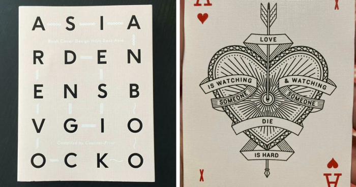
- The scrambled gardening title. Words jumped around the cover until a peaceful plant guide resembled an encrypted warning from a shrub.
- The traffic sign offering every direction. “Left,” “right,” “only,” and “no turn” collided, making straight ahead feel safest.
- The friendship quote assembled by a blender. Alternating lines produced two fortune cookies arguing about loyalty.
- The romantic plaque that became grim. Poor line breaks grouped “love,” “watching,” and “die” before the intended sentiment could recover.
- The restaurant window requiring neck exercises. One word ran upward, another downward, and lunch required an owl’s flexibility.
- The gym slogan with broken syntax. Words were meant to be read by color, but position created a motivational robot malfunction.
- The school banner inventing new teams. Following the rows instead of the colors produced two institutions that did not exist.
- The wedding backdrop suggesting separation. Layered names and a slogan accidentally implied the newlyweds were better apart.
- The coffee wall designed as a maze. Arrows, beans, steam, and oversized words competed; the menu’s real message was “good luck.”
Typography Choices That Committed Public Mischief
- The font where “cl” became “d.” A wholesome cleaning company suddenly appeared to offer a very different service.
- The boutique logo with criminal kerning. Some letters divorced while others fused, inventing a suspicious new product category.
- The bakery sign written in decorative spaghetti. Flourishes swallowed “fresh bread daily” until it resembled a royal signature.
- The warning printed for ants. The promise was enormous; every limitation appeared in microscopic italics.
- The shirt whose folds rewrote the slogan. Missing words left a phrase that discouraged conversation and prolonged eye contact.
- The van door that changed the company name. A sliding panel turned a plumbing promise into an alarming confession.
- The neon sign missing one letter. A tired tube instantly rebranded the hotel with dramatically different amenities.
- The menu using seven fonts. Script, stencil, serif, and pirate handwriting made ordering soup feel archaeological.
- The red text on a red background. Designers called it subtle; readers called it absent.
- The all-caps paragraph screaming equally. The date, location, disclaimer, and bathroom instructions all demanded emergency-level attention.
Punctuation and Wording Fails With Immediate Consequences
- The café apparently serving children. A missing comma transformed a family promotion into a sentence requiring legal counsel.
- The sign warning about “slow children.” Intended road-safety advice became an unnecessary review of local academic performance.
- The “nothing over $20” sale with $35 products. A tiny exception note lost its argument against the giant headline.
- The restroom notice mentioning mysterious “it.” Visitors had to evaluate every object they carried before approaching the toilet.
- The office email titled “Problem.” No context, deadline, or requestjust one ominous noun sitting in everyone’s inbox.
- The final sale with easy returns. Two signs offered opposite policies and invited shoppers to choose their preferred reality.
- The hotel asking guests not to disturb emergencies. A line break merged separate instructions and gave crises quiet hours.
- The pharmacy advertising “free flu children.” The intended offer involved vaccines; the wording suggested questionable inventory management.
- The menu for “gluten free people.” The restaurant seemed to categorize customers rather than dishes.
- The apology that blamed the audience. “We’re sorry you misunderstood” arrived wearing boxing gloves.
Texts, Emails, and Posts Sent One Thought Too Early
- The complaint sent to its subject. Autocomplete chose the criticized coworker instead of the intended friend.
- The reply-all request to stop replying all. Hundreds repeated the same mistake while condemning everyone else for making it.
- The sarcastic “great job.” The sender heard warmth; the recipient heard a disappointed iceberg conducting a performance review.
- The breakup text sent to the family group. A private moment became a panel discussion featuring one extremely fast aunt.
- The cheerful scheduled post during a crisis. Automation demonstrated excellent timing only when properly supervised.
- The password pasted into team chat. A heroic string of symbols revealed more about security habits than anyone requested.
- The voice-to-text message that invented a feud. Dictation replaced one harmless word with an insult and added confident punctuation.
- The boss’s one-word reply: “Fine.” Employees spent an hour deciding whether it meant approval, disappointment, or airport Wi-Fi.
- The screenshot exposing the hidden conversation. The proof included the gossip it was supposed to conceal.
- The urgent message without an action. Three paragraphs explained the pressure, but urgency had eaten the verb.
Digital messages are vulnerable because senders know the tone they intend and assume recipients can hear it. Research found that people can overestimate how accurately they convey tone by email, while workplace guidance recommends stating intent and desired outcomes clearly.
Brand, Advertising, and Public Notices That Needed Another Review
- The billboard buried under legal copy. The exciting claim shouted while its important qualifications became an unreadable gray hedge.
- The impossible discount banner. “Up to 70% off everything” combined two promises that mathematics refused to support.
- The charity campaign centered on its sponsor. The corporate logo dwarfed the cause and made generosity look like a product launch.
- The safety poster showing unsafe behavior. The model ignored the protective equipment promoted by the headline.
- The restaurant apology beside a food glamour shot. A hygiene statement and sizzling cheese created unforgettable emotional whiplash.
- The “locally owned” national chain. The phrase may have been technically defensible, but the giant corporate branding laughed first.
- The package marked “actual size.” The product was tiny, the photo enormous, and the label deeply optimistic.
- The notice listing three deadlines. The headline, body, and footer allowed every reader to be wrong differently.
- The recruitment ad insulting applicants. The company mocked “average” workers, then wondered why talented people avoided the motivational hostage situation.
- The anti-waste campaign printed as disposable clutter. Thousands of glossy flyers delivered a clear message through accidental satire.
Advertising guidance offers a useful reality check: key qualifications should be clear, noticeable, understandable, and close to the claim they modify. Information is not effective merely because it technically appears somewhere in the design.
Why These Message Fails Keep Happening
Creators See Intention; Audiences See Output
The writer knows the correct reading order. The designer knows which color belongs to which line. The marketing team knows what the asterisk means. The public knows none of that. Readers encounter only the final arrangement, usually while distracted, moving, scrolling, or deciding whether to spend money.
Teams Review Pieces Instead of the Whole
Copy may be approved in a document, artwork approved in a design file, and placement approved on a mockup. The failure appears when everything lands on a shirt, van, door, package, or phone screen. Correct parts can still create a ridiculous whole.
Speed Defeats the Sanity Check
Deadlines reward completion, not reflection. The simplest prevention is unglamorous: pause, read aloud, view the message at its real size, and ask an uninvolved person what it means. Five awkward minutes in review can prevent five years as a meme.
Experiences and Practical Lessons From Real-World Message Failures
Anyone who has written a sign, scheduled a social post, prepared a presentation, or sent a rushed email has experienced a smaller version of these disasters. The common problem is not stupidity. It is familiarity. After staring at the same words for an hour, the brain stops reading what is present and starts reading what it expects. Missing words quietly return. Awkward line breaks disappear. A slogan that requires three seconds of decoding feels obvious because its creator has already decoded it fifty times.
A typical workplace failure begins with harmless efficiency. One person writes the copy, another places it in a template, a manager checks the facts, and a printer receives the file. Everyone assumes somebody else reviewed the complete message. Then the poster arrives, and a fold covers the word “not.” A safety instruction becomes a dangerous command. Nobody intended the error, but the workflow practically manufactured it.
Email creates a different experience. A sender types “Can we talk?” because they want a quick update. The recipient reads it as a warning that their career is about to enter a cardboard box. A manager replies “Fine” because they are busy. The employee spends the afternoon wondering whether “fine” means approved, barely acceptable, or please update your résumé. Text removes facial expression, pacing, and vocal warmth, so tiny phrases can carry enormous imagined meaning.
Public signage adds distance and speed. A designer may admire a clever two-column layout on a large monitor, but a driver sees it for one second through a windshield. A shopper views packaging under supermarket lights, not in a controlled studio. A restaurant guest reads a notice while hungry and standing behind six people. Real communication happens under imperfect conditions, so the message must be more obvious than its creator thinks necessary.
The most valuable test is watching an uninvolved person encounter the message without explanation. Ask what they noticed, what they think it means, and what they would do next. Their first interpretation matters more than a long defense of the concept. If they read the words in the wrong order, the layout failed. If they miss the deadline, hierarchy failed. If they cannot identify the action, the copy failed. Communication is measured by what arrives, not what was sent.
There is also a healthy reason to laugh. Humor can turn an embarrassing error into a memorable lesson, and research has associated adaptive humor with reduced stress and more positive emotional states during difficult situations. The goal is not to shame someone for one unfortunate sign or text. It is to recognize how easily intention and interpretation separateand to build review habits that reconnect them.
Conclusion: Think Like the Reader Before You Press Send
The best message is not the cleverest, loudest, or most decorative. It is the one a busy stranger understands correctly the first time. These 50 message fails show how quickly communication collapses when reading order, typography, punctuation, tone, context, or timing becomes an afterthought. Before printing, posting, or sending, ask one question: could a reasonable person interpret this differently? Revise it before the internet does the editing for you.
Note: These examples are original reconstructions and paraphrases based on documented categories of sign, design, advertising, email, and social-media communication failures. They are presented for analysis and entertainment, not as verbatim reproductions.