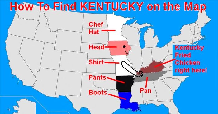
Some maps help you get from point A to point B. Others help you realize point B may be “somewhere near Nebraska, possibly in the ocean, depending on the legend.” Welcome to the wonderfully weird world of terrible maps: the maps that are inaccurate, chaotic, overly confident, visually cursed, and somehow impossible not to love.
The phrase “30 Maps So Terrible They’re Good” captures a very specific kind of internet joy. These are not always bad because they fail at geography. Sometimes they are bad because they are too honest, too silly, too aggressively designed, or too committed to a joke that only one mapmaker and three geography teachers fully understand. They might rename every country, distort continents beyond recognition, use colors that look like a melted box of crayons, or label the United States according to fast food, weather complaints, or “places people pretend to understand.”
But funny maps are more than digital junk food. They show us how maps work, how easily visuals can persuade us, and why cartography is both a science and an art. A terrible map can teach projection, scale, bias, data accuracy, cultural stereotypes, and design hierarchyusually while making us laugh like someone mislabeled Canada as “Cold Florida.”
Why Do Terrible Maps Go Viral?
Terrible maps go viral because maps feel authoritative. Put a claim inside an outline of the world, add a color gradient, and suddenly it looks officialeven if the map says “Countries That Look Like Sandwiches.” People trust maps because we associate them with navigation, research, and school textbooks. That trust makes map humor especially powerful. When the content is ridiculous, the format makes the joke sharper.
Another reason is instant recognition. You do not need to be a cartographer to understand that a map labeling Europe as “tiny castle zone” and the Pacific Ocean as “too much water” is not trying to win a geography award. The joke lands fast. The best terrible maps combine familiar shapes with unexpected logic.
And sometimes, a bad map is accidentally educational. A distorted world map can start a conversation about projections. A messy choropleth map can show why color choices matter. A map with no legend can remind us that design without explanation is just decorative confusion wearing a compass hat.
What Actually Makes a Map Bad?
A map becomes bad when it fails its purpose. If it is meant to help people navigate, incorrect roads are a problem. If it is meant to explain data, misleading colors or unclear categories are a problem. If it is meant to be funny, however, “bad” can become the whole point.
Poor Data
Many terrible maps begin with questionable data. Maybe the map compares raw totals instead of population rates. Maybe it shows “most popular snack by state” based on one person’s pantry and a dream. Bad data makes maps entertaining, but in serious contexts it can mislead readers.
Confusing Design
Map design depends on visual hierarchy, contrast, labels, balance, and legibility. When every label screams, every color glows, and every symbol competes for attention, the reader’s eyes file a formal complaint.
Projection Problems
No flat map can perfectly represent a round planet. Map projections always involve trade-offs. Some preserve shape, some preserve area, and some preserve direction. Terrible maps often exaggerate these distortions or use the wrong projection for the message.
Missing Context
A map without a title, legend, scale, or source can be funny, but it can also be useless. “Red states” might mean politics, heat, danger, tomatoes, or states where someone spilled cranberry juice. Context matters.
30 Maps So Terrible They’re Good
1. The World According to People Who Hate Geography
This classic style labels entire continents with vague descriptions like “hot,” “cold,” “far away,” and “probably Europe.” It is terrible because it ignores everything. It is good because it perfectly captures how some people mentally organize the planet before their morning coffee.
2. The U.S. Map Where Every State Is Ohio
A map that renames every state as Ohio is geographically useless but spiritually powerful. It turns the Midwest into a state of mind and proves that repetition can be comedy when applied with enough cartographic confidence.
3. The Map With No Legend
Nothing says “good luck” like a map covered in seven colors and zero explanations. Is blue population density? Rainfall? Pizza preference? The reader must solve the mystery like a detective trapped in a geography classroom.
4. The Mercator Map Used for Size Comparisons
The Mercator projection is useful for navigation, but it badly distorts landmass sizes near the poles. When someone uses it to compare the size of Greenland, Africa, Alaska, or Europe, the result can be misleading. Terrible? Yes. Historically important? Also yes.
5. The “Countries I Can Name” Map
This map usually has a few confident labels, several question marks, and one country labeled “Spain?” despite clearly being Portugal. It is bad geography but excellent self-awareness.
6. The Map of Europe by Food Stereotype
Italy becomes pasta, France becomes cheese, Germany becomes sausage, and the rest of Europe fights for seasoning rights. It is not academically rigorous, but it may cause hunger, which is a valid emotional response.
7. The Map That Uses Red for Everything
Red can imply danger, urgency, heat, anger, or importance. A map that paints everything red makes every location feel like it is either on fire or late for a meeting. Dramatic? Absolutely. Helpful? Not always.
8. The “Population by Land Area” Choropleth Disaster
Choropleth maps shade geographic areas by value. They are common, but they can mislead when large rural regions dominate the visual field while dense urban areas look tiny. This is how a map can shout with acres while whispering with people.
9. The Subway Map of Places With No Subway
Turning a small town into a subway-style diagram is ridiculous and delightful. The “Central Station” might be a gas station, the “Green Line” might stop at a dentist, and somehow the map feels more official than the town budget.
10. The Map Where North Is Optional
Most maps put north at the top, but not all maps have to. The terrible version rotates the world without warning, making readers feel like someone shook the globe and walked away whistling.
11. The “Most Popular Thing by State” Map With Suspicious Data
These maps claim every state loves one oddly specific item: garden gnomes, ranch dressing, haunted basements, or emotional support waffles. The map looks official, but the methodology may be “trust me, bro.”
12. The Map of America Based on Weather Complaints
Florida is “too humid,” Arizona is “dry oven,” Minnesota is “winter with taxes,” and the Pacific Northwest is “rain with opinions.” This map is bad as science but excellent as emotional climatology.
13. The Map Where Labels Cover the Map
Label placement is an art. A terrible map treats labels like confetti fired from a cannon. Cities overlap rivers, mountains hide behind text, and the map’s actual geography quietly leaves the room.
14. The Map That Treats Oceans as Blank Wasted Space
Some funny maps use oceans for jokes: “Here be meetings,” “Too much water,” or “Fish politics.” It is terrible cartography, but it gives the ocean a personality, and frankly the ocean has earned it.
15. The Map of U.S. Regions That Starts an Argument
Nothing unites Americans like disagreeing about where the Midwest ends. A terrible regional map might put Pennsylvania in New England, Texas in the Southwest, and Delaware in “miscellaneous.” Chaos follows immediately.
16. The Map Based on One Person’s Road Trip
Instead of geography, this map ranks places by personal trauma: “great tacos,” “bad motel,” “mosquito incident,” “never again.” It is subjective, emotional, and probably more memorable than most travel guides.
17. The Map That Uses 47 Colors
Color should clarify differences. A terrible map uses so many colors that the reader begins negotiating with their own eyesight. Somewhere between lavender, electric lime, and “angry salmon,” meaning disappears.
18. The Historical Map With Wild Sea Monsters
Old maps often included decorative creatures, mythical islands, and dramatic illustrations. Some were serious for their time; others now look like a medieval ocean invited its weird friends over. Terrible by modern GPS standards, beautiful by imagination standards.
19. The Map of the World by Internet Memes
Countries become jokes, oceans become reaction images, and continents are reorganized by online humor. It expires culturally in six months, but while it lasts, it is a masterpiece of digital nonsense.
20. The Map Where Scale Has Left the Building
A map without consistent scale can make a small island look like a continent or a short walk look like a heroic expedition. It is the cartographic equivalent of saying “five minutes away” when you mean 45.
21. The Map of “Places Americans Think Are in Europe”
This map usually includes England, France, Italy, “Scandinavia somewhere,” and a suspiciously large blank area labeled “history stuff.” It is painful, funny, and possibly too real.
22. The Map of Borders Drawn by Vibes
Instead of legal boundaries, this map divides regions by mood: chill, chaotic, fancy, haunted, suspiciously flat. It has no administrative use, but it may describe road trips better than official borders.
23. The Election Map That Confuses Land With Voters
Election maps often show large areas of color, which can make land area look like political support. A more accurate view may require population-weighted maps or cartograms. The terrible version forgets that cornfields do not vote, even if they look very decisive.
24. The Map of “Best Pizza” That Angers Everyone
Pizza geography is dangerous. Put New York, Chicago, Detroit, and New Haven on one map, then choose a winner, and you have created not a map but a regional conflict with mozzarella.
25. The Fantasy Map With Too Many Apostrophes
Fantasy maps are charming until every kingdom is named A’thra’lor’neth. The mountains form a perfect circle, rivers split in impossible directions, and the capital city is always called something like “Eldoria.” Terrible? Maybe. Cozy? Definitely.
26. The Map Where the Compass Rose Is the Main Character
A compass rose should help orientation. On a terrible map, it becomes enormous, ornate, and more detailed than the continents. It is not pointing north; it is demanding applause.
27. The Map of “Where People Think They Live”
This one compares identity with reality. Someone living 90 miles from New York City says they are “basically from New York.” A person near Los Angeles says they are “in LA” despite needing three freeways and a snack to get there.
28. The Map Made Entirely of Stereotypes
Stereotype maps can be funny, but they are also risky. The best ones punch up, reveal bias, or mock the mapmaker’s own assumptions. The worst ones simply recycle lazy ideas. A terrible map can still be good if the joke is smart enough to know what it is doing.
29. The Map That Pretends to Be Scientific
Charts, gradients, labels, and decimal points can make nonsense look serious. A map titled “Average Goblin Energy by County” may appear convincing if designed professionally. This is why visual literacy matters.
30. The Map So Bad It Accidentally Explains Maps
The best terrible map reveals something true: maps are arguments. Every map chooses what to show, what to hide, how to simplify, and how to guide attention. A bad map makes those choices visible, sometimes by tripping over them in public.
Why Terrible Maps Are Secretly Useful
Terrible maps are funny because they break rules, but they are useful because they reveal the rules. A professional map tries to make design decisions invisible. It quietly manages scale, projection, hierarchy, labeling, and data classification so the reader can focus on the message. A terrible map does the opposite. It spills the toolbox onto the floor.
That is why teachers, designers, and data storytellers often use bad examples to explain good practices. A confusing legend shows why legends matter. A misleading color ramp shows how emotion influences interpretation. A strange projection opens the door to discussing why all world maps distort something. A fake “most popular food by state” map can become a lesson in sample size, bias, and source quality.
In other words, funny maps are not just disposable entertainment. They are mini case studies in communication. They remind us that design choices shape meaning. They also remind us that the internet will absolutely turn any serious discipline into a meme by lunchtime.
How to Enjoy Terrible Maps Without Getting Fooled
The first rule is simple: laugh first, verify second. If a map makes a bold claim, look for the title, legend, date, source, and methodology. Ask whether it uses raw totals or rates. Check whether the colors exaggerate differences. Notice whether land area is being used in a way that hides population patterns.
Also, pay attention to the map’s purpose. A joke map does not need to meet the same standards as an emergency evacuation map. A satirical map may intentionally distort geography to make a point. A persuasive map may use symbolism, selective labels, or dramatic colors to influence opinion. The problem begins when entertainment, persuasion, and factual reporting blur together.
Good map reading is not about rejecting maps. It is about reading them the way you would read headlines: with curiosity, context, and a tiny internal fact-checker wearing comfortable shoes.
Experience Notes: What Terrible Maps Teach After the Laugh
Anyone who spends enough time looking at terrible maps eventually develops a strange new skill: you start seeing maps everywhere. A mall directory becomes a tiny drama about poor labeling. A restaurant delivery zone becomes a political boundary dispute. A theme park map becomes a fantasy kingdom with churros. Even weather maps begin to look suspiciously emotional, especially when the entire country is colored in alarming shades of “you should have stayed inside.”
The most enjoyable experience with terrible maps is sharing them with people who are not expecting to care. Show someone a map of the United States divided by “states that think they are the South,” “states that deny being the Midwest,” and “states everyone forgets during quizzes,” and suddenly the room has opinions. People who have not discussed geography since high school become constitutional scholars of regional identity. Someone will defend Ohio. Someone will accuse Delaware of being too small to count. Someone will bring up barbecue, and at that point the map has done its job.
Terrible maps also make travel memories funnier. After a long road trip, the official route on your phone may show highways and arrival times, but your personal map remembers the real landmarks: the gas station with suspicious coffee, the town where every street was under construction, the exit you missed twice, and the diner that saved morale with pancakes the size of hubcaps. That kind of map is not accurate in the traditional sense, but it is emotionally precise. It maps experience instead of distance.
There is also a creative lesson hiding in the chaos. Making a bad map on purpose is harder than it looks. The best funny maps are not random. They choose a simple idea, exaggerate it, and use familiar geography as the stage. The outline of a country or state gives the viewer instant structure. The joke comes from replacing expected information with unexpected categories. That is why a map of “places I understand” versus “places I pretend to understand” works so well. It uses the authority of maps to reveal the silliness of human confidence.
On the practical side, terrible maps make you a better reader of serious maps. Once you have laughed at a map with a useless legend, you notice legends more. Once you have seen a misleading color scale, you question dramatic gradients. Once you understand that projections distort the world in different ways, you stop treating a flat world map as neutral truth. The humor becomes a doorway into media literacy.
Most importantly, terrible maps remind us that maps are human-made. They are not pure windows onto reality. They are edited, designed, simplified, and framed. That does not make maps untrustworthy; it makes them worth reading carefully. A good map helps us understand the world. A terrible map helps us understand how easily the world can be misunderstoodand if it makes us laugh along the way, that is a pretty good route to take.
Conclusion
30 Maps So Terrible They’re Good is more than a collection of geography jokes. It is a celebration of how maps can inform, mislead, entertain, persuade, and accidentally expose the weird machinery of human perception. From projection problems and messy legends to stereotype maps and fake data visualizations, terrible maps show us what happens when design choices go rogue.
They are funny because they are wrong, but they are valuable because they make us ask better questions. What is this map trying to say? What data does it use? What has been left out? Why did the mapmaker choose these colors, borders, labels, or categories? When a map is terrible enough, it becomes a lesson wearing a clown nose.
Note: This article is original editorial content written for web publication. It is based on widely accepted principles of cartography, GIS, map projections, data visualization, and examples of satirical and humorous maps.