Some rooms walk into your life and immediately feel calm, polished, and oddly expensiveeven when the sofa came from a clearance section and the coffee table has survived three moves and one unfortunate nacho incident. Other rooms have perfectly nice furniture, lovely colors, and somehow still feel… off. The difference often comes down to composition. That is where the rule of thirds in interior design earns its tiny superhero cape.
The rule of thirds is a simple visual guideline borrowed from photography, painting, and graphic design. Instead of placing everything dead center, you imagine your room, wall, shelf, coffee table, or vignette divided into three equal parts horizontally and vertically. This creates a tic-tac-toe-style grid with nine sections and four intersection points. The magic happens when important design elementsart, lighting, furniture, plants, mirrors, color accents, or decorative objectssit along those lines or near those intersections.
In plain English: the rule helps your space look balanced without looking stiff. It gives the eye a place to travel, pause, and enjoy the view. Think of it as interior design’s polite way of saying, “Please stop shoving everything in the middle and hoping for the best.”
What Is the Rule of Thirds in Interior Design?
The rule of thirds is a composition principle that divides a visual field into three equal columns and three equal rows. In interior design, that “visual field” might be an entire room, one wall, a mantel, a console table, a bookcase, a bed, or even a single corner. The goal is to create visual balance, rhythm, and interest by placing key items slightly off center.
Imagine looking straight at your living room wall. Now picture two vertical lines dividing it into left, center, and right sections, and two horizontal lines dividing it into top, middle, and bottom sections. Where those lines cross are natural focal points. A framed print, wall sconce, sculptural vase, or tall plant placed near one of those points often feels more dynamic than the same item placed exactly in the center.
This does not mean symmetry is bad. Symmetry can be beautiful, especially in formal rooms, traditional bedrooms, or spaces where you want a calm and orderly feeling. But the rule of thirds adds a little movement. It says, “Yes, we are balancedbut we also have a personality.”
Why the Rule of Thirds Works So Well
The human eye likes patterns, but it also likes discovery. A perfectly centered arrangement can feel stable, but it may also feel predictable. The rule of thirds creates a gentle asymmetry that keeps the eye moving through the room. That movement makes a space feel layered, thoughtful, and more natural.
Interior designers use this concept because it supports several essential design principles at once: balance, scale, proportion, emphasis, rhythm, and negative space. When these principles work together, a room feels complete without feeling crowded. When they do not, you may end up with a space where everything technically matches, yet nothing seems to sing. Or worse, everything sings at once like a furniture-store karaoke night.
It Creates Balance Without Boredom
Balance does not always mean matching lamps, matching chairs, and matching pillows marching across the room like they are reporting for duty. Balance can also come from distributing visual weight. A large sofa on one side of a room might be balanced by a pair of accent chairs, a floor lamp, and artwork on the other. The rule of thirds helps you spread those visual anchors so the room does not lean too heavily in one direction.
It Helps You Find a Focal Point
Every well-designed room needs a focal point. It might be a fireplace, a large window, a dramatic headboard, a gallery wall, a bold light fixture, or a beautiful piece of art. The rule of thirds helps you decide where that focal point should live. Instead of placing everything in the middle, you can shift the most interesting feature slightly to one side and let the rest of the room support it.
It Makes Styling Feel Intentional
Have you ever placed three objects on a shelf and suddenly thought, “Wait, do I know what I’m doing?” That is the rule of thirds waving hello. Grouping objects in threessuch as a vase, a stack of books, and a small bowloften feels more natural than arranging two identical items side by side. Varying height, shape, and texture makes the grouping even better.
How to Use the Rule of Thirds in a Room Layout
To use the rule of thirds in a full room, start by standing at the main entrance or the most common viewing point. This might be the doorway to a living room, the foot of the bed in a bedroom, or the opening into an open-plan dining area. Mentally divide what you see into three vertical sections and three horizontal sections.
Now look at where the largest visual elements fall. Is all the furniture pushed into the bottom third? Is one side overloaded with heavy objects while the other side looks empty? Is the focal point fighting with another focal point across the room? These are signs that the room needs better visual distribution.
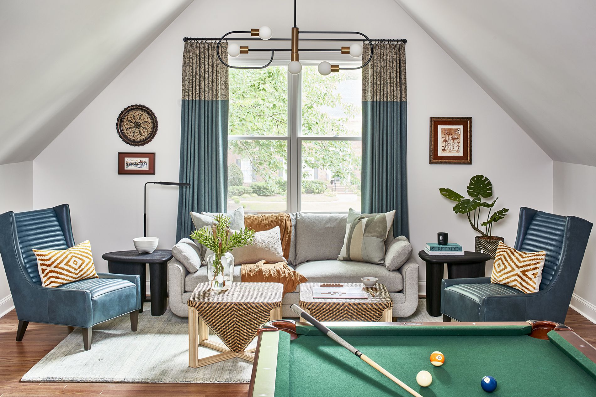
For example, in a living room, the sofa may occupy the lower middle third, while a large piece of artwork sits in the upper third above it. A floor lamp might land along the right vertical third, while a plant or side table balances the left. The result feels composed but not rigid.
Using the Rule of Thirds with Furniture Placement
Furniture is where the rule of thirds becomes especially practical. A room often feels awkward when all major pieces are lined against the walls or clustered too tightly in the center. Dividing the room into thirds can help you create zones that feel useful and visually pleasing.
Living Room Example
In a rectangular living room, you might place the main sofa across the center third of the longest wall. Instead of putting a media console exactly in the middle of the opposite wall, you could shift it slightly toward one third and balance the other side with a tall plant, floor lamp, or slim cabinet. This creates a more relaxed composition while still keeping the layout functional.
Bedroom Example
In a bedroom, the bed usually becomes the focal point. If the bed is centered on the main wall, you can still use the rule of thirds vertically. The headboard fills the lower third, artwork or a mirror occupies the middle-to-upper third, and lighting creates height on either side. If the room is small, try placing a tall elementlike a curtain panel, plant, or floor lampnear one vertical third line to draw the eye upward.
Dining Room Example
In a dining room, the table usually anchors the center. The rule of thirds can come in through lighting, wall decor, and storage. A pendant light should feel connected to the table, but the surrounding elements can be arranged in thirds: artwork on one wall, a sideboard along another, and open negative space to let the room breathe.
How to Apply the Rule of Thirds to Walls
Walls are prime territory for the rule of thirds because they are basically blank canvases waiting for a little design discipline. Whether you are hanging art, placing mirrors, installing shelves, or styling a gallery wall, the grid gives you a helpful starting point.
For a single piece of artwork, try aligning the center of the piece near one of the grid intersections rather than automatically centering it on the wall. This works especially well above a console table, in a hallway, or beside a reading chair. If you are hanging a mirror, consider how it reflects light and what it frames. A mirror placed along a third line can make a room feel larger while also creating a more interesting composition.
For gallery walls, think in clusters rather than perfect rows. You can build the arrangement around one strong anchor piece placed near an intersection, then add smaller pieces around it. The overall shape can still feel balanced, but it will have more energy than a grid that looks like a spreadsheet got promoted to home decor.
Using the Rule of Thirds for Coffee Tables, Shelves, and Vignettes
The rule of thirds is not only for large rooms. In fact, it may be easiest to practice on small surfaces. Coffee tables, bookshelves, mantels, nightstands, and entry consoles are perfect training grounds.
Coffee Table Styling
Divide the table into three sections. In one section, place a stack of books. In another, add a decorative bowl or tray. In the third, use something with height, such as flowers, branches, or a sculptural candleholder. The key is variation. Combine tall and short, smooth and textured, practical and decorative. The arrangement should look collected, not like the accessories had a committee meeting.
Bookshelf Styling
On a bookshelf, avoid filling every shelf from end to end. Instead, create groupings in thirds. One shelf might have books on the left, a framed photo in the center, and a small object on the right. Another shelf might reverse that rhythm. Leave some empty space so each grouping can stand out. Negative space is not wasted space; it is the design equivalent of taking a deep breath.
Mantel Styling
A mantel can look great with one large anchor item, such as a mirror or artwork, slightly off center. Then add a group of three objects on one side and one taller element on the other. This creates asymmetrical balance, which often feels more modern and relaxed than identical objects placed on both ends.
The Rule of Thirds and Color
The rule of thirds also connects beautifully with color planning. Many designers use related color formulas, such as the 60-30-10 rule: 60 percent dominant color, 30 percent secondary color, and 10 percent accent color. While this is not exactly the same as the rule of thirds, both ideas help prevent visual chaos.
For example, in a living room, your dominant color might be warm white on the walls and large upholstery. Your secondary color could be natural wood and beige textiles. Your accent color might be deep green in pillows, art, and a plant. Instead of scattering the accent color randomly, place it in three intentional areas: one pillow grouping, one artwork detail, and one decorative object. Suddenly the room looks coordinated instead of accidentally sponsored by the color green.
The Rule of Thirds and Scale
Scale is one of the biggest reasons a room can feel wrong. A tiny rug under a large sofa, a small painting floating above a king-size bed, or a delicate lamp beside an oversized sectional can all make the proportions feel confused. The rule of thirds helps you judge whether objects relate well to the space around them.
When choosing art above furniture, a helpful guideline is to let the artwork or grouping take up a substantial portion of the wall area above the piece, often around two-thirds of the furniture width. This does not mean you need a calculator and a panic attack. It simply means the art should feel connected to the furniture below it. A tiny frame above a wide sofa looks lonely. A larger piece or a well-planned grouping feels grounded.
Common Mistakes to Avoid
The most common mistake is treating the rule of thirds as a law. It is not a law. Nobody from the Interior Design Police is coming to inspect your throw pillows. The rule is a guide to help you make better decisions, especially when something feels off and you cannot figure out why.
Another mistake is using too many focal points. If every wall has bold art, every surface has tall objects, and every corner is shouting for attention, the room becomes visually noisy. Use the rule of thirds to choose where the eye should go first, second, and third.
A third mistake is ignoring negative space. The empty parts of a room are part of the composition. Leaving a wall partially blank, keeping one corner simple, or allowing space around a statement chair can make the whole room feel more sophisticated.
When to Break the Rule of Thirds
Great design rules are meant to be understood first and broken later. Centering can be powerful when you want drama, formality, or calm. A centered bed with matching nightstands can look timeless. A centered fireplace with symmetrical built-ins can feel elegant. A centered dining table under a chandelier is often the right move because function matters too.
Break the rule when symmetry supports the room’s purpose. Break it when a centered arrangement feels stronger. Break it when architectural features demand it. Just do not break it because you forgot it existed. Intentional rule-breaking looks stylish. Accidental rule-breaking looks like the room got dressed in the dark.
Real-Life Experience: What the Rule of Thirds Looks Like at Home
The best way to understand the rule of thirds is to use it in an ordinary roomnot a magazine-perfect space with twelve-foot ceilings, custom millwork, and a chair nobody is allowed to sit in. Real homes have phone chargers, dog toys, laundry baskets, remote controls, and that one random cable no one can identify. The rule still works.
One of the easiest places to begin is the living room. Stand at the entrance and take a quick photo of the room with your phone. Then look at the image as if it were a design board. Is the visual weight sitting mostly on one side? Are all the tall pieces clumped together? Does the wall art feel too high, too low, or too centered? When you view the room through a photo, the problems become easier to spot. The rule of thirds suddenly feels less theoretical and more like a friendly little map.
In a small apartment, I have seen this rule make a dramatic difference without buying anything new. A sofa was centered on a wall, a coffee table sat in front of it, and a bookcase stood awkwardly in the corner. Nothing was technically wrong, but the room felt flat. The simple fix was to shift the floor lamp toward the left third of the sofa wall, move a plant to the opposite third near the window, and restyle the coffee table into three zones: books, a tray, and a vase. The room immediately felt taller, warmer, and more intentional. The furniture did not change. The composition did.
Another practical experience comes from styling shelves. Many people fill shelves like they are trying to win a storage contest. Books go everywhere, objects squeeze into gaps, and the final result feels heavy. When you divide each shelf into thirds, you start editing naturally. One third might hold upright books, another might hold a small framed print, and the last third might stay open or feature a single ceramic object. The shelf begins to breathe. Even inexpensive items look better because they have room to be noticed.
The rule also helps when decorating on a budget. Instead of buying more decor, you can rearrange what you already own. Three mismatched vases can become a charming vignette if they vary in height and share a color family. A stack of books, a candle, and a small plant can turn a plain nightstand into a finished moment. A mirror moved slightly off center above a console can make an entryway feel more relaxed and designer-approved.
Most importantly, the rule of thirds teaches you to trust your eye. At first, you may literally imagine the grid. After a while, you start to feel it. You will notice when a chair needs a lamp beside it, when a wall needs breathing room, or when a coffee table arrangement needs one taller object. That is the quiet beauty of the rule: it trains you to see your home as a composition, not a collection of stuff. And once you see it, you can make almost any room feel more balanced, more personal, and more pulled togetherwithout requiring a mansion, a design degree, or a financially irresponsible number of throw pillows.
Conclusion
The rule of thirds in interior design is one of the simplest ways to make a room feel balanced, stylish, and intentional. By dividing a space into three horizontal and vertical sections, you can place furniture, art, lighting, color, and accessories where they naturally guide the eye. It works for full room layouts, small vignettes, shelves, mantels, gallery walls, and color accents.
Use it as a flexible design tool, not a strict commandment. Sometimes symmetry is perfect. Sometimes centered is best. But when a room feels dull, crowded, or slightly awkward, the rule of thirds can help you diagnose the problem and create a better composition. Start small, adjust one surface or wall, and let your eye learn the rhythm. Before long, your home will look less “I put things where they fit” and more “Yes, I absolutely meant to do that.”