Warm colors have a reputation for doing the heavy lifting in a room. They make spaces feel friendlier, flatter natural materials, and can turn even the plainest corner into a place people actually want to sit down in. In interior design coverage from HGTV, Better Homes & Gardens, Martha Stewart, Real Simple, House Beautiful, Architectural Digest, Houzz, Southern Living, The Spruce, and Elle Decor, the same message keeps showing up in different forms: reds, oranges, yellows, terracottas, browns, and warm neutrals create energy, comfort, and a sense of welcome when they are used thoughtfully.
The trick is not to drown a room in pumpkin-spice everything. The best warm-color interiors usually combine a warm base with natural textures, layered lighting, a few cooler notes for balance, and carefully chosen accents that make the palette feel curated instead of noisy. That is why designers keep returning to warm whites, caramel, clay, rust, ochre, amber, and chocolate brown, especially in rooms where comfort matters most.
What Counts as a Warm Color Palette?
In home decor, warm colors are typically the shades that visually feel sunlit, earthy, or flame-inspired. Think red, orange, yellow, coral, terracotta, cinnamon, camel, beige, warm white, and brown. Even a neutral can read warm if it has peach, gold, or pink undertones. That is why one “white” can feel crisp and modern while another feels soft and cozy.
Warm colors are especially useful in rooms that need a little emotional lift. They can make large rooms feel more inviting, help north-facing spaces feel less chilly, and give smaller rooms a cocoon-like feeling when they are balanced with lighter surfaces and reflective finishes. Designers also use warm colors to make wood, brass, leather, linen, and other natural materials look richer.
How to Use Warm Colors Without Overdoing It
The easiest way to decorate with warm colors is to decide on one anchor tone and build around it. Many designers recommend choosing a mid-tone, then adding lighter and darker shades from the same family so the room feels layered instead of random. Another reliable move is to keep large surfaces calmer, then add warmth through furniture, textiles, artwork, lamps, and accessories.
Lighting matters just as much as paint. Warm bulbs, table lamps, sconces, candles, and other layered light sources help warm colors glow instead of flatten out. Designers have been leaning hard into layered lighting because it softens harsh overhead light and makes a room feel more livable, especially at night.
15 Decor Ideas That Make Warm Colors Shine
1. Start with warm white walls
Warm white is one of the smartest starting points because it adds softness without stealing the show. Creamy whites, ivory, oat, and white shades with pink or yellow undertones create a relaxed backdrop for nearly any style, from modern to traditional.
2. Add a terracotta accent chair
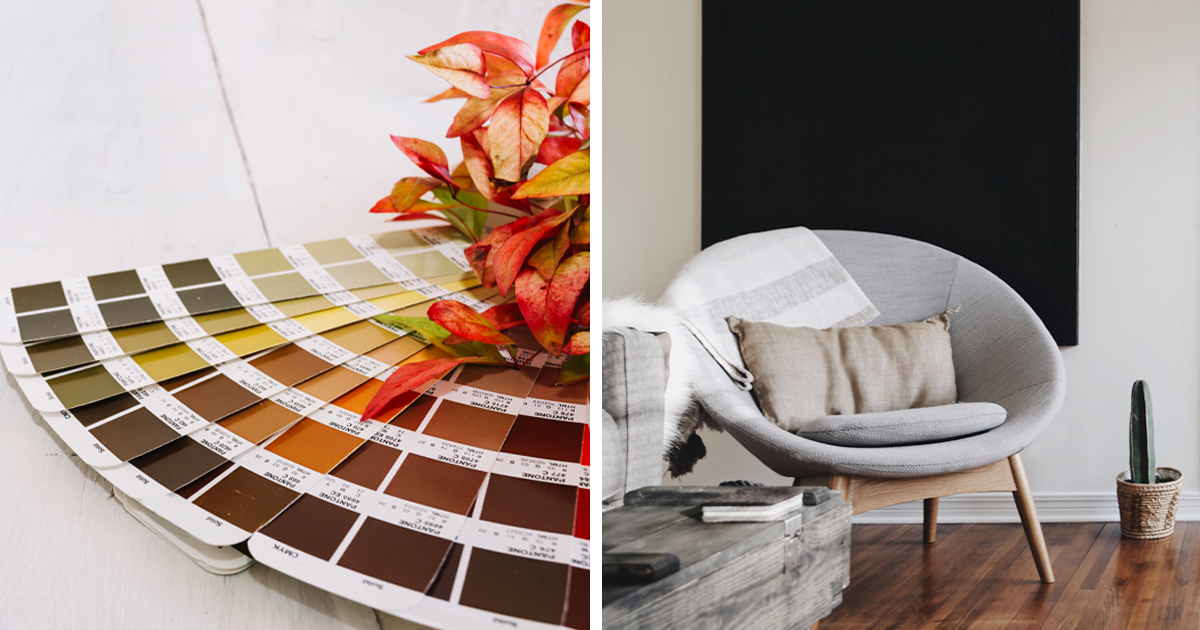
Terracotta is one of those colors that does not need much help. A single chair in this earthy hue can anchor a reading nook, brighten a corner, or add warmth to a neutral living room without making the room feel heavy.
3. Use rust-colored throw pillows
If you want a low-commitment upgrade, pillows are the easiest place to start. Rust, clay, and cinnamon tones instantly make a sofa feel more inviting, especially when mixed with linen, boucle, or velvet. Designers often recommend changeable accents like pillows because they let you test color before making a bigger commitment.
4. Ground the room with a warm rug
A rug in caramel, red-brown, amber, or earthy gold can pull together an entire room. It also gives you a chance to introduce color at floor level, which makes a space feel grounded and intentional rather than top-heavy.
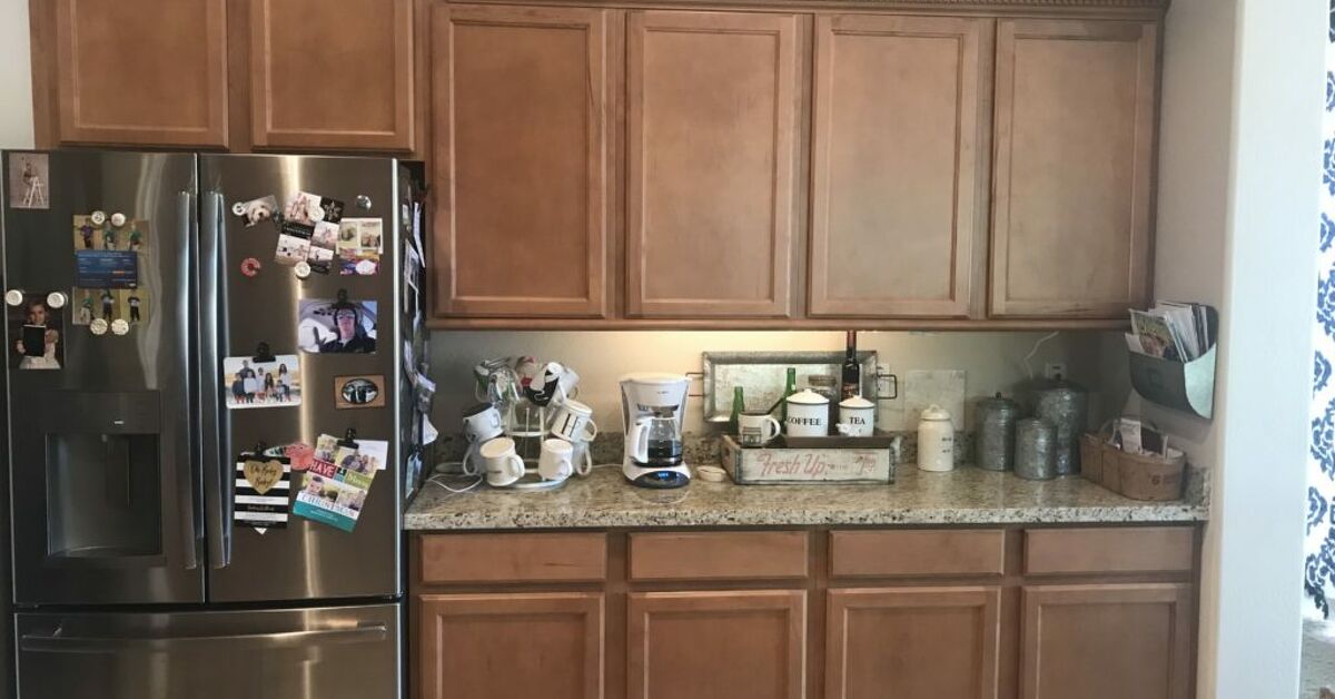
5. Paint kitchen cabinets in a soft ochre or curry tone
Warm cabinet colors work beautifully in kitchens because they bring personality without requiring every surface to shout. HGTV’s kitchen color guidance points out that warm tones can live on cabinets, chairs, or accessories if you do not want them on every wall.
6. Mix warm colors with natural wood
Wood is one of the best partners for warm color palettes. Light oak, walnut, teak, and aged pine make terracotta, beige, and brown tones feel richer, while also preventing the room from becoming visually flat. Houzz and Southern Living both highlight the value of pairing warm colors with wood to keep spaces balanced and grounded.
7. Choose brass or aged-gold lighting
Metal finishes can quietly reinforce the color story. Brass, antique gold, and warm bronze fixtures echo warm hues and add a subtle glow that feels more polished than shiny chrome in many cozy interiors.
8. Build a gallery wall with warm-toned art
Artwork is a smart place to introduce strong warm colors because it gives you flexibility. A gallery wall with ochre abstracts, sunset landscapes, clay-toned prints, or brown-and-cream photography can deliver warmth without repainting anything.
9. Try a color-drenched powder room
Small rooms are often the best places to go bolder. A powder room in maroon, amber, cinnamon, or deep coral can feel dramatic, stylish, and memorable without overwhelming the rest of the home. Design editors often note that saturated colors work especially well in smaller spaces where they can feel intimate instead of overpowering.
10. Layer cozy textiles in the bedroom
Warm colors look especially good in bedding because fabric adds softness to the palette. A duvet in muted rust, a knit throw in caramel, or pillow shams in warm beige can instantly make a bedroom feel calmer and more restful.
11. Bring in amber glass and ceramic accessories
Decor objects are perfect for testing color in small doses. Amber vases, clay bowls, ochre lamps, and caramel ceramic pieces add visual warmth and also catch the light beautifully on shelves, sideboards, and mantels.
12. Warm up a dining room with deep red or wine accents
Dining rooms can handle richer color more easily than many other rooms because they are often used for shorter, social bursts of time. Deep red, burgundy, and wine tones create an atmosphere that feels welcoming and a little more formal without becoming stiff.
13. Use warm neutrals in an open-plan space
Open layouts need colors that connect zones without making the whole floor feel chaotic. Warm beige, tan, oatmeal, caramel, and soft brown help different areas flow together while still leaving room for contrast in furniture and decor.
14. Create a sunny entryway
An entryway is your first chance to set the mood, so even a small hit of warm color can change the whole house. A gold mirror, a terra-cotta tray, a rust runner, or a honey-toned bench can make the space feel instantly more welcoming.
15. Add warm color through window treatments
Curtains are one of the easiest ways to soften a room while introducing warm color. Linen panels in caramel, gold, blush-beige, or muted clay can frame the window, filter light, and make the whole room feel more finished.
Best Warm Color Pairings for a Balanced Look
Warm colors tend to look their best when they are paired with calm companions. Cream and beige soften bright orange or red. Warm wood and brass make terracotta feel sophisticated. Muted green can cool a palette just enough to keep it from feeling sugary. Even cooler blues or gray-green accents can help warm tones breathe, which is why so many designer rooms rely on a blend rather than a single-note palette.
Texture is the other major balancing tool. Woven baskets, nubby upholstery, boucle, unfinished wood, stone, linen, and matte ceramic all help warm colors feel dimensional. Without texture, a warm palette can look too flat or too sweet; with texture, it feels layered and expensive in the best possible way.
Common Mistakes to Avoid
The most common mistake is using too many warm shades at the same intensity. A room full of saturated red, orange, and yellow can feel loud if there is no visual pause. Another mistake is ignoring undertones, which is how a “warm” white suddenly turns pink in one room and yellow in another. Designers also caution against relying on overhead light alone, because it can make warm colors look dull instead of glowing.
A safer method is to choose one hero color, one supporting neutral, and one material-driven accent such as wood, brass, leather, or woven fiber. That formula keeps the palette warm without turning the room into a theme park for autumn.
Real-World Experience: What Warm Colors Actually Feel Like in a Home
When warm colors are used well, the effect is not just visual. The room feels more social, more human, and more forgiving. A cream sofa against a clay wall looks relaxed rather than staged. A brown wood table under amber lighting feels like a place where people naturally linger. Even a simple hallway can feel less like a pass-through and more like part of the home once warm tones are introduced in art, lighting, or a runner. That is the quiet magic of this palette: it changes behavior as much as appearance.
One of the most useful lessons from design coverage is that warm colors rarely need to be loud to work. A pale peach wall can be just as effective as a bold orange one if the room is getting strong daylight. A caramel throw blanket may do more for a room than repainting every wall. A brass lamp can bring more warmth than another decorative object piled onto a shelf. In practice, warm color is often a matter of proportion, not intensity.
Another practical takeaway is that warm colors are surprisingly adaptable across styles. They can read rustic in a room with raw wood and stone, modern in a space with clean lines and creamy walls, classic in a dining room with burgundy upholstery, and minimal when used as a soft beige foundation with a few earthy accents. That range is why warm palettes continue to show up in trend roundups year after year instead of disappearing after one season.
In lived-in homes, warm colors also have a useful side effect: they are practical. Richer neutrals and earth tones tend to hide everyday wear better than ultra-pale or very cool shades, which is one reason designers keep recommending them for active spaces like living rooms, family rooms, and entryways. If you have pets, children, frequent guests, or simply a lot of life happening in your home, warm colors can be both beautiful and forgiving.
I have also found that warm colors reward patience. People often expect one coat of paint or one pillow swap to transform everything instantly, but the most successful rooms usually evolve. A room may begin with a warm white base, then gain a rug, then a lamp, then a few pieces of art, and finally one strong accent piece. That slow layering is what makes the space feel collected instead of purchased all at once. It is also what keeps a warm palette from looking like a seasonal display that needs to be packed away on November 1st.
Warm colors can even change how you use a room. A cozy reading nook gets more inviting when the chair is rust and the lamp glow is soft. A kitchen feels more approachable when it has warm wood and amber accents instead of only hard white surfaces. A bedroom feels quieter when the palette leans toward cream, sand, and muted rose. Those effects are subtle, but they are exactly why warm color remains a staple of good interior design: it works on the mood before you even notice the details.
There is also something wonderfully flexible about warm colors in a web-published home article. Readers can picture themselves using them in a weekend refresh or in a full-room makeover, because the ideas can scale up or down so easily. A candle and a throw blanket count. So does a new paint color, a wood coffee table, or a terracotta accent wall. That flexibility is one reason warm colors keep winning: they are approachable for beginners and still interesting for design-savvy readers who want more depth.
Conclusion
Warm colors work because they bring comfort, visual richness, and a sense of ease to modern interiors. Whether you use them in a single accent chair, a whole-room palette, or a few carefully chosen accessories, the goal is the same: make the space feel lived-in, welcoming, and balanced. If you mix warm hues with natural texture, thoughtful lighting, and a few grounding neutrals, you will get a room that feels stylish without trying too hard.
Note: This article was synthesized from reputable U.S. interior-design publications and written for web publication.