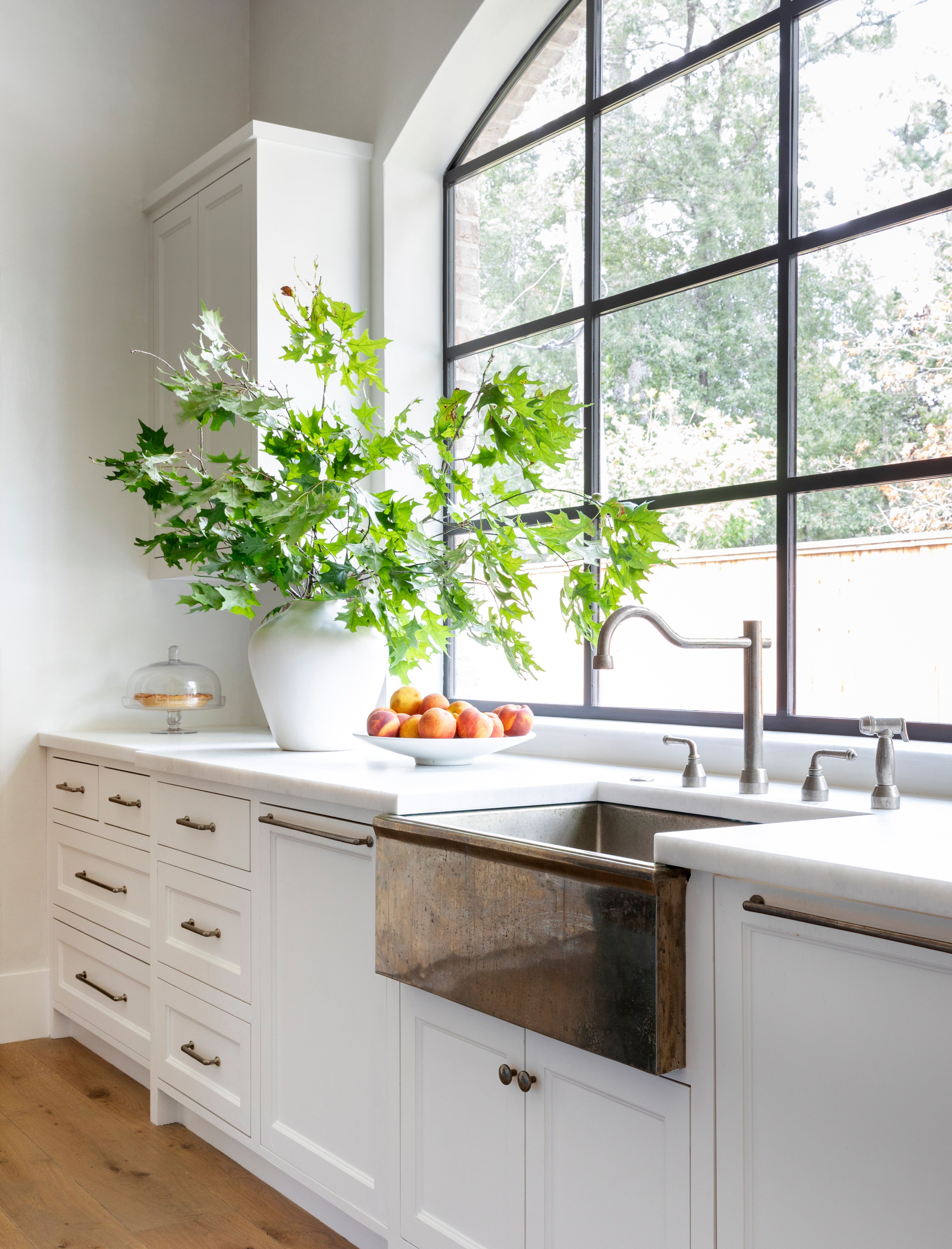
Once upon a time, the “dream kitchen” was easy to spot: white cabinets, white counters, white backsplash, and maybe a stainless-steel appliance standing in the corner like it had been invited to the party but did not know anyone. Clean? Yes. Safe? Absolutely. Memorable? Well… let’s just say not every kitchen needs to look like a very polite cloud.
Today, homeowners and designers are reaching for something warmer, richer, and more personal: the two-toned kitchen. This look uses two cabinet colors, two finishes, or two material tones to create contrast and character. Think creamy upper cabinets with walnut lowers, a sage green island in a white kitchen, navy base cabinets under soft neutral walls, or black cabinetry paired with natural white oak. The result feels custom without shouting, “I spent my entire life savings on drawer pulls.”
Two-toned kitchen cabinets are not just a passing social media crush. They solve real design problems. They can make a small kitchen feel lighter, ground an open-concept room, highlight an island, soften a modern layout, or bring personality to builder-grade cabinets. Done well, the look is stylish, livable, and surprisingly flexible. Done badly, it can feel like two kitchens got stuck in an elevator together. The difference is planning.
Below, you will find a practical, design-forward guide to getting the two-toned kitchen look right, from color placement and material pairing to hardware, lighting, countertops, and real-life lessons from living with this trend every day.
What Is a Two-Toned Kitchen?
A two-toned kitchen is a kitchen that intentionally uses two different colors, finishes, or materials in the cabinetry or major design elements. The most common version is simple: lighter upper cabinets and darker lower cabinets. This keeps the room feeling open above eye level while giving the lower half visual weight.
But that is only one version. A two-tone kitchen can also mean a painted perimeter with a wood island, white cabinets with a navy pantry wall, mushroom-toned cabinets paired with black accents, or natural wood lowers beneath creamy painted uppers. The second tone might appear on the island, pantry cabinets, open shelving, range hood, coffee bar, or even the inside of glass-front cabinets.
The best two-toned kitchens do not look random. They look layered. The colors relate to the countertops, backsplash, flooring, hardware, and lighting. In other words, the cabinets should talk to the rest of the room instead of arguing with it before breakfast.
Why Two-Toned Kitchens Are Still So Popular
The staying power of two-toned kitchen cabinets comes from one big advantage: they offer personality without total commitment. Painting every cabinet deep green might feel bold. Painting only the island deep green? Much easier to love, and much easier to repaint later if your future self develops a passionate relationship with warm taupe.
Two-tone kitchens also fit the broader shift away from cold, all-white interiors and toward warmer, more layered spaces. Homeowners want kitchens that feel like part of the home, not a laboratory where a sandwich may be inspected under fluorescent lighting. Warm woods, earthy neutrals, muted greens, deep blues, soft creams, charcoal, mushroom, walnut, and brass accents are all helping kitchens feel more collected and comfortable.
Another reason this trend endures is flexibility. A two-toned kitchen works in farmhouse, transitional, coastal, modern, cottage, Scandinavian, traditional, and contemporary spaces. The trick is choosing the right level of contrast. A modern kitchen may handle black and white cabinets beautifully, while a cozy cottage kitchen might prefer cream and sage. A transitional home may look best with white oak and warm gray. There is no single formula, which is exactly why the look keeps evolving.
The Classic Formula: Light on Top, Dark on Bottom
If you are new to the two-toned kitchen idea, start with the most dependable layout: light upper cabinets and darker lower cabinets. This works because darker base cabinets visually anchor the room while lighter uppers keep the kitchen from feeling heavy.
For example, try warm white uppers with navy lowers, cream uppers with forest green lowers, pale greige uppers with walnut lowers, or soft beige uppers with charcoal base cabinets. This arrangement is especially helpful in small kitchens because it keeps the eye moving upward. The kitchen feels taller, brighter, and less boxed in.
One important rule: pay attention to undertones. A cool white upper cabinet can look icy next to warm wood floors. A yellow cream can clash with a blue-gray lower cabinet. Before committing, test large paint samples near your backsplash, countertop, flooring, and natural light. Paint is sneaky. It behaves differently at 8 a.m., 2 p.m., and “why is everyone hungry again?” o’clock.
The Island-as-Accent Approach
The easiest way to try a two-toned kitchen is to make the island the star. Keep the perimeter cabinets neutral, then paint or stain the island in a contrasting tone. This approach creates a focal point without making the entire kitchen feel busy.
A white kitchen with a navy island is a classic for a reason. It is crisp, timeless, and easy to coordinate with brass, nickel, or black hardware. For a softer look, pair creamy cabinets with a sage green island. For a richer, more modern mood, try mushroom perimeter cabinets with a dark walnut island. If your home has a lot of natural light, a black or deep charcoal island can look elegant instead of heavy.
The island strategy also works beautifully when you want a custom look on a budget. If your existing cabinets are in good condition, repainting only the island can change the entire personality of the room. It is the kitchen version of changing your jacket and suddenly looking like you have a reservation somewhere expensive.
Wood and Paint: The Pairing That Rarely Fails
One of the most beautiful two-tone kitchen cabinet ideas is mixing painted cabinetry with natural wood. Wood adds warmth, texture, and movement. Painted cabinets add structure and color. Together, they create a kitchen that feels designed rather than decorated.
White oak is especially popular because it feels light, warm, and modern without being too rustic. Walnut brings depth and luxury. Maple can feel clean and understated. Rift-sawn oak offers a sleek, linear grain that works well in contemporary kitchens.
Try white oak lower cabinets with creamy upper cabinets for a bright and natural look. Pair walnut cabinets with soft beige or pale taupe for a sophisticated effect. Use painted perimeter cabinets with a wood island if you want contrast but still crave a grounded, organic feel. If you already have wood floors, make sure the cabinet wood does not compete with them. Similar undertones matter more than a perfect match.
Best Two-Toned Kitchen Color Combinations
White and Navy
White and navy is crisp, classic, and almost impossible to regret. Use white on upper cabinets and navy on lowers, or keep the main cabinets white and paint the island navy. Add warm brass hardware for a polished look or matte black hardware for a more modern edge.
Cream and Sage Green
Cream and sage green create a soft, welcoming kitchen that feels fresh without being trendy in a loud way. This pairing works especially well with warm wood floors, marble-look quartz, handmade tile, and unlacquered brass accents.
White Oak and Mushroom
Mushroom, taupe, and warm greige shades are excellent partners for natural wood. The look is calm, earthy, and elevated. It is a smart option for homeowners who want something warmer than gray but quieter than green or blue.
Black and Natural Wood
Black cabinets paired with natural wood can look dramatic and high-end, especially in kitchens with strong natural light. Use black carefully in small or dark kitchens. If the room lacks windows, consider black only on the island, pantry wall, or lower cabinets.
Soft Blue and Warm White
Soft blue lower cabinets with warm white uppers can create a breezy, coastal-inspired kitchen without turning your home into a seashell souvenir shop. Keep the blue muted and slightly gray or green-based for a more timeless result.
Forest Green and White Oak
Forest green and white oak offer a grounded, nature-inspired palette. Green brings mood and depth, while wood keeps the room from feeling too formal. This combination works beautifully with stone countertops and warm metal finishes.
How to Choose the Right Placement
Color placement is just as important as color choice. Before picking paint, decide what you want the second tone to do. Should it ground the room? Highlight a feature? Define zones? Make the kitchen feel bigger? Add drama?
For small kitchens, keep the darker color low or limited to one feature. Dark upper cabinets can make a compact kitchen feel top-heavy. For open-concept kitchens, a contrasting island can help separate the cooking zone from the living area. For long galley kitchens, using a deeper color at the far end can create a focal point and reduce the tunnel effect.
If your kitchen has a tall pantry wall, that can be an excellent place for a second tone. A dark pantry wall can look intentional and built-in, while lighter surrounding cabinets keep the rest of the room airy. You can also use a different finish on a coffee bar or beverage station to make it feel like a charming little destination. Warning: once you create a cute coffee zone, everyone in the house may suddenly become a “latte person.”
Countertops and Backsplashes: The Peacekeepers
In a two-toned kitchen, the countertop and backsplash act like mediators. They help the two cabinet tones feel connected. If your cabinets contrast strongly, choose a countertop that includes hints of both colors or a neutral surface that calms the palette.
White quartz or marble-look quartz works well with navy, green, black, and wood cabinets. Warm beige stone pairs nicely with cream, mushroom, walnut, and taupe. Butcher block can add warmth, especially with painted cabinets, though it requires more maintenance than engineered stone. Dramatic marble or quartzite can be stunning, but if the veining is bold, keep the cabinet colors calmer so the room does not turn into a visual wrestling match.
For backsplashes, simple does not mean boring. Handmade-look subway tile, zellige-style tile, slab backsplashes, vertical tile layouts, and soft neutral ceramic tiles can all support a two-tone cabinet scheme. If your backsplash already has strong color or pattern, pull cabinet colors from it instead of introducing unrelated shades.
Hardware, Lighting, and Finishing Touches
Hardware can make or break a two-toned kitchen. When cabinet colors differ, using one consistent hardware finish can create unity. Brass warms up navy, green, cream, and walnut. Polished nickel feels classic and bright. Matte black adds contrast and works well in modern or farmhouse spaces.
You do not have to match every metal in the room. In fact, mixed metals can look more collected. The key is repetition. If you use brass cabinet pulls, repeat brass in pendant lights, sconces, or a faucet detail. If you choose black hardware, echo black in window frames, stools, or lighting. One lonely black knob in a sea of brass will look less “designer” and more “we ran out of knobs on installation day.”
Lighting matters, too. Dark lower cabinets need good task lighting. Under-cabinet lighting helps the backsplash glow and keeps the work area functional. Pendant lights over the island should complement the cabinet tones, not fight them. Clear glass pendants, woven shades, aged brass fixtures, and simple metal domes can all work depending on the style of the room.
Common Mistakes to Avoid
Choosing Two Colors That Do Not Share an Undertone
Two colors do not need to match, but they should belong to the same conversation. Pair warm with warm, cool with cool, or use a bridging element like a countertop that contains both undertones.
Using Too Many Statement Finishes
Two cabinet colors, bold counters, patterned tile, dramatic hardware, colorful appliances, and statement lighting can overwhelm the room. Choose one or two stars and let everything else be the supporting cast.
Ignoring the Floor
Flooring covers a large visual area. If your floor is warm honey oak, cool gray cabinets may feel disconnected. If your floor is dark, dark lower cabinets may need lighter counters and walls to avoid a heavy look.
Forgetting About Flow
A kitchen should connect to nearby rooms. In an open floor plan, look at the living room, dining area, and entryway before selecting cabinet colors. Your kitchen does not need to match everything, but it should not look like it wandered in from another house.
Budget-Friendly Ways to Get the Two-Toned Look
You do not need a full renovation to create a two-toned kitchen. The most affordable option is painting part of your existing cabinetry. Paint the island, lower cabinets, or pantry wall while leaving the rest as is. This is especially effective if your current cabinets are white, cream, gray, or wood.
Another option is replacing only some cabinet doors. If the cabinet boxes are solid, new doors on upper cabinets or a fresh island panel can change the look without replacing the entire kitchen. Open shelving can also introduce a second tone. For example, wood shelves over painted lower cabinets create warmth and visual contrast.
Hardware updates are small but mighty. New pulls and knobs can help connect two different cabinet finishes. If old hardware holes are awkward, choose pulls with backplates. They cover imperfections and make the update look intentional. Translation: your cabinets get a tiny tuxedo.
Experience Section: What Living With a Two-Toned Kitchen Really Feels Like
The first thing people notice about a two-toned kitchen is usually the style. The first thing you notice after living with one is how practical the look can be. Darker lower cabinets are forgiving. They hide scuffs, shoe marks, pet enthusiasm, and the mysterious smudges that appear near the trash pull-out even when everyone in the house insists they “never touched it.” Lighter upper cabinets, meanwhile, keep the room feeling open. This combination makes daily life easier without sacrificing beauty.
One common real-life experience is that the kitchen feels more organized visually. When the lower cabinets are darker, the eye naturally understands the base of the room. When the uppers are lighter, the walls feel less crowded. This is especially helpful in kitchens with a lot of storage. Instead of one massive block of cabinetry, the room has rhythm. It feels designed in layers.
Another benefit is emotional. A two-tone kitchen often feels more personal than a single-color kitchen. A white kitchen can be lovely, but adding a walnut island or sage green base cabinets gives the space a point of view. It says, “Someone lives here and has opinions about soup pots.” That personality matters because kitchens are not showrooms. They are where homework happens, coffee is made, snacks are negotiated, and someone inevitably opens the refrigerator while saying there is “nothing to eat” in front of seventeen edible options.
There are practical lessons, too. First, samples are non-negotiable. A color that looks elegant online may look muddy under your lighting. Test paint on boards and move them around the room. Look at them in morning light, evening light, and artificial light. Second, sheen matters. Cabinet paint should be durable and washable. Satin, semi-gloss, or specialty cabinet finishes often perform better than flat paint in a kitchen environment. Third, do not forget cleaning. Deep colors can show dust, while pale colors can show food splatters. There is no perfect cabinet color, only the one whose messes annoy you the least.
Living with a two-toned kitchen also teaches you the value of restraint. The most successful rooms usually have one bold decision and several quiet ones. If the island is a dramatic navy, the backsplash can be simple. If the cabinets mix walnut and cream, the hardware can stay consistent. If the lower cabinets are forest green, the countertop can provide breathing room. A kitchen does not need every trend at once. It needs balance, function, and enough charm to make unloading the dishwasher feel slightly less tragic.
In the end, the two-toned kitchen is popular because it feels human. It gives homeowners room to be classic and creative, practical and stylish, bold and cautious. It is not about chasing a trend; it is about building a kitchen with depth. And if that depth happens to make your morning coffee corner look like it belongs in a magazine, well, that is just a very welcome side effect.
Conclusion
Two-toned kitchens are here to stay because they offer something homeowners keep asking for: a kitchen that feels personal, warm, flexible, and timeless. The look works because it balances contrast with comfort. Light upper cabinets can keep a room airy. Dark lowers can add grounding. A painted island can become a focal point. Natural wood can soften modern finishes. The right mix can make a kitchen feel custom, even when the budget is more “careful spreadsheet” than “celebrity chef compound.”
To get the look right, start with the architecture of your space. Study your lighting, flooring, countertops, and backsplash before choosing colors. Use darker tones where you want weight and lighter tones where you want openness. Repeat hardware and materials for cohesion. Above all, choose combinations you can imagine loving not just today, but during many ordinary Tuesdays, rushed breakfasts, birthday cakes, late-night leftovers, and everything in between.
A two-toned kitchen is not about making cabinets compete. It is about helping them cooperate beautifully. When the colors, finishes, and materials support each other, the result is a kitchen with personality, polish, and staying power.