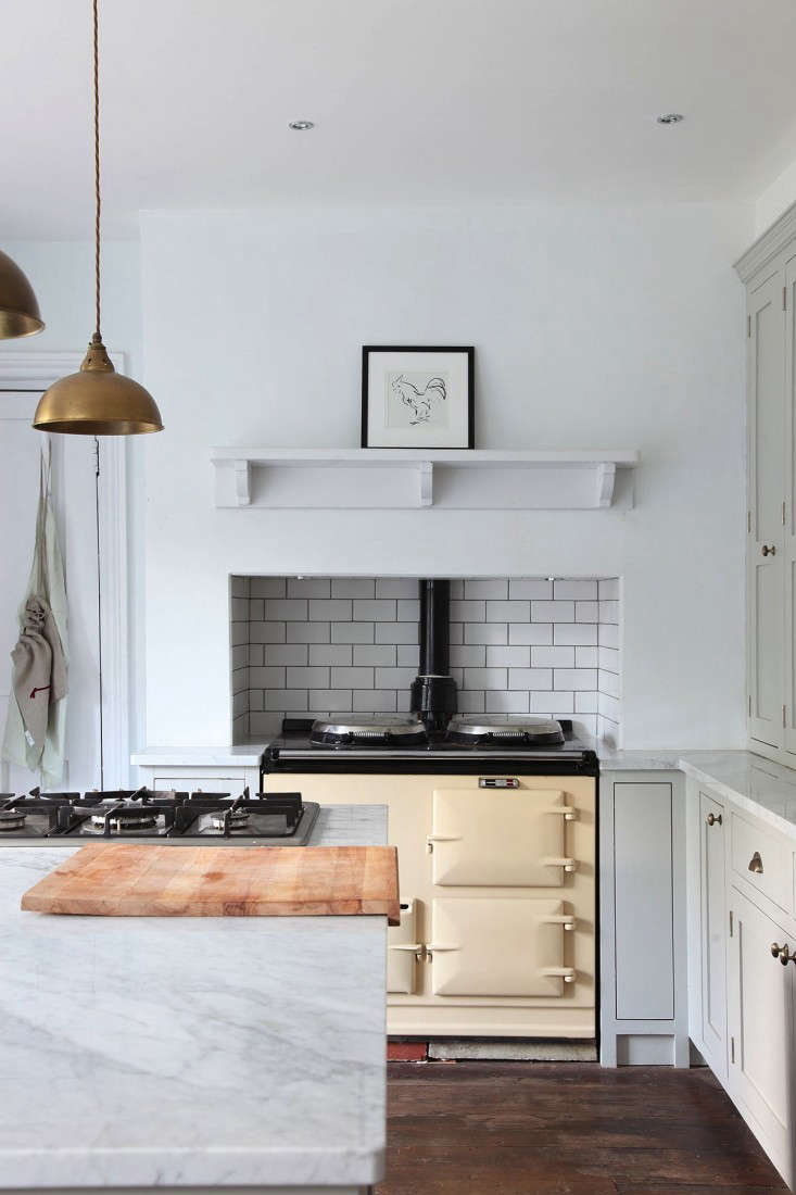
Kitchen tile used to have one job: stand behind the stove and quietly take tomato sauce to the face. Noble work, certainly. But today’s best tiled kitchens are refusing to stay in the background. Tile is climbing to the ceiling, wrapping around range hoods, slipping under islands, dressing floors like patterned rugs, and turning awkward corners into small moments of design glory.
The modern kitchen is no longer satisfied with a safe strip of subway tile and a polite nod to “timelessness.” Homeowners and designers are leaning into personality, texture, color, handmade character, and materials that feel collected rather than copied. A tiled kitchen can still be practical, durable, and easy to clean, but it can also be playful, moody, luxurious, nostalgic, or just plain fun.
Below are 11 unexpected kitchen tile details that prove tile can do much more than protect a wall. Think of this as a design menu: a little zellige for texture, a slab moment for drama, a patterned floor for attitude, and maybe a tiled island because apparently even islands deserve outfits.
Why Unexpected Kitchen Tile Details Are Having a Moment
Kitchen design has been moving toward warmth, personalization, texture, and multifunctional beauty. Tile fits perfectly into that shift because it combines form and function. Ceramic and porcelain tile can handle splashes, heat, and daily wipe-downs, while natural stone, handmade tile, and bold patterns add depth that paint alone cannot deliver.
Unexpected tile details also work because they let a kitchen feel custom without requiring every surface to shout. A colorful backsplash, a counter-to-ceiling tile wall, or a tiled niche can transform a simple kitchen into something memorable. The trick is balance: choose one or two tile statements, then let cabinetry, counters, lighting, and hardware support the look instead of wrestling it to the floor.
11 Kitchens with Unexpected Tile Details
1. The Counter-to-Ceiling Tile Wall
The classic backsplash stops under the cabinets. The unexpected version keeps going until it hits the ceiling and says, “I live here now.” Counter-to-ceiling tile creates a strong architectural backdrop, especially around a range, sink wall, or open shelving. It makes the kitchen feel taller, more finished, and more intentional.
This look works beautifully with handmade ceramic, glossy zellige-style tile, vertical subway tile, marble-look porcelain, or small-format mosaics. In a small kitchen, a full tile wall can actually simplify the room because there are fewer visual breaks. In a larger kitchen, it creates a focal point that anchors the entire space.
Design tip: If the tile has strong color or movement, keep upper shelving minimal. Let the wall do the talking. It has practiced its speech.
2. A Tiled Range Hood That Steals the Show
A tiled range hood turns a purely functional feature into a sculptural centerpiece. Instead of hiding the hood behind cabinetry or metal, designers are covering it with tile to create a seamless, dramatic, or charmingly handmade effect.
For a Mediterranean-inspired kitchen, terracotta or hand-painted tile can bring warmth. For a modern kitchen, slim stacked tile or stone-look porcelain can make the hood feel clean and architectural. For a cottage-style kitchen, a soft blue or cream tile can make the range wall look like it wandered in from a very chic countryside vacation.
Design tip: Confirm heat, ventilation, and installation requirements before tiling a hood. Beautiful is good. Beautiful and safely installed is better.
3. Tile Wrapped Around Open Shelving
Open shelves already invite attention, so why not give them a better background than plain drywall? Wrapping tile behind and around open shelves adds depth, color, and texture to everyday items like bowls, mugs, jars, and that one decorative pitcher nobody is allowed to touch.
This detail is especially effective when shelves are wood, brass, or black metal. The contrast between the tile and shelf material creates a layered look. Glossy tile can reflect light behind darker shelving, while matte tile can soften a bright kitchen with subtle texture.
Design tip: Choose grout carefully. Matching grout creates a calmer look; contrasting grout emphasizes the tile pattern and can make simple shapes feel graphic.
4. A Tiled Kitchen Island Front
The kitchen island is usually treated like a cabinet block with a countertop hat. But tiling the island front or sides gives it the presence of a furniture piece. It can be sleek, quirky, coastal, retro, or dramatic depending on the tile choice.
Fluted tile, kit kat tile, slim vertical tile, square zellige-style tile, and geometric mosaics all work well on island fronts. This is also a smart place to use bolder tile because it is visually important but not directly in the main cooking splash zone. Translation: less grease drama, more design applause.
Design tip: Consider durability around seating areas. Shoes, stools, and enthusiastic children can all become tiny demolition crews.
5. Tile Used Like a Kitchen Rug
A patterned tile “rug” on the floor can define a cooking zone, breakfast nook, or galley kitchen without adding actual fabric. This is especially useful in kitchens where washable practicality matters. A real rug near spaghetti sauce is a brave lifestyle choice; a tile rug is the sensible cousin with great taste.
Popular approaches include encaustic-look porcelain, checkerboard borders, mosaic insets, or a central pattern framed by simpler field tile. The result feels custom and architectural, especially in open-plan homes where the kitchen needs visual boundaries.
Design tip: Keep surrounding floors quieter if the tile rug is busy. The goal is “intentional focal point,” not “the floor is arguing with itself.”
6. Hand-Painted Tile as Kitchen Art
Hand-painted tile brings personality, craftsmanship, and a sense of story to the kitchen. Floral motifs, blue-and-white patterns, folk-inspired designs, and custom murals can turn a backsplash into artwork that also happens to survive splashes.
This detail works especially well behind a range, above a coffee bar, inside a butler’s pantry, or in a small breakfast corner. You do not need to cover every wall. Even a small framed panel of decorative tile can create the feeling of a collected, one-of-a-kind kitchen.
Design tip: Pair decorative tile with simple counters and cabinets. If everything in the room is the star, the kitchen becomes a talent show with no judges.
7. A Bold Grout Choice
Grout is often treated like an afterthought, but it can completely change how tile reads. Dark grout with white tile feels graphic and crisp. Warm beige grout softens handmade tile. Colored grout can turn ordinary tile into something playful and unexpected.
For example, soft green grout with cream tile can quietly echo sage cabinets. Terracotta grout with white tile can warm up a minimalist kitchen. Charcoal grout can make vertical tile feel more architectural. It is a small decision with a big personality, like a tiny espresso with a huge opinion.
Design tip: Test grout samples with the actual tile before committing. Grout can look different once installed, sealed, and surrounded by your lighting.
8. Tile Inside a Niche or Coffee Bar
Small tiled moments can be more charming than giant design gestures. A tiled niche, appliance garage, coffee station, pantry wall, or bar area adds personality without overwhelming the main kitchen.
This is the perfect place to use a tile you love but might not want everywhere: deep green zellige-style squares, glossy burgundy ceramic, terrazzo, scalloped tile, or a playful pattern. Because the area is smaller, you can often choose a more expensive tile without making the renovation budget faint dramatically.
Design tip: Repeat one color from the niche elsewhere in the kitchen through hardware, art, dishware, or textiles to make the detail feel connected.
9. Tile That Looks Like Wallpaper
Wallpaper-inspired tile is one of the most exciting ways to add pattern to a kitchen. It gives the visual charm of wallpaper with the moisture resistance and cleanability of tile. That means you can enjoy pattern near sinks and stoves without nervously whispering, “Please don’t splatter.”
Botanical prints, delicate geometrics, vintage motifs, and mural-style tiles can bring softness to hard-working kitchens. This detail works especially well in traditional, cottage, Spanish-style, and eclectic spaces, but it can also add surprise to a clean modern kitchen.
Design tip: Use wallpaper-look tile on one feature wall or backsplash zone. Too much pattern can shrink a room visually, especially if cabinets are also detailed.
10. Slab Tile and Stone-Look Porcelain for Seamless Drama
Not every unexpected tile detail is small and patterned. Large-format porcelain slabs and stone-look surfaces are changing the backsplash conversation. These materials create a sleek, continuous look with fewer grout lines, which is wonderful news for anyone who has ever stared at grout with a toothbrush and questioned every life decision.
Marble-look porcelain, quartzite-inspired slabs, and richly veined surfaces can make a kitchen feel luxurious without the maintenance concerns of some natural stones. They are especially striking when the slab runs behind the range, wraps around a corner, or continues from countertop to wall for a countersplash effect.
Design tip: Pay attention to veining direction and pattern matching. A dramatic slab should look intentional, not like it lost a fight with a puzzle.
11. Tile Around Windows and Corners
Windows, corners, and edges are where many kitchens lose design momentum. Tile can solve that. Wrapping tile around a window creates a polished, built-in look and makes the sink area feel special. Continuing tile around a corner can connect a cooking wall to a breakfast nook or pantry zone.
This approach is subtle but powerful. It avoids the awkward “backsplash ends here because we got tired” effect. With the right trim, edge detail, or bullnose finish, tiled corners can look crisp and tailored.
Design tip: Plan tile transitions before installation. The prettiest tile in the world can look messy if the edges are treated like a surprise quiz.
How to Choose the Right Tile Detail for Your Kitchen
Start with the Kitchen’s Personality
Before choosing tile, decide what your kitchen wants to be when it grows up. Warm and rustic? Clean and modern? Colorful and artsy? Calm and spa-like? Tile should support that identity. A glossy emerald backsplash can look stunning in a dramatic kitchen, while a soft handmade cream tile may be better for a relaxed, organic space.
Think About Cleaning Before Falling in Love
Tile is practical, but not all tile behaves the same way. Glazed ceramic, porcelain, and glass are generally easier to wipe clean than porous natural stone. Textured tile adds beauty but can collect more grease near a range. Natural stone may need sealing and gentle cleaners. In other words, choose with your heart, but let your sponge have a vote.
Use Bold Tile Where It Makes Sense
If you are nervous about pattern or color, place it in a smaller zone: a coffee bar, niche, island front, or pantry backsplash. If you love drama, go bigger with a full-height backsplash, tiled hood, or patterned floor. The best kitchens do not follow one formula; they match design ambition to real-life habits.
Balance Pattern, Color, and Texture
A kitchen can handle several materials, but they need rhythm. If your tile is colorful, keep counters quieter. If your counters are heavily veined, consider a simpler tile. If your cabinets are dark, glossy tile can add light. If your kitchen is very bright, matte or textured tile can add softness.
Common Mistakes to Avoid with Unexpected Kitchen Tile
Choosing Trend Over Longevity
Trends are useful for inspiration, but a kitchen renovation is not a disposable outfit. Choose tile you will still enjoy after the internet has moved on to something called “celery-core industrial cottage futurism.” If a trend fits your home and your taste, great. If it only looks good in someone else’s filtered photo, proceed with caution.
Forgetting Scale
Tiny mosaics can look busy across a large wall. Large slabs may overwhelm a very small kitchen if the veining is intense. Medium-scale tile often offers the safest balance, but rules can be broken when the proportions are planned well.
Ignoring Lighting
Glossy tile can bounce light beautifully, but it can also create glare. Matte tile can feel calm, but it may look flat in a dark room. Always view tile samples in morning light, evening light, and under your actual kitchen fixtures.
Skipping Professional Installation for Complex Details
A basic backsplash may be DIY-friendly for an experienced homeowner, but tiled hoods, slab porcelain, wrapped corners, niches, and patterned floors require precision. Good installation is the difference between “custom designer detail” and “weekend project that now haunts the household.”
Real-Life Experience: What Unexpected Tile Details Feel Like After the Photos
Unexpected kitchen tile details are easy to admire in a polished design photo, but living with them is where the real personality shows up. A full-height backsplash, for example, changes the way a kitchen feels every morning. Instead of staring at a painted wall while making coffee, you get light bouncing off texture, color shifting as the sun moves, and a surface that quietly makes the room feel finished. It is a small daily pleasure, which is exactly what good design should deliver.
In real homes, the best tile choices usually come from a mix of beauty and honesty. A family that cooks every night may love handmade tile behind the range, but they will love it more if the finish is easy to wipe. A homeowner who wants a bold patterned floor should think about crumbs, chair legs, and how the pattern looks from the next room. The glamorous choice is not always the highest-maintenance choice, but the maintenance should never be a mystery.
One of the most satisfying approaches is using unexpected tile in a contained zone. A tiled coffee bar can make a morning routine feel special without requiring a huge renovation. A tiled island front can refresh a kitchen that already has decent cabinets. A patterned backsplash behind open shelves can make ordinary dishes look styled, even if half the mugs are promotional freebies from conferences nobody remembers attending.
Texture also matters more in person than it does online. Handmade-looking tile has small variations that catch the light and make a kitchen feel alive. Those little ripples and uneven edges bring warmth, especially in kitchens with flat cabinet doors, stainless appliances, and smooth quartz counters. Perfect surfaces can feel cold when everything is too polished. Imperfect tile gives the eye somewhere to land.
Color can be surprisingly livable when used thoughtfully. Many people fear colorful tile because they imagine getting tired of it. But a muted green, smoky blue, warm terracotta, or creamy yellow can behave almost like a neutral when it connects to wood, stone, and metal finishes. The key is choosing a color with depth instead of a flat, overly bright shade. A kitchen should feel cheerful, not like it is wearing a party hat to a board meeting.
Another real-world lesson: grout deserves respect. Light grout may look soft and seamless, but it can show stains in heavy-use zones. Dark grout can be practical and graphic, but it emphasizes every tile line. Colored grout is fun, but it should be sampled first. Grout is not just filler; it is the punctuation of the tile sentence. Use too much contrast and the kitchen starts yelling in commas.
Unexpected tile details are also great for older homes because they can bridge past and present. A vintage-style patterned tile can honor the age of a house while modern cabinetry keeps the room functional. A zellige-style backsplash can soften new construction. A stone-look slab can make a modest kitchen feel more architectural. Tile has a rare ability to look both permanent and personal.
The biggest experience-based advice is simple: do not choose tile in isolation. Put samples next to cabinet doors, counter material, flooring, hardware, wall paint, and lighting. Look at everything together. The tile may be gorgeous on its own and still wrong for the room. Or, more happily, a tile that seems quiet in the showroom may become the exact detail that makes the whole kitchen click.
When done well, unexpected kitchen tile does not feel trendy for the sake of being trendy. It feels like evidence that someone paid attention. Someone cared about the corner by the window, the coffee station, the range wall, the island, the floor under breakfast stools. That is what makes a kitchen memorable. Not just expensive materials. Not just a perfect layout. Details. Delicious, durable, wipeable details.
Conclusion: Tile Is the Kitchen Detail That Refuses to Be Boring
The best tiled kitchens prove that practical surfaces can still have a sense of humor, drama, elegance, and soul. Whether you choose a counter-to-ceiling backsplash, a tiled range hood, a patterned floor, a colorful coffee bar, or a slab-style statement wall, tile can help your kitchen feel more personal and complete.
The secret is not to use every idea at once. Pick the detail that fits your home, your cooking habits, and your tolerance for visual excitement before breakfast. A little unexpected tile can go a long way. A lot of unexpected tile can be spectacular. Either way, your kitchen backsplash no longer has to sit quietly in the background taking marinara for the team.
Note: This article is written for web publishing in standard American English and synthesizes current kitchen design guidance, tile trend reporting, practical backsplash maintenance advice, and real-world design considerations without inserting source links into the article body.