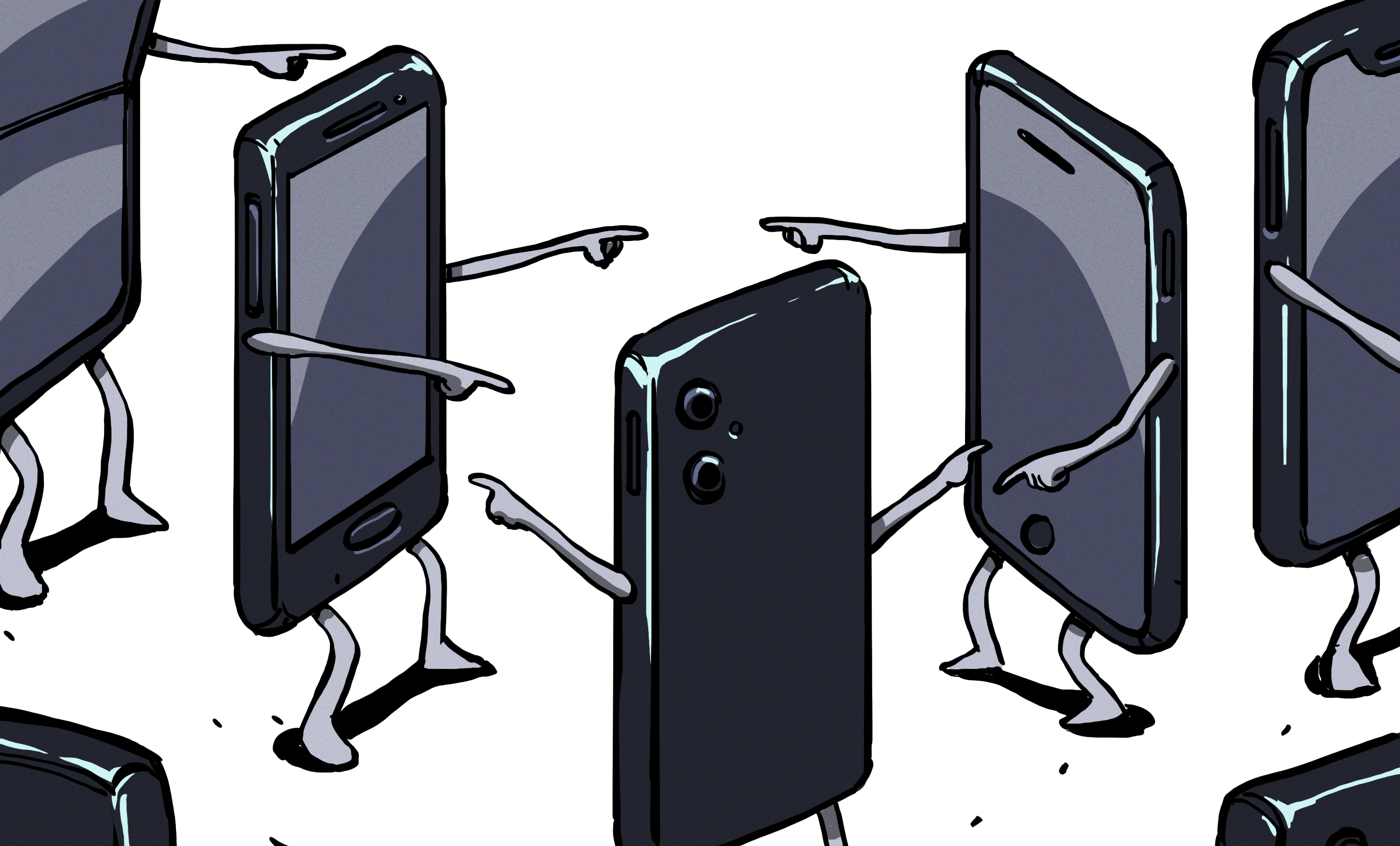
Once, electronics looked as though they had arrived from a specific future. Radios wore chrome faces, cameras bristled with purposeful controls, translucent computers glowed like candy, and a phone could be recognized from across a parking lot. Today, much of consumer technology follows the same visual recipe: a dark screen, rounded corners, a thin metal frame, and a camera bump doing its best impression of a kitchen stovetop.
Industrial design is not literally dead. However, its most visible qualities have been squeezed by screens, global supply chains, software ecosystems, corporate caution, and the relentless pursuit of thinness. We now live among remarkably capable devices that often feel emotionally anonymous. The technology has become smarter while the objects carrying it have become quieter, safer, and much harder to remember.
Industrial Design Is More Than Decoration
Calling industrial design “styling” is like calling architecture “choosing paint.” The Industrial Designers Society of America describes the field as a practice involving a product’s appearance, functionality, manufacturability, lasting value, and overall user experience. Industrial designers do not simply make a gadget attractive after the engineers finish arguing with the battery. They help determine how it feels, how it communicates, how it is assembled, and whether people can understand it without consulting a 94-page PDF.
At its best, industrial design translates invisible technology into a physical idea. A handle invites a grip. A dial suggests rotation. A hinge implies movement. A carefully placed seam can communicate where one function ends and another begins. Form becomes a quiet set of instructions.
Older electronics naturally offered designers more physical elements to compose. A cassette player needed a door, transport buttons, headphone ports, and room for a tape. A camera required a lens, shutter control, film mechanism, and viewfinder. Those limitations could be frustrating, but they also gave products recognizable faces. Today, the smartphone’s dominant component is a screen, and the screen would prefer the rest of the object to disappear.
When Electronics Had Faces
Braun and the Beauty of Legible Machines
Mid-century consumer electronics often displayed their purpose instead of hiding it. Dieter Rams and the Braun design team created radios, record players, speakers, and appliances with disciplined grids, restrained colors, clear typography, and logically arranged controls.
These products were minimal, but they were not blank. Their visual restraint emerged from function. Every switch, opening, marking, and proportion appeared to have a job. A Braun radio did not need decorative flames or an illuminated gaming logo to establish an identity. Its organization was its identity.
This is the difference between meaningful minimalism and the generic minimalism that dominates modern electronics. One removes confusion. The other occasionally removes everything except the charging port.
The Sony Walkman Made Technology Personal
The original Sony Walkman offers another example of industrial design shaping culture. Released in 1979, the TPS-L2 was only slightly larger than a cassette. It included two headphone jacks and a “hotline” button that allowed listeners to speak without fully removing their headphones.
Its blue-and-silver body, visible controls, metal details, and compact mechanical purpose made it feel both technical and personal. It did not pretend to be an invisible portal to content. It looked unmistakably like a Walkman.
The device changed behavior by making private music portable, but its cultural influence was strengthened by its physical form. You clipped it to your belt, ran the headphone cable through your jacket, and immediately announced that ordinary life now had a soundtrack.
The iMac Made Computers Look Alive
Personal computers of the 1980s and 1990s commonly arrived in varying shades of office oatmeal. The original iMac shattered that mood with a translucent Bondi Blue shell and a rounded all-in-one body. Later versions appeared in colors such as blueberry, grape, lime, strawberry, and tangerine.
The important innovation was not color alone. The iMac reframed a computer as something that could belong in a bedroom, kitchen, classroom, or stylish apartment without resembling surplus equipment from an insurance company. It had a face, a posture, and a sense of humor.
Even people who could not identify its processor could describe the computer. That is industrial design functioning as cultural translation: the internal technology provided capability, while the physical object gave that capability social meaning.
How the Black Rectangle Won
The Screen Ate the Product
The modern smartphone is both an engineering triumph and an industrial design trap. Its most valuable surface is the display, so designers are rewarded for maximizing that surface and minimizing everything around it. Bezels shrink, buttons disappear, speakers hide in narrow slots, and sensors move beneath the glass.
The closer a phone gets to becoming “all screen,” the less territory remains for visible character. From the front, many premium devices differ mainly in wallpaper and the location of a camera cutout. From the back, the camera island carries the burden once shared by keyboards, hinges, sliders, lenses, speaker grilles, and dozens of other elements.
Technology publications have been describing this convergence for years. WIRED has repeatedly observed that smartphones can be excellent and boring at the same time. Fast Company has explored how manufacturing difficulty, software expectations, component availability, and market response push phones toward similar shapes.
The rectangle is not evidence that designers stopped thinking. It is evidence that the industry discovered an extremely successful answer and became nervous about asking a different question.
Minimalism Became a Corporate Costume
Good minimalism removes confusion. Bad minimalism removes identity. The electronics industry learned the visual vocabulary of Applealuminum, glass, hidden fasteners, pale packaging, and sparse typographyand copied the individual ingredients without always understanding the recipe.
Soon, every router, speaker, charger, thermostat, and electric toothbrush wanted to look as though it had been approved by a committee wearing matching gray turtlenecks.
A Braun radio could be visually quiet because every detail had a role. Much contemporary “minimal” hardware is quiet because nearly every detail has been deleted. One creates calm; the other creates absence.
Color alone cannot solve the problem. Painting a generic slab bright yellow may make it easier to locate on a desk, but it does not automatically give the object meaning. Memorable consumer electronics need proportion, tactility, interaction, construction logic, and a convincing reason for looking the way they do.
Why Electronics Became So Visually Safe
Global Supply Chains Prefer Familiar Shapes
Modern devices are assembled through complex networks of display manufacturers, battery suppliers, chipmakers, camera specialists, antenna engineers, software teams, factories, and logistics partners. A product must survive heat tests, drop tests, waterproofing requirements, regulatory approval, automated assembly, and shipping containers.
A dramatic physical form can interfere with several systems at once. The bold sketch that looks wonderful on a studio wall may block an antenna, reduce battery space, weaken the frame, increase packaging volume, and cause the manufacturing team to develop a collective eye twitch.
Technology design is therefore no longer a simple handoff from a creative industrial designer to a factory. Hardware layout, electronics, software, cloud services, testing, and manufacturing must be developed together. This coordination can produce exceptional products, but it also favors conservative forms.
Corporate Risk Management Hates Personality
Distinctive design divides opinion. Some people may adore a strange shape while others reject it immediately. That tension can make a product culturally powerful, but a manager studying sales forecasts may see only lost customers.
Neutrality promises a larger audience. It also produces products that are difficult to love because they were intentionally designed to be difficult to dislike.
Market research can deepen the problem. When every choice is evaluated against existing expectations, the safest result is a polished version of something customers already recognize. The process is logical, measurable, and remarkably effective at sanding the weirdness off an idea.
By launch day, the rebellious concept has become a tasteful aluminum rectangle with “premium materials” and a press release describing its slightly curved edges as revolutionary.
Software Became the Main Attraction
For many technology companies, hardware is now a doorway into subscriptions, advertising, cloud storage, app ecosystems, digital services, or recurring upgrades. That business model changes the role of industrial design.
The device is expected to be dependable, scalable, and visually unobtrusive. Meanwhile, software receives the animation, customization, experimentation, and personality. A stable physical platform can reduce learning curves and improve accessibility, but it can also turn hardware into a neutral container.
When the function of an object can change after a software update, its exterior no longer needs to explain exactly what it does. It becomes a blank stageand blank stages tend to look alike.
Thinness, Sealed Bodies, and the Disappearing Owner
The pursuit of thinness has given us lighter laptops, pocketable phones, and elegant tablets. It has also encouraged glued batteries, hidden screws, fused assemblies, and products that resist disassembly.
Adhesives can improve water resistance, durability, and compactness. However, repair specialists note that excessive glue makes screens, batteries, and internal components harder to replace. The Federal Trade Commission has also examined how manufacturer restrictions can limit repair choices and increase the difficulty of maintaining consumer products.
This is an industrial design issue, not merely a repair-shop complaint. A device communicates ownership through its construction. Visible screws, accessible panels, and replaceable modules suggest that an object can be understood and maintained. A sealed shell suggests temporary custody: you may use the product, but its interior remains the manufacturer’s private kingdom.
Modern electronics often look permanent while behaving as disposable. Metal and glass imply durability, yet a worn battery can end the useful life of an otherwise pristine object. The visual language says “heirloom.” The service model says “see you at the trade-in counter.”
Industrial Design Is Not DeadIt Moved
From Product Shapes to Complete Systems
The obituary is premature because industrial design has expanded rather than vanished. Designers now work across hardware, software, packaging, retail environments, accessibility, sustainability, repair, and connected services.
The best contemporary products are not merely attractive shells. They are coordinated experiences. A laptop hinge, setup animation, charging connector, repair manual, companion app, and shipping box can all belong to the same design system.
Cooper Hewitt’s account of Google Glass, for example, describes the challenge of transforming a clunky technical prototype into an object that could be comfortably worn. Microsoft’s hardware guidance similarly considers tactility, materials, mechanical force, manufacturing quality, and software response as interconnected parts of the user experience.
The industrial designer has not left the room. The room has simply become much larger and now contains several hundred engineers.
The Rebels Prove Dullness Is a Choice
Distinctive electronics still appear when companies accept the cost of having an opinion. Nothing uses transparent surfaces, exposed graphic elements, and lighting to make its phones recognizable. Google’s Pixel devices use camera bars, color blocking, and softer materials to create a family identity. Foldable phones reintroduce hinges and physical movement.
Modular computers and repair-focused products turn access into a design feature rather than an embarrassing secret hidden beneath adhesive. Some newer tools and home electronics also use unusual forms, colors, and interfaces to challenge traditionally dull product categories.
These products are not always perfect, and that is partly why they matter. Their peculiarities create conversation. They remind consumers that a device can be an object with character rather than a delivery mechanism for notifications.
How Electronics Could Become Interesting Again
Design for Recognition
A product should remain identifiable when its screen is off, its logo is covered, and the dramatic marketing lighting has been removed. Meaningful silhouettes, proportions, material transitions, controls, and construction details can give an object a recognizable physical identity.
Designers should ask whether users could identify a device by touch in a dark roomnot merely whether it looks impressive while spinning inside a promotional animation.
Restore Useful Physical Controls
Not every function needs a dedicated button, but some certainly benefit from one. Camera shutters, volume wheels, mute switches, programmable keys, and textured surfaces can be faster and more accessible than controls hidden behind multiple layers of software.
A physical control provides location, resistance, and feedback. It allows the hand to learn a product. That does not mean turning every gadget into an airplane cockpit; it means recognizing that glass is not the perfect interface for every task.
Make Repairability Part of the Aesthetic
Repairable products do not need to resemble unfinished laboratory equipment. Screws can be attractive. Replaceable modules can create visual rhythm. Access panels can become intentional design features.
A product that explains how it comes apart may develop more character than a seamless shell whose greatest achievement is pretending it was grown in one piece.
Design Products to Age Gracefully
Consumer electronics are usually photographed at the moment of birth, untouched by scratches, fingerprints, cables, dust, or reality. Better industrial design considers the fifth year as seriously as the first five minutes.
Materials should wear gracefully. Batteries should be serviceable. Software support should reflect the durability of the physical object. The goal should be patina and long-term attachment rather than premature retirement.
Accept That Delight Has Practical Value
A satisfying click, surprising color, visible mechanism, playful sound, or clever charging dock may appear unnecessary on a spreadsheet. Yet those details often determine whether users enjoy and keep a product.
Emotional durability is practical. People are more likely to maintain objects they understand, enjoy, and feel connected to.
Living Through the Era of Dull Electronics: A Personal Experience
The decline of visible industrial design becomes obvious when you clean out an old drawer. Older electronics often return as distinct memories. There is the silver compact camera with the sliding lens cover, the tiny MP3 player with a click wheel, the flip phone that snapped shut with courtroom-finality, and the portable radio whose tuning dial made stations drift into focus like distant planets.
Even when broken, these objects retain their identities. Each seems to remember the particular job it was designed to perform.
Now place three recent smartphones on a table with their screens turned off. Unless you are a repair technician or someone who studies camera-bump rumors recreationally, the devices can become surprisingly difficult to distinguish. Pick up the wrong one and your first clue may be that your face fails to unlock it. This is an impressive technical achievement wrapped in a small social comedy.
The same sensation appears in electronics stores. Televisions have become almost entirely screen, so the physical product disappears. Laptops form a migration of thin silver wedges. Wireless earbuds live inside smooth black or white pebbles. Smart speakers resemble fabric-covered air fresheners. Everything is tasteful, competent, and strangely difficult to remember after leaving the building.
Using these products can still be wonderful. Modern displays are bright, batteries last longer, cameras produce astonishing images in poor light, and setup is dramatically easier than it was twenty years ago. Nostalgia should not become an unlimited warranty for the past. Old gadgets were often bulky, fragile, confusing, and powered by enough disposable batteries to concern a small environmental agency.
Yet older products frequently offered a stronger sense of participation. Loading a cassette, opening a camera lens, rotating a tuning dial, replacing a battery, or connecting a cable made the device’s operation visible. You understood the sequence because your hands performed it. Modern interfaces compress many of those actions into taps on glass. The process is quicker, but the physical object contributes less to the experience.
Phone cases reveal the contradiction. Manufacturers spend years perfecting glass curves, polished frames, and microscopic tolerances. Customers then immediately wrap the result in rubber because the phone is slippery, fragile, expensive, and visually similar to every other phone.
The protective case becomes the industrial design people actually experience. It provides grip, color, texture, kickstands, wallets, finger loops, and personality. The official device is the engine; the accessory becomes the body.
There is also an emotional distance created by sealed construction. When an old remote stopped working, you opened the battery compartment. When a desktop computer needed more memory, you removed a panel. When a toy broke, there was at least a visible argument involving several screws.
A sealed modern device offers no such invitation. It presents an image of perfection until the moment it presents a repair bill.
The most refreshing contemporary electronics are therefore not always the most technologically advanced. They are the ones that acknowledge being physical things. A textured dial on a speaker, a colored switch on a keyboard, a hinge that closes confidently, or a transparent panel showing internal structure can create disproportionate delight.
These details suggest that someone considered the fingers, eyes, habits, curiosity, and surroundings of the person using the product. That is what is missing from dull electronics: not decoration, but recognition.
People want devices that recognize their bodies and their desire to understand how things work. They also want to recognize the devices themselves. A world filled with competent rectangles is convenient, but convenience alone does not create culture.
The hopeful sign is that boredom eventually becomes a market opportunity. Once every company converges on the same safe answer, difference becomes valuable again. Transparent phones, folding screens, modular laptops, tactile controls, expressive colors, repairable construction, and unusual materials are already pushing against the edges of the rectangle.
Some experiments will fail spectacularly. That is not a tragedy. Industrial design has always advanced through objects brave enough to risk looking strange.
Conclusion: The Physical Object Still Matters
Industrial design did not die. It was compressed by screens, hidden inside services, disciplined by manufacturing, and softened by corporate caution. The resulting electronics are often better than ever in performance and worse than ever at introducing themselves.
The next era does not need to reject minimalism or bring back every button from 1998. It needs to restore meaning to physical form. Products can be simple without being anonymous, repairable without being clumsy, and technologically mature without becoming visually sedated.
The challenge is not to add decoration. It is to give electronics a reason to look, feel, and behave like themselves. When every device becomes a flawless black rectangle, the boldest innovation may be something wonderfully obvious: an object with a face.