A successful kitchen renovation does not always begin by ordering an island large enough to have its own postal code. Sometimes it starts with a more thoughtful question: Which room should become the true center of the home?
In an Edwardian house in Upminster, East London, the answer was the original dining room. With tall ceilings, garden views, period moldings, and beautiful waxed oak floors, it had the proportions and atmosphere the existing closet-size kitchen lacked. Designer Sophie van Winden of Owl Design worked with the homeowners and deVOL Kitchens to transform that formal room into a colorful, practical gathering space.
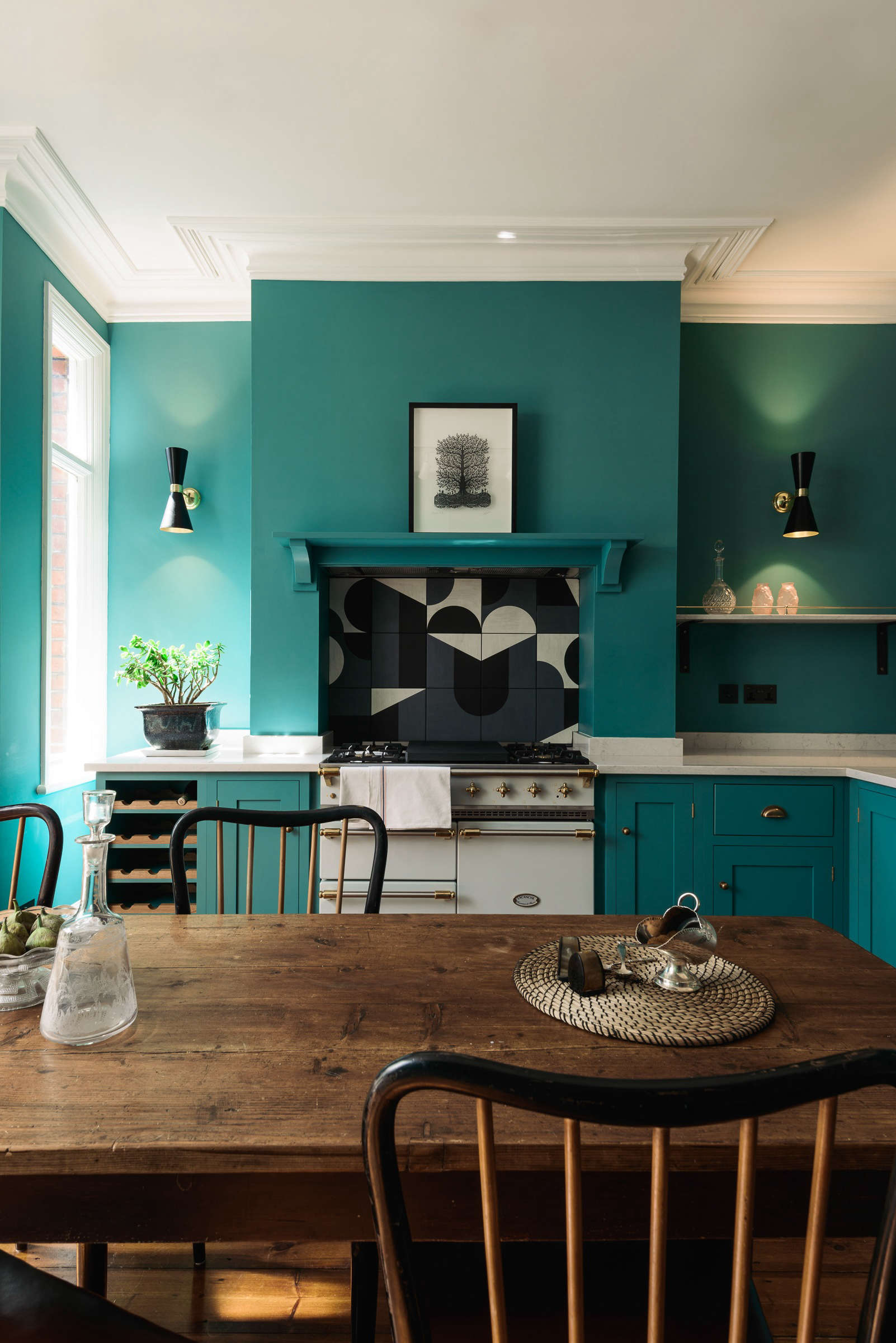
The finished design combines traditional deVOL Shaker cabinetry, blue-green walls, polished quartz surfaces, aged brass details, and a dramatic geometric tiled backsplash. It respects the architecture without behaving as though modern life never happened. The result is cheerful, sophisticated, and highly instructive for anyone planning a traditional kitchen with a contemporary streak.
A London kitchen that begins with the room, not the cabinets
The most important design decision was made before anyone debated paint samples or cabinet knobs. The homeowners relocated the kitchen into the former dining room, while the cramped side-extension kitchen became a utility space.
This change gave the household a larger, brighter hub connected to the garden and conservatory. It also allowed the kitchen to inherit architectural details that instantly made it feel established. Rather than forcing period charm into a plain box with decorative trim and crossed fingers, the designers worked with a room that already had character.
That approach is particularly relevant in older London houses. Their layouts often reflect another era, when kitchens were hidden service areas rather than social rooms. Moving a kitchen can involve plumbing, electrical work, ventilation, and a larger construction budget, but the improvement in daily flow may justify the investment. A beautiful countertop cannot compensate for a room in which two people must negotiate passage like diplomats at a narrow border crossing.
“`
Why the original fireplace became an asset
The old fireplace niche provided a natural location for the range. Instead of treating the chimney breast as an awkward obstacle, the design turned it into the cooking zone and visual anchor.
This strategy gives the range a sense of permanence while preserving the room’s historic rhythm. It also demonstrates a useful renovation principle: inherited architectural features do not automatically need to be removed. A fireplace opening, alcove, ceiling beam, or uneven wall can become the detail that makes a custom kitchen memorable.
“`
Why deVOL Shaker cabinetry works in an Edwardian interior
Shaker-style cabinetry is based on a restrained five-piece door: a recessed center panel surrounded by simple rails and stiles. Its appeal comes from proportion and craftsmanship rather than carved decoration. That makes it unusually adaptable. It can appear rustic in natural wood, crisp in white, modern in charcoal, or distinctly English when painted in a complex heritage color.
In this London kitchen, deVOL’s Shaker cupboards provide a calm architectural framework for much more expressive choices. The doors have enough detail to suit the Edwardian room but remain visually quiet beside the statement tile. This balance is essential. When cabinetry, tile, countertops, lighting, and hardware all demand top billing, the kitchen begins to resemble an awards ceremony with no audience.
The fitted cabinets also create practical storage without erasing the character of the room. A tall bank of cabinetry accommodates a full-size refrigerator, freezer, and double-door larder. Keeping these larger functions together produces a cleaner main cooking area and reduces visual interruption around the range and sink.
“`
The value of furniture-like details
A convincing English kitchen rarely feels like a continuous wall of identical boxes. Furniture-style proportions, framed doors, visible legs, cornices, freestanding tables, and carefully selected hardware help the room feel collected rather than installed in one frantic afternoon.
Here, an old English refectory table takes the place of a conventional island. It introduces age, warmth, and a social function without adding another heavy block of cabinetry. Midcentury chairs prevent the composition from becoming overly traditional, proving that a room can respect history without dressing entirely for a costume drama.
“`
A bold blue-green palette unifies cabinets and walls
The cabinet and wall color is a saturated blue-green known as South Bank from Fired Earth. Using the same shade across both surfaces creates continuity and allows the cabinetry to merge with the architecture. Instead of outlining every cabinet against a contrasting wall, the color wraps the room in a single atmospheric layer.
Color drenching is especially effective in rooms with tall ceilings, original trim, and abundant natural light. The uninterrupted color can make a complex space feel calmer while drawing attention to texture, silhouette, and changing daylight. In this case, the blue-green also relates naturally to the garden outside and complements the pink tones visible in the adjoining hall.
The lesson is not that every kitchen should be turquoise. The larger lesson is to evaluate color relationships beyond the kitchen doorway. A cabinet finish should respond to neighboring rooms, flooring, outdoor views, and the quality of natural light. A paint chip that looks pleasantly sage under showroom lighting can become surprisingly minty beside a warm oak floor.
“`
How to use saturated kitchen color without creating chaos
A strong cabinet color works best when several other elements remain disciplined. The countertops are pale, the cabinetry has a consistent profile, and the major appliances are integrated into a clear layout. Brass hardware adds warmth, but it does not introduce another competing color family.
Homeowners considering a similar scheme should test large painted boards on multiple walls. View them during the morning, afternoon, and evening, and place them beside the proposed countertop and tile. Tiny samples are useful for choosing lipstick. They are less reliable when deciding what should cover an entire kitchen.
“`
The statement tiled backsplash acts like functional artwork
The kitchen’s most recognizable feature is its geometric backsplash, created with Puzzle tiles designed by Edward Barber and Jay Osgerby. Their interlocking graphic pattern introduces sharp modern geometry into a room defined by traditional moldings, framed cabinetry, antique furniture, and oak flooring.
This contrast is what gives the space energy. A conventional neutral subway tile would have been safe, but it would not have created the same conversation between past and present. The Puzzle tiles protect the walls around the sink and range while functioning almost like a permanent art installation.
The placement is controlled rather than excessive. The pattern is concentrated in hardworking backsplash zones, allowing the painted walls to provide visual breathing room. This is an effective strategy for expensive or highly distinctive tile: use it where it has practical value and where the eye naturally lands.
“`
Why geometric tile complements Shaker cabinets
Shaker doors and geometric tiles share a basic visual language. Both are constructed from strong lines, repeated shapes, and careful proportions. The difference is one of intensity. The cabinetry supplies a slow, steady rhythm; the backsplash delivers the drum solo.
Because the cabinet design is simple, it can support a patterned backsplash without making the room feel ornate. Meanwhile, the tile keeps the Shaker kitchen from appearing generic. This relationship is useful in many renovation styles. Pair quieter permanent elements with one deliberately expressive surface, then repeat small hints of its color elsewhere.
Handmade variation versus machine-perfect uniformity
Statement tile does not need an elaborate printed pattern. Handmade glazed tiles can create drama through tonal variation, irregular edges, and reflected light. Slight differences between pieces give a wall depth that perfectly uniform tile may lack.
Before installation, unpack several boxes and blend tiles from different batches. Lay a representative section on the floor or photograph a dry layout. This step helps distribute darker, lighter, glossier, or more textured pieces naturally. Otherwise, an accidental cluster may appear on the wall and stare at you through every breakfast.
“`
Countertops, brass, and appliances complete the material story
The kitchen uses polished Lagoon Silestone for the counters and open shelves. The pale engineered surface reflects light and creates a clean horizontal break between the saturated cabinetry and graphic backsplash. Its restrained appearance allows the tile and paint to remain the visual focus.
An aged brass faucet and brass cabinet hardware add warmth against the cool blue-green background. Brass is particularly effective in traditional kitchens because it develops character and sits comfortably beside wood, painted cabinetry, and vintage furniture. A living finish may darken or change with use, which should be considered part of its appeal rather than an emergency requiring three cleaning products and a motivational podcast.
The Lacanche range, finished in a soft celery-green shade called Silice, contributes another nuanced color without introducing a harsh contrast. Rather than selecting a standard appliance finish and attempting to disguise it, the design treats the range as part of the decorative composition.
“`
Lighting that feels residential, not clinical
Polished brass wall sconces illuminate the working area and reinforce the room’s warm metallic accents. Wall lights are an excellent addition to an older kitchen because they provide light at eye level and contribute decorative character without crowding the ceiling.
A practical lighting plan should still include ambient, task, and accent illumination. Decorative sconces alone may look charming while leaving someone chopping onions in mysterious semi-darkness. Under-shelf lighting, well-positioned ceiling fixtures, and dimmers can preserve atmosphere while supporting actual cooking.
“`
Why omitting the island improved the layout
An island was considered during planning but ultimately removed from the design. That decision preserved circulation around the table, range, sink, garden doors, and fitted storage.
Kitchen islands are useful, but they are not proof that a renovation has succeeded. In a period room, a large built-in island can block sightlines, crowd doorways, and fight the original architecture. A freestanding table may provide food preparation space, informal dining, and flexibility with less visual weight.
Before adding an island, map the clearance required for appliance doors, cabinet drawers, seating, and people carrying hot pans. Mark the proposed footprint on the floor with painter’s tape, then live with it for several days. Walk around it, open everything, and invite another person into the room. If every movement becomes an intimate team-building exercise, the island is probably too large.
How to recreate the look without copying it
The strongest interiors are translated, not duplicated. A successful interpretation of this deVOL kitchen should borrow its design logic rather than reproduce every color and product.
“`
Start with restrained cabinet architecture
Choose well-proportioned Shaker doors with a genuine recessed panel and a durable painted finish. Inset cabinetry creates a particularly tailored appearance, although full-overlay cabinets can produce a similar effect at a different price point. Avoid unnecessary molding when the backsplash is intended to be the star.
Select one emotionally confident color
Consider blue-green, olive, aubergine, brick red, smoky blue, or another complex shade that changes with the light. Use it consistently on cabinetry and possibly the surrounding walls. Balance the color with pale stone, quartz, or warm wood rather than adding multiple unrelated finishes.
Treat tile as part of the architecture
Decide where the tile should begin and end before ordering it. Align terminations with shelves, cabinet edges, window frames, or architectural openings. A bold backsplash looks intentional when its boundaries make sense. Random stopping points make even expensive tile look as though the installer ran out before lunch.
Repeat materials sparingly
Carry the hardware finish into the faucet or lighting, repeat a tile color in a painted appliance or accessory, and connect the kitchen to adjacent rooms through flooring or wall color. Two or three thoughtful repetitions create cohesion. Fifteen repetitions create a theme restaurant.
“`
Common mistakes when combining Shaker cabinets and statement tile
The first mistake is choosing the cabinet paint and backsplash independently. The undertones must cooperate. Place the samples together beside the countertop and under the actual room lighting before making a final decision.
The second mistake is ignoring grout. A high-contrast grout emphasizes every joint and intensifies the pattern. Tonal grout creates a softer, more continuous field. Neither choice is automatically correct, but it should be deliberate. Grout also needs appropriate sealing and maintenance in areas exposed to grease, steam, and tomato sauce with ambitious travel plans.
The third mistake is failing to plan the tile layout. Dry-lay the pattern, center important motifs, and avoid tiny cuts at visible edges. Outlets should be coordinated early so they do not interrupt the most interesting part of the design.
Finally, resist filling every remaining wall with open shelves, rails, artwork, utensils, and decorative cookware. A statement backsplash needs enough open space to be read as a composition. Practical objects can add life, but the room should still provide clear work surfaces.
Experience notes: what living with a kitchen like this can teach you
Photographs capture a kitchen on its best-behaved day. The real test begins when breakfast is late, someone cannot find the colander, and three grocery bags arrive while the dishwasher door is open. A design inspired by this London kitchen succeeds because its expressive choices are supported by practical planning.
“`
Bold color often becomes easier to live with over time
Homeowners sometimes fear that saturated cabinetry will feel exhausting. In practice, a complex blue-green can behave almost like a neutral when it is applied consistently and paired with natural wood, pale counters, and warm metal. It changes throughout the day, appearing brighter in direct sun and deeper during the evening. This movement gives the kitchen atmosphere that flat white walls may not provide.
The experience is usually less about constantly noticing the color and more about sensing that the room feels settled. Consistency is important. When the walls and cabinets share a shade, the eye is not repeatedly stopping at contrasting boundaries.
A patterned backsplash changes the way clutter is perceived
Graphic tile provides energy, but it also raises the importance of countertop editing. A kettle, utensil pot, cutting board, mixer, fruit bowl, mail stack, and six decorative jars can quickly compete with the pattern. Keeping only frequently used objects visible allows the backsplash to remain expressive rather than noisy.
This does not require maintaining a showroom. It means giving appliances and food packages assigned storage so the kitchen can return to order without a major expedition. A generous larder or appliance cabinet becomes especially valuable in a colorful room.
A table can outperform an island socially
A freestanding table offers a softer experience than a fixed island. People can sit face-to-face rather than lining up on stools, and the table can host homework, breakfast, flowers, food preparation, or a long dinner. It also allows chairs to be changed and the furniture to move as household needs evolve.
The trade-off is that a table may not provide built-in outlets, plumbing, or storage. That makes strong perimeter planning essential. The sink, range, refrigerator, waste bin, and main preparation surface must still form an efficient working arrangement.
Natural finishes look better when perfection is not the goal
Aged brass, oak flooring, handmade tile, and painted wood develop marks and subtle changes. Owners who expect every surface to remain untouched may find these materials frustrating. Those who appreciate patina often discover that normal wear makes the room feel richer.
Maintenance should still be sensible: wipe splashes promptly, use gentle products approved for each finish, protect vulnerable countertops, and clean grout before stains settle. The goal is graceful aging, not surrender.
The best historical renovations feel current because they are useful
The lasting lesson of this deVOL kitchen is not simply that turquoise cabinets and geometric tiles look good together. It is that historical character becomes meaningful when it supports contemporary life. The fireplace frames the range, the dining room becomes the family hub, the old table replaces an oversized island, and modern storage is integrated into traditional cabinetry.
That combination makes the kitchen feel personal rather than themed. It acknowledges the house’s age while allowing its occupants to cook, gather, store groceries, and move comfortably. Good design is rarely a battle between old and new. It is a negotiation in which both sides leave the table pleased.
“`