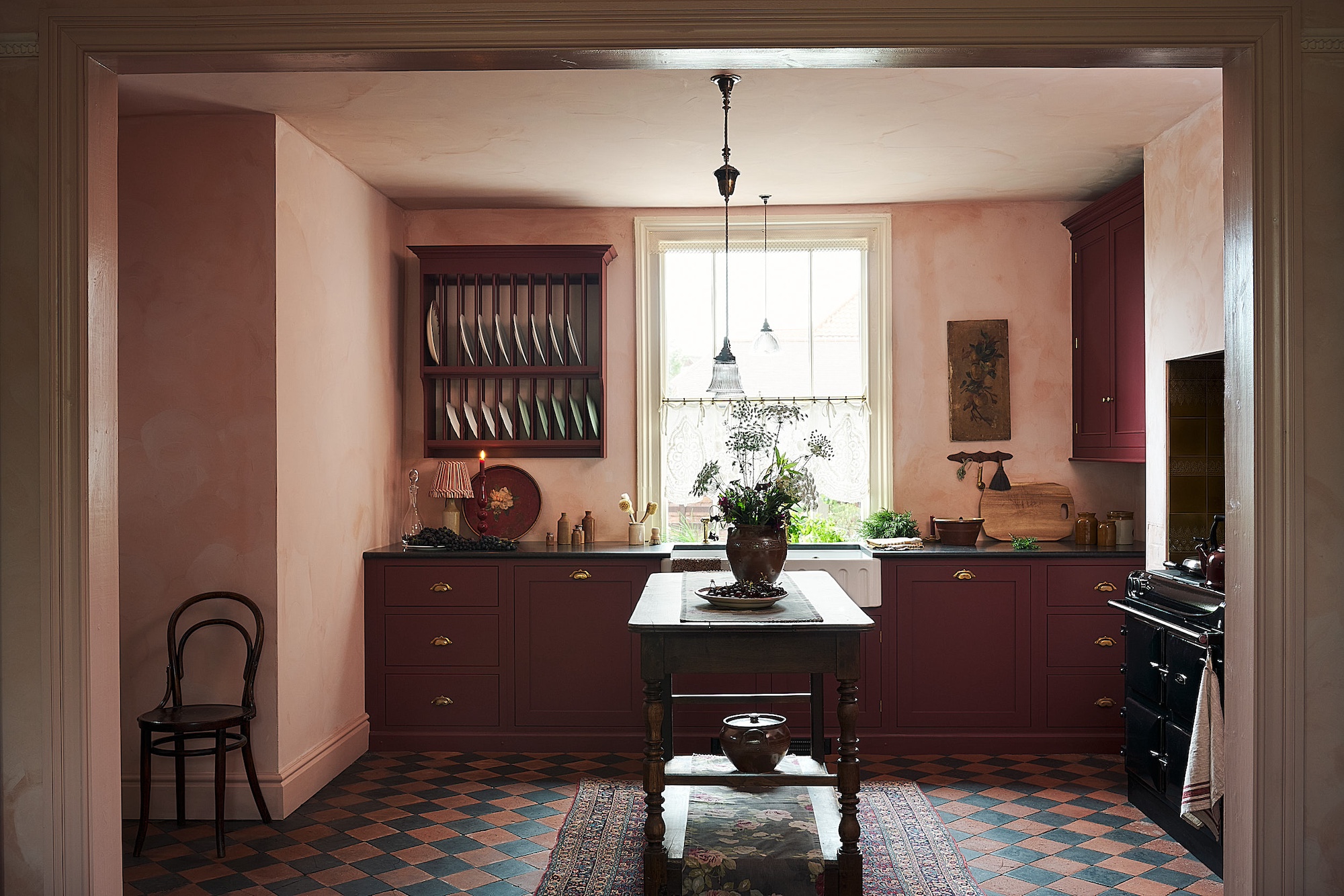
Some kitchens are designed to impress. Others are designed to be used. And then there is the rare, glorious creature that manages to do both while looking like it wandered out of a novel with muddy boots, fresh scones, and excellent opinions about curtain fabric. That is the charm of a deVOL kitchen dressed in red, pink, and lace in the English countryside: it feels romantic without being flimsy, polished without being stiff, and beautiful without acting like nobody is allowed to fry an onion in it.
At first glance, the combination sounds a little mischievous. Red? In a country kitchen? Pink too? And lace? That last detail especially can make people nervous, probably because they imagine a room one teacup away from complete theatrical collapse. But in the right hands, and particularly in the sort of layered, soulful setting deVOL is known for, these elements do not feel precious. They feel lived in. They feel storied. They feel like a kitchen that knows how to host a pie, a muddy dog, and a very long conversation.
This is what makes the look so appealing right now. Homeowners are tired of kitchens that seem designed mainly for being photographed next to a bowl of lemons. They want warmth. They want personality. They want rooms that can carry color, history, and a bit of playful eccentricity without slipping into chaos. A deVOL kitchen in the English countryside answers that brief beautifully. It treats cabinetry like furniture, color like atmosphere, and textile details like secret weapons.
Why This Color Story Works So Well
Red, pink, and lace sound dramatic on paper, but in practice they form a surprisingly intelligent palette. Red brings structure. Pink softens the mood. Lace introduces delicacy and pattern without demanding center stage. Together, they create tension in the best possible way: grounded and airy, bold and gentle, historic and fresh.
Red gives the room its backbone
Every memorable room needs an anchor, and in this kind of kitchen, red does the heavy lifting. It can show up in painted cabinetry, a range alcove, a tiled accent, a checked runner, or even a single antique stool with a worn crimson seat. Red gives the eye somewhere to land. It creates warmth instantly, which is particularly effective in a countryside setting where stone floors, old plaster, and gray English light can lean cool if they are not balanced with something richer.
The trick is to think less bright tomato and more nuanced, heritage-friendly red. Oxblood, burgundy, brick, claret, and muted berry all feel at home here. These shades do not shout. They murmur with conviction. They look beautiful against natural wood, aged brass, cream walls, and handmade tile. In a deVOL-style space, red behaves less like a trend color and more like an heirloom coat: practical, handsome, and somehow better with age.
Pink is the peacemaker
Pink in a kitchen used to be treated like a rebellious choice. Now it feels clever. In an English-country context, pink does not have to read sugary or juvenile. Dusty pink, plaster pink, blush, shell, or the faintest chalky rose can soften cabinetry, walls, or ceilings in a way that flatters everything around them. It warms white paint, mellows dark wood, and makes red feel intentional rather than aggressive.
Pink is especially effective because it changes throughout the day. In the morning, it can feel almost neutral. At lunch, it seems optimistic. By evening, in the glow of lamps and a kettle on the stove, it turns cozy and cinematic. In other words, it works very hard while pretending to be effortless, which is frankly the dream.
Lace is the wink, not the costume
Lace is the most intriguing part of the trio because it introduces softness in a kitchen, which is normally a world of hard edges: wood, stone, enamel, metal, glass. A lace panel at a window, a scalloped café curtain, or a textile with a lace-like motif can make the room feel intimate without turning it into a stage set. Used sparingly, lace becomes texture rather than decoration. It filters light, diffuses formality, and adds just enough romance to keep the room from looking overly disciplined.
The smartest version of lace in this setting feels inherited, thrifted, or quietly handmade. It should look like something discovered in a linen cupboard, not ordered in panic from a website at 2 a.m. after searching “English cottage vibes.” The goal is atmosphere, not costume drama.
What Makes a deVOL Kitchen Different
deVOL kitchens are admired because they rarely look like they were installed all at once on a Tuesday. Even when they are beautifully made and newly fitted, they tend to feel collected. That is a big difference. The cabinetry has a furniture-like quality. The finishes are tactile rather than glossy. The hardware often looks like it belongs in an old utility room, which is a compliment of the highest order.
In a countryside home, this approach matters. A historic setting does not always need a kitchen that mimics the past exactly, but it does benefit from one that respects the architecture. That means cabinetry that feels rooted, colors that sit comfortably with old materials, and details that acknowledge the age of the house rather than arguing with it. A deVOL-style kitchen succeeds because it understands restraint. It lets the room breathe. It does not need to prove it has a Pinterest account.
In the look suggested by “red, pink, and lace,” that sensibility becomes even more appealing. The kitchen is allowed to be decorative, yes, but still practical. Plate racks can hold daily dishes. Open shelves can display ironstone, jam jars, and the one slightly chipped bowl everyone mysteriously loves most. A small table can function as prep space, homework station, flower-arranging bench, and emergency toast headquarters. Nothing is too polished to be used, and that is precisely why it feels luxurious.
The English Countryside Effect
Location matters. The same red-and-pink kitchen dropped into a glassy downtown loft would tell a completely different story. In the English countryside, however, the palette takes on depth. It makes sense beside old brick, weathered beams, aged floorboards, and gardens that look good even when they are being dramatic about the rain.
An English-country kitchen is less about perfection and more about temperament. It should feel welcoming, slightly layered, and comfortable with a bit of visual noise. Natural materials help. So do antiques, worn woods, painted finishes, unlacquered metals, and surfaces that show the passing of time without looking neglected. This style is not about creating museum stillness. It is about making a hardworking room feel gentle, personal, and rooted.
That is why the red, pink, and lace combination works particularly well here. It taps into the countryside tradition of decoration that is emotional rather than sterile. English rural interiors often understand something modern minimalism forgets: a home can be practical and still flirt a little.
Design Details That Make the Look Sing
Patterned tile with a point of view
A kitchen like this benefits from tile that feels handcrafted or storied. Patterned backsplash tile, especially with a slightly historic flavor, helps bridge the gap between cabinetry and textiles. In a red-and-pink scheme, tile can either reinforce the palette or calm it down with cream, faded blue, or earthy neutrals. The best options look like they belong to the house, even if they were installed last month.
Furniture-style islands and worktables
A big blocky island can kill the mood of a romantic country kitchen faster than a fluorescent light bulb. A better choice is a freestanding worktable, butcher’s block, or island that looks like actual furniture. Turned legs, painted bases, open shelves, or worn wood tops all help the room feel softer and older. A table in the middle of the kitchen also makes the space feel more social. People sit, lean, chat, shell peas, steal bread, and generally behave like humans instead of showroom mannequins.
Open shelving and plate racks
Closed storage is useful, but a fully sealed kitchen can feel emotionally unavailable. A few open shelves or a simple plate rack bring life to the room. They allow color and texture to emerge through dishes, bowls, copper pans, pottery, and glassware. In a pink and red palette, white ceramics look especially crisp, while floral china, transferware, and hand-painted mugs add a little extra character.
Café curtains, lace panels, and soft window treatments
Window treatments matter more than people think. The right curtain can make a kitchen feel settled, as if someone has loved it long enough to notice the light. Café curtains are ideal here because they provide privacy without blocking the view or the sunshine. Lace inserts, ticking stripes, soft checks, or semi-sheer linen all work beautifully. The key is lightness. The window should still feel breezy and bright, not smothered in upholstery.
Patina, always patina
There is a reason aged brass, worn wood, old stools, and slightly imperfect paint finishes are so appealing in this style: they make the room believable. A kitchen inspired by the countryside should not feel too new. This does not mean fake distressing everything in sight until it looks like a pirate ship. It means mixing materials that age gracefully and allowing a little honest wear to become part of the beauty.
How to Recreate the Look Without Copying It Exactly
The most successful kitchens inspired by deVOL are not replicas. They borrow the mood, not every measurement. If you want this kind of atmosphere in your own home, start with the bones.
Choose one main paint color and one supporting color
Let one hue lead. That might be a muted pink on the walls and a deeper red on a pantry cupboard, or cream cabinetry with red accents and a pink ceiling. Keeping the palette edited helps it feel intentional. Red and pink can absolutely coexist; they just need room to breathe.
Mix refined pieces with humble ones
Part of the magic lies in contrast. Pair a lovely painted cabinet with a beat-up wooden stool. Put a delicate curtain beside a hardworking stone sink. Hang a pretty pendant above a very ordinary table. When everything is fancy, the room gets exhausting. When everything is rough, it can feel unfinished. Balance is what gives it grace.
Let textiles soften the architecture
If your kitchen is heavy on cabinetry and hard surfaces, textiles can rescue it. Consider seat cushions, runners, tea towels, café curtains, a skirted sink, or even a fabric-lined shelf area. These details do not have to be elaborate to be effective. They simply need to suggest warmth and use.
Decorate with objects that earn their keep
The prettiest country kitchens are full of things that are both useful and charming: pitchers, baskets, chopping boards, bowls of fruit, crockery, flower buckets, jars of wooden spoons. This kind of decorating is less about styling and more about arranging daily life attractively. It feels relaxed because it is rooted in function.
Why This Style Feels So Current
For years, kitchen design leaned hard into sleek surfaces, visual uniformity, and the idea that every appliance should disappear like a witness protection program for toasters. That look still has its fans, but many homeowners now want spaces with more softness, memory, and individuality. A red, pink, and lace deVOL-inspired kitchen delivers exactly that.
It also reflects a wider shift toward homes that feel layered and deeply personal. People are embracing color again. They are mixing old and new. They are choosing kitchens that support everyday rituals instead of just broadcasting efficiency. This style understands that domestic life is messy, repetitive, funny, and intimate. The room should support that, not sterilize it.
And perhaps that is the real reason the look lands so well. Beneath the paint colors and pretty curtains, it offers emotional usefulness. It makes ordinary routines feel richer. Boiling pasta feels more charming. Buttering toast feels practically literary. Even standing at the sink seems less annoying, which may be the greatest miracle of all.
A Longer Reflection: Living With Red, Pink, and Lace
Imagine walking into a kitchen like this on a cold morning in the countryside. The floor is cool underfoot, the windows are a little misty, and somewhere outside the garden looks gloriously damp in the theatrical way only the English landscape can manage. Inside, though, everything feels warm before the stove is even on. That is the first surprise of this palette. Red and pink do not simply decorate the room; they set its temperature. They make the air seem softer.
You notice the cabinetry first, because good cabinetry always behaves like the grown-up in the room. It is calm, confident, and slightly smug about being both handsome and useful. Then the softer details begin to reveal themselves. A lace-edged café curtain trembles when the window is cracked open. The checked runner has faded beautifully in places where countless feet have crossed it. A pink wall catches the weak daylight and turns it flattering. Suddenly the room feels less like a kitchen and more like an accomplice.
That is the thing about a well-designed country kitchen: it becomes part of your routine in a deeply specific way. It is where you stand with a cup of coffee while deciding whether the weather is romantic or simply rude. It is where someone sits at the table pretending to help while actually eating cheese. It is where flowers from the garden end up in a chipped jug, and where mail, shopping lists, and opinions all get sorted out at once.
Red contributes energy to those moments. It keeps the room lively. Even when no one is speaking, a little red in a kitchen makes it feel like conversation has recently happened and will probably happen again soon. Pink, meanwhile, makes the room kind. It takes the edge off practical surfaces and reminds you that utility and tenderness are allowed to share a postcode. Lace does something even more subtle: it gives the room memory. It suggests that beauty can be domestic, that softness is not weakness, and that a hardworking room can still have a poetic side.
Over time, those details become more powerful, not less. The room starts collecting evidence of life. The brass darkens. The wood gets scratched. A curtain hem loosens. A chair picks up another mark from being dragged too enthusiastically across the floor. None of this ruins the look. It completes it. In a kitchen like this, wear does not read as failure. It reads as participation.
And maybe that is why the style lingers in the imagination. It is not just pretty. Plenty of kitchens are pretty and instantly forgettable. This one has mood. It has humor. It understands that domestic spaces should not feel frozen in time; they should feel generous enough to absorb time. A deVOL-inspired country kitchen in red, pink, and lace does not ask for reverence. It asks to be lived in fully, joyfully, and maybe with a pie cooling on the sill.
By the time evening comes and the lamps are on, the room shifts again. The red deepens, the pink glows, the lace softens the glass, and the whole kitchen becomes the kind of place people drift toward without thinking. Someone opens a cupboard. Someone slices bread. Someone says they are only staying for ten minutes and is still there an hour later. That is when you realize the room has done its real job. It has not merely looked beautiful. It has made people want to stay.
Conclusion
Red, pink, and lace in a deVOL kitchen in the English countryside is not a gimmick. It is a master class in balance. The red brings depth, the pink brings gentleness, and the lace brings intimacy. Together, they create a kitchen that feels layered, welcoming, and quietly unforgettable. Add natural materials, furniture-like cabinetry, antiques, patterned tile, and a few lovingly imperfect details, and the result is a room that feels both grounded in history and entirely relevant now.
Most importantly, this look proves that a kitchen does not have to choose between function and feeling. It can be hardworking and romantic. It can be elegant and relaxed. It can be useful enough for everyday life and beautiful enough to make everyday life feel better. And really, for a room where toast, tea, and family politics all tend to collide, that is a pretty admirable achievement.