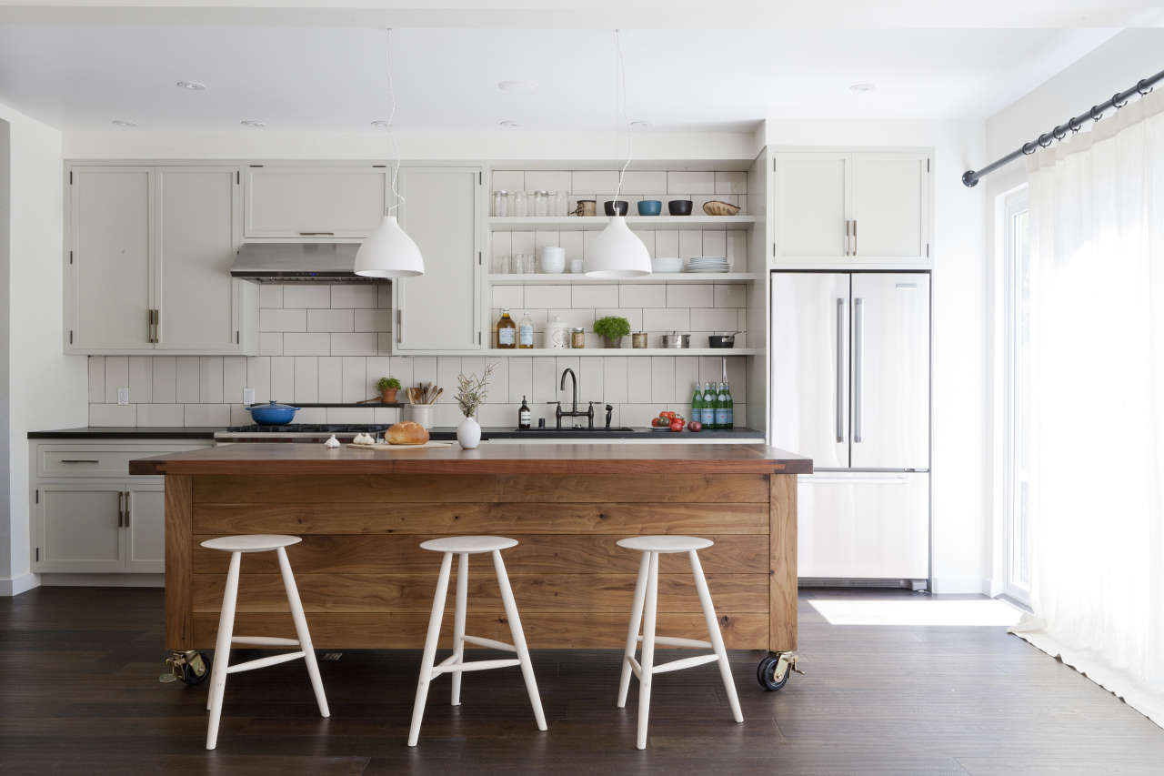
Some kitchen remodels politely improve a room. Others walk in wearing sunglasses, move the furniture around, and make everyone ask, “Wait, why didn’t it always look like this?” This Venice, California kitchen belongs firmly in the second group.
Set inside a Los Angeles beachside home, the project began with a familiar design dilemma: the homeowner liked the raw confidence of loft-style interiors, but he did not want a kitchen that looked like a converted loading dock with a coffee machine. Designers Alexi Rennalls and Sam Gnatovich of Simo Design answered with a smart middle path: an “industrial-lite” kitchen that feels strong, clean, warm, and livable.
The result is a memorable Venice kitchen before and after: cluttered open shelving became controlled display, a forgettable island became the room’s sculptural centerpiece, and ordinary finishes were replaced with walnut, dark stone, white tile, bronze accents, and linen-filtered California light. In other words, the kitchen got a haircut, a tailored jacket, and a much better personality.
The Before: When Open Shelving Gets a Little Too Open
Open shelving can be beautiful. It can make a kitchen feel airy, casual, and personal. It can also become the place where mugs, spices, bowls, jars, mystery chargers, and one lonely souvenir glass from 2009 gather for a very public meeting.
Before the remodel, this Venice kitchen had three long rows of open shelves stretching across an 18-foot wall. The layout itself was not the real problem. The bones were workable, the room had good proportions, and the kitchen already sat naturally within the home. But the surfaces and materials were not doing the space any favors. Paired with a basic island and plain lower cabinetry, the shelves made the room feel busy and unfinished rather than edited and intentional.
That is the great lesson of this before and after kitchen remodel: sometimes a kitchen does not need to be moved, expanded, or dramatically reconfigured. Sometimes it needs discipline. The designers kept the useful parts of the room and focused on texture, contrast, storage, and proportion.
The Design Direction: Industrial Style, Softened for Real Life
The homeowner came to the project with images of lofts and industrial interiors. That could have led to a predictable recipe: exposed metal, heavy concrete, cold surfaces, and a mood that says, “Please enjoy your toast under this factory light.” Instead, Simo Design translated the industrial idea into something more refined.
The finished kitchen still has the confidence of an industrial space. There is dark granite, visible hardware, open shelving, strong pendant lights, and a substantial work island. But every harder element is balanced by something warm or tactile. White cabinetry calms the room. Walnut brings depth. Linen curtains soften the afternoon sun. Oak flooring keeps the kitchen connected to the rest of the house. The effect is not warehouse cosplay; it is polished Venice living with a little grit under its fingernails.
The Walnut Island: The Star That Earned Its Close-Up
The most important move in the remodel was the custom American black walnut island on casters. Designed with furniture maker Doug McCollough, the island anchors the kitchen visually and functionally. It is not just a block of storage dropped into the center of the room. It behaves like a piece of furniture.
That distinction matters. A furniture-like kitchen island instantly makes a kitchen feel more personal. It can soften the built-in quality of cabinets and counters, especially in a room with white tile and dark stone. Here, the walnut grain adds warmth and movement, while the island’s mobility gives the kitchen a relaxed, adaptable quality. It looks substantial, but not trapped in place.
The heavy lacquered top also makes the island practical as a workspace. This is where good design earns its keep. A kitchen island should not simply look handsome in photographs. It should welcome chopping, serving, leaning, coffee drinking, laptop balancing, and the occasional dramatic conversation about where the good olive oil went.
White Cabinets as the Calm Backdrop
Because the island commands attention, the surrounding cabinetry needed restraint. Simo Design chose white Shaker-style flat-panel doors with exposed hinges and antiqued bronze hardware. The cabinets do not compete with the walnut island; they frame it.
This is a useful principle for any kitchen renovation. Not every surface can be the main character. If the island is bold, the perimeter cabinets can be quiet. If the backsplash is lively, the hardware may need to whisper. A successful kitchen is less like a solo performance and more like a dinner party where everyone knows when to speak.
The white cabinetry also keeps the room bright, which is especially important in a coastal California home. Venice light can be gorgeous, but strong. The cabinets help bounce daylight around the space without making the kitchen feel sterile. The bronze hardware adds just enough age and depth to keep the white from looking flat.
The Backsplash: Subway Tile With a Twist
White subway tile is a classic for a reason: it is affordable, flexible, easy to understand, and almost impossible to offend. But in this Venice kitchen, the tile installation gets a clever upgrade. The designers used white subway tile from Mission Tile West and installed it in a mix of horizontal and vertical orientations with dark gray grout.
That small shift changes everything. The tile still feels familiar, but the pattern gives the wall rhythm. It adds visual structure without introducing a loud color or complicated motif. The dark grout outlines the tile and connects the backsplash to the darker countertops, faucet, and lighting. It is a reminder that “simple” does not have to mean “basic.” Sometimes the smartest design idea is not a more expensive material, but a more thoughtful use of a familiar one.
Open Shelving, Now Under Control
The remodel did not banish open shelving entirely. Instead, it edited it. That is the grown-up version of the trend. Open shelves can still be useful for daily dishes, glassware, cookbooks, or ceramics, but they need structure. In this kitchen, the shelves are spaced according to the tile height, which makes them feel integrated into the backsplash rather than randomly attached to the wall.
The difference between “collected” and “cluttered” often comes down to spacing. A few shelves with breathing room can look architectural. Too many shelves stacked with every object you own can make a kitchen feel like it is auditioning for a storage-unit documentary. This before and after proves that open storage works best when it is designed, not merely added.
Dark Granite, Bronze Fixtures, and a Little Drama
The countertops are flamed absolute black granite, a choice that gives the kitchen weight and contrast. Against the white cabinets and tile, the dark counter reads as crisp rather than gloomy. It also supports the industrial-lite concept: strong, practical, and slightly rugged, but still refined.
The Kohler Parq faucet in oil-rubbed bronze continues that mood. Bronze is less shiny than brass and warmer than black. It brings a lived-in quality that suits the Venice setting, where design often works best when it feels collected over time rather than ordered in one anxious weekend.
Lighting completes the material story. Benjamin Hubert’s Decode Heavy Lights hang overhead, giving the room an industrial note without overpowering it. The pendants are bold, but because the palette stays controlled, they feel intentional rather than theatrical.
California Light: The Secret Ingredient
One of the quiet heroes of the remodel is the use of sheer Belgian linen drapery from Restoration Hardware. The curtains diffuse the strong afternoon sun, which is a very Venice problem to have and, frankly, not the worst problem in the world.
Still, light control is essential. Too much direct sunlight can create glare, heat, and harsh shadows. Linen softens the room, giving the kitchen a relaxed coastal quality. It also balances the harder materials: stone, tile, metal, and wood. The space becomes less about showing off finishes and more about creating atmosphere.
Why This Venice Kitchen Still Feels Relevant
Although the project was completed years ago, it still looks current because it was built around durable ideas rather than trend-chasing. Warm wood islands, hardworking storage, neutral palettes, furniture-like details, mixed materials, and practical lighting continue to show up in modern kitchen design. The kitchen feels fresh because it never tried too hard to be trendy.
That is the magic of a well-edited remodel. The room has personality, but it does not scream. It nods to industrial style, but it does not turn the house into a themed restaurant. It uses white tile, but not lazily. It uses open shelving, but with boundaries. It uses a statement island, but the island also works hard.
Design Ideas to Steal From This Before/After Kitchen
1. Let One Feature Lead
The walnut island is the hero. Once that decision was made, the rest of the kitchen could support it. Homeowners often run into trouble when every choice is meant to be exciting. A bold island, dramatic stone, colorful cabinets, patterned floors, unusual lights, and statement hardware can quickly become a design traffic jam. Choose one or two standout elements and let the others create balance.
2. Use Contrast Carefully
White cabinets and black countertops are a classic pairing, but this kitchen avoids feeling stark because of the walnut island, bronze hardware, oak flooring, runner, and linen curtains. Contrast works best when it has a middle note. Wood is often that bridge.
3. Make Open Shelving Earn Its Place
If you love open shelving, plan what it will hold before installing it. Daily dishes? Ceramics? Glasses? Cookbooks? The Venice kitchen shows how shelves can look clean when they align with the architecture and are limited to what the room can visually handle.
4. Think Beyond Standard Tile Patterns
A simple tile can become special through layout. Mixing vertical and horizontal subway tile is an accessible idea that adds personality without making the backsplash feel busy.
5. Soften Hard Materials
Industrial-inspired kitchens can turn cold fast. Balance stone, metal, and tile with wood, textiles, warm lighting, and natural fibers. Even a runner can change the emotional temperature of a room.
How to Apply the Look in Your Own Home
You do not need a Venice address or a custom walnut island to borrow from this kitchen. Start with the principle: refined contrast. Pair light cabinetry with a darker counter. Use wood as a warm anchor. Choose hardware that feels aged rather than overly shiny. Keep the backsplash simple but interesting. Add lighting with character. Then edit, edit, and edit again.
For smaller kitchens, consider a movable island or worktable instead of a bulky built-in. For renters, the lesson might be as simple as reducing visual clutter on open shelves, adding a runner, swapping in warmer lighting, or using linen curtains to soften bright windows. For a full renovation, this project makes a strong case for investing in the island, because it can become the piece that defines the entire room.
Experience Notes: What This Kitchen Teaches About Living Through a Remodel
A kitchen remodel is never just about cabinets and counters. It is about habits. It is about where the coffee maker lives, where the cutting boards hide, how many pans are too many pans, and whether anyone in the house can unload the dishwasher without asking a philosophical question.
The Venice kitchen is a helpful case study because it shows the value of observing a space before changing it. The original layout was not the villain. The problem was visual noise and weak material choices. That distinction can save homeowners a lot of money. Before you decide to move plumbing, knock down walls, or expand the footprint, ask what is actually failing. Is the room too small, or is storage poorly organized? Is the layout broken, or are the surfaces making it feel chaotic? Is the island in the wrong place, or is it simply the wrong island?
One practical experience from projects like this is that the island deserves early attention. Many homeowners pick cabinets first, counters second, hardware third, and then treat the island as a cabinet package with a bigger hat. But the island is often where life happens. It is the prep zone, breakfast bar, serving station, homework desk, mail drop, and unofficial neighborhood gossip counter. In this Venice kitchen, the walnut island works because it was designed as furniture. It has presence. It feels chosen.
Another lesson is that open shelving should be treated honestly. It looks effortless in photographs because someone edited it within an inch of its ceramic life. In daily use, open shelving requires discipline. If you are not the kind of person who enjoys lining up bowls by height, that is not a character flaw; it is useful information. Use fewer shelves, add more closed storage, or reserve open shelves for the prettiest everyday pieces. Your kitchen should not depend on you behaving like a stylist at 7:15 every morning.
Lighting is another area where experience matters. A striking pendant can change the mood of a kitchen, but task lighting still has to work. You need light where you chop, wash, read labels, and inspect whether the avocado has crossed over to the dark side. The Venice kitchen balances decorative pendants with bright surfaces and filtered natural light, creating a room that feels atmospheric without becoming impractical.
Finally, this kitchen reminds us that renovation success often comes from restraint. The designers did not pile on every idea. They used a controlled palette, a few strong materials, and careful proportions. That kind of discipline may sound simple, but it is hard when you are knee-deep in samples and every tile suddenly seems to have a destiny. The best remodels usually come from saying no to good things so the great things can stand out.
If you are planning your own before and after kitchen transformation, take a cue from Venice: keep what works, improve what does not, and give the room one unforgettable focal point. Also, label your cabinet samples. Future you, standing in a showroom with eight shades of white, will be grateful.
Conclusion
This striking Venice, California kitchen proves that a remodel does not need to shout to be memorable. By replacing cluttered shelving, underwhelming cabinetry, and a forgettable island with a warm walnut centerpiece, white cabinetry, black granite, patterned subway tile, bronze fixtures, and soft linen-filtered light, Simo Design created a kitchen that feels both polished and relaxed.
The room succeeds because it understands balance: industrial but not cold, coastal but not cliché, simple but not plain. It is a before and after kitchen remodel with lessons for almost any home: edit your materials, respect the light, make storage intentional, and let one beautiful feature lead the way.
Note: This article is an original, fully rewritten SEO feature based on the documented Venice, California kitchen project and broader U.S. kitchen remodeling best practices.