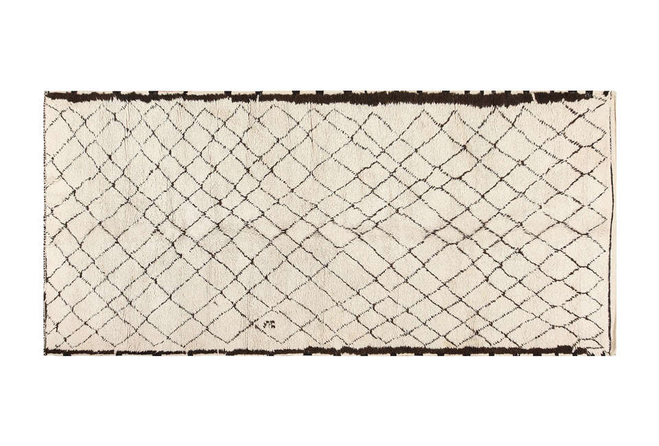
Chocolate brown is having the kind of comeback that makes you wonder whether it ever truly left or was simply hiding in a walnut sideboard, waiting for gray-on-gray chocolate home decor is becoming a favorite way to make rooms feel warmer, more collected, and considerably less like a waiting room with excellent Wi-Fi.
The appeal is backed by a broader move toward warm neutrals, natural materials, tactile fabrics, and interiors that feel lived in rather than staged within an inch of their lives. Chocolate brown works especially well because it can act as a neutral while still delivering depth. It is darker than beige, warmer than charcoal, and generally more forgiving than black.
Amazon, naturally, has no shortage of brown decor. The trick is separating genuinely stylish finds from items that could accidentally turn your living room into a 2004 coffee shop. Drawing on current interior design guidance, color trends, and designer styling principles, these are the chocolate-toned decor categories and Amazon finds worth considering.
Why Chocolate Brown Home Decor Feels Fresh Again
Brown has cycled through several decorating eras. The 1970s loved it alongside avocado green and orange. The early 2000s occasionally used enough espresso furniture to make entire rooms disappear after sunset. Today’s interpretation is softer, more layered, and much more intentional.
Chocolate brown is now being treated as a warm neutral. Current color palettes increasingly pair deep browns with cream, mushroom, warm white, dusty pink, muted blue, sage, terracotta, and burgundy. Wood, stone, rattan, linen, bouclé, velvet, and aged metals make these color combinations feel richer.
The renewed enthusiasm is measurable, too. Houzz’s 2026 U.S. emerging trends data reported a sharp rise in searches for chocolate brown, reflecting a larger appetite for cozy, grounded interiors. Major paint brands have also continued exploring brown-inflected shades, from velvety brown undertones to deep espresso and burnt-umber-inspired neutrals.
In other words, brown is no longer the backup singer. It has taken the microphone.
Designer Rules for Shopping Chocolate Home Decor at Amazon
Think About Texture Before Buying More Stuff
A common design mistake is buying five objects in the same color and assuming a coordinated room will magically appear. Usually, it just looks like five objects in the same color.
Texture creates the real sophistication. A chocolate cable-knit blanket, dark wood frame, rattan light fixture, and glossy agate accessory can share a similar color family without feeling repetitive. The eye notices the difference between woven cotton, organic stone, wood grain, and sculptural wax.
When searching Amazon, add material-specific terms such as walnut wood decor, chocolate bouclé chair, brown cotton throw, or espresso stone bookends. This is often more productive than simply typing “brown home decor” and preparing yourself for 73,000 mysterious decorative orbs.
Match Undertones, Not Exact Shades
Chocolate brown can lean red, yellow, purple, gray, or almost black. You do not need every item to be an identical shade. In fact, exact matching can make a room look flat.
Instead, pay attention to undertones. Walnut and cognac browns generally sit comfortably with warm creams, olive green, and brass. Cooler cocoa or taupe-brown pieces can work beautifully with pale blue, charcoal, and crisp off-white. Espresso offers strong contrast against light upholstery and natural flooring.
Use Brown to Ground a Room
Dark colors carry visual weight. Interior designers often use deeper furniture, rugs, or architectural details as anchors. A walnut console in a pale entryway can give the space definition. Chocolate dining chairs can prevent a light room from floating away into a cloud of beige.
The smartest Amazon purchases are often pieces that solve a visual problem rather than merely participating in a trend.
Chocolate Brown Amazon Decor Finds Worth the Designer Treatment
1. A Vintage-Look Brown Area Rug
A brown patterned rug is one of the easiest ways to introduce the color without repainting walls or replacing a sofa. Vintage-inspired designs containing chocolate, rust, muted beige, and earthy red can hide everyday wear while making newer furniture feel more collected.
The Loloi Amber Lewis Josie Collection is an example of the type of Amazon rug that suits this approach. Rather than reading as one large brown rectangle, its distressed pattern creates movement and tonal variation.
Use a runner in a kitchen, hallway, or laundry room, or choose an area rug large enough to visually connect the main furniture pieces. A too-small rug is less “cozy European apartment” and more “decorative postage stamp.”
2. A Chocolate Cable-Knit Throw Blanket
Textiles are the low-risk investment category of color trends. A cotton cable-knit throw, such as the brown options associated with brands like NTBAY on Amazon, can immediately warm a cream sofa or white duvet.
Cable knitting is especially useful because its raised texture keeps a dark neutral from looking heavy. Drape the blanket loosely over an armchair, fold it at the bottom third of a bed, or place it in an open basket.
Avoid surrounding it with six other brown textiles of identical value. Add flax linen, ivory cotton, sage, muted blue, or even a restrained stripe.
3. A Rattan or Warm-Brown Light Fixture
Lighting is an excellent place to introduce natural brown texture. Rattan chandeliers and woven pendants create subtle shadows and add visual softness to kitchens, dining rooms, and bedrooms.
Amazon fixtures similar to the Lynnoland farmhouse rattan chandelier demonstrate why the material works. Brown enters the room through texture rather than a solid block of color.
Before purchasing any light fixture, verify dimensions, ceiling compatibility, electrical specifications, bulb requirements, and installation instructions. A chandelier can be delightfully dramatic. Discovering it is twice the width of your breakfast table is a different genre of drama.
4. A Dark Wood Bar Cart or Serving Cart
Wood may be the most natural route into the chocolate decor trend. A walnut- or rustic-brown serving cart can provide storage while bringing warmth to a kitchen or dining area.
Amazon pieces such as VASAGLE serving carts illustrate the concept: functional furniture with an earthy finish and simple construction. Style one with glassware, a ceramic vase, cocktail tools, or a small lamp rather than covering every surface with themed accessories.
The current design preference for layered wood tones also means your cart does not need to match your dining table perfectly. A little variation helps interiors look acquired over time.
5. Cocoa-Toned Bedding
The bedroom is practically begging for chocolate brown. The shade naturally supports a cocooning atmosphere, particularly when combined with cream sheets, tan upholstery, soft lighting, and natural wood.
Brown comforter sets from Amazon brands such as Bedsure provide an accessible way to experiment. For a contemporary result, mix the bedding with lighter elements. Think warm white sheets, a mushroom-colored lumbar pillow, and maybe a pale blue accent.
If the walls, carpet, furniture, curtains, and bedding are all dark brown, however, congratulations: you have decorated the inside of a truffle.
6. Brown Bouclé Dining or Accent Chairs
Bouclé gives brown an entirely different personality. Instead of looking formal or traditional, chocolate bouclé feels soft, modern, and tactile.
Vasagle-style bouclé dining chairs in earthy brown shades can ground a dining space with pale walls or a light table. The same idea applies to an occasional chair in the living room or bedroom.
Keep surrounding finishes varied. Dark fabric looks particularly effective next to pale oak, travertine-style surfaces, warm white paint, or muted green accents. Check seat dimensions, weight capacity, fabric care instructions, and customer photos when shopping online.
7. Walnut Picture Frames
Picture frames might be the most underestimated decorating tool on Amazon. Changing thin white or shiny black frames to warm walnut can alter the mood of an entire gallery wall.
Wood frames, including styles similar to FlyJoe’s darker picture-frame selections, add visible grain and craftsmanship. Chocolate frames look striking around botanical prints, landscape photography, abstract art, sketches, and family photographs.
For an elevated arrangement, vary the sizes while maintaining some consistency in material or finish. Measure the artwork and mat opening carefully. Online frame dimensions occasionally require the reading comprehension of an attorney reviewing a merger.
8. Natural Agate Bookends
Small accessories work best when the material itself is interesting. Brown agate offers layered color, irregular patterns, and natural variation, giving shelves a polished organic quality.
Amoystone-style agate bookends are representative of this Amazon category. Espresso, caramel, cream, and smoky bands can echo the colors already present in wood furniture.
Use natural stone sparingly. One pair of bookends on a shelf can look luxurious. Twenty-seven coordinating mineral objects can make guests wonder whether they have entered a very elegant geology department.
9. Chocolate Taper Candles and Brass Holders
Brown taper candles are an inexpensive way to test the trend on a dining table, mantel, or console. Their tall vertical shape adds drama even before the candles are lit.
Unscented chocolate taper sets, like those sold by brands such as Viyffo, pair especially well with aged brass or antique-inspired candleholders. Deep plum, muted teal, cream, and burgundy table linens can introduce additional color.
Never leave burning candles unattended, and keep flame placement away from curtains, greenery, and decorative bows. Beautiful tablescaping is better without an emergency subplot.
10. A Brown Wood Console Table
A console table is a larger commitment, but it demonstrates one of chocolate brown’s best design qualities: the ability to visually anchor an open space.
Amazon carries dark wood and farmhouse-inspired consoles similar to Tribesigns models. In an entryway, place a lamp at one end, a tray or bowl in the center, and an organic element such as branches at the other. The goal is asymmetrical balance, not a lineup of seven tiny ornaments standing at attention.
Dark consoles also help connect separate brown accents throughout a room. A wood frame, brown rug motif, and walnut table can repeat the same general color family without becoming a matching furniture set.
11. Sculptural Brown Candles and Organic Objects
Modern rooms benefit from one or two objects with unexpected shapes. Sphere candles, irregular ceramics, twisted candles, and abstract vessels add curves to spaces dominated by rectangular furniture.
Chocolate-colored sculptural candles similar to LAWA’s sphere designs can function as decorative objects on coffee tables or shelves. Group one with a small stack of books and a low bowl. Three objects of differing heights are usually more visually interesting than a dozen unrelated accessories.
Best Colors to Pair With Chocolate Brown Decor
Chocolate Brown and Cream
This is the easiest combination for creating contrast without feeling stark. Cream lifts deep brown while maintaining warmth. Use it through upholstery, curtains, bedding, or wall color.
Chocolate Brown and Sage Green
Brown and green naturally reference landscapes and plant materials. Muted sage gives chocolate furniture a softer, relaxed appearance. Darker forest green creates a moodier, more traditional result.
Chocolate Brown and Pale Blue
Cool blue can make warm brown look noticeably richer. Powder blue, faded cornflower, and dusty blue work particularly well with walnut frames, leather-inspired tones, and deep cocoa textiles.
Chocolate Brown and Burgundy
For a dramatic space, combine chocolate with wine, oxblood, or burgundy accents. Keep lighter neutral areas in the room so the palette has breathing room.
Chocolate Brown and Brass
Brass adds warmth and gentle reflection. It is particularly effective in lamps, candleholders, furniture hardware, and picture lights. Aged or brushed finishes usually feel more relaxed than highly polished yellow metal.
How to Keep Chocolate Brown From Looking Dated
The primary danger is not the color itself. It is repetition.
Older brown-heavy interiors often relied on matching furniture suites, uniform espresso finishes, dark flooring, and beige walls. The contemporary approach emphasizes contrast and material diversity.
Mix brown wood with painted furniture. Place a textured chocolate throw on a lighter sofa. Combine walnut with aged brass rather than forcing every metal finish to match. Add one cooler color, such as pale blue or sage, to balance the warmth.
Lighting matters as well. Deep brown absorbs more visual light than cream or white, so use layered illumination. A room should ideally combine ambient, task, and accent lighting appropriate to its function. Lamps, pendants, sconces, and natural daylight can reveal the variation in wood grain and textured textiles.
Most importantly, buy pieces that make sense for your home. Trends are useful as inspiration, not a court order. A beautiful walnut frame you enjoy for ten years is a better purchase than an entire cart of brown accessories bought during a 1 a.m. decorating identity crisis.
A Realistic Chocolate Decor Styling Experience: What You Notice Once You Start
A typical experience with chocolate home decor begins innocently. You replace one small itemperhaps a throw blanket on a pale sofa. Almost immediately, the room feels warmer. Nothing architectural has changed, but the darker textile gives the eye somewhere to rest. The cream upholstery suddenly looks brighter, and a wood coffee table that previously seemed unrelated now appears connected to the color palette.
The next lesson is that brown reveals weak texture quickly. Place a smooth brown polyester pillow beside a brown cotton cable knit and the difference becomes obvious. The richer room is not necessarily the one with the most expensive objects; it is usually the room where materials respond differently to light. Woven fibers cast tiny shadows. Wood has directional grain. Stone contains tonal irregularities. These details keep a neutral palette alive.
Then comes the temptation to overcorrect. Once chocolate starts working, it is very easy to believe every object should become brown. This is the point where experienced decorators mentally remove half the shopping cart.
A more successful approach is to walk to the doorway and evaluate the room as a complete composition. Suppose the sofa now has a chocolate throw and the wall displays walnut frames. Those two points may already create enough repetition. Instead of buying brown curtains, a brown lamp, and brown cushions, adding a pale blue pillow or a cream rug can strengthen the existing chocolate pieces by providing contrast.
Lighting produces another noticeable surprise. During daylight, a walnut console may show caramel highlights. At night under warm lamps, the same furniture appears deeper and closer to espresso. For this reason, evaluating brown decor at only one time of day can be misleading. Dark neutrals are wonderfully moody, but they are professional shapeshifters.
Scale also becomes important when ordering from Amazon. A decorative object photographed alone against a white background can look substantial online and arrive with the physical presence of a dinner roll. Measuring shelves, tables, rugs, frames, and lighting fixtures before ordering saves a tremendous amount of disappointment. Painter’s tape is particularly useful for outlining furniture footprints on the floor or marking frame sizes on a wall.
One of the most satisfying stages happens when the room begins to look connected rather than coordinated. The dark stripe in a vintage-style rug echoes a picture frame. A brass lamp relates to candleholders across the room. A brown blanket references a wooden table without matching it exactly. This repetition is subtle, but it gives the impression that every piece knows why it was invited.
The experience also proves that small swaps can be more effective than major purchases. Changing frames, adding taper candles, or introducing one textured throw may create greater visual improvement than replacing an acceptable sofa with a trendy brown one. Large furniture demands commitment; accessories allow experimentation.
Finally, chocolate brown has an emotional quality that is difficult to understand from a product thumbnail. In a finished room, deep earthy shades can make pale neutrals feel less sterile and everyday belongings feel more intentional. Books, pottery, photographs, and natural wood all seem comfortable around brown. The color does not demand perfection. It actually looks better with a little patina, varied texture, and evidence that humans occasionally sit on the furniture.
That may be the best lesson of the chocolate decor trend. The most appealing rooms are not simply brown. They are warm, layered, personal spaces in which brown plays the role of a visual anchor.
Conclusion: Chocolate Brown Is a Neutral With Personality
Interior designer-approved chocolate home decor works because brown gives rooms depth without forcing homeowners into a loud color commitment. A vintage-look rug, walnut frame, textured throw, woven light fixture, dark wood console, or cocoa-toned bedding can introduce warmth one layer at a time.
Amazon makes the trend accessible, but thoughtful editing remains more important than filling a cart. Focus on texture, check undertones, measure carefully, and use lighter or cooler shades to create contrast. The goal is not to turn the entire house chocolate brown. The goal is to use this rich, earthy neutral to make existing rooms feel warmer, more grounded, and more deliberate.
Note: Amazon inventory, finishes, product specifications, and prices can change. Review current listing details, dimensions, materials, care instructions, and recent customer feedback before purchasing.