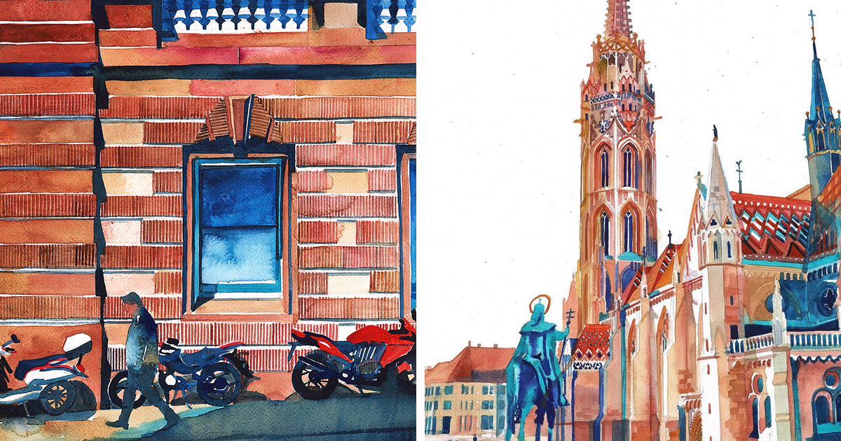
Southern Europe rarely enters a room quietly. It arrives with sunlit stone, blue shutters, tiled walls, striped awnings, scooters, laundry lines, and a sea that appears to own several shades unavailable in ordinary paint boxes. Those details inspired this collection of 27 bright summer watercolorssmall city portraits designed to capture atmosphere rather than produce architectural blueprints. Each painting began with a recognizable place, then wandered slightly into memory, color, and the cheerful unpredictability of watercolor.
Why Southern European Cities Belong in Watercolor
Watercolor is built for light. Transparent pigment allows white paper to glow through a wash, creating the kind of luminosity that suits Mediterranean streets, pale limestone, reflective harbors, and cloudless summer skies. It can also move from precision to beautiful chaos in one brushstroke. That is useful when painting a balcony accurately but suggesting an entire café crowd with three dots and a confident squiggle.
“`
For these watercolor cityscapes, I worked from broad shapes to small details: sky, architecture, shadow, foliage, and finally the human signs that make a place feel lived in. I kept pencil lines loose, reserved clean paper for the brightest highlights, and layered transparent color instead of trying to force every value into the first wash. The result is a travel-inspired art series that feels sunny, spontaneous, and slightly more organized than an actual summer suitcase.
“`
Portugal: Hills, Tiles, and Atlantic Light
“`
1. Lisbon Tram Yellow Against Tile Blue
Lisbon became a composition of climbing streets, cobalt azulejos, coral walls, and one determined yellow tram. I exaggerated the slope and let the windows tilt a little. In a city of hills, perfect perspective can take the afternoon off.
2. Porto Reflections Along the Douro
For Porto, I stacked narrow riverside facades above loose blue-violet reflections. The waterfront needed texture, so I used broken brush marks for balconies and rooflines, then softened the river until the buildings seemed to be dreaming about themselves.
3. Évora White Walls and Ochre Edges
Évora called for restraint: warm white architecture, ochre trim, a quiet square, and deep patches of shade. A few cypress shapes and terracotta roofs kept the palette grounded while the untouched paper supplied the fierce midday brightness.
“`
Spain: Pattern, Heat, and Street Theater
“`
4. Barcelona Curves That Refuse to Behave
Barcelona inspired curling balconies, mosaic-like color, palm shadows, and architecture that treats straight lines as polite suggestions. I painted the major forms carefully, then added playful marks to echo the city’s modernist rhythm without turning the page into a geometry exam.
5. Valencia Old Stone Meets Future White
This painting paired warm historic facades with sleek, pale modern forms. Turquoise water linked the two worlds. The contrast made Valencia feel especially alive: part old-neighborhood conversation, part spaceship that stopped for lunch.
6. Seville Orange Trees and Blue Shadow
Seville became a study in heat. I used golden walls, green-orange foliage, dark cobalt shade, and a slim tower rising above the roofs. The strongest color sits where sunlight meets shadowthe visual equivalent of stepping outside and immediately reconsidering your hat.
7. Granada The Alhambra at Rose-Gold Hour
Rather than paint every carved detail, I reduced Granada’s palace forms to warm blocks, delicate arches, and hazy hills. A rose wash over ochre created the evening glow, while cooler foreground shadows helped the distant architecture shimmer.
8. Málaga Palms, Harbor Blue, and Easy Lines
Málaga asked for an open composition. I left generous sky around a sunlit waterfront, used quick strokes for palms, and dropped bright red accents into café awnings. The picture feels like a long lunch that accidentally became dinner.
9. Cádiz White Architecture in a Blue Sandwich
Sea and sky nearly meet around Cádiz, so I placed white buildings between two bands of blue. Golden domes, rooftop antennas, and tiny boats broke the calm. Salt air is difficult to paint, but granulating pigment does a convincing impersonation.
“`
Southern France: Pastels With Excellent Manners
“`
10. Nice Promenade Light
Nice became a ribbon of ultramarine sea, pale architecture, and striped umbrellas. I kept the figures tiny and gestural, allowing the promenade to feel busy without making me paint 84 individual vacationers and their complicated beach bags.
11. Marseille Harbor Masts and Working Color
For Marseille, vertical masts created the drawing’s rhythm. Warm stone and cool water met in rough, energetic washes, while darker boats anchored the foreground. The scene needed polish, but not too much; this harbor has work to do.
12. Menton The Citrus Palette
Menton practically selected its own colors: lemon yellow, tangerine, blush pink, leafy green, and Mediterranean blue. I stacked the hillside buildings like bright boxes and resisted correcting every bloom. Here, even the paint seemed to be on vacation.
“`
Italy: The Country That Keeps Adding Details
“`
13. Venice Reflections Before Architecture
I painted Venice from the water upward, beginning with a loose reflective wash before adding facades, windows, poles, and a dark gondola shape. This reversed process kept the canal alive and prevented the buildings from becoming a very elegant spreadsheet.
14. Naples Laundry, Domes, and Glorious Congestion
Naples needed overlapping marks: balconies, signs, shutters, scooters, laundry, and a dome appearing above the commotion. I used a warm, crowded palette and allowed lines to collide. Tidiness would have missed the point entirely.
15. Matera Stone Carved by Light
Matera’s layered buildings became a near-monochrome study in raw sienna, burnt umber, and violet shadow. Small dark doorways suggested depth, while irregular dry-brush marks echoed weathered stone. The city looked ancient without becoming visually dusty.
16. Lecce Baroque in Honey Color
Lecce’s ornate stonework could consume a lifetime and several brushes, so I suggested its Baroque energy with clustered shadows and dancing edges. A honey-gold wash unified the facade, making the architecture appear carved from late-afternoon sunlight.
17. Ostuni White on White, Somehow
Painting a white city required colorful shadows. I used pale lavender, turquoise, and warm gray to define stairways and cubic homes, saving pure paper for the brightest walls. One red flowerpot became the tiny hero of the entire composition.
18. Palermo Layers That Do Not Apologize
Palermo inspired arches, domes, market awnings, ochre walls, and flashes of green. I combined elegant architectural lines with loose street-level marks, because the city’s beauty lies partly in its refusal to separate grandeur from everyday noise.
19. Syracuse Ortigia in Sea-Washed Gold
For Syracuse, I placed warm limestone against an almost electric blue sea. Soft edges suggested glare along the waterfront, while sharper ink lines defined balconies and church fronts. The finished piece feels sun-bleached, salty, and pleasantly unhurried.
“`
Croatia and Malta: Limestone Beside Impossible Water
“`
20. Dubrovnik Terracotta Above the Adriatic
Dubrovnik’s city walls formed a strong pale frame around red roofs and blue water. I simplified the old town into repeating warm shapes, then let the Adriatic wash spread freely. The contrast made the fortified city feel both solid and weightless.
21. Split Roman Walls, Modern Laundry
Split offered the irresistible combination of ancient stone and present-day life. I painted massive pale walls, narrow passages, café chairs, and hanging fabric. History feels friendlier when someone has clipped a striped shirt to it.
22. Trogir A Small City With a Detailed Face
Trogir’s compact old town became an intimate arrangement of stone facades, a bell tower, shutters, and waterfront reflections. I used a fine brush sparingly; too much detail would have crowded the scene faster than a tour group at noon.
23. Valletta Honey Limestone and Painted Balconies
Valletta’s steep streets, fortifications, and enclosed balconies created strong geometry. Golden limestone dominated the page, while green, blue, and red balcony accents supplied rhythm. A slice of harbor at the bottom kept all that architecture from becoming too serious.
“`
Greece: White Walls, Blue Distances, and Ancient Layers
“`
24. Athens The Acropolis Above the Everyday City
I placed the Acropolis high and pale, then built the modern neighborhood below with balconies, awnings, trees, and rooftop shapes. Warm stone met dusty pink and gray-blue, showing Athens as a living city rather than a monument surrounded by respectful silence.
25. Chania Venetian Harbor in Soft Color
Chania became a graceful arc of pastel buildings around water. I used fluid reflections and a thin lighthouse silhouette to hold the composition together. The harbor’s layered history stayed present without turning the watercolor into a lecture with boats.
26. Nafplio Bougainvillea Takes Over
Nafplio’s neoclassical facades provided structure, but bougainvillea stole the painting. Magenta pigment spread across balconies and stairways, creating joyful disorder. I let it. Some plants understand composition better than people do.
27. Rhodes Stone Gate, Blue Sky, Red Scooter
The final watercolor framed a medieval street through a broad stone arch. A red scooter and two tiny figures brought the scene into the present. That contrastold walls, ordinary life, and startling summer colorbecame the theme of the entire series.
“`
How I Kept the Series Bright Without Making It Loud
Brightness is not the same as using every color at full strength. I limited each painting to a dominant warm family, a cool counterweight, and one or two accent colors. Lisbon leaned blue and yellow; Matera stayed earthy; Menton happily raided the citrus bowl. Repeating pigments across the collection created unity even when the architecture changed.
“`
Shadows mattered as much as sunlight. In Southern European summer scenes, a deep doorway or awning makes the bright wall beside it glow. I mixed many shadows from ultramarine, violet, and warm earth colors rather than reaching automatically for black. The resulting darks stayed colorful and transparent.
“`
Extended Artist’s Diary: What Painting These Places Taught Me
“`
Travel Sketching Is Mostly the Art of Choosing
The first lesson was that a city gives you too much. Every street contains windows, cables, signs, roof tiles, chairs, pedestrians, plants, shadows, and at least one parked vehicle determined to ruin the historic mood. I learned to ask what the picture was actually about. In Seville, it was the temperature of the shadow. In Porto, it was the vertical pile of houses above the river. In Valletta, it was the strict street geometry interrupted by colorful balconies. Once that decision was clear, unnecessary detail became easier to remove.
Water Has Opinions
Harbors and canals looked simple until I tried to paint them. Water reflects color, breaks shapes, catches light, and changes its mind every few seconds. I stopped treating reflections as upside-down buildings and began painting them as vertical fragments joined by horizontal ripples. Venice required soft gray-green movement; Chania needed clear turquoise; Marseille asked for choppier marks. The less I tried to control every edge, the more believable the water became. This was humbling, especially because the water achieved in one accidental bloom what I had been planning for 20 minutes.
White Buildings Are Never Just White
Ostuni, Cádiz, and several Greek scenes taught me to look harder at pale architecture. A white wall can contain reflected blue from the sky, warm yellow from the ground, pink from a neighboring facade, and violet in the shade. Leaving some paper untouched gave me the highest light, but the surrounding tinted shadows made that white convincing. This approach also protected the paintings from becoming flat. The most useful “white paint” in transparent watercolor turned out to be patience and the ability not to brush over everything.
People Can Be Tiny and Still Matter
I added figures late, usually with two or three strokes. They were not portraits; they were scale, movement, and narrative. A person under an umbrella made Nice feel hot. Two walkers beneath the gate in Rhodes made the stonework feel enormous. A café server in Málaga suggested an entire social world without requiring facial features. Tiny figures also rescued several compositions that felt suspiciously like real-estate listings. Architecture becomes a place only when somebody appears to be late for lunch inside it.
The Best Mistakes Became Local Weather
Watercolor has a reputation for being unforgiving, but this series made me appreciate its talent for improvisation. A backrun became sea foam. A hard edge became a sunlit cornice. Granulation suggested old limestone. A dropped speck of green became a flowerpot and then, through artistic diplomacy, an entire balcony garden. I corrected structural problems when necessary, but I stopped trying to sterilize every irregularity. Southern European streets are compelling because they carry age, repair, use, and change. The paintings improved when the surfaces did the same.
“`
Conclusion: Twenty-Seven Places, One Summer Palette
These 27 bright summer watercolors are not postcards in the strict sense. They are compact records of light, color, architecture, and the small human details that give Southern European cities their character. Together, they move from Atlantic hills to Mediterranean harbors, from tiled facades to fortified streets, and from carefully drawn landmarks to paint that simply decided to wander. That balance between observation and spontaneity is what makes watercolorand travelso addictive.