Creating an X-ray effect in Photoshop is one of those editing tricks that looks suspiciously advanced until you realize the secret recipe is mostly contrast, inversion, smart masking, and a little blue-cyan drama. No hospital badge required. No mysterious machine humming in the corner. Just Photoshop, a decent image, and a willingness to make normal objects look like they belong inside a sci-fi scanner.
In this guide, you will learn how to create an X-ray effect in Photoshop using two easy methods. The first method is fast, flexible, and great for beginners: it uses adjustment layers, Invert, Black & White, Curves, and color tinting to create a believable X-ray photo effect. The second method is more advanced but still beginner-friendly: it combines overlays, masks, blending modes, glow, and optional displacement mapping to create a more stylized, layered X-ray look.
The goal is not to create a medically accurate radiograph. Photoshop cannot magically reveal real bones inside a hand, a shoe, a bag, or a product photo. What it can do beautifully is simulate the visual language of an X-ray: pale glowing edges, dark negative tones, cool blue highlights, translucent layers, and sharp internal-looking details. Think of it as graphic design theater. The audience knows it is a stage, but the lighting is good enough that everyone claps anyway.
Before You Start: What Makes an X-Ray Effect Look Real?
A convincing Photoshop X-ray effect usually has five ingredients: a strong negative-style tonal base, high contrast, reduced color, a cool cyan or blue tint, and carefully controlled glow. If the whole image is simply inverted, it may look like a camera accident from 2007. If you refine the tones and selectively brighten the right areas, it starts to feel intentional.
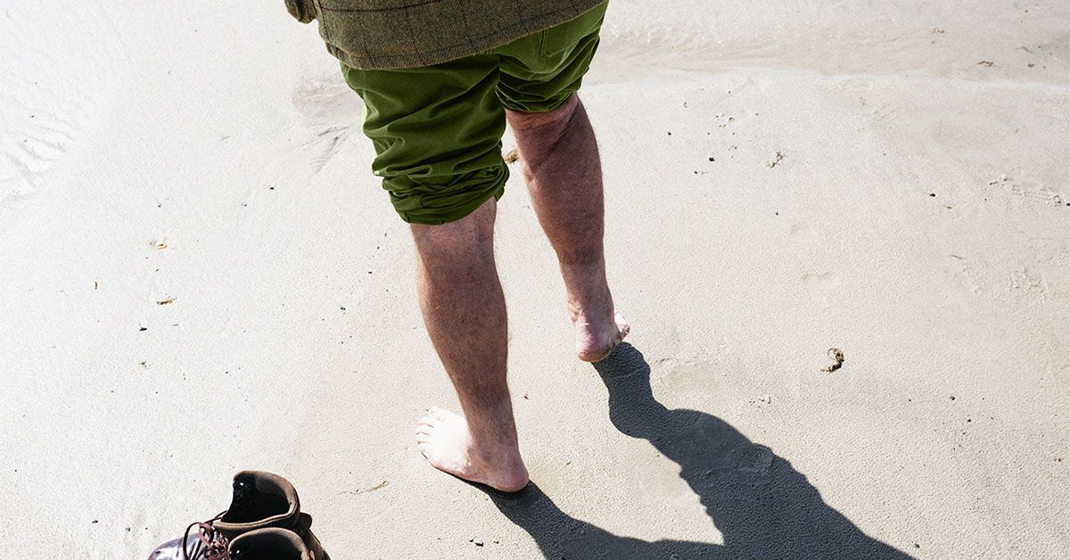
The best source images have clear shapes, visible edges, and simple backgrounds. Objects with strong silhouettes work especially well: hands, shoes, leaves, flowers, tools, bags, electronics, or product photos. Busy backgrounds make the effect harder because the viewer’s eye has to fight through clutter. For a cleaner result, use an image with good separation between subject and background.
Recommended Photoshop Setup
Open your image in Photoshop and immediately duplicate the original layer. Better yet, convert the duplicate into a Smart Object so you can apply filters non-destructively. This keeps your original photo safe while you experiment. X-ray effects often need several rounds of adjustment, and you do not want to discover after twenty minutes that your only copy now looks like a haunted photocopy.
Use a layered workflow whenever possible. Adjustment layers are ideal because they let you change color, contrast, brightness, and masks without permanently damaging the image. You can lower opacity, change blend modes, or remove an adjustment later. That flexibility is what separates a polished Photoshop workflow from “I clicked too many things and now my file is emotionally unstable.”
Method 1: The Fast Invert and Blue Tint X-Ray Effect
This first method is the easiest way to create an X-ray effect in Photoshop. It works well for portraits, objects, clothing, flowers, hands, and product-style images. The process is simple: convert the image to black and white, invert the tones, increase contrast, add a cool tint, and refine the glow.
Step 1: Duplicate the Image Layer
Open your image in Photoshop. In the Layers panel, right-click the background layer and choose Duplicate Layer. Name the new layer something clear, such as “X-Ray Base.” If you prefer keyboard shortcuts, press Ctrl+J on Windows or Command+J on Mac.
Now right-click the duplicated layer and choose Convert to Smart Object. This is optional, but highly recommended. A Smart Object lets you apply filters and transformations in a more flexible way. If you later decide the glow is too strong or the blur is too soft, you can revise it without starting over.
Step 2: Add a Black & White Adjustment Layer
Go to Layer > New Adjustment Layer > Black & White. Photoshop will remove the color while preserving tonal information. In the Properties panel, adjust the individual color sliders to control which parts of the image become lighter or darker.
For example, if you are working with a photo of a hand against a warm background, the Reds and Yellows sliders may strongly affect skin tones. If you are editing a blue object, the Blues and Cyans sliders become more important. Do not simply accept the default conversion. Move the sliders slowly and watch how the image changes. Your goal is to create good separation between the subject and the background.
Step 3: Add an Invert Adjustment Layer
Next, add the classic negative effect. Go to Layer > New Adjustment Layer > Invert. Bright areas become dark, and dark areas become bright. This is the heart of the X-ray photo effect.
At this point, your image may look strange. That is normal. The first Invert step often looks too harsh, too gray, or too flat. The magic happens when you use Curves, Levels, and color tinting to shape the effect. In other words, do not judge the cake while it is still flour.
Step 4: Use Curves or Levels to Build X-Ray Contrast
Add a Curves adjustment layer above the Invert layer. Pull down the shadow area slightly and lift the highlights until the subject begins to glow. You want bright edges and internal-looking details, but you do not want the whole image to turn into a white fog.
If Curves feels intimidating, use Levels instead. Drag the black point inward to deepen dark areas, move the white point inward to brighten highlights, and adjust the midtone slider until the image feels balanced. For a typical X-ray look, the background should be darker and the subject should have pale, glowing structure.
Step 5: Add a Cyan or Blue Gradient Map
Now give the image its recognizable X-ray color. Add a Gradient Map adjustment layer. Use dark navy, deep blue, or near-black for the shadows, and pale cyan or icy blue-white for the highlights. Set the Gradient Map blend mode to Color, Soft Light, or Normal, depending on the result you want.
If the color becomes too strong, reduce the layer opacity to around 20–60%. A good X-ray effect usually feels cool and luminous, not like someone spilled neon sports drink on the canvas.
Step 6: Add a Soft Glow
To create a subtle glow, duplicate the visible result by pressing Ctrl+Alt+Shift+E on Windows or Command+Option+Shift+E on Mac. This creates a merged copy on top while keeping the layers below intact. Convert this new layer to a Smart Object, then go to Filter > Blur > Gaussian Blur. Use a radius between 5 and 20 pixels, depending on image size.
Set the blurred layer’s blend mode to Screen or Linear Dodge (Add), then lower the opacity until the glow looks natural. Screen is usually softer and safer. Linear Dodge is brighter and more dramatic, but it can blow out highlights quickly. Use it like hot sauce: exciting, but not by the gallon.
Step 7: Mask the Background and Clean the Edges
Add a layer mask to your glow or adjustment group. Use a soft black brush to hide the effect in areas where it feels too strong. Focus especially on the background, face details, or any area that becomes distracting. Painting with black on a mask hides the effect; painting with white reveals it again.
This step is where the edit starts to look professional. Beginners often apply the same effect everywhere. More polished edits guide the viewer’s attention by making some areas bright, some dark, and some quiet.
Method 2: The Overlay, Glow, and Displacement X-Ray Effect
The second method creates a more complex X-ray effect by layering extra internal details over your subject. This is useful if you want a design that suggests hidden structure: bones inside a hand, wires inside a device, objects inside a bag, veins in a leaf, or a skeleton-like pattern inside typography.
The idea is simple. You create the X-ray base using Method 1, then add a second image or texture as an internal overlay. With masks, blending modes, and optional displacement mapping, the overlay appears to sit inside or behind the subject rather than floating awkwardly on top.
Step 1: Create Your X-Ray Base
Start by completing the main tonal effect from Method 1: Black & White, Invert, Curves or Levels, and a blue-cyan tint. Group these layers and name the group “X-Ray Base.” Keeping your layers organized will save your sanity, especially when the file begins to look like a small apartment building in the Layers panel.
Step 2: Add an Internal Overlay Image
Place your overlay image above the X-ray base. This might be a bone illustration, wireframe texture, circuit pattern, leaf vein texture, glass crack texture, or abstract white line artwork. Choose an overlay that matches the subject. A circuit pattern inside a smartphone makes sense. A fish skeleton inside a coffee mug may be memorable, but possibly for the wrong reasons.
Go to File > Place Embedded and select the overlay image. Resize and position it so it lines up with the subject. Lower the opacity temporarily so you can see how it fits.
Step 3: Change the Blend Mode
Set the overlay layer’s blend mode to Screen, Lighten, Color Dodge, or Linear Dodge (Add). These blend modes help bright details show through while hiding darker parts of the overlay. Screen is often the most natural. Color Dodge can create a sharper electric glow, but it may need lower opacity.
If the overlay is too colorful, add a clipped Black & White adjustment layer above it. Then add a clipped Curves adjustment to make the overlay brighter or darker. Clipping the adjustments keeps them attached to the overlay only, so they do not affect the entire image.
Step 4: Mask the Overlay Inside the Subject
Add a layer mask to the overlay. Use a soft black brush to remove anything outside the subject. If you already have a subject selection, load it as a mask. You can use Select Subject, the Pen Tool, Object Selection Tool, or any selection method you prefer.
The overlay should feel contained within the object. If it spills outside the edges, the illusion breaks. Think of the mask as the velvet rope at an exclusive club: only the right pixels get in.
Step 5: Use Displacement for a More Realistic Fit
For advanced realism, use a displacement map. A displacement map is a grayscale version of the base image that helps distort the overlay according to the light and dark contours of the subject. This makes the overlay bend with fabric, skin, product curves, or surface texture.
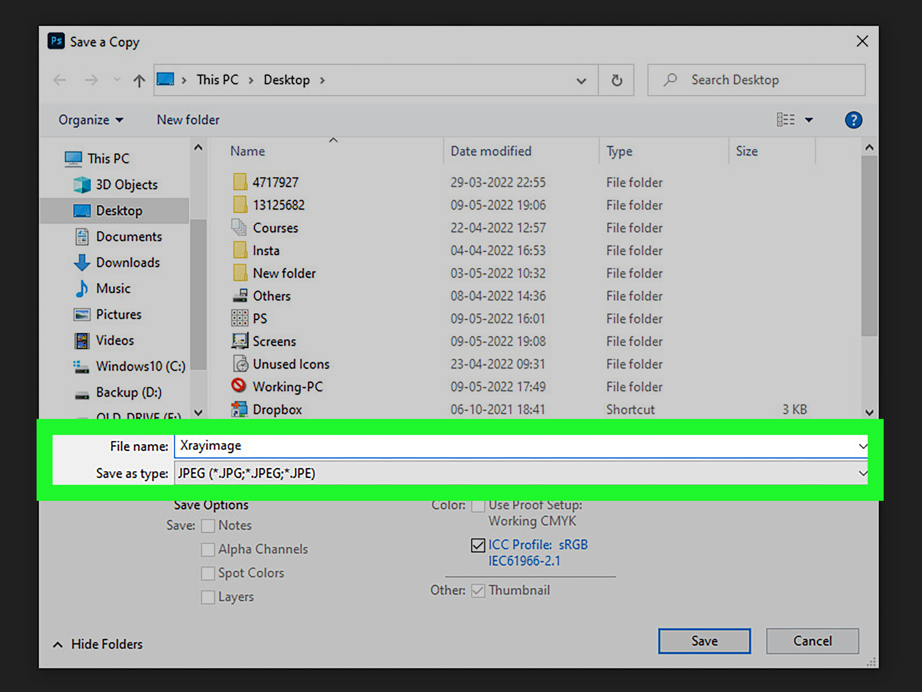
To make one, duplicate your base image into a new document, convert it to black and white, increase contrast slightly, apply a small Gaussian Blur, and save it as a PSD file. Then return to your main project, select the overlay layer, and go to Filter > Distort > Displace. Choose modest values first, such as 5–10 for horizontal and vertical scale, then select the PSD displacement map.
If the result looks too warped, undo and try lower values. Displacement should be subtle. The goal is to make the overlay conform to the subject, not look like it survived a washing machine tornado.
Step 6: Add Edge Glow and Final Color
Create a merged copy on top and apply Gaussian Blur. Set the blurred layer to Screen and lower the opacity. Add a final Gradient Map or Color Balance adjustment to unify the image. For a classic X-ray style, use deep blue shadows and pale cyan highlights. For a futuristic poster style, try violet shadows and electric aqua highlights.
Finish by sharpening selected details. Use a mask so sharpening affects only the subject or internal overlay, not the entire image. A little crispness helps the X-ray effect feel intentional and high resolution.
Best Settings for a Photoshop X-Ray Effect
There is no single perfect setting because every image has different lighting, color, and contrast. However, these starting points work well for many projects:
- Black & White adjustment: Adjust color sliders until the subject separates clearly from the background.
- Curves: Increase highlight brightness and deepen shadows without crushing detail.
- Gradient Map: Use dark navy for shadows and pale cyan for highlights.
- Glow blur: Try Gaussian Blur between 5 and 20 pixels.
- Glow blend mode: Start with Screen at 20–50% opacity.
- Overlay blend mode: Try Screen, Lighten, Color Dodge, or Linear Dodge.
- Displacement: Start with low values around 5–10 for subtle contour matching.
Common Mistakes to Avoid
Using Only Invert and Stopping There
Invert is the beginning, not the whole effect. A simple inverted photo rarely looks like an X-ray. It usually needs black-and-white conversion, contrast control, tinting, and masking.
Making Everything Too Bright
An X-ray effect needs dark areas to make the bright parts glow. If every part of the image is bright, nothing stands out. Keep some rich shadows and let the highlights do the talking.
Ignoring the Background
A messy background can ruin the illusion. Darken, blur, mask, or simplify the background so the subject becomes the main attraction.
Overusing Color Dodge
Color Dodge can look amazing, but it can also create harsh, blown-out highlights. Lower the opacity and use masks to control where the intensity appears.
Skipping Layer Organization
Name your layers. Group related adjustments. Your future self will thank you, possibly with snacks.
Creative Ideas for Using the X-Ray Effect
Once you understand the basic technique, the X-ray effect can be used in many creative projects. You can make Halloween posters, sci-fi album covers, product ads, social media graphics, surreal portraits, digital collages, and educational-style illustrations. The effect also works beautifully with typography. Large bold letters can be filled with glowing internal textures, giving the text a transparent, futuristic look.
For product design, try applying the effect to sneakers, backpacks, headphones, cameras, or tech gadgets. Add subtle internal shapes to suggest hidden components. For botanical images, use flowers or leaves and emphasize veins, edges, and translucent petals. For portraits, keep the effect tasteful and stylized rather than trying to imitate real medical imagery.
Experience Notes: What I Learned While Creating X-Ray Effects in Photoshop
The biggest lesson from building X-ray effects in Photoshop is that the edit succeeds or fails in the midtones. Most beginners focus on the brightest glow because it looks exciting, but the real believability comes from the quiet gray-blue transitions between shadow and highlight. If those midtones are too flat, the image looks dull. If they are too contrasty, the subject becomes crunchy and artificial. Curves is usually the best tool for finding that sweet spot.
Another practical experience is that masks matter more than fancy filters. A simple X-ray effect with excellent masking often looks better than a complicated one with sloppy edges. When the glow gently fades around the subject and the background stays controlled, the viewer reads the effect as intentional. When the effect leaks everywhere, it looks like a filter was dropped on the image from a great height.
Working with overlays taught me to choose internal textures carefully. Not every skeleton, circuit, or abstract pattern works. The overlay needs to match the subject’s shape, scale, and perspective. Thin glowing lines inside a hand or leaf can look elegant. Oversized details may look fake because they do not follow the object’s structure. Lowering opacity, adding blur, and using displacement can help, but the best fix is often choosing a better overlay from the start.
Color is another area where restraint wins. A cyan-blue tint instantly says “X-ray,” but too much saturation turns the effect into neon fantasy. That can be great for a poster, but not for a clean tutorial-style image. When in doubt, reduce saturation and let contrast create the drama. A pale blue highlight against a dark navy background usually feels more polished than a fully electric image.
I also found that Smart Objects make experimentation much easier. X-ray effects involve trial and error: blur strength, blend mode, opacity, Curves shape, gradient color, and mask softness all need adjustment. If filters are applied destructively, every change becomes a commitment. With Smart Objects and adjustment layers, the process feels more like sculpting. You can push the edit too far, pull it back, and compare versions without wrecking the original file.
Finally, the best X-ray effect is not always the most realistic one. Sometimes a stylized result is more useful for web design, thumbnails, ads, or social posts. The viewer is not looking for a radiology report; they are looking for a clear, cool visual idea. If the image communicates “transparent, glowing, hidden structure” in the first second, the effect is doing its job.
Conclusion
Learning how to create an X-ray effect in Photoshop is really about learning how to control tone, contrast, color, and light. Method 1 gives you a fast and flexible result using Black & White, Invert, Curves, Gradient Map, and glow. Method 2 adds more depth with overlays, masks, blending modes, and optional displacement mapping.
Start simple. Build the negative-style base. Add contrast carefully. Tint with cool blue or cyan. Then use masks to guide the viewer’s eye. Once you are comfortable, experiment with internal overlays and glowing details. The more you practice, the more you will see that the X-ray effect is less about one magic button and more about stacking small, smart decisions.
Note: This Photoshop X-ray effect is a creative visual simulation, not a medical imaging technique. Use it for design, art, education-style graphics, and visual storytellingnot diagnosis, health claims, or real anatomical analysis.