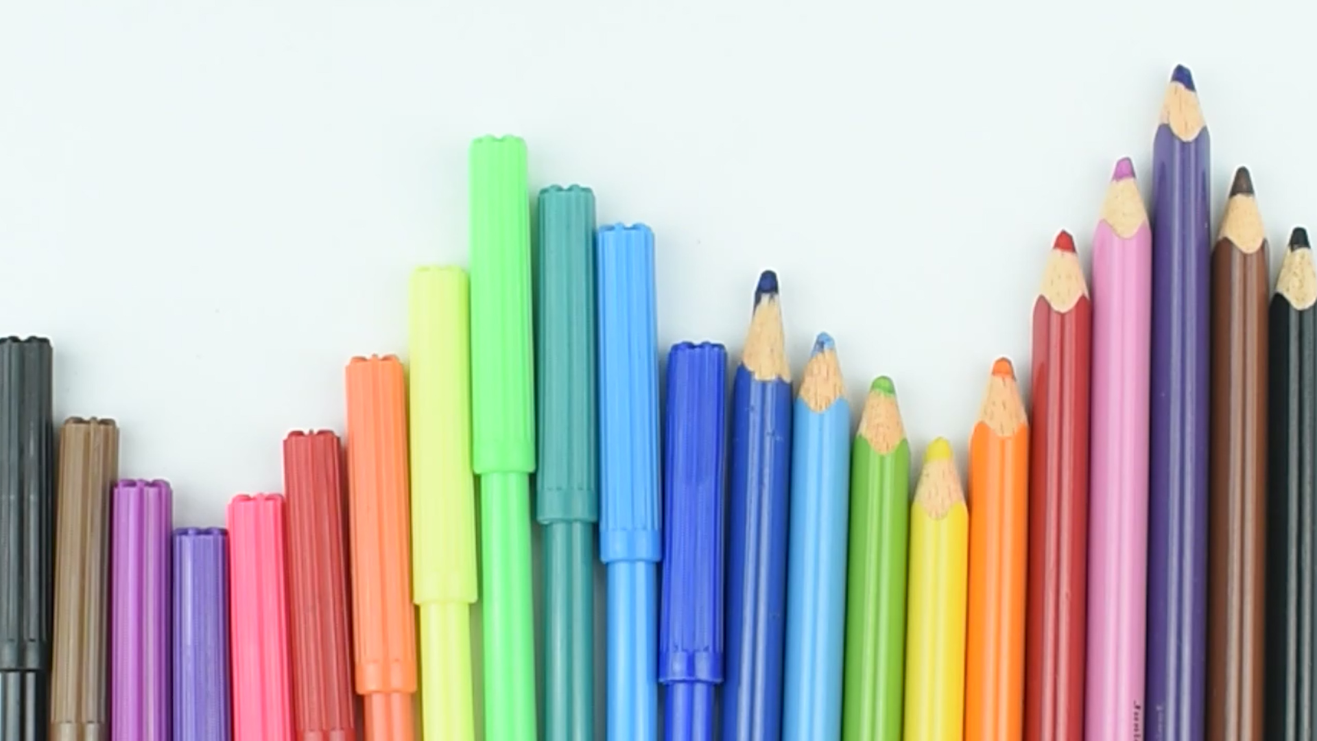
Coloring looks simple until your sky turns into a streaky blue lasagna, your shadows look like mysterious bruises, and your “soft sunset gradient” starts resembling a melted traffic cone. The good news? Learning how to color is not about owning a suitcase full of expensive pencils or being born with magical art hands. It is about understanding a few basic coloring techniques, practicing with patience, and building color in layers instead of attacking the page like it owes you money.
Whether you are using colored pencils, markers, crayons, gel pens, or a mix of everything in your desk drawer, the same core ideas apply: choose the right supplies, plan your color palette, start lightly, layer gradually, blend carefully, shade with intention, and finish with details that make the artwork feel alive. This beginner-friendly guide breaks the process into nine practical steps so you can color drawings, coloring book pages, handmade cards, classroom projects, and creative sketches with more confidence.
Think of coloring as cooking with light. A single flat color is like plain toast. Perfectly acceptable, but not exactly a standing ovation. Add highlights, shadows, warm tones, cool tones, texture, and contrast, and suddenly your picture has flavor. Grab your tools, find a comfortable spot, and let’s turn that blank page into something worth proudly sticking to the fridgeeven if you are a fully grown adult with a mortgage.
Step 1: Choose the Right Coloring Tools
The first step in learning how to color is choosing tools that match your project. Colored pencils are excellent for beginners because they offer control, layering, shading, and detail work. Markers create bold, smooth color and are great for graphic designs, cartoons, lettering, and large areas. Crayons are forgiving and nostalgic, though they can be waxy and harder to blend. Gel pens add sparkle, shine, and fine accents. Watercolor pencils can be used dry like regular colored pencils or activated with water for a soft painted effect.
If you are coloring a detailed page with tiny flowers, thin lines, and miniature leaves that seem designed to test your emotional stability, colored pencils or fine-tip markers are your best friends. For posters or big shapes, broad markers or crayons can save time. For realistic coloring, such as skin, fruit, animals, or landscapes, colored pencils allow subtle layering and color mixing.
Basic beginner supplies
You do not need every art product in the store. A practical beginner kit might include a set of 24 to 48 colored pencils, a pencil sharpener, a white pencil, a colorless blender pencil, a kneaded eraser, scrap paper for testing colors, and a smooth but slightly textured drawing paper. If using markers, add a protective sheet under your page to prevent bleed-through. Your table will thank you, and so will your security deposit.
Step 2: Pick Good Paper Before You Start
Paper matters more than most beginners realize. The surface texture, often called “tooth,” helps grab pigment from colored pencils. Very smooth paper can create clean lines, but it may not hold many layers. Rougher paper holds more pigment, but it can make details look grainy. Medium-textured drawing paper is usually a good starting point for colored pencil coloring because it balances smooth application with enough grip for layering.
Coloring book paper varies widely. Some pages are thin and slick, while others are thicker and more artist-friendly. If you are using markers, always check whether the paper bleeds. Place a blank sheet behind your coloring page or use marker paper when possible. If you are using watercolor pencils, choose heavier paper that can handle moisture without wrinkling like a sad napkin.
Before committing to your final artwork, test your colors on a corner or on a separate scrap sheet. This helps you see how the pencil or marker behaves on that exact paper. A color that looks gentle in the pencil barrel may appear surprisingly loud on paper, like it had three espressos.
Step 3: Plan a Simple Color Palette
A color palette is the group of colors you plan to use. Planning it before you begin prevents the classic beginner problem: using every color available and ending up with visual confetti. Start with three to seven main colors. For example, a cozy autumn palette might include burnt orange, golden yellow, brown, deep red, olive green, and cream. A peaceful ocean palette might use teal, blue, turquoise, sand, white, and soft gray.
Understanding basic color theory helps. Primary colors are red, yellow, and blue in traditional pigment mixing. Secondary colorsorange, green, and purplecome from mixing two primaries. Complementary colors sit opposite each other on the color wheel, such as blue and orange or red and green. They create strong contrast when placed side by side. Analogous colors sit next to each other, such as blue, blue-green, and green. They create harmony and are easier to blend.
Easy palette ideas
For beginners, try a monochromatic palette using light, medium, and dark versions of one color. This is perfect for practicing value, shading, and blending without worrying about color clashes. Another easy option is a warm palette with yellows, oranges, and reds, or a cool palette with blues, greens, and violets. When in doubt, limit your colors. A controlled palette often looks more polished than a rainbow explosion wearing tap shoes.
Step 4: Start With Light Pressure
One of the most important coloring tips is simple: start lightly. Many beginners press hard immediately, trying to get rich color in one layer. This flattens the paper texture, makes blending harder, and leaves harsh marks that are difficult to fix. Instead, hold your pencil with a relaxed grip and apply gentle pressure. Build color gradually through multiple layers.
Light pressure gives you room to adjust. You can darken an area later, but it is much harder to make a dark, waxy patch light again. Think of your first layer as a whisper, not a dramatic courtroom confession. Use small circular motions or smooth back-and-forth strokes to create even coverage. Keep your pencil sharp for details and slightly duller for soft shading over larger areas.
If you are using markers, begin with your lightest color. Alcohol markers and water-based markers can both become too dark quickly, so test them first. With markers, use steady strokes and avoid stopping in the middle of a large area, which can create visible overlap marks. Work while the ink is still slightly wet if you want smoother blends.
Step 5: Color in the Same Direction for Smooth Coverage
Direction matters. Random scribbling may feel freeing, but it often creates messy texture unless that is your artistic goal. For smooth coloring, keep your strokes consistent. On a leaf, follow the direction of the veins. On hair, follow the flow of the strands. On fabric, follow the folds. On round objects, curve your strokes slightly to support the shape.
Small circular strokes are useful for creating soft, even layers with colored pencils. Long strokes work well for hair, grass, wood grain, and fabric. Hatching and cross-hatching can create texture and shadow. Stippling, or using tiny dots, can add interesting effects to sand, stone, skin texture, or background details.
The goal is not to erase every sign of your hand. Handmade coloring has charm. The goal is to make the texture look intentional. If your strokes support the shape, your coloring will immediately look more polished, even before you add fancy blending or dramatic shadows.
Step 6: Build Layers Instead of Using One Heavy Coat
Layering is the secret sauce of good coloring. Colored pencils are usually semi-transparent, which means each layer can influence the one beneath it. By layering light blue over pale yellow, you can create a soft green. By adding lavender to a shadow, you can make it feel cooler and more realistic. By layering brown over orange, you can create a richer autumn tone.
Start with your lightest color, then gradually add midtones and darker shades. For a red apple, you might begin with pale yellow in the highlight area, add light red over most of the apple, deepen the shadow with crimson or dark red, and finish with a touch of brown or purple in the darkest areas. The result is more dimensional than simply filling the apple with one flat red.
Layering tips for beginners
Use two to five light layers before pressing harder. Rotate between colors instead of finishing one color completely before adding another. Keep highlights lighter by avoiding those areas or using very gentle pressure. If an area looks dull, add a related color rather than simply pressing harder. For example, enrich green leaves with yellow-green, olive, dark green, and a tiny touch of blue in the shadows.
Step 7: Add Shading and Highlights
Shading gives your coloring depth. Without shadows, objects can look flat, like stickers. Before shading, decide where your light source is. Is the light coming from the upper left? The right side? Directly above? Once you know that, place highlights on the side facing the light and shadows on the opposite side.
For a simple rule, use three values: light, medium, and dark. The light value is your highlight. The medium value is the main local color. The dark value is your shadow. A yellow flower, for example, might use pale yellow for highlights, golden yellow for the main petals, and orange or brownish yellow for shadows near the center.
Do not shade everything with black. Black can make colors look muddy if overused. Try darker versions of the same color, complementary colors, or cool tones such as blue, violet, or gray. For skin tones, shadows may include peach, tan, brown, rose, lavender, or muted red depending on the complexion and lighting. For white objects, shade with pale gray, blue, cream, or lavender instead of leaving everything blank.
Step 8: Blend Carefully for a Finished Look
Blending smooths transitions between colors. With colored pencils, you can blend by layering similar colors, using a white pencil, using a colorless blender, or burnishing. Burnishing means applying heavier pressure near the end to push pigment into the paper and create a smooth, polished finish. It can look beautiful, but it should usually come after you have built enough layers because it flattens the paper tooth and makes it harder to add more color afterward.
For a simple blend, choose three colors in the same family: light blue, medium blue, and dark blue. Lay down the lightest color first, add the medium color overlapping part of it, then add the dark color in the shadow area. Go back over the transition with the medium color, then soften the light area with the light color. This back-and-forth layering creates a smoother gradient.
With markers, blending works best when colors are close in tone. Use two or three shades from the same color family. Apply the darker shade first, add the lighter shade next to it, then use the lighter marker to soften the edge where they meet. Work on suitable paper and practice on simple shapes before trying detailed artwork. Marker blending can be magical, but it can also go from “soft peach” to “why is this carrot crying?” very quickly.
Step 9: Add Details, Clean Edges, and Finish Strong
The final step is where your coloring becomes crisp and intentional. Sharpen your pencils and add small details: veins in leaves, strands of hair, texture on fabric, sparkle in eyes, or tiny shadows under objects. Strengthen the darkest areas slightly to improve contrast. Reclaim highlights with a white gel pen, white pencil, or careful erasing if your paper and tools allow it.
Clean edges make a big difference. Go slowly around outlines, especially in detailed coloring pages. If you accidentally color outside the lines, do not panic. Most colored pencil mistakes can be softened with a kneaded eraser or disguised by deepening the background. Marker mistakes are harder to remove, but you can sometimes incorporate them into a shadow, border, or decorative element. Congratulations, it is not a mistake; it is now “mixed media.”
When you think you are finished, step away for a few minutes. Look at the artwork from a distance. Ask yourself: Does it need more contrast? Are the shadows clear? Do the colors feel balanced? Is one area much more intense than the rest? A short break helps you see the piece with fresh eyes. Artists call this “evaluating the work.” Everyone else calls it “staring suspiciously at paper.”
Common Coloring Mistakes to Avoid
Pressing too hard too soon
Heavy pressure at the beginning limits your ability to layer and blend. Start light, then increase pressure gradually near the end.
Using too many unrelated colors
A smaller palette often looks cleaner. Choose colors that share a mood, temperature, or theme.
Ignoring the light source
If highlights and shadows appear randomly, objects look flat or confusing. Pick a direction for the light and stay consistent.
Blending before layering enough color
Blending works best when there is enough pigment on the page. Build several light layers first, then blend.
Forgetting to test colors
Always test pencils and markers on scrap paper. This prevents surprise colors, bleeding, and awkward combinations.
Beginner Coloring Practice Exercises
Practice makes coloring easier, but it does not have to be boring. Try drawing five small circles and turning them into spheres using light, medium, and dark values. Color a row of leaves using different green combinations. Create a gradient strip from yellow to orange to red. Fill a square with smooth pencil layers using light pressure only. Then fill another square with heavy pressure and compare the difference. Your hand will quickly learn what your eyes already suspect: gentle layers usually win.
Another useful exercise is the three-color challenge. Choose only three colors and complete a small drawing with them. This teaches creativity, restraint, and problem-solving. You may discover that blue, brown, and cream can create a peaceful winter scene, or that pink, orange, and purple can create a lively sunset. Limiting your tools often makes your choices stronger.
Best Coloring Techniques for Different Subjects
Flowers
Use lighter colors at the petal tips and darker colors near the center or where petals overlap. Add subtle lines following the petal shape.
Animals
Use short strokes that follow the direction of fur or feathers. Layer several related colors instead of relying on one flat brown, gray, or black.
Landscapes
Keep distant objects lighter and less detailed. Use stronger contrast and sharper texture in the foreground.
Skin tones
Build slowly with peach, tan, brown, rose, cream, and muted shadow colors. Avoid one-color skin unless you want a cartoon style.
Lettering
Use gradients, shadows, and highlights to make letters pop. A darker outline or drop shadow can instantly improve hand-lettered designs.
Conclusion: Coloring Is a Skill, Not a Talent Test
Learning how to color is really learning how to see. You begin noticing where light falls, how shadows shift, how colors influence one another, and how a few thoughtful layers can turn a simple drawing into something expressive. The nine steps are easy to remember: choose good tools, pick the right paper, plan your palette, start lightly, control your strokes, build layers, add shading, blend carefully, and finish with clean details.
You do not need to color perfectly. In fact, perfect coloring can look a little lifeless. What you want is intention: colors that feel chosen, shadows that make sense, textures that support the subject, and details that guide the viewer’s eye. The more you practice, the more natural these decisions become. Eventually, you will stop asking, “Am I doing this right?” and start asking, “What mood do I want this color to create?” That is when coloring becomes more than filling empty spaces. It becomes art.
Experience Notes: What Coloring Teaches You After the First Few Pages
The first thing most beginners learn from coloring is that patience is not optional. It is the entire engine. On the first page, it is tempting to press hard, finish fast, and expect instant richness. The result usually looks bold at first, but it can become patchy, waxy, and difficult to adjust. After a few practice pages, you begin to understand the quiet power of light layers. A pale first layer may look unimpressive, but by the fifth layer, the color starts to glow. It feels a little like watching bread rise: not dramatic minute by minute, but very satisfying when it works.
Another experience many colorists share is the surprising importance of testing colors. Pencil barrels, marker caps, and printed swatches are not always honest little citizens. A pencil that looks soft coral may turn neon salmon on the page. A gray marker may dry warmer than expected. Testing colors on scrap paper saves artwork from unpleasant surprises. It also helps you discover beautiful combinations you might not have planned, such as lavender shadows under yellow flowers or pale blue highlights on white snow.
Coloring also teaches you to slow down and observe. At first, a leaf is simply green. After practice, you notice yellow-green near the light, deep olive near the stem, blue-green in the shadow, and maybe a warm brown along the edge. A face is not just “skin color.” A cloud is not just white. A wooden table is not just brown. Everything has temperature, value, texture, and reflected light. Once you start noticing these details, the world becomes a giant reference library that does not even charge late fees.
One of the most useful personal habits is rotating the page. Many beginners keep the paper locked in one direction and twist their wrist into positions normally reserved for advanced yoga. Turn the page instead. This helps create smoother strokes and cleaner edges. Another helpful habit is stepping back. A page that looks messy from six inches away may look beautifully blended from across the room. The opposite is also true, which is rude but educational.
Mistakes become less scary with experience. A dark patch can become a shadow. A marker bleed can become a background. A color choice that feels too bright can be balanced by repeating that color elsewhere. The best colorists are not people who never make mistakes; they are people who know how to negotiate with them. Coloring is full of tiny decisions, and each page gives you more confidence for the next one. The real reward is not only the finished picture. It is the calmer hand, sharper eye, and braver sense of color you build along the way.
SEO Tags
Note: This article is written in original, publication-ready American English and synthesizes real art-education principles without inserting source links or unnecessary reference placeholders.