Turning your iPhone screen to grayscale is one of those tiny settings that feels almost suspiciously powerful. One minute your phone is a glowing carnival of red badges, blue buttons, neon app icons, and “just one more scroll” temptation. The next minute, it looks like a very polite newspaper. Still useful, just far less dramatic.
Whether you want to reduce screen distractions, make your iPhone easier on your eyes, support better focus, or simply experiment with a calmer black-and-white display, grayscale mode is built directly into iOS. You do not need a third-party app, a secret developer menu, or a tech-savvy cousin named Tyler who “knows phones.” You only need the Settings app and about one minute.
In this guide, you will learn how to change your iPhone screen to grayscale, how to turn it off, how to create a quick shortcut, and how to use black-and-white mode in real life without making your phone feel like it was designed during the silent film era.
What Is Grayscale Mode on iPhone?
Grayscale mode is an iPhone accessibility display setting that removes color from the screen and shows everything in shades of black, white, and gray. Your apps, photos, videos, messages, icons, widgets, and menus still work normally. The only difference is visual: the screen loses its color.
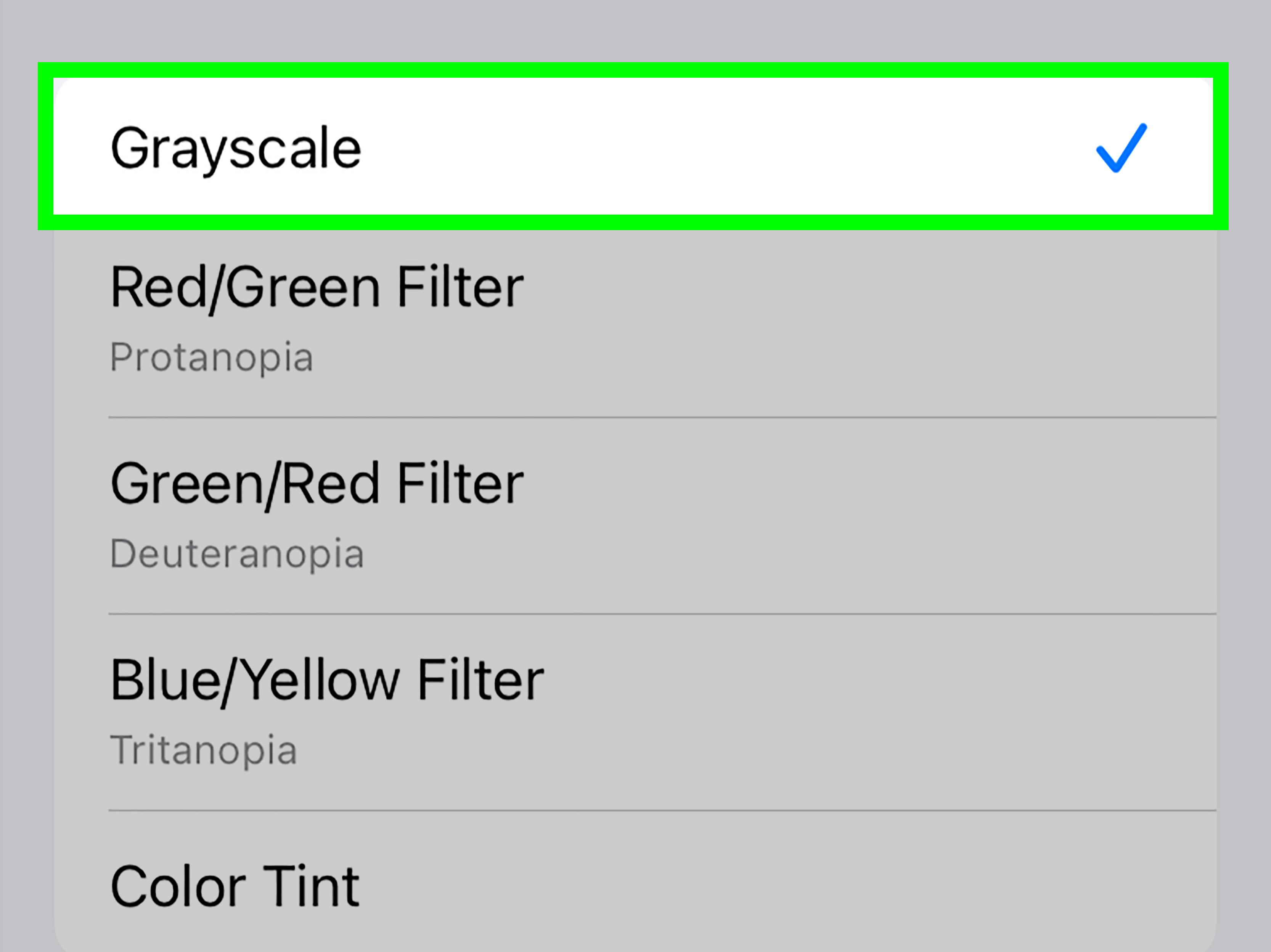
On iPhone, grayscale is part of the Color Filters feature. Apple includes Color Filters to help people who have difficulty distinguishing certain colors, but the feature is also commonly used by people who want to make their phones less visually stimulating.
That is the real magic of grayscale. It does not block apps. It does not delete anything. It does not lecture you about screen time like a disappointed gym teacher. It simply makes the phone less exciting to look at, which can make it easier to put down.
How to Change Your iPhone Screen to Grayscale
The fastest way to make your iPhone black and white is through Accessibility settings. The wording may vary slightly depending on your iOS version, but the path is generally the same on modern iPhones.
Step-by-Step Instructions
- Open the Settings app on your iPhone.
- Tap Accessibility.
- Tap Display & Text Size.
- Scroll down and tap Color Filters.
- Turn on the Color Filters switch.
- Select Grayscale.
Your iPhone screen should immediately switch to black and white. There is no save button to press. iOS applies the change instantly, so if your screen suddenly looks like a vintage documentary, congratulationsyou did it correctly.
How to Turn Grayscale Off on iPhone
If you try grayscale and decide you miss color more than you expected, turning it off is just as easy. Go back to the same setting and disable Color Filters.
To Turn Off Grayscale
- Open Settings.
- Tap Accessibility.
- Tap Display & Text Size.
- Tap Color Filters.
- Turn Color Filters off.
Your screen will return to full color right away. If you selected a different filter by accident, simply choose Grayscale again or turn Color Filters off completely.
How to Add a Grayscale Shortcut on iPhone
If you plan to use grayscale often, digging through Settings every time can feel like opening a filing cabinet just to turn off a lamp. The better option is to add Color Filters to your Accessibility Shortcut. This lets you triple-click the Side button or Home button to toggle grayscale quickly.
Set Up the Triple-Click Shortcut
- Open Settings.
- Tap Accessibility.
- Scroll to the bottom and tap Accessibility Shortcut.
- Select Color Filters.
After this is set up, triple-click the Side button on Face ID iPhones or the Home button on older iPhones. If Color Filters is the only shortcut selected, grayscale should toggle on or off immediately. If you selected multiple accessibility shortcuts, iPhone may show a small menu so you can choose which feature to activate.
This shortcut is especially useful if you want your phone in color during certain tasks, such as editing photos, shopping online, reading maps, or checking design work, but want grayscale the rest of the time.
Why Use Grayscale on iPhone?
People turn on iPhone grayscale for different reasons. Some use it for accessibility. Others use it as a digital wellness trick. Some just want to know what their Home Screen would look like if it had a quiet existential crisis. All valid.
1. It Can Make Your Phone Less Distracting
Color is a big part of why smartphones feel so inviting. App icons are carefully designed to stand out. Notification badges use bright red because red screams, “Look at me immediately, even if I am just a coupon for socks.” Social media apps rely heavily on colorful images, reactions, icons, and interface cues to keep your attention moving.
When you turn the screen black and white, many of those visual hooks lose their punch. The phone still works, but it feels more like a tool and less like a pocket-sized amusement park.
2. It May Help Reduce Mindless Scrolling
Grayscale does not magically give you monk-level discipline. However, it can add friction. A black-and-white feed often feels less rewarding than a colorful one. Photos look flatter. Video thumbnails look less tempting. App icons stop shouting for attention.
That little reduction in visual reward can make it easier to pause and ask, “Did I open this app for a reason, or did my thumb just stage a tiny rebellion?”
3. It Can Support a Calmer Phone Setup
Many people combine grayscale with other iPhone settings, such as Focus modes, fewer notifications, a simplified Home Screen, reduced motion, or app limits. Together, these changes can make the iPhone feel calmer and more intentional.
Think of grayscale as the visual equivalent of cleaning your desk. The desk still has everything you need, but it no longer looks like six projects got into a wrestling match.
4. It Can Help Some Users With Visual Accessibility
Color Filters are part of iPhone’s accessibility tools. While grayscale is popular for focus, the broader Color Filters menu can also help users adjust how colors appear on the screen. Some filters are designed for different types of color vision needs, and others allow color tint adjustments.
If you are using grayscale for accessibility, it is worth exploring the full Display & Text Size menu. You may also find useful options such as Bold Text, Larger Text, Increase Contrast, Reduce Transparency, Reduce White Point, and Smart Invert.
Does Grayscale Affect Photos, Videos, or Screenshots?
Grayscale changes how your iPhone display looks, but it does not permanently edit your photos, videos, apps, or files. If you take a photo while grayscale is on, the photo itself is still captured in color unless you use a camera filter or editing effect. Your iPhone is not repainting reality. It is only changing the way the screen displays color.
Screenshots can be a little confusing. Depending on how the image is viewed and shared, a screenshot may appear in color to someone else even if your display looked black and white when you captured it. That is because Color Filters are a display effect, not necessarily a permanent change to the underlying content.
For everyday use, remember this simple rule: grayscale changes your viewing experience, not the actual color data stored in your files.
Grayscale vs. Dark Mode: What Is the Difference?
Grayscale and Dark Mode are often mentioned together, but they are not the same thing.
Grayscale
Grayscale removes color from the entire iPhone display. Apps, icons, images, videos, menus, and notifications appear in black, white, and gray.
Dark Mode
Dark Mode changes the interface from a light background to a darker one in supported apps and system menus. It does not remove color. App icons, photos, buttons, and images can still appear colorful.
If your goal is to reduce brightness at night, Dark Mode may be more comfortable. If your goal is to make your phone less visually tempting, grayscale usually has the stronger “this is boring now” effect. You can also use both at the same time for a very calm, very serious-looking iPhone.
Grayscale vs. Reduce White Point
Another helpful iPhone display option is Reduce White Point. This setting lowers the intensity of bright colors and whites, which can make the screen feel softer, especially in low light.
Reduce White Point does not remove color. It simply tones down brightness and intensity. Grayscale removes color entirely. If your eyes feel blasted by your screen at night, Reduce White Point may help. If Instagram looks too deliciously clickable, grayscale may be the better choice.
How to Use Grayscale With Focus Modes
Focus modes help you control notifications and distractions during work, school, sleep, driving, or personal time. Grayscale can pair nicely with Focus because it changes not just what interrupts you, but how tempting your phone looks when you pick it up.
For example, you might use a Work Focus that silences social media notifications and keeps your Home Screen simple. Add grayscale to that routine, and your phone becomes much less interesting during deep work. It still handles calls, messages, calendars, notes, maps, and productivity apps, but it loses the candy-coated glow that invites extra tapping.
If you are comfortable using the Shortcuts app, you can also experiment with automations that turn Color Filters on or off during certain times or activities. For many users, though, the triple-click Accessibility Shortcut is simpler and reliable enough.
When You Should Not Use Grayscale
Grayscale is useful, but it is not perfect for every situation. There are times when full color is genuinely important.
Photo and Video Editing
If you edit photos, create graphics, color-correct videos, choose filters, or design anything visual, turn grayscale off. Trying to judge color in grayscale is like trying to smell soup through a spreadsheet.
Maps and Navigation
Maps still work in grayscale, but colors can help distinguish routes, traffic conditions, transit lines, and map details. If you are navigating somewhere unfamiliar, full color may be easier to understand quickly.
Shopping and Product Comparisons
If you are buying clothing, furniture, makeup, accessories, paint, or anything where color matters, turn grayscale off before making a decision. Otherwise, “navy blue” and “charcoal gray” may become a tiny betrayal waiting in your delivery box.
Accessibility Needs That Depend on Color
Some people rely on color to identify alerts, charts, labels, app categories, or status indicators. If grayscale makes your phone harder to use, it may not be the right setting for you. Accessibility is personal; the best setup is the one that helps you use your device comfortably.
Troubleshooting: Why Is My iPhone Stuck in Black and White?
If your iPhone screen suddenly looks black and white and you did not mean to enable grayscale, Color Filters may have been turned on by accident. This can happen if someone was exploring Accessibility settings or if the triple-click shortcut was activated.
Check Color Filters
- Go to Settings.
- Tap Accessibility.
- Tap Display & Text Size.
- Tap Color Filters.
- Turn Color Filters off.
Check the Accessibility Shortcut
If grayscale keeps coming back, check whether Color Filters is assigned to the Accessibility Shortcut:
- Open Settings.
- Tap Accessibility.
- Scroll down to Accessibility Shortcut.
- Look for Color Filters.
- Uncheck it if you do not want triple-click to control grayscale.
Once removed from the shortcut, accidental triple-clicks should no longer switch your iPhone into black-and-white mode.
Tips for Making Grayscale More Useful
Grayscale works best when you use it intentionally. Here are a few practical ways to make it part of a smarter phone routine.
Use It During Work or Study Hours
If your iPhone is constantly pulling your attention away from homework, writing, meetings, or deep work, turn grayscale on during focus blocks. The phone remains available for important tasks, but it becomes less entertaining.
Use It at Night
At night, grayscale can make your phone feel less engaging. Pair it with Night Shift, Dark Mode, or Reduce White Point if your goal is a calmer nighttime screen. This will not magically put you to sleep, but it may help reduce the “I opened one app and now it is somehow tomorrow” problem.
Use It for Social Media Boundaries
Social media apps are much less thrilling in black and white. If you do not want to delete them, grayscale can be a gentle middle ground. You can still check messages or updates, but endless browsing may feel less rewarding.
Keep the Shortcut Available
The triple-click shortcut makes grayscale easier to live with. You can quickly switch back to color when needed, then return to grayscale when you want fewer distractions.
Common Questions About iPhone Grayscale
Does grayscale save battery on iPhone?
Grayscale is not primarily a battery-saving feature. On some displays, darker content can affect power use, but grayscale itself should not be treated as a major battery solution. If battery life is your main concern, focus on Low Power Mode, screen brightness, background app activity, and battery health.
Can I make only certain apps grayscale?
iPhone’s built-in Color Filters setting applies system-wide. However, advanced users sometimes use the Shortcuts app to create automations that turn Color Filters on when opening selected apps and turn them off when closing those apps. This takes more setup than the basic grayscale method, but it can be useful if you only want social media, games, or shopping apps to appear black and white.
Will grayscale damage my screen?
No. Grayscale is a software display filter. It does not damage your iPhone screen or permanently change your apps, photos, or videos.
Is grayscale the same as black-and-white mode?
For everyday iPhone use, yes. When people say “black-and-white mode” on iPhone, they usually mean the Grayscale option inside Color Filters.
Real-Life Experiences With Changing an iPhone Screen to Grayscale
Using grayscale sounds almost too simple to matter. After all, it is just a color setting. But in real life, that small visual change can make your relationship with your phone feel noticeably different.
The first thing many people notice is that app icons lose their emotional volume. In full color, the Home Screen can feel like a wall of tiny billboards. Every icon has its own personality. Red notification badges look urgent. Bright shopping apps look cheerful. Social media icons look familiar and inviting. In grayscale, they all become quieter. They are still there, but they stop waving their arms like inflatable tube men outside a phone dealership.
One practical experience is using grayscale during work hours. Imagine sitting down to write, study, or complete a project. You pick up your phone to check one message. In full color, your eyes may jump from Messages to Instagram, then to YouTube, then to a weather widget you did not need, then suddenly you are watching a video about a raccoon stealing cat food. Grayscale does not prevent that entirely, but it makes the detour less shiny. The phone becomes easier to put down because the visual reward is weaker.
Another useful experience is turning grayscale on during the evening. A colorful phone can feel strangely energetic at night, especially when every app is glowing like it has exciting news. Black-and-white mode makes the screen feel more plain and less stimulating. It can help create a mental signal that the day is winding down. You may still use your phone, but it feels less like entertainment and more like a simple tool for checking tomorrow’s alarm, reading a message, or setting a reminder.
Grayscale can also reveal how much design influences behavior. Food delivery photos look less delicious. Shopping apps look less glamorous. Game icons look less dramatic. Social media feeds look flatter. None of the content changed, but your reaction to it may change. That is the interesting part. The setting does not force discipline; it changes the environment so discipline has less heavy lifting to do.
There are a few annoyances too. If you are trying to choose an outfit, compare product colors, edit a picture, or read a chart that depends on color, grayscale can get in the way. That is why the Accessibility Shortcut is so helpful. Triple-clicking the Side button to switch color back on makes grayscale practical instead of annoying. Without the shortcut, you may get tired of digging through Settings and abandon the habit after a day.
A balanced approach works best. You do not have to live in grayscale forever like your iPhone joined a historic film festival. Try using it only during specific times: work sessions, school hours, bedtime, meals, or social media breaks. After a few days, you may notice which apps become less appealing and which tasks still require full color.
For many people, the biggest benefit is awareness. Grayscale makes you notice how often you reach for your phone automatically. When the screen is less rewarding, those automatic checks become more obvious. You may catch yourself unlocking the phone, staring at the gray icons, and thinking, “Wait, why am I here?” That tiny pause is valuable. It gives you a chance to choose what to do next instead of letting habit drive.
In short, grayscale is not a miracle cure for distraction, but it is a surprisingly effective nudge. It is free, reversible, built into the iPhone, and easy to test. If it helps, keep it. If not, turn it off. Your phone will not be offended. It has survived worse, including being dropped between car seats and blamed for your low storage.
Conclusion
Changing your iPhone screen to grayscale is quick, simple, and surprisingly useful. Go to Settings > Accessibility > Display & Text Size > Color Filters, turn on Color Filters, and choose Grayscale. That is all it takes to make your iPhone black and white.
For convenience, add Color Filters to the Accessibility Shortcut so you can triple-click the Side button or Home button to switch grayscale on and off. This makes it easy to use grayscale when you want fewer distractions and return to color when you need it for photos, maps, shopping, or design work.
Grayscale will not solve every screen-time problem, but it can make your iPhone feel calmer, less addictive, and more intentional. Sometimes the smartest phone trick is not adding another app. Sometimes it is removing the rainbow.
Note: Menu names and paths may vary slightly by iOS version, but the grayscale option is generally found under Accessibility, Display & Text Size, and Color Filters.