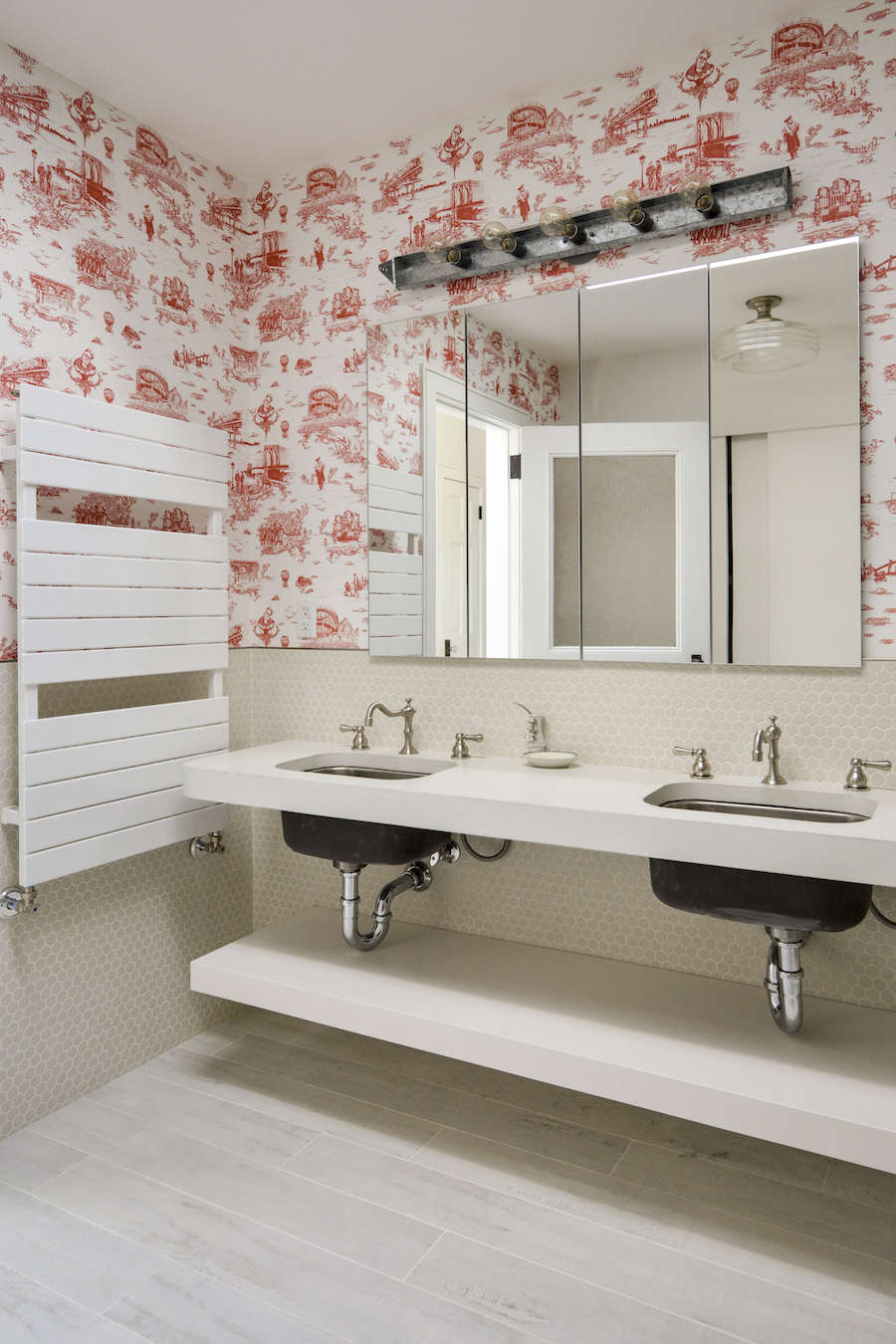
Some wallpapers politely decorate a room. Flavor Paper’s Brooklyn Toile Wallpaper walks in wearing sneakers, orders a slice, nods at the elevated train, and somehow still remembers its French manners. That is the magic of this pattern: from across the room, it looks like a classic toile de Jouy, all delicate linework and old-world charm. Step closer, though, and the pastoral countryside gives way to Brooklyn icons, street culture, pigeons, bridges, borough landmarks, and a visual wink so confident it should probably have its own MetroCard.
Brooklyn Toile is one of those rare wallcoverings that works as design, storytelling, and conversation bait. It was created through a collaboration involving Mike Diamond, better known as Mike D of the Beastie Boys, along with Vincent J. Ficarra and Adela Qersaqi of Revolver New York, and manufactured by the Brooklyn-based wallpaper studio Flavor Paper. Originally imagined for Mike D’s Brooklyn brownstone, the design has grown beyond private-home coolness into something closer to a modern design artifact. It is bold, funny, sophisticated, and very New Yorkmeaning it can charm you while cutting in line for coffee.
For homeowners, designers, renters with ambition, and anyone who believes a wall should do more than hold up framed prints, Flavor Paper’s Brooklyn Toile Wallpaper offers a deeply specific kind of beauty. It blends traditional decorative language with local identity, proving that wallpaper can be both elegant and mischievous. In other words, it is toile with a side of attitude.
What Is Flavor Paper’s Brooklyn Toile Wallpaper?
Flavor Paper’s Brooklyn Toile Wallpaper is a contemporary reinterpretation of classic toile de Jouy, a decorative pattern style historically known for detailed, repeated scenes printed in a limited color palette. Traditional toile often features romantic rural landscapes, shepherds, trees, classical buildings, and well-dressed people doing leisurely things in a world suspiciously free of parking tickets. Brooklyn Toile keeps the structure but swaps the scenery. Instead of French countryside calm, it delivers urban rhythm.
The pattern includes Brooklyn imagery such as Coney Island, Borough Hall, Fulton Mall, the Brooklyn Bridge, elevated subways, pigeons, b-boys with boomboxes, and references to The Notorious B.I.G. It uses the familiar look of antique toile as a visual setup, then rewards closer inspection with unmistakably modern, local, and humorous details. This is not wallpaper pretending to be timeless by avoiding personality. It is timeless because it has personality.
Flavor Paper offers Brooklyn Toile in multiple colorways, including Black and White, Pigeon, Porcelain Blue, Money Green, Flamingo, and Diamond Red. These options let the same design shift moods dramatically. Black and White feels crisp and graphic. Porcelain Blue nods most directly to traditional toile. Money Green has a cheeky, urban-luxe energy. Flamingo and Diamond Red turn up the drama, ideal for rooms where subtlety has already packed its bags and moved to Connecticut.
The Story Behind Brooklyn Toile
The origin story is part of the wallpaper’s appeal. Mike Diamond wanted a Brooklyn-inspired toile for his own brownstone, but not a novelty print that screamed for attention every five seconds. The goal was more interesting: create something that looked traditional from a distance and revealed Brooklyn’s layered character up close. That “double take” effect is what makes the design work so well.
Revolver New York helped translate the idea into artwork, while Flavor Paper produced the wallcovering with the kind of craft and technical control that has made the studio a favorite among designers looking for more than beige-on-beige politeness. The result is a wallpaper that lives comfortably between high design and street-level storytelling. It respects toile history without treating it like a museum rope you are afraid to cross.
Brooklyn Toile was designed and printed in 2012, and the Brooklyn Museum later acquired the pattern for its Decorative Arts and Design collection. That matters because it confirms what many design fans sensed immediately: this was not just another trendy wallcovering. It captured a cultural moment, a borough identity, and a clever evolution of a centuries-old design language.
Why This Wallpaper Became a Modern Design Favorite
It Looks Classic Until It Starts Talking
The genius of Brooklyn Toile is that it behaves like classic decor at first glance. The repeating pattern, fine illustration style, and restrained color options make it visually familiar. It can live in a brownstone, powder room, hallway, boutique hotel, restaurant, nursery, or creative office without looking like a mural that wandered in by mistake.
But once someone notices the details, the room changes. Suddenly the wall is not just background; it is a narrative. Guests start pointing things out. “Is that the Brooklyn Bridge?” “Wait, is that a pigeon?” “Is this toile… with attitude?” Congratulations: your wallpaper is now hosting the party.
It Connects Place and Pattern
Many wallpapers are beautiful but anonymous. Brooklyn Toile is proudly specific. It belongs to Brooklyn, not in a narrow tourist-postcard way, but in the way neighborhoods become collections of symbols, jokes, memories, landmarks, and characters. It captures the borough as both myth and lived experience.
This specificity gives the wallpaper emotional weight. For someone who lives in Brooklyn, used to live there, loves New York, or simply appreciates urban storytelling, the print can feel personal. It is not just “pretty wallpaper.” It is a wall-sized love letter with better linework than most love letters and fewer regrettable metaphors.
It Balances Humor and Taste
Funny design can go wrong quickly. One minute it is clever; the next minute your bathroom looks like a theme restaurant that serves fries in tiny shopping carts. Brooklyn Toile avoids that trap because the humor is embedded in a refined visual system. The pattern is witty, not goofy. It has rhythm, scale, and historical references that keep it grounded.
That balance makes it surprisingly versatile. In a formal room, it loosens the collar. In a casual room, it adds polish. In a small powder room, it transforms limited square footage into a tiny gallery of urban charm. In a hallway, it creates movement and discovery. It can be playful without sacrificing design credibility, which is a harder trick than it sounds.
A Quick Look at Toile de Jouy: The Tradition Brooklyn Toile Reimagines
To understand why Brooklyn Toile feels so satisfying, it helps to understand the pattern tradition it updates. Toile de Jouy became famous in France in the 18th century, especially through printed textiles associated with Jouy-en-Josas. Classic toile typically used detailed repeating scenes printed in one color on a light ground. The subjects often included pastoral landscapes, architecture, gardens, animals, and people enjoying a life that seemed suspiciously free of inbox notifications.
Over time, toile became a staple in interiors, appearing on wallpaper, upholstery, bedding, curtains, and decorative fabrics. It has cycled through periods of popularity, from colonial-inspired interiors to country French rooms to grandmillennial revivals. Its staying power comes from the way it combines order and storytelling. The repeat gives structure; the miniature scenes invite curiosity.
Brooklyn Toile succeeds because it does not simply mock the old form. It understands the old form. Traditional toile was already a storytelling medium. Flavor Paper’s version just changes the story from rural leisure to city life. Instead of pretending the modern world is not there, Brooklyn Toile invites it onto the wall, gives it a fine-line illustration treatment, and lets it mingle with centuries of decorative history.
Flavor Paper: The Studio Behind the Wallcovering
Flavor Paper is not a shy wallpaper company. Founded in 2003, the brand is known for audacious hand-screened and digitally printed wallcoverings, artist collaborations, experimental materials, vivid color, and a general refusal to let walls become boring. Based in Brooklyn, the studio has built a reputation for turning wallpaper into art, performance, and sometimes pure visual mischief.
The company emphasizes water-based production methods and eco-conscious materials where possible, including PVC-free substrates, recycled content, and FSC Certified paper content. It also produces work in-house, which allows for quality control and creative flexibility. That matters for a design like Brooklyn Toile, where the fine details, repeat, scale, and printing quality all affect how successfully the pattern reads.
Flavor Paper’s Brooklyn headquarters is itself part of the brand mythology: a production facility, showroom, and creative space where the act of making wallpaper is visible rather than hidden. That openness fits the company’s personality. Flavor Paper does not treat wallpaper as a quiet background product. It treats it as a designed object with a story, process, and point of view.
Design Details That Make Brooklyn Toile Stand Out
Scale and Repeat
Brooklyn Toile has a strong repeat structure, which gives it the decorative order expected from toile. The official product details list a 26-inch vertical repeat with a straight match. For homeowners, that detail is important because pattern matching affects installation planning, material calculations, and waste. A straight match means the design aligns horizontally across panels, but precision still matters. This is not the wallpaper to install while “mostly paying attention” and also watching a cooking competition finale.
Colorways with Different Personalities
The colorway determines how loudly the wallpaper speaks. Black and White is the most classic and graphic, great for rooms that need punch without extra color complexity. Porcelain Blue feels closer to traditional toile and works beautifully with white trim, navy accents, antique brass, or warm wood. Money Green is playful and memorable, especially in bars, powder rooms, creative offices, and spaces that can handle a little wink. Diamond Red and Flamingo are bolder choices, ideal for maximalist interiors or statement walls.
Urban Icons in a Historic Style
The detailed illustrations are the heart of the design. The Brooklyn Bridge, subway scenes, pigeons, Coney Island references, and music-culture nods create a pattern that rewards repeated viewing. The best wallpapers often reveal themselves slowly. Brooklyn Toile does that particularly well. You can live with it for months and still catch a detail you missed, which is more than can be said for many beige paint colors named after oatmeal.
Where to Use Brooklyn Toile Wallpaper
Powder Rooms
If Brooklyn Toile had a natural habitat, the powder room would be high on the list. Small bathrooms are perfect places to take design risks because the limited square footage keeps the pattern contained while maximizing impact. A powder room wrapped in Brooklyn Toile feels intentional, memorable, and just dramatic enough. Add a simple mirror, good lighting, and a compact vanity, and the space becomes a jewel box with jokes.
Entryways and Hallways
Entryways benefit from wallpaper that establishes personality immediately. Brooklyn Toile tells visitors that the home has a sense of humor, a design point of view, and possibly excellent snacks. In a hallway, the repeated scenes create visual movement and make transitional space feel considered rather than forgotten.
Dining Rooms and Breakfast Nooks
Because toile has a long history in dining rooms and formal interiors, Brooklyn Toile can create a clever contrast in eating spaces. Pair it with a modern table and simple chairs for a crisp mix, or lean into the old-meets-new effect with vintage lighting, café curtains, and art that does not take itself too seriously.
Nurseries and Kids’ Rooms
Brooklyn Toile can work beautifully in a child’s room, especially in softer colorways. Unlike overly cute nursery wallpaper, it has enough sophistication to grow with the child. The little illustrated scenes invite curiosity, and the city imagery can become a fun visual scavenger hunt. Just keep the rest of the palette calm so the room feels cozy rather than visually caffeinated.
Creative Offices and Studios
For a design studio, music room, home office, or boutique workspace, Brooklyn Toile provides instant character. It signals creativity without resorting to motivational wall decals, which, let us be honest, have already told enough people to “dream big” in vinyl lettering.
How to Style Flavor Paper’s Brooklyn Toile Wallpaper
Let the Wallpaper Be the Lead Singer
Brooklyn Toile has presence, so it usually works best when the surrounding elements support rather than compete. Simple furniture silhouettes, solid fabrics, and clean trim help the pattern shine. Think of the wallpaper as the lead singer and the furniture as the band. Everyone matters, but not everyone gets the microphone.
Repeat One Color from the Wallpaper
A smart way to create cohesion is to pull one color from the wallpaper into the rest of the room. With Porcelain Blue, use navy pillows, blue-gray cabinetry, or ceramic accents. With Money Green, try olive upholstery, brass hardware, or deep green trim. With Black and White, bring in black lighting, white oak, or warm leather to keep the palette from feeling flat.
Mix Old and New
Because Brooklyn Toile already mixes antique decorative structure with urban imagery, it pairs well with both vintage and contemporary pieces. A traditional mirror can make the toile feel more classic. A modern sconce can sharpen the whole room. A marble sink, lacquered cabinet, or midcentury chair can all work, provided the proportions feel balanced.
Use It Above Wainscoting
For homeowners nervous about full-wall coverage, installing Brooklyn Toile above wainscoting is a strong compromise. The lower paneling gives the eye a break, while the wallpaper brings detail and personality to the upper wall. This approach works especially well in dining rooms, stair halls, and powder rooms.
Installation Considerations Before You Order
Brooklyn Toile is not the kind of wallpaper you should order by guessing. Because it has a defined repeat and illustrated scenes, accurate measurements matter. Measure wall height and width, account for doors and windows, and remember that pattern matching can require extra material. Ordering too little wallpaper is one of the fastest ways to turn a fun design project into a small domestic opera.
The official product information notes panel widths and multiple panel lengths, with the wallpaper digitally printed to order in the United States. Depending on the substrate and installation type selected, some versions may be better suited to professional hanging, while others are designed to be more DIY-friendly. Flavor Paper’s EZ Papes option, for example, is often discussed by installers as a pre-pasted material that can be easier to hang and remove than heavier alternatives.
Wall preparation is crucial. Surfaces should be smooth, clean, dry, and properly primed. Old texture, dust, grease, uneven patches, or glossy paint can interfere with adhesion and make seams more obvious. If the wallpaper is going near a sink, consider splash exposure and edge protection. In bathrooms and powder rooms, ventilation also matters. Wallpaper may be fabulous, but it is not a superhero cape for moisture problems.
Is Brooklyn Toile Wallpaper Worth It?
For the right space and the right person, absolutely. Brooklyn Toile is worth considering if you want wallpaper that feels custom, meaningful, and visually rich. It is especially strong for interiors that need a memorable focal point. It is not a generic background pattern; it is a design statement. That means it may not be ideal for someone who wants walls to whisper. Brooklyn Toile speaks in a confident Brooklyn accent.
The value also comes from its cultural depth. This wallpaper is tied to a specific creative collaboration, a specific borough, and a specific design tradition. Its presence in the Brooklyn Museum’s collection gives it additional significance. Many wallpapers are beautiful; fewer can claim this level of story, provenance, and charm.
That said, the pattern deserves thoughtful use. In a room already packed with busy textiles, colorful art, open shelving, and competing prints, Brooklyn Toile may start a visual street fight. Give it breathing room. Let the pattern do what it does best: reward attention, make people smile, and turn a wall into an experience.
Experience Notes: Living With the Idea of Brooklyn Toile
Imagine walking into a small powder room wrapped in Brooklyn Toile for the first time. At first, you register the familiar elegance of toile: delicate lines, rhythmic spacing, a tidy decorative structure that feels almost historic. Then your eyes adjust. The “country scene” is not a country scene at all. There are pigeons. There is the Brooklyn Bridge. There are urban vignettes where you expected shepherds and trees. Suddenly, the room has a punchline, but it is delivered with perfect posture.
That layered experience is why this wallpaper sticks in the memory. Many interiors are designed to be admired quickly, photographed once, and forgotten by Tuesday. Brooklyn Toile invites lingering. It gives guests something to discover while washing their hands or waiting for dinner. In a home, that kind of interaction matters. The best rooms are not just styled; they create moments.
One practical experience with a pattern like this is that scale becomes very real once it is on the wall. A sample is helpful, but a full panel tells the truth. On a large wall, the print can feel immersive and architectural. In a tight powder room, it becomes more intimate, almost like being inside an illustrated storybook that grew up, moved to Brooklyn, and developed strong opinions about bagels. Before committing, it is wise to tape up samples and view them in morning light, afternoon light, and artificial light. Colorways can shift depending on the bulbs, wall direction, and surrounding finishes.
Another experience-related lesson is that Brooklyn Toile works best when you resist the urge to over-theme the room. You do not need subway-sign art, bridge-shaped bookends, pigeon figurines, and a framed map of every place you once bought coffee in Williamsburg. The wallpaper already carries the Brooklyn story. Let it. Pair it with good materials instead: a stone countertop, a simple wood vanity, unlacquered brass, matte black fixtures, linen towels, or a clean ceramic lamp. The contrast between the animated print and grounded materials makes the design feel grown-up.
There is also a social benefit. Brooklyn Toile is a rare decor choice that can break the ice without trying too hard. Guests notice it. Designers remember it. Kids spot details in it. Adults pretend they are not doing the same thing, then lean closer anyway. In restaurants, boutique hotels, and creative offices, that conversational quality is valuable. In homes, it adds warmth. It says the people who live here care about design, but they have not surrendered their sense of humor at the door.
From an ownership perspective, the wallpaper’s biggest strength is also its biggest warning: it has a point of view. That is wonderful if you love it. It is less wonderful if you are choosing it only because it is famous or because someone online used it beautifully. The right wallpaper should feel like a decision you are excited to defend. Brooklyn Toile is not shy, and that is exactly why fans love it. It brings a room to life without requiring neon paint, oversized art, or furniture shaped like punctuation.
For anyone considering it, the best approach is to start with the room’s purpose. A powder room can handle the full theatrical effect. A bedroom may prefer a softer colorway or a single feature wall. A hallway can use it as a visual journey. A dining nook can turn it into atmosphere. Once the purpose is clear, the pattern becomes easier to place.
In the end, living with Brooklyn Toile is about enjoying the slow reveal. It is beautiful from far away and fun up close. It honors decorative tradition while refusing to behave like a museum piece. It proves that wallpaper can be elegant, local, nostalgic, and hilarious without becoming a gimmick. That is a rare combinationand like a good New York slice, it is best appreciated in person.
Conclusion
Flavor Paper’s Brooklyn Toile Wallpaper is more than a stylish wallcovering. It is a smart collision of classic toile de Jouy, Brooklyn street culture, music history, local pride, and contemporary interior design. Created through a collaboration involving Mike Diamond, Revolver New York, and Flavor Paper, the pattern transforms familiar toile language into something fresh, witty, and unmistakably urban.
Its appeal comes from contrast: refined from a distance, surprising up close; traditional in structure, modern in subject; decorative enough for elegant rooms, funny enough to keep them human. Whether used in a powder room, hallway, dining area, nursery, or creative office, Brooklyn Toile brings story and style to the wall. It is not for people who want their interiors to disappear politely into the background. It is for people who believe a room should have a little rhythm, a little history, and maybe one very well-drawn pigeon.