For years, Android users have lived with one tiny but surprisingly annoying truth: the Chrome address bar sat at the top of the screen, and your thumb simply had to deal with it. If you owned a compact phone, fine. If you owned one of today’s giant Android phones, reaching the address bar sometimes felt like trying to tap a streetlight from the sidewalk.
Now, finally, Android users can move the Chrome address bar to the bottom of the screen. It is not a dramatic redesign, a shiny AI chatbot, or a feature that promises to organize your life and then forgets your grocery list. It is something better: a practical, everyday usability improvement that makes mobile browsing feel more natural.
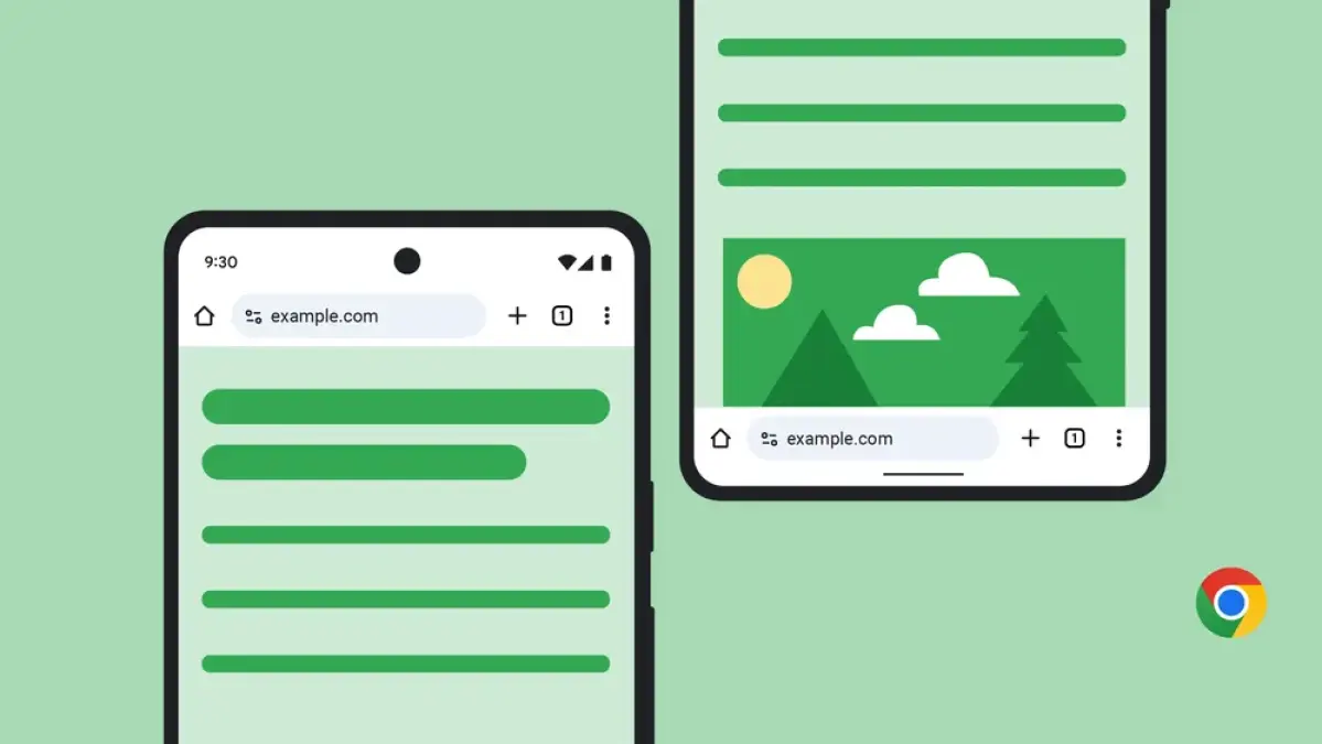
The new Chrome for Android address bar option allows users to choose whether the Omnibox stays at the top or moves to the bottom. That means you can keep the classic desktop-like layout if you prefer it, or shift the search and URL bar closer to your thumb for easier one-handed browsing. In a world where phones keep getting taller and our hands stubbornly refuse to evolve into spider legs, this is a welcome change.
What Changed in Chrome for Android?
Google has added a customization option that lets Chrome users on Android move the address bar from the top of the screen to the bottom. The address bar, also known as the Omnibox, is where you type website addresses, search queries, and occasionally questions like “why is my phone battery at 3 percent already?”
With the new setting, users can decide which placement feels better. The traditional top address bar remains available, so nobody is forced into a new layout. This matters because browser muscle memory is powerful. Some users love bottom controls. Others see them and immediately feel like someone rearranged the kitchen drawers.
The feature began rolling out in 2025 and was designed around flexibility. Google’s reasoning is simple: different hands, different phones, different preferences. A user with a smaller Android phone may be perfectly happy with the address bar at the top. Someone using a large-screen Galaxy, Pixel Pro, OnePlus, Motorola, or foldable phone may prefer the bottom address bar because it is easier to reach while browsing one-handed.
How to Move the Chrome Address Bar to the Bottom on Android
Moving the Chrome address bar is refreshingly easy. You do not need developer tools, secret codes, a ritual candle, or a degree in Android archaeology.
Method 1: Long-Press the Address Bar
The fastest way is to open Chrome on your Android phone, press and hold the address bar, and choose the option to move the address bar to the bottom. Once selected, Chrome shifts the bar downward so it sits closer to your thumb.
If you change your mind later, repeat the process and move it back to the top. Chrome is not judging you. It has seen your open tabs.
Method 2: Use Chrome Settings
You can also change the address bar position from the Settings menu. Open Chrome, tap the three-dot menu, go to Settings, choose Address bar, and select either Top or Bottom. This method is useful if the long-press menu does not appear immediately or if you simply prefer adjusting features through settings.
What If You Do Not See the Option Yet?
If the option is not showing, update Chrome through the Google Play Store. Feature rollouts can arrive gradually, so some users may see the setting before others. You should also restart Chrome after updating. In some cases, the feature may appear after the app refreshes or after your device receives the latest version.
Why the Bottom Address Bar Matters
At first glance, this looks like a small design tweak. But in daily use, small design tweaks can make a big difference. Mobile browsing is built around repetition. You open Chrome, tap the address bar, search, switch tabs, copy links, read articles, check tracking pages, and return to the address bar again. When a control is used dozens of times a day, its placement matters.
The bottom address bar brings Chrome closer to the natural resting position of your thumb. On large phones, the top of the screen is often difficult to reach without shifting your grip. That grip shift may seem harmless until you do it while walking, commuting, carrying coffee, or lying in bed pretending you are “just checking one thing” before accidentally reading three product reviews and a forum thread from 2017.
By placing the address bar at the bottom, Chrome becomes easier to use with one hand. It reduces stretching, improves comfort, and makes the browser feel more like a mobile-first app rather than a desktop browser squeezed into a phone screen.
Android Was Late to the Party, but at Least It Brought Snacks
One reason this update has attracted attention is that Chrome on iOS already offered a bottom address bar option before Android. Safari also popularized the idea of moving browser controls closer to the bottom of the screen. For Android users, the delay was a little ironic. Chrome is Google’s browser, Android is Google’s mobile platform, and yet iPhone users got this style of Chrome customization first.
Still, the Android rollout is important because Chrome is the default browser experience for many Android users. A feature like this reaches a huge audience, especially people who may never install alternative browsers but still want more comfort and control.
The move also reflects a larger design trend. Mobile apps increasingly place important controls near the bottom of the screen because modern phones are tall. Bottom navigation bars, floating action buttons, and thumb-friendly menus are now common in apps for shopping, messaging, banking, streaming, and social media. Chrome’s new address bar option fits into that broader shift toward ergonomic mobile design.
Top Address Bar vs. Bottom Address Bar: Which Is Better?
The best position depends on how you use your phone. There is no universal winner, which is why Chrome’s choice-based approach is smart.
Choose the Bottom Address Bar If You Browse One-Handed
If you often use Chrome with one hand, the bottom address bar will probably feel better. It is easier to tap, easier to edit search terms, and easier to access when your phone is large. This is especially useful when you are standing in line, riding public transit, cooking with one hand free, or holding your phone while your other hand is busy doing something more heroic, like preventing your coffee from becoming a floor decoration.
Choose the Top Address Bar If You Prefer the Classic Layout
The top address bar still makes sense for many users. If you have used Chrome for years, your eyes may naturally look upward for the URL field. Some people also prefer the top bar because it keeps the website controls visually separate from bottom navigation gestures. If you use Android gesture navigation, a bottom browser bar may feel close to the home gesture area at first.
Try Both for a Week
The easiest way to decide is to test both positions. Use the bottom address bar for a few days, then switch back to the top. Pay attention to comfort, typing speed, accidental taps, and whether your phone feels easier to control. The better option is the one you stop noticing because it simply works.
How This Improves Chrome’s Everyday Usability
The Chrome address bar is more than a URL box. It is the center of browsing. You use it to search Google, type web addresses, revisit pages, trigger autocomplete suggestions, scan URLs, and copy links. Moving it closer to the bottom affects several everyday actions.
Searching Becomes Faster
With the bar at the bottom, starting a new search takes less thumb travel. That may sound minor, but repeated actions define whether an app feels smooth or clumsy. When search is easier to start, Chrome feels quicker even if the browser engine itself has not changed.
Large Phones Feel Less Awkward
Many Android phones now have screens that stretch well beyond six inches. They are great for videos, maps, reading, and multitasking, but not always great for reachability. A bottom address bar helps balance that trade-off by keeping a frequently used control within a more comfortable thumb zone.
It Makes Chrome Feel More Customizable
Users like having control over their interface. This update is not just about ergonomics; it is about preference. Some people want the old layout. Some want the new one. Chrome now lets both groups exist peacefully, which is basically diplomacy with pixels.
Does the Bottom Address Bar Change How Websites Look?
For most users, websites should work normally. The page content remains the page content. The main difference is where Chrome places its browser controls. However, because the address bar takes up visual space at the bottom, some users may notice that certain websites feel slightly different, especially pages with sticky bottom buttons, cookie banners, chat widgets, or mobile checkout bars.
For example, a shopping website might already have a sticky “Add to Cart” button at the bottom. A travel site might show a floating “Book Now” button. A news site might place share buttons or newsletter prompts near the lower edge. With Chrome’s address bar also at the bottom, the page may feel more crowded in that area.
Good mobile websites should account for browser UI, safe areas, and responsive design. Still, the real mobile web is a glorious jungle of pop-ups, banners, cookie notices, and chat bubbles named “Megan” who appear 0.4 seconds after you land on a page. The bottom address bar may make those cluttered designs more noticeable.
What This Means for Web Designers and SEO Publishers
For website owners, bloggers, SEO editors, and UX designers, Chrome’s bottom address bar is a reminder that mobile layout matters. Most web traffic in many industries comes from phones. If a website only looks good on a desktop monitor, it is not finished. It is wearing a tuxedo on top and pajama pants underneath.
Keep Important Buttons Clear
Designers should avoid placing too many fixed elements at the bottom of the page. Sticky ads, cookie banners, newsletter boxes, chat widgets, and app install prompts can collide visually. If users choose a bottom browser bar, the lower part of the screen becomes even more valuable.
Improve Tap Targets
Buttons should be large enough to tap comfortably. Small links crammed near the bottom of a mobile page can become frustrating. Clear spacing, readable text, and sensible margins improve usability and can reduce bounce rates.
Prioritize Readability
For SEO, readability is not just a nice bonus. It affects engagement. Short paragraphs, clear headings, fast loading, and clean design help users stay longer. Chrome’s address bar placement does not directly change search rankings, but better mobile usability can support stronger user experience signals.
Is This a Big Innovation or Just a Nice Fix?
Let’s be honest: moving an address bar is not the moon landing. Nobody is going to build a statue for it, unless the statue has unusually strong thumbs. But it is still meaningful because it solves a real annoyance. Technology does not always need to be futuristic to be valuable. Sometimes the best update is the one that makes a daily habit slightly less irritating.
This is also a good example of user-centered design. Instead of assuming one layout works for everyone, Chrome now gives users a choice. That matters because people use phones differently. Some hold phones in one hand. Some use two hands. Some browse on small devices. Some use giant foldables. Some keep 98 tabs open and call it “research.” Chrome’s address bar option respects those differences.
Privacy, Security, and Performance: Does Anything Else Change?
The address bar position does not change Chrome’s core browsing features. Search suggestions, URL entry, security indicators, tab access, and Chrome’s general browsing behavior continue to work as expected. Moving the bar is a layout preference, not a privacy setting or performance mode.
That said, users should still pay attention to the address bar for security. Whether it is at the top or bottom, the address bar shows the site you are visiting. Before entering passwords, payment details, or personal information, check that the web address looks correct. A bottom address bar may even make this easier because it is closer to your thumb and more convenient to tap or inspect.
Real-World Experience: What It Feels Like to Use Chrome With the Address Bar at the Bottom
After switching the Chrome address bar to the bottom, the first thing you notice is not visual drama. It is relief. The browser suddenly feels less like it was designed for a tiny phone from a decade ago and more like it understands the large glass rectangle you are actually holding.
Opening a new tab, typing a search, or editing a URL becomes easier during casual browsing. Imagine standing in a grocery store trying to search for a recipe while holding a basket, your keys, and the unreasonable confidence that you do not need a cart. With the address bar at the top, you may have to shift your phone upward in your palm or use your other hand. With the address bar at the bottom, your thumb reaches it naturally. It is not magic, but it does feel like Chrome finally stopped making you perform finger yoga.
The change is especially noticeable on tall Android phones. On devices with large screens, reaching the top of Chrome can make the phone feel unstable. You stretch, the phone tilts, and suddenly you are one careless tap away from dropping it onto tile. The bottom address bar reduces that movement. It keeps the most-used control near the area where your thumb already rests.
Reading also feels smoother. When you finish an article and want to search a related term, you do not have to climb to the top of the display. When you want to copy a link, start a new query, or correct a typo in the URL, the action is closer. The difference is small each time, but after a full day of browsing, small conveniences add up.
There is a short adjustment period. If you have used Chrome on Android for years, your eyes may still jump to the top of the screen. Your thumb may hover in confusion, like a dog waiting at the wrong door. After a few days, though, the bottom placement starts to feel normal. For users coming from Safari on iPhone, Chrome on iOS, Samsung Internet, or other mobile browsers with bottom controls, the adjustment may be almost instant.
The bottom bar is not perfect for everyone. If you use Android gesture navigation aggressively, you may need time to get used to the address bar sitting closer to the home gesture area. Some websites with sticky bottom elements can also feel cramped. A cookie banner, a chat bubble, a bottom navigation menu, and Chrome’s own bottom address bar can turn the lower screen into a tiny convention of rectangles. In those moments, the top address bar may feel cleaner.
Still, the best part of the feature is that it is optional. You can move the Chrome address bar down, try it during your normal routine, and move it back if it does not fit. That choice makes the update feel mature. Google is not saying, “Here is the future, please enjoy your confusion.” It is saying, “Here are two layouts; pick the one your hand likes.”
For many Android users, the bottom address bar will become one of those quiet upgrades that quickly disappears into habit. You stop thinking about it. You just browse more comfortably. That is the sign of a good interface change: it does not demand applause; it simply gets out of the way.
Conclusion
Android users can finally move their Chrome address bar, and the update is more useful than its size suggests. By letting people choose between top and bottom placement, Chrome becomes more comfortable, more flexible, and better suited to modern large-screen phones.
The feature is easy to activate: long-press the address bar or use Chrome’s Settings menu. It does not force a new design on everyone, and it does not change Chrome’s core browsing functions. Instead, it gives users a practical option that can make searching, typing URLs, switching tasks, and browsing one-handed feel smoother.
For everyday users, this is a welcome comfort upgrade. For web designers and publishers, it is another reminder that mobile usability should be treated as a priority, not an afterthought. And for anyone who has ever nearly dropped a phone while reaching for the top of Chrome, this update deserves a tiny round of applause from your thumb.