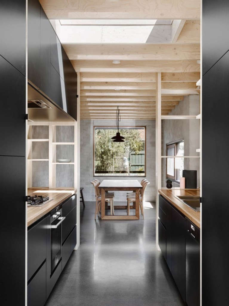
Some home additions arrive with a dramatic staircase, a glossy marble island, or a bathtub that looks like it expects applause. Then there are quieter projects that change how a house works without shouting about it. An Inspired Melbourne Addition with Shelves as Walls belongs firmly in the second category. It is clever, practical, warm, and just a little bit smug in the way truly efficient design can be. And honestly? It has earned the right.
Set in Northcote, Melbourne, this compact residential renovation by Rob Kennon Architects shows how a modest home can gain personality, storage, light, and flow without ballooning into a suburban mansion. The big idea is beautifully simple: instead of treating shelves as accessories hung on walls after the “real” architecture is done, the design makes shelving part of the architecture itself. The shelves divide rooms, frame views, hide clutter, connect zones, and give everyday objects a place to behave themselves.
The result is a Melbourne house addition that feels both disciplined and human. It uses raw birch plywood, polished concrete, black details, brick texture, glass, and carefully planned built-ins to create a home that is compact but not cramped. In other words, it is the architectural equivalent of packing for a weekend trip with one carry-on and still somehow bringing three outfits, a book, snacks, and emotional stability.
Why This Melbourne Addition Feels So Fresh
Many home additions fall into a familiar trap: they add square footage but not intelligence. A new room appears, the floor plan grows, and suddenly the house has more space but no more grace. This Melbourne addition takes a different route. Rather than chasing size for its own sake, it focuses on how space is used, divided, lit, and lived in.
The original house is a semi-detached Art Deco home in Northcote. Instead of overpowering the existing structure, the rear extension sits neatly behind it, creating new living, kitchen, dining, and study areas while allowing the older part of the home to keep its identity. The addition does not try to cosplay as heritage architecture. It is modern, honest, and clearly new, but it still respects the scale and rhythm of the home it joins.
The standout move is the lattice-like plywood shelving system. These shelves are not merely storage. They act as partial walls, screens, organizers, and visual connectors. They allow the kitchen, dining, and living areas to feel distinct without being fully sealed off from one another. That balance is the magic trick: separation without isolation.
Shelves as Walls: The Design Idea That Does the Heavy Lifting
In most homes, a wall does one job: it divides. Occasionally it holds art, hides electrical wires, or supports a family calendar covered in suspiciously optimistic plans. In this Melbourne addition, the “walls” do much more. The shelving creates boundaries while remaining porous. You can see through parts of it, store things within it, and experience it as both furniture and architecture.
This matters because open-plan living can be tricky. Everyone says they want openness until the blender, homework, dinner prep, and video call all happen within the same acoustic soup. Full walls can make a small home feel chopped up. No walls can make it feel chaotic. Shelving-as-walls offers a middle path. It defines space while keeping air, light, and conversation moving.
Open Shelves for Connection
Open shelves allow visual continuity. They let the living room borrow depth from the kitchen and dining area, and vice versa. Books, ceramics, plants, or everyday objects soften the structure and keep the interior from feeling too rigid. The shelving becomes a filter, not a barricade.
Closed Storage for Sanity
The project also understands that not everything deserves to be displayed. Nobody needs a gallery moment for cereal boxes, appliance cords, or the mystery container at the back of the fridge. Closed cabinets and concealed storage help the addition maintain its clean, calm appearance. This combination of open and closed storage is one reason the home feels livable rather than staged for a magazine and then abandoned before anyone makes toast.
A Compact House That Refuses to Feel Small
The renovated home is compact, but the planning makes it feel generous. The rear addition includes the kitchen, living, dining, and study zones, arranged to support daily routines without wasting precious square footage. Instead of treating compactness as a problem to disguise, the design treats it as a discipline.
Every element appears to earn its keep. The kitchen cabinetry blends into the larger shelving language. Butcher block counters feel like extensions of the timber framework. The concealed fridge and pantry reduce visual clutter near the entry to the addition. Even the laundry is integrated behind glass, giving a practical utility space a designed presence rather than banishing it to the realm of “we’ll deal with that later.”
This is a useful lesson for small home renovation: space is not only measured in square feet. It is measured in how easily you can move, how quickly you can find things, how well light travels, and how calmly a room handles the mess of ordinary life.
Material Palette: Plywood, Concrete, Black Details, and Brick
The Melbourne addition succeeds partly because its material palette is restrained. It does not sample every finish in the showroom like a homeowner with a Pinterest board and no adult supervision. Instead, it relies on a few strong materials: raw birch plywood, polished concrete, black cabinetry and fixtures, brickwork, glass, and tile.
Raw Birch Plywood Adds Warmth
Plywood is the emotional anchor of the interior. Its pale tone brings warmth and texture, while its repeated use across shelving, cabinetry, and ceiling elements creates continuity. It feels practical rather than precious. That is important in a family home, where surfaces should be beautiful but not so delicate that everyone has to whisper near them.
Architectural plywood also has a pleasing honesty. You can see the layers. You understand how it is made. It does not pretend to be stone, silk, or something found in a billionaire’s minimalist cave. In this project, the plywood makes the addition feel approachable and crafted.
Polished Concrete Grounds the Space
Polished concrete brings weight and durability. Against the light plywood, it provides contrast: cool against warm, hard against soft, industrial against domestic. Concrete floors can also help create visual flow because they run continuously through connected spaces. Here, they give the compact addition a calm foundation.
Black Accents Sharpen the Design
Black cabinetry, fixtures, and tile add definition. Without them, the pale wood and gray concrete could become too gentle, like a very polite conversation that never gets to the point. The black elements create rhythm and contrast, especially in the kitchen, where the faucet, cabinets, and subway tile backsplash provide a graphic edge.
Light as Decoration
One of the smartest details in the addition is the use of windows and glass. Sliding glass doors open the living area to the garden, extending the interior visually and physically. A central square window brings daylight into the galley kitchen and dining area, acting almost like a framed artwork. Instead of hanging a painting, the room borrows the outdoors.
This is more than a pretty move. Good daylighting can transform compact interiors. It reduces the sense of enclosure, improves the mood of rooms, and helps materials show their texture. Plywood glows differently in natural light than it does under artificial lighting. Concrete shifts from flat gray to subtly reflective. Black details become crisp rather than heavy.
For homeowners planning an addition, the lesson is clear: do not treat windows as leftover holes after the floor plan is finished. Design them as active parts of the room. A well-placed window can do the work of art, lighting, ventilation, and psychological relief all at once. Very efficient. It should probably get a tiny employee badge.
The Kitchen: A Worker’s Space With a Calm Face
The kitchen in this Melbourne addition is one of the project’s strongest moments. It is compact and practical, but it does not feel squeezed. The shelving wraps and defines it, creating a sense of enclosure while keeping it connected to the living and dining areas. This is especially valuable in family life, where cooking is rarely a private performance. Someone is usually asking where the scissors are.
The design hides clutter without hiding the cook. That distinction matters. Many open kitchens expose everything, which can be charming until dinner prep turns into a countertop crime scene. Other kitchens hide away so completely that the cook feels exiled. Here, the shelving creates a buffer. It allows activity, storage, and mess to be managed while preserving social connection.
The butcher block counters add a tactile quality that complements the plywood. The black backsplash makes the work zone feel durable and intentional. The concealed pantry and fridge keep the visual field clean. It is a kitchen designed not just to photograph well, but to function under weekday pressure.
Built-In Study and Niche Spaces
Another clever move is the use of built-in work areas. A niche workspace can be far more effective than a freestanding desk awkwardly squeezed into a corner. In a compact home, built-ins reduce furniture clutter and allow awkward spaces to become useful.
This is where the shelves-as-walls concept becomes especially powerful. The same system that divides the living space can also create display zones, storage pockets, and work surfaces. Instead of buying separate furniture for every need, the architecture absorbs those functions. The home becomes more coherent and less crowded.
For modern households, this idea is even more relevant now than when the project first attracted attention. Many people need flexible work-from-home space, homework zones, charging areas, and storage for devices. A built-in niche can support those needs without turning the living room into a full-time office with a couch held hostage in the corner.
Why Shelving Works Better Than Standard Partitions
A standard partition can make a small home feel smaller. It creates privacy, yes, but it can also block light and interrupt flow. Shelving offers a more flexible solution because it performs multiple roles at once.
- It divides space without fully closing it off.
- It provides storage where a plain wall would provide none.
- It adds texture through books, objects, plants, and everyday items.
- It supports flexibility because open shelves can be restyled as family needs change.
- It creates identity by making the interior feel custom and intentional.
Of course, shelving as architecture must be designed carefully. Open shelves can become clutter theaters if every surface is overloaded. The best systems combine open display with closed storage. They also consider depth, reach, cleaning, lighting, and how objects will actually be used. A shelf that looks elegant but cannot hold a cookbook, a mug, or a school folder is not design. It is performance art.
Lessons for Homeowners Planning an Addition
This inspired Melbourne addition offers several practical takeaways for anyone considering a home extension, whether in Melbourne, Seattle, Austin, Boston, or any city where homeowners are trying to make older houses work for modern life.
1. Design Storage From the Beginning
Storage should not be an afterthought. If shelves, cabinets, and utility zones are designed early, they can shape the architecture rather than crowd it later. Built-in storage is especially valuable in compact additions because it reduces the need for extra furniture.
2. Use Materials Repeatedly
A small addition can feel more spacious when the same materials repeat across rooms. In this project, plywood links the kitchen, living area, ceiling, and shelving. That repetition creates unity and reduces visual noise.
3. Balance Open and Closed Elements
Open shelving brings lightness and display. Closed cabinetry hides the less glamorous parts of life. The best interiors need both. Think of it as emotional support for your future self on laundry day.
4. Let Light Shape the Plan
Windows, glass doors, and borrowed views can make a compact addition feel far larger. Daylight should be planned as carefully as cabinetry and circulation.
5. Respect the Existing House
A successful addition does not need to imitate the old structure, but it should understand it. Scale, rooflines, material transitions, and entry points all affect whether the new work feels thoughtful or simply attached.
The Beauty of Functional Architecture
What makes this Melbourne addition memorable is not extravagance. It is the quiet confidence of a home where practical decisions become beautiful ones. Shelves are not decoration pasted onto a finished room. They are the walls, the storage, the screen, the rhythm, and the personality.
This kind of architecture is deeply appealing because it solves real problems without making the solution look heavy. The home needs storage, so the storage becomes spatial. The home needs separation, so the separation becomes permeable. The home needs warmth, so plywood becomes a repeated architectural language. The home needs durability, so concrete and tile carry the daily load.
There is also something refreshing about a project that does not rely on excess. It proves that a house can be compact and still feel rich. It can be minimal and still feel warm. It can be organized and still feel relaxed. That is a hard balance to strike, and this addition strikes it with style.
Experiences and Practical Reflections: Living With Shelves as Walls
Imagine living in a home like this for a month. At first, the shelves would probably be the thing everyone comments on. Guests would walk in, pause, and say something deeply original like, “Wow, these shelves are cool.” And they would be right. But after the novelty faded, the real value would show up in smaller daily moments.
In the morning, the kitchen would feel connected but not exposed. Someone could make coffee while another person reads in the living area. The shelving would allow a sense of togetherness without forcing everyone into the same activity. This is one of the underrated benefits of partial divisions: they support parallel living. A family can share space without constantly colliding.
During the day, the built-in storage would make routines easier. Cookbooks, bowls, school supplies, keys, chargers, and favorite objects could each have a place. The difference between a stressful home and a calm one is often not the amount of stuff people own, but whether the stuff has somewhere logical to go. Shelves-as-walls create that logic. They turn storage into a map.
In the evening, the material palette would become especially important. Plywood tends to warm up under soft lighting. Concrete settles into the background. Black details sharpen the edges. The house would likely feel calm without feeling blank. That is a rare quality. Some minimal interiors look beautiful in photographs but seem to whisper, “Please do not own a backpack.” This one feels more forgiving.
There would be challenges, of course. Open shelves require editing. If every cubby becomes a landing zone for receipts, water bottles, and half-read mail, the design can start to look busy. A home like this works best when the household develops simple habits: display what is beautiful or useful, hide what is chaotic, and occasionally remove objects that have mysteriously multiplied. Looking at you, reusable tote bags.
Cleaning is another real-world consideration. More shelves mean more surfaces. Dust will arrive. It always does. Dust has excellent commitment. But because the shelving is integrated and orderly, maintenance can become part of a weekly rhythm rather than a dreaded expedition.
The biggest experiential benefit is flexibility. Shelves can change as life changes. A young family might use them for toys, children’s books, and baskets. Later, they might hold art, plants, records, office supplies, or travel objects. Unlike a solid wall, a shelf-wall can evolve. It records the life of the house without requiring renovation every time the household enters a new chapter.
For anyone inspired by this Melbourne addition, the key is not to copy every detail exactly. The goal is to borrow the thinking. Ask what your walls could do besides stand there. Ask where storage could define space. Ask how light, materials, and built-ins could reduce clutter while adding character. A great addition is not always the biggest one. Sometimes it is the one that makes every inch feel awake, useful, and quietly brilliant.
Conclusion
An Inspired Melbourne Addition with Shelves as Walls is a masterclass in compact residential design. It shows how a small home can become more functional, beautiful, and flexible through intelligent planning rather than excessive expansion. By turning shelving into architecture, Rob Kennon Architects created an addition that organizes daily life, filters space, brings warmth through plywood, and connects rooms without erasing their individual identities.
The project is especially relevant for homeowners who want more from their existing houses. It proves that storage can be elegant, partitions can be useful, and small spaces can feel generous when every detail has a purpose. In a world full of oversized renovations, this Melbourne addition makes a persuasive case for thoughtful design. It does not scream for attention. It simply works beautifully, which is often the most luxurious thing a house can do.

