The kitchen is where coffee happens, leftovers disappear, and somebody always ends up leaning against the counter for a “quick chat” that turns into forty-five minutes. So yes, color matters here. A lot. The right kitchen palette can make a compact room feel brighter, a large room feel warmer, and a perfectly decent kitchen feel like it finally got its life together.
Right now, the smartest kitchen color ideas are less about chasing one trendy shade and more about building a room with personality. Design pros are leaning into warmer whites, soft taupes, earthy greens, moody blues, natural wood tones, and selective bold accents instead of the cold, overly sterile palettes that ruled for years. Translation: your kitchen no longer has to look like a laboratory with a fruit bowl.
Below, you’ll find 41 kitchen color ideas that work across modern, farmhouse, traditional, transitional, and small-space kitchens. Some are timeless, some are a little daring, and a few are just plain fun. All of them can help you create a look you’ll actually love living with.
How to Choose a Kitchen Color Without Regretting It Two Weeks Later
Before diving into the ideas, remember this: kitchen color is never just about paint. It works with light, cabinet style, flooring, backsplash, metal finishes, countertops, and how much clutter you consider “decorative.” North-facing kitchens often look cooler, so warm whites, beige, mushroom, and soft green can help balance the chill. Bright kitchens can handle deeper shades like navy, olive, charcoal blue, or even aubergine without feeling gloomy.
A good rule is to choose one dominant tone, one supporting neutral, and one accent. That formula keeps the room interesting without making it look like five ideas showed up to the same party uninvited.
41 Kitchen Color Ideas to Inspire Your Next Refresh
1. Creamy White with Natural Wood
This is the modern classic. Creamy white cabinets or walls paired with white oak shelving, stools, or flooring feel warm, soft, and timeless. It’s cleaner than beige, less stark than bright white, and very forgiving in real life.
2. Warm White and Brass
If you want a kitchen that feels polished without trying too hard, combine warm white cabinetry with unlacquered brass or brushed brass hardware. The metal adds glow, and the white keeps everything airy.
3. Soft Taupe Cabinets
Taupe has become the quiet overachiever of kitchen design. It adds depth, reads sophisticated, and works beautifully with stone countertops. It’s neutral, but not boring-neutral.
4. Mushroom Gray
Not every gray deserves a comeback, but mushroom gray does. It has brown or greige undertones that make it feel cozy and grounded instead of chilly and corporate.
5. Beige-on-Beige Layers
Beige used to get teased. Now it’s back with better styling and stronger boundaries. Layer beige cabinetry, creamy walls, and lightly veined stone for a soft, luxe “cashmere kitchen” effect.
6. Putty Walls with White Cabinets
Putty shades sit between gray, beige, and stone, which makes them incredibly versatile. Use them on walls if you want subtle contrast against off-white cabinets.
7. Ivory Cabinets and Black Hardware
This pairing gives a classic kitchen sharper definition. The ivory keeps things warm, while black pulls, faucets, or pendants create crisp punctuation.
8. Greige with Marble Details
Greige still works when it leans warm. Pair it with marble-look counters or backsplashes to create a layered neutral kitchen that feels elegant rather than flat.
9. Sand and Stone Tones
Think of this as the vacation-house palette. Sandy cabinetry, pale stone counters, and woven accents make the room feel relaxed, breezy, and quietly expensive.
10. Soft Brown Cabinets
Brown is back, and frankly, it deserves an apology. Soft cocoa, latte, and light walnut-inspired finishes bring richness to a kitchen without pushing it into dark, heavy territory.
11. Sage Green Cabinets
Sage remains a favorite because it behaves like a neutral while still adding color. It pairs well with butcher block, marble, brass, matte black, and nearly every shade of white.
12. Olive Green with Brass
Olive is moodier and more grown-up than sage. It looks especially good in traditional or European-inspired kitchens where the cabinetry is meant to feel collected over time.
13. Forest Green Island
Not ready to paint every cabinet green? Give the island a forest green finish and leave perimeter cabinets light. You get drama without the full commitment.
14. Moss Green and Cream
Moss tones feel earthy and calming. When paired with cream walls or backsplash tile, they create a kitchen that feels rooted, lived-in, and welcoming.
15. Green-Gray Cabinetry
This hybrid tone is ideal if you want something subtle. It changes beautifully throughout the day, reading more green in warm light and more gray in cooler light.
16. Eucalyptus Green Walls
For renters or anyone not repainting cabinets, eucalyptus walls are a smart move. They add color while staying soft enough to support wood, white, or black cabinetry.
17. Mint with Black Accents
Mint can be adorable or chaotic. The trick is to ground it with black barstools, lighting, or hardware so it feels playful, not sugary.
18. Deep Green Lower Cabinets
Paint only the base cabinets a deep green and keep uppers white or open. It visually anchors the room while preserving brightness up top.
19. Herb Green with Terracotta
This earthy pairing feels collected and warm. Herb green cabinets, terracotta floor tile, and creamy plaster-like walls can make even a new kitchen feel full of character.
20. Green with Walnut Wood
One of the prettiest combinations in kitchen design is any mid-to-deep green alongside walnut. The contrast feels rich, tailored, and a little bit show-offy in the best way.
21. Navy Blue Cabinets
Navy has sticking power because it’s dramatic without being reckless. It can read classic in a Shaker kitchen or sleek in a flat-panel space, especially with white counters.
22. Dusty Blue Walls
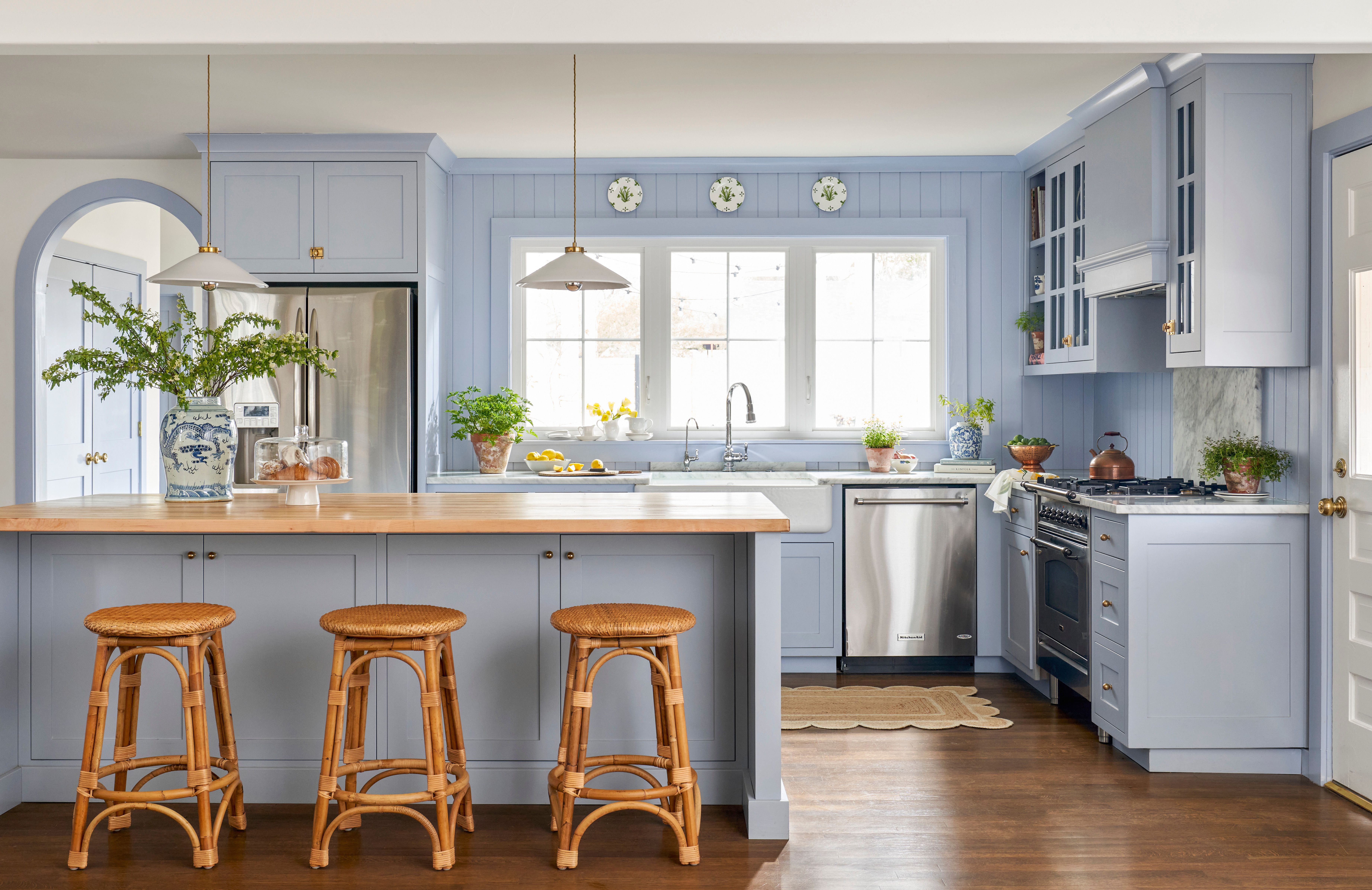
Dusty blue is softer than navy and more forgiving than bright sky blue. Use it on walls to add calm without making the kitchen feel themed.
23. Slate Blue Island
A slate blue island is a crowd-pleaser. It adds personality, pairs with warm wood and brass, and works well in kitchens where the rest of the palette stays neutral.
24. Blue-Gray Cabinets
If you like color but fear commitment, blue-gray is your friend. It reads sophisticated and subtle, especially with honed stone counters and simple hardware.
25. Coastal Blue and Crisp White
This look stays fresh when the blue is muted rather than tropical. Think weathered, sea-glass-adjacent tones, not “souvenir shop by the pier.”
26. Charcoal Blue with Warm Wood
Dark blue with warm wood shelves or trim creates just enough contrast to feel custom. It’s especially effective in larger kitchens with plenty of daylight.
27. Teal Accent Cabinets
Teal can be a star when used in a small dose. Try it on a beverage station, pantry door, or island if you want a more artistic color moment.
28. Powder Blue for Vintage Charm
Powder blue has retro energy, but it doesn’t have to feel kitschy. Pair it with warm white walls, checkerboard floors, or polished nickel for a charming, tailored result.
29. Butter Yellow Walls
Yellow is sneaking back into kitchens, but the good versions are buttery and muted, not highlighter-bright. It brings sunshine to small or low-light rooms.
30. Ochre Accents
Ochre works beautifully in stools, window treatments, painted pantry interiors, or backsplash details. It gives a kitchen warmth without overwhelming it.
31. Terracotta and Cream
This combination feels Mediterranean, grounded, and inviting. Terracotta floor tile or accents paired with creamy cabinets can make a kitchen feel instantly more soulful.
32. Brick Red on a Pantry Door
Red sounds risky until you use it strategically. A brick-red pantry door or hutch adds a bold focal point without turning the whole room into a tomato.
33. Aubergine in a Butler’s Pantry
Deeper purples are emerging as a sophisticated alternative to dark blue or black. Keep it contained to a butler’s pantry, coffee bar, or built-in for a jewel-box effect.
34. Blush Accents for a Retro Twist
A little blush can work surprisingly well in a kitchen, especially with cream, walnut, or brass. Think accent tile, a painted island stool set, or vintage-style accessories.
35. Black and White with Warmth
This combo never really leaves, but it works best now when softened with wood, woven texture, or creamy undertones. Otherwise, it can feel a little too “fancy café that serves one olive.”
36. Charcoal Cabinets with Pale Stone
For a moody, modern kitchen, charcoal cabinetry paired with pale counters and a light backsplash creates drama without swallowing the room.
37. Two-Tone Cabinets in White and Color
One of the easiest ways to use color is with two-tone cabinets: white or cream uppers, colored lowers. It keeps sightlines light while still bringing in personality.
38. White Perimeter, Colorful Island
If you want resale-friendly with a side of fun, paint the island only. A green, blue, or taupe island can make the whole kitchen look custom for relatively little effort.
39. Color-Drenched Breakfast Nook
Paint a connected breakfast nook, banquette, or breakfast corner in a stronger shade than the main kitchen. It creates definition and adds charm without overwhelming the work zone.
40. Colored Ceiling for Unexpected Personality
Most people forget the ceiling exists until they have to patch it. A soft blue, pale green, or warm blush ceiling can bring surprising softness and dimension to the room.
41. Wood Tones as the “Color”
Not every kitchen needs painted cabinets. White oak, walnut, or medium-tone stained cabinetry can act as the main color story, especially when paired with creamy walls and textured stone.
Which Kitchen Colors Age Best?
If your goal is longevity, the safest choices are warm whites, cream, taupe, mushroom, sage, olive, navy, and natural wood. These colors have range. They can shift traditional or modern depending on the hardware, backsplash, and lighting. That flexibility is what keeps them from feeling dated too quickly.
The trick is to avoid extremes. Very cold gray, stark bright white, or super-saturated novelty colors can work, but they require more careful styling to stay lovable over time. If you want bold, use it in places that are easier to repaint: an island, a pantry, a wall, shelving, or even the ceiling.
Real-Life Experience: What People Learn After Living with Kitchen Color
Once people actually live with a kitchen color for a while, they usually discover that the “perfect” color on a tiny swatch and the color that works in real life are not always the same thing. A lot of homeowners start out convinced they want pure white because it sounds safe and clean. Then they install it, live with it through cloudy mornings, overhead lighting, fingerprints, spaghetti sauce, and the general chaos of being human, and suddenly they understand why warmer whites and soft neutrals have become so popular.
One of the most common experiences is realizing that undertones matter more than the color family itself. A green kitchen can feel serene and expensive or a little swamp-adjacent depending on the light. A taupe kitchen can feel elegant or muddy. A navy island can look rich and tailored in daylight and almost black at night. That’s why people who are happiest with their kitchens often test samples on multiple walls and watch them for a few days instead of making a dramatic decision based on one very confident paint chip.
Another thing people learn fast: kitchens need warmth. Even homeowners who love modern design usually end up wanting a space that feels friendly, not clinical. That’s why successful kitchen color schemes often include some warmer element, whether it’s wood shelving, brass hardware, woven stools, creamy tile, or a wall color with a soft beige or green undertone. It balances hard surfaces like stone, metal, and glass, which are everywhere in a kitchen whether you planned for them or not.
There’s also a practical lesson that shows up again and again: bold color is easier to enjoy when it’s used strategically. People who paint every cabinet in a dramatic color sometimes love it forever, but many others are happier when the color lives on the island, lower cabinets, pantry, or breakfast nook. That approach gives the room identity without demanding that you stay emotionally committed to aubergine for the next decade.
And then there’s the mood factor, which sounds fluffy until you experience it. Color really does change how a kitchen feels at 7 a.m. Warm cream can make the room feel calm before the day gets noisy. Sage and mossy greens feel restful and grounded. Blue tones can feel crisp and orderly. Yellow, when handled with restraint, can make a dark kitchen feel more cheerful. The best kitchen colors don’t just photograph well; they support the way you want the room to feel when you’re rushing, hosting, cleaning, or standing there eating shredded cheese straight from the bag.
The biggest takeaway from real homes is simple: the most loved kitchens aren’t always the trendiest. They’re the ones where the color works with the light, the materials, and the people using the room every day. In other words, the “right” kitchen color is less about impressing the internet and more about making your space feel like a place you genuinely want to be.
Final Thoughts
The best kitchen color ideas balance personality with staying power. Warm neutrals, earthy greens, layered blues, natural wood, and carefully chosen bold accents are winning for a reason: they make kitchens feel more personal, more comfortable, and far less sterile. Whether you want a calm cream-and-wood palette or a deep green island that steals the show, the goal is the samebuild a kitchen that looks beautiful on day one and still feels right after a thousand breakfasts.