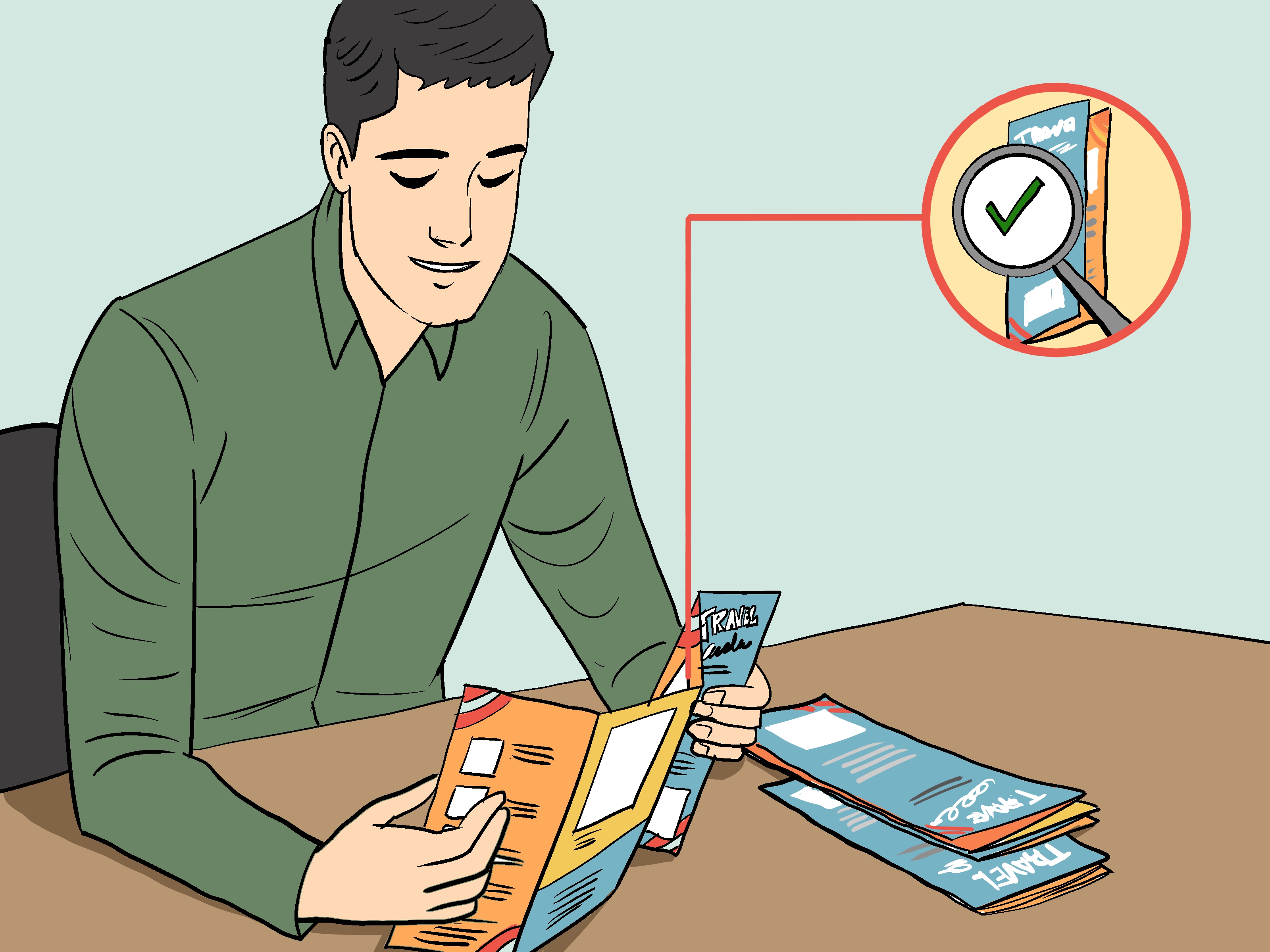
Making a travel brochure sounds simple until you’re staring at a blank page, a folder full of photos, and a brain that has suddenly decided it has never heard of “layout” before. The good news is that creating a brochure is not some mystical art practiced only by graphic designers in black turtlenecks. It is a practical, learnable process. A great travel brochure combines smart structure, strong visuals, clear writing, and accurate information to help readers imagine a trip and trust the details enough to take action.
Whether you are designing a brochure for a school project, a travel business, a tourism campaign, or a local destination, the goal is the same: make people want to go. That means your brochure needs to do more than look pretty. It should guide the reader, answer common questions, highlight what makes the destination special, and make the next step obvious. In this guide, you’ll learn exactly how to make a travel brochure step by step, without turning it into a tiny paper novel nobody asked for.
Why a Travel Brochure Still Works
In a world packed with websites, social media ads, and inboxes full of “limited-time escapes,” the humble travel brochure still holds its ground. Why? Because it is focused. A brochure gives readers a curated experience. Instead of dumping fifty tabs of information onto someone’s screen, it presents the highlights in one tidy, visual format. It can be printed, shared as a PDF, handed out at events, displayed in hotels, or sent to potential customers after an inquiry.
A strong brochure also helps with branding. Fonts, colors, images, tone, and messaging work together to create a mood. A luxury resort brochure should feel elegant. A family road trip brochure should feel lively and practical. An eco-tourism brochure should feel clean, natural, and trustworthy. The style should match the destination and the audience, not your sudden emotional attachment to neon green.
Step 1: Know the Purpose of Your Travel Brochure
Before choosing colors or photos, decide what your brochure is supposed to do. Are you promoting a destination? Selling a tour package? Giving visitors an overview of attractions? Supporting a class assignment? Your purpose shapes everything from the headline to the call to action.
Ask these questions first:
- Who is the brochure for?
- What action should the reader take after reading it?
- Is it meant to inspire, inform, persuade, or all three?
- Will it be printed, emailed, downloaded, or displayed online?
For example, a brochure for honeymoon travelers will not sound like one aimed at budget-conscious college students. One sells romance and ease. The other sells adventure and value. If you try to speak to everyone, you usually end up sounding like nobody’s favorite option.
Step 2: Choose the Right Brochure Format
The format determines how your content flows. The most common choice is the tri-fold brochure because it is compact, easy to organize, and familiar to readers. A bi-fold brochure offers larger panels and works well when you want a cleaner, more spacious look. Digital brochures can go beyond standard folds and include clickable links, videos, or interactive elements, but the same design rules still apply.
Popular brochure formats:
- Tri-fold: Best for step-by-step content, highlights, and compact travel promotions.
- Bi-fold: Best for image-heavy destinations and premium travel experiences.
- Multi-page digital brochure: Best for detailed itineraries, destination guides, or interactive sharing.
If you’re unsure, start with a tri-fold. It gives you six panels to work with, which is just enough space to be useful and just little enough space to stop you from writing your memoir.
Step 3: Research the Destination Like You Actually Care
A travel brochure should be exciting, but it also has to be accurate. This is where good research matters. Collect the essential facts first: location, climate, best time to visit, major attractions, transportation options, travel times, contact details, and any special features that make the place memorable. If the brochure promotes a tour or service, make sure all claims are truthful and current.
Do not oversell with vague lines like “the most breathtaking beach in the world” unless your destination has somehow won the International Council of Officially Impressive Sand. Use specific details instead. Readers respond better to concrete information such as “three snorkeling spots within a ten-minute boat ride” or “free walking tours every Saturday morning.” Specificity creates trust.
Gather content in four buckets:
- Must-know facts: where, when, how, how much
- Main attractions: landmarks, activities, food, culture, events
- Practical tips: what to pack, how to get around, local etiquette
- Action details: website, QR code, booking info, phone number, email
Step 4: Build a Clear Content Outline
One of the biggest brochure mistakes is throwing information onto panels in whatever order it happens to leave your brain. A better approach is to outline the brochure before designing it. Think of each panel as a mini-job with a clear purpose.
Simple tri-fold panel plan:
- Front cover: destination name, striking image, short hook
- Inside flap: quick overview of the destination
- Inside center: top attractions or itinerary highlights
- Inside right: food, culture, local experiences, or travel tips
- Back inside: map, transportation, pricing, or useful details
- Back cover: contact information and call to action
This structure works because it mirrors how people naturally open and scan brochures. It feels organized instead of chaotic. Your reader should never need detective skills to find the booking link or figure out what city you are even talking about.
Step 5: Write Copy That Is Clear, Short, and Tempting
Travel brochure writing is a balancing act. You want vivid, persuasive language, but you also need clarity. Brochures are not built for long paragraphs that stretch like airport security lines. Keep sentences crisp. Lead with benefits. Use headings that help readers scan fast.
What good brochure copy does:
- Uses strong headlines
- Focuses on reader benefits
- Breaks information into short sections
- Uses plain language instead of fluff
- Includes a clear call to action
Compare these two versions:
Weak: “Our destination offers a wide variety of enjoyable activities for tourists of all ages.”
Better: “Hike coastal trails in the morning, browse local markets by noon, and catch a sunset boat ride before dinner.”
The second version paints a picture. The first sounds like it was written by a committee locked in a room with only decaf coffee and corporate fear.
Step 6: Use High-Quality Visuals That Sell the Experience
In a travel brochure, images carry enormous weight. Readers often notice the visuals before the text, so your photos must support the story you’re telling. Choose bright, high-resolution images that reflect the actual experience. Show landscapes, food, culture, accommodations, activities, and people enjoying the destination when appropriate.
Avoid cluttering the brochure with too many small images. One large, compelling hero image on the cover is usually more effective than six tiny photos fighting for attention like contestants on a reality show. Inside the brochure, use a few supporting images that match the tone and color palette.
Visual best practices:
- Use sharp, professional-looking photos
- Keep image style consistent
- Leave enough white space around text
- Do not cover important image details with text blocks
- Use icons sparingly for quick information like weather, transport, or duration
Step 7: Make the Layout Easy to Scan
Good brochure design is really about guiding the eye. Readers should know where to look first, second, and third. Use headings, subheadings, bullet points, spacing, and alignment to create order. A brochure that is hard to scan feels hard to trust.
Choose one or two fonts only. More than that, and your brochure starts dressing like it got ready in the dark. Use a readable font for body text and a complementary one for headings. Keep body text large enough to read comfortably, especially if the brochure will be printed. Maintain consistent margins and panel spacing so the design feels polished.
Layout essentials:
- Strong headline hierarchy
- Short text blocks
- Consistent font sizes and spacing
- Color used to organize, not overwhelm
- A clear visual path from cover to contact details
Step 8: Include the Information Travelers Actually Need
A beautiful brochure that omits practical details is basically decorative confusion. Your audience needs enough information to move from interest to action. Include what a traveler would reasonably ask before making a decision.
Useful details to include:
- Best time to visit
- How to get there
- Length of stay or sample itinerary
- Price range or package highlights
- What to bring
- Accessibility notes if relevant
- Contact information and website
- QR code for booking or more details
If you have room, a small map can be incredibly useful. Maps, route tips, and location cues help readers understand the destination faster. That is one reason visitor brochures from parks and tourism services often combine vivid visuals with practical orientation tools. Inspiration is important, but nobody wants to be inspired into getting lost.
Step 9: Add a Strong Call to Action
Every travel brochure needs a next step. Do not assume readers will magically know what to do after admiring your excellent typography. Tell them clearly. Your call to action should match the brochure’s purpose and appear in a visible location, usually on the back cover and sometimes inside as well.
Examples of effective calls to action:
- Book your getaway today
- Download the full itinerary
- Scan to reserve your tour
- Visit our website for seasonal offers
- Call now to customize your trip
Good calls to action are specific, direct, and easy to follow. Pair them with one main action instead of five competing choices. If your brochure says “call, email, visit, scan, subscribe, follow, share, and maybe send a pigeon,” the reader may do none of the above.
Step 10: Proofread, Test, and Finalize
Before printing or publishing, review every part of the brochure. Spelling mistakes, outdated prices, wrong phone numbers, and awkward formatting can damage credibility quickly. Proofreading is not glamorous, but neither is printing 500 brochures that say “free brakefast.”
Final checklist:
- Check spelling, grammar, and punctuation
- Verify all facts, prices, and contact information
- Make sure claims are accurate and not misleading
- Test links and QR codes
- Print a sample copy before final production
- View the brochure on mobile if it will be shared digitally
If possible, ask someone else to review it. Fresh eyes catch things you stopped noticing three coffee refills ago.
Common Mistakes to Avoid
Even visually attractive brochures can fall apart if they ignore the basics. Here are the most common problems:
- Too much text: Readers skim brochures. Keep only what matters.
- Weak images: Blurry photos make the destination look less appealing.
- No audience focus: Generic messaging feels forgettable.
- Poor panel planning: Information ends up awkwardly placed.
- Missing practical details: Readers need logistics, not just lovely adjectives.
- No clear action step: Interest without direction rarely converts.
Example: A Simple Travel Brochure Concept
Imagine you are making a brochure for a weekend trip to Savannah, Georgia. Your front cover might feature a tree-lined square with the headline “Savannah in 48 Hours: Charm, History, and Southern Flavor.” Inside, you could organize content into sections such as historic walking tours, riverfront dining, boutique inns, and must-see landmarks. A side panel could offer a mini itinerary: Friday evening check-in, Saturday trolley tour, Sunday brunch and market shopping. The back cover could include a QR code for hotel packages and a short line like “Plan your Savannah escape today.”
That brochure would work because it is specific, visually guided, and reader-focused. It promises an experience, explains what makes the destination worth visiting, and provides a clear next step.
Extra Tips for Making Your Travel Brochure Stand Out
- Use a cover headline that promises a feeling or outcome, not just a place name.
- Keep your color palette connected to the destination, such as ocean blues, desert neutrals, or urban jewel tones.
- Feature one unforgettable detail, like a famous local dish or hidden viewpoint.
- Mix inspiration with utility so readers can dream and plan at the same time.
- Repurpose the brochure into a PDF, landing page, or social media carousel for wider reach.
Real Experiences and Lessons from Making Travel Brochures
One of the most interesting things about learning how to make a travel brochure is that the process teaches you more than design. It teaches you how people make decisions. When beginners first create a brochure, they usually focus on decoration. They want dramatic fonts, lots of pictures, bright colors, and catchy lines. That enthusiasm is great, but after a while they discover the truth: the best brochure is not the one with the most sparkle. It is the one that answers the reader’s questions before the reader even asks them.
For example, students making travel brochures for class projects often start by collecting random facts and pasting in photos of landmarks. Then they realize the brochure feels scattered. Once they choose a clear angle, such as “best family destination,” “perfect weekend getaway,” or “budget-friendly beach town,” the entire project improves. Suddenly the photos make sense, the text becomes easier to write, and the layout feels intentional. That is a valuable lesson for both school assignments and real marketing work.
Small businesses in tourism learn another lesson quickly: honesty matters. A brochure can absolutely be exciting, but it should not create expectations the experience cannot match. If a hotel is twenty minutes from the beach, calling it “steps from the shore” is the kind of wording that may sound clever in a meeting and look disastrous in a review. Readers appreciate appealing copy, but they trust accuracy. A brochure that feels helpful and believable often performs better than one that tries too hard to sound luxurious or dramatic.
There is also the practical side of experience. Designers often discover that the fold matters more than they expected. A gorgeous layout on a flat screen can become awkward when printed and folded. Headlines may land in strange places. Photos may get cut off. Contact details may vanish into a crease like socks in a dryer. That is why test printing is such a smart habit. It saves time, money, and a surprising amount of emotional damage.
Another common experience is learning the power of editing. The first draft of a brochure is usually too long. The second draft is still too long, but now with better fonts. Only after trimming the copy, sharpening the message, and removing nonessential details does the brochure begin to feel professional. In other words, good brochure design is often less about adding more and more and more, and more about deciding what deserves the valuable real estate on each panel.
People who create the best travel brochures usually become better communicators overall. They learn how to combine storytelling, design, marketing, and practical information into one compact piece. They also learn empathy: what does the traveler need, fear, want, compare, and remember? That mindset turns a brochure from a school task or marketing asset into a true guide. And that is the real win. A successful travel brochure does not just describe a place. It helps readers picture themselves there, trust the experience, and feel ready to go.
Conclusion
If you want to know how to make a travel brochure that people actually read, remember this formula: know your audience, organize the content, write clearly, design with purpose, use strong visuals, and always include the next step. Keep it beautiful, but keep it useful. The best brochures are part invitation, part roadmap, and part quiet confidence that says, “Yes, this trip is worth your time.”
So start with a clear plan, choose a format that fits your goal, and build the brochure panel by panel. With the right mix of creativity and structure, you can create a travel brochure that informs, inspires, and maybe even makes someone book a ticket before lunch.