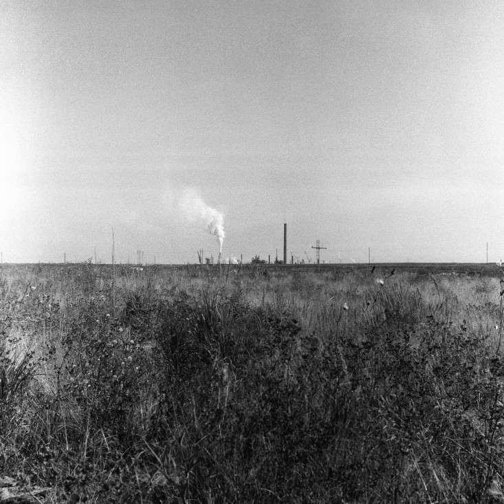
Klee Larsen Photography (Suncore) is the kind of artwork that quietly walks into a room, refuses to shout, and somehow ends up becoming the most interesting guest at the party. At first glance, it may appear to be a simple black-and-white photograph. Look longer, though, and the image begins to open up: film grain, industrial landscape, northern atmosphere, archival texture, and a sense of distance that feels both beautiful and uneasy.
The photograph known as Suncore is associated with Canadian visual artist Klee Larsen, a Vancouver-based artist whose practice blends photography, film processes, painting, silver leaf, resin, and mixed media. The listed work was shot with a medium-format Yashica camera using high-speed black-and-white film and was captured in the oil sands of northern Alberta. That combination matters. It gives the piece its visual personality: the depth of a larger negative, the rough poetry of film grain, and a subject that is far more complicated than a pretty landscape calendar hanging beside a dentist’s chair.
For collectors, interior designers, photography lovers, and anyone who has ever stared at a moody wall and thought, “This needs something with a little existential weather,” Suncore offers a compelling mix of design elegance and conceptual bite. It is not just wall decor. It is a conversation about landscape, memory, industry, and the strange beauty of places we do not always know how to feel about.
Who Is Klee Larsen?
Klee Larsen is a Vancouver-based mixed media artist known for work that uses photography as both image and raw material. Her practice is strongly connected to landscape, horizon lines, atmosphere, and the tension between what is visible and what seems to be disappearing. Born into a creative family on Salt Spring Island, Larsen grew up around making, experimenting, and, presumably, the kind of household where “don’t touch the paint” was more of a suggestion than a law.
Her background in photography gives her work a grounded technical base, while her mixed media approach allows the images to move beyond straightforward documentation. Larsen has described her interest in combining old and new technologies: shooting on film, digitizing the image, and then developing the work through layered surfaces and contemporary finishing techniques. That blend is important because it positions her photography between analog nostalgia and modern object-making.
In other words, her work does not treat a photograph as a flat rectangle that politely behaves itself. It treats the photograph as a living surface. Grain, paper, resin, silver leaf, wax, and shadow all become part of the experience. For anyone researching Klee Larsen Photography, this is the essential starting point: her images are not only about what the camera saw, but also about how memory, material, and atmosphere change the way we see.
What Is “Suncore”?
Suncore is a black-and-white photographic print by Klee Larsen. Public product descriptions identify it as an image shot with a medium-format Yashica camera using high-speed black-and-white film. The photograph was captured in the oil sands of northern Alberta, a region known for its vast industrial energy operations and equally vast environmental debates.
The listed print was produced on archival paper with a laminate finish, designed to help protect the image and allow it to be displayed with clips. It was also described as signed and numbered by the artist and available in multiple sizes. At the time of its product listing, pricing ranged from an entry-level print price to a higher price for larger editions. Because art pricing and availability change faster than a cat knocking over a ceramic vase, buyers should always confirm current details directly with the artist, gallery, or retailer before making decisions.
The title Suncore is especially interesting because it sounds bright, warm, and almost solar. Yet the image itself is tied to the oil sands, a landscape shaped by extraction, industry, and heavy machinery. That contrast gives the work its tension. The name feels like sunlight; the subject points toward energy, earth, and human intervention. The result is a photograph that can be read as beautiful, documentary, abstract, environmental, or all of the above before your coffee gets cold.
Why Medium-Format Film Matters
The phrase “shot with a medium-format Yashica” is not just a fancy technical garnish sprinkled on the description for flavor. Medium-format film typically produces larger negatives than 35mm film, which can create richer detail, smoother tonal transitions, and a different sense of depth. Even when the final image embraces grain and atmosphere, the larger negative can give the photograph a more substantial visual presence.
Yashica medium-format cameras, especially twin-lens reflex models, are beloved by many film photographers for their straightforward handling and distinctive square-format possibilities. Shooting with one is slower than snapping a phone photo. You compose carefully. You wait. You look down into the finder. The camera practically whispers, “Maybe think for a second, Ansel Adams Jr.”
That slowness matters in a place like northern Alberta’s oil sands. Industrial landscapes can easily become spectacle: huge machines, scarred land, dramatic scale. A medium-format film camera encourages a different kind of attention. It turns the scene into structure, tone, and atmosphere. Instead of simply saying, “Look at this place,” the image asks, “What does this place feel like when reduced to light, grain, and horizon?”
The Role of High-Speed Black-and-White Film
High-speed black-and-white film brings its own personality to Suncore. Higher ISO film is more sensitive to light, which helps in dim or unpredictable conditions, but it often produces more visible grain. In digital photography, noise is frequently treated like a rude guest that must be removed. In film photography, grain can be part of the music.
In Larsen’s work, grain does not feel like a flaw. It feels like weather. It gives the image texture, age, and emotional friction. The oil sands are not a smooth subject, so a perfectly polished image might feel almost dishonest. The grain makes the picture breathe. It softens hard industrial facts without erasing them. It also gives the print a tactile quality that works beautifully in interiors where people want art with depth, not just a decorative rectangle that matches the sofa and says nothing.
Black-and-white photography also removes the easy seduction of color. Without blue sky, orange earth, or metallic machinery dominating the frame, the viewer must pay attention to form, contrast, surface, and shadow. This is one reason black-and-white landscape and industrial photography remains so powerful: it strips the scene down until mood becomes architecture.
Oil Sands as Subject: Beauty, Industry, and Discomfort
The oil sands of northern Alberta are among the most visually and politically charged landscapes in North America. They represent energy production, economic development, environmental concern, technological ambition, and large-scale transformation of land. For a photographer, that is a loaded subject. It is not a meadow with butterflies and a picnic blanket. It comes with baggage. Very heavy baggage. Possibly transported by an enormous truck.
That complexity is exactly what can make Suncore compelling. The work does not need to lecture the viewer. Its power lies in ambiguity. A photograph of an industrial landscape can be beautiful without being comfortable. It can draw us in with texture and composition while also making us question what we are looking at. Is this landscape wounded? Productive? Strange? Sublime? All of the above?
Good art rarely behaves like a multiple-choice quiz with one correct answer. Larsen’s photograph gives the viewer space to think. The oil sands setting adds context, but the image can still function as a study in line, tone, and atmosphere. That dual nature makes it attractive to both art collectors and design-minded buyers. It works visually on the wall, but it also carries intellectual weight. In the art world, that is what professionals call “a win.” In the rest of life, it is what we call “finally buying something that makes guests ask an interesting question.”
How “Suncore” Fits Into Larsen’s Larger Practice
Klee Larsen’s broader work often explores horizon lines, water, sky, fog, ocean, and the uncertain boundary between one element and another. She is interested in moments that feel transitional: not quite day, not quite night; not quite solid, not quite dissolving. That sensibility helps explain why Suncore feels more poetic than purely documentary.
Even though the photograph was captured in an industrial region, it shares Larsen’s interest in atmosphere. The image is not only about the oil sands as a location. It is about perception. The viewer is invited to enter a space where land, sky, industry, and memory blur together. That is a very different approach from traditional landscape photography, which often aims to show nature at its most majestic and postcard-ready.
Larsen’s mixed media practice also adds another layer to how we understand her photography. Her later works incorporate materials such as paint, silver leaf, resin, cold wax, and layered surfaces. Knowing this, Suncore can be seen as part of a larger artistic language: film-based images that are concerned with surface, transformation, and the emotional weight of place.
Archival Paper and Laminate Finish: Why Materials Matter
The product description for Suncore notes that the photograph is printed on archival paper with a laminate finish. For buyers, this is more than a nice phrase that sounds reassuring while you reach for your wallet. Archival paper is intended for longevity, stability, and quality reproduction. It is commonly chosen for fine art prints because it supports richer tonal detail and better preservation when handled and displayed properly.
The laminate finish adds practical protection. It can help guard the surface against handling, minor environmental exposure, and the ordinary chaos of real homes. Let’s be honest: art does not live in a museum bubble once it enters a house. It lives near windows, furniture, pets, curious children, and that one friend who points with a glass of red wine. Protection matters.
The ability to hang the laminated print with clips also changes the mood of the piece. Instead of requiring a heavy traditional frame, the print can be displayed in a more casual, studio-like manner. That fits the spirit of the work. Suncore does not need a gilded frame and a velvet rope. It can look sharp in a modern apartment, a creative office, a minimalist bedroom, or a gallery wall where texture and restraint are the whole point.
Styling Klee Larsen Photography at Home
Because Suncore is black and white, it is unusually flexible in interior design. It can work in warm, rustic spaces as easily as in clean modern rooms. The image’s industrial subject gives it edge, while its film process gives it softness. That balance makes it useful for homeowners who want art that feels thoughtful without making the room look like a graduate seminar moved into the dining area.
For Minimalist Interiors
In a minimalist room, Suncore can serve as a quiet focal point. Pair it with white walls, natural wood, linen, black metal, or stone. Keep surrounding decor simple so the tonal shifts in the image can breathe. A single large print can be more effective than a crowded wall arrangement.
For Warm, Handmade Spaces
Larsen’s connection to craft and mixed media makes the print feel at home beside ceramics, woven textiles, handmade furniture, and organic surfaces. The photograph’s industrial subject contrasts nicely with softer materials. It says, “I am serious art,” while the ceramics reply, “Great, but please use a coaster.”
For Offices and Creative Studios
In a workspace, Suncore can add visual depth without overwhelming the room. It is especially appropriate for architects, designers, writers, photographers, and anyone who likes art that suggests process, landscape, and layered meaning. It is also a strong alternative to generic office prints of bridges, skylines, or motivational mountain peaks with suspiciously energetic typography.
Collecting “Suncore”: What Buyers Should Consider
Before buying any signed and numbered photographic print, collectors should review the edition details, available sizes, condition, paper type, finish, and current price. If purchasing from a secondary seller, ask for documentation and confirm whether the print has been stored properly. If buying directly from the artist or an authorized retailer, request current information about edition size, shipping, and display recommendations.
Collectors should also think about why they are drawn to the work. Some buyers may love the analog process. Others may be interested in the oil sands subject. Others may simply respond to the visual mood. All are valid reasons. The best art purchases usually involve both the eye and the gut. If the image keeps pulling you back, that is worth paying attention to.
From an SEO and art-market perspective, phrases such as Klee Larsen Photography, Suncore print, black and white film photography, archival photography print, and medium format Yashica are useful because they reflect what people are likely to search when looking for this specific work or similar fine art photography.
How to Care for an Archival Photography Print
Even archival prints need thoughtful care. Archival does not mean immortal. It means the materials are designed for long-term quality when treated properly. Display the print away from direct sunlight, avoid humid rooms, and keep it out of areas with dramatic temperature swings. Bathrooms are usually a bad idea unless your design theme is “beautiful photograph slowly losing a battle with steam.”
If the print is clipped rather than framed, handle it with clean, dry hands and avoid touching the image surface. If framing, use acid-free materials and consider UV-filtering glazing. For long-term storage, keep the print flat in archival sleeves or folders, away from basements, attics, and other places where moisture, heat, or pests may cause damage.
The laminate finish may provide extra surface protection, but it should not be treated as armor. Fine art still prefers a stable environment, gentle handling, and a little respect. Basically, treat it better than your phone screen.
Why “Suncore” Still Feels Relevant
Suncore remains relevant because it sits at the intersection of several lasting interests: analog photography, environmental landscape, industrial beauty, and handmade art objects. Film photography has experienced renewed attention in recent years, not because it is the easiest method, but because it offers something digital perfection often lacks: texture, limitation, and chance.
The photograph also speaks to our complicated relationship with energy landscapes. Modern life depends on extraction, infrastructure, and industry, yet many people feel uneasy about the environmental costs behind that convenience. A work like Suncore does not solve that tension. It holds it in place long enough for us to look.
That is what strong photography can do. It can turn a place into an experience. It can make a viewer pause between admiration and discomfort. It can make a wall feel less decorated and more awake.
Experience Notes: Living With and Looking at Work Like “Suncore”
One of the most memorable experiences with a photograph like Suncore is how differently it behaves throughout the day. In bright morning light, a black-and-white print may appear crisp, graphic, and almost architectural. By evening, under softer lamps, the same image can feel heavier and more mysterious. This is especially true with film-based work, where grain and tonal transitions respond beautifully to changing light. The print does not exactly change, of course, but your eye does. That is part of the fun. Art is cheaper than remodeling and far less likely to involve arguing about grout.
In a home setting, Suncore would likely work best when given breathing room. Some artworks enjoy being part of a busy gallery wall, surrounded by family photos, postcards, tiny paintings, and the mysterious framed object nobody remembers buying. This piece feels stronger when it has space around it. A clean wall, a low bench, a ceramic vessel, or a simple reading chair nearby would allow the photograph’s atmosphere to expand without competition.
Another useful experience is viewing the work from different distances. Up close, the material details matter: grain, surface, paper, and the physicality of the print. Step back, and the composition becomes more important. The image may begin to read as landscape, abstraction, or industrial memory. That shift is one reason medium-format black-and-white photography can feel so rewarding. It gives the viewer more than one way in.
For collectors new to fine art photography, Suncore is also a good reminder that a print does not need bright color to carry emotional force. In fact, removing color can make an image more flexible and more intense. The viewer is not distracted by whether the sky was blue or the earth was orange. Instead, attention moves to contrast, shadow, scale, and silence. The image becomes less about “what color was it?” and more about “what did it mean to stand there?”
There is also a practical experience worth mentioning: signed and numbered prints feel personal in a way mass-produced posters rarely do. Knowing that the artist approved, signed, and editioned the work adds a sense of connection. It does not magically make the print whisper artistic secrets at midnight, but it does remind the owner that this is part of a limited creative practice, not just a decorative file sent to a factory.
Finally, work like Suncore tends to grow on viewers. It may not deliver the instant sugar rush of colorful pop art or a giant beach photograph. Its appeal is slower. It waits. It lets the room settle around it. Over time, the quietness becomes the point. The image becomes part of the atmosphere of the home, like a window onto a place that is real, altered, distant, and unresolved.
Conclusion
Klee Larsen Photography (Suncore) is more than a black-and-white archival print. It is a film-based study of landscape, industry, texture, and uncertainty. Shot with a medium-format Yashica on high-speed black-and-white film, the image carries the tactile character of analog photography and the conceptual weight of its northern Alberta oil sands setting.
For collectors, the work offers a strong blend of visual restraint and narrative depth. For interior designers, it provides a versatile piece that can sharpen a minimalist room, deepen a warm handmade space, or give a creative studio a more thoughtful edge. For photography lovers, it is a reminder that grain, shadow, and process still matter in a world obsessed with ultra-clean digital surfaces.
The beauty of Suncore is not simple. That is exactly why it works. It asks viewers to sit with contrast: natural and industrial, soft and harsh, documentary and abstract, elegant and uneasy. In a room full of forgettable decor, this is the piece that has something to say.
Note: This article is based on publicly available information about Klee Larsen, the listed “Suncore” photography print, and established best practices for fine art photography care. Availability, pricing, sizes, and edition details should be verified with the artist or authorized retailer before publication or purchase.