Designers may spend their workdays debating grout lines, marble veining, handmade edges, and whether “warm white” is secretly 47 different colors wearing one trench coat. But when it comes to their own homes, their tile choices tend to become surprisingly practical. They want colors that age well, flatter natural light, hide everyday chaos, and still make guests say, “Wait, why does your laundry room look better than my living room?”
That is why the best tile colors designers use at home are rarely random trend grabs. They are hardworking, mood-setting, resale-friendly, and flexible enough to survive changing cabinet colors, towels, rugs, hardware, and the occasional “I’m suddenly into vintage brass” phase. Whether you are choosing bathroom tile colors, kitchen backsplash tile, shower tile, floor tile, or a statement mudroom surface, the right color can make a room feel brighter, richer, calmer, or more customwithout requiring a personality transplant for your house.
Below are six tile colors designers return to again and again in their own homes, plus smart ways to use each one without making your space look like a showroom that politely asks you not to touch anything.
1. Warm White: The Designer’s Forever Favorite
White tile is a classic for a reason, but designers rarely choose the cold, clinical version that makes a bathroom feel like a dental office with better lighting. In their own homes, they usually reach for warm white, creamy white, ivory, bone, chalk, or handmade white tile with subtle tonal variation.
Warm white tile works because it reflects light, expands small spaces, and plays nicely with almost every design style. It can lean farmhouse, coastal, traditional, modern, Scandinavian, or Mediterranean depending on the tile shape and finish. A glossy warm white zellige-style tile feels artisanal and light-catching. A matte white square tile feels calm and architectural. A creamy subway tile with matching grout creates a soft, seamless wall that quietly does its job without begging for applause.
Where designers use warm white tile
Warm white is especially useful in bathrooms, shower walls, kitchen backsplashes, laundry rooms, and small powder rooms. It is also one of the safest choices for a home that may be sold later because it gives future owners room to personalize with paint, mirrors, lighting, and textiles.
The trick is to avoid making the space feel flat. Designers usually add interest through texture, layout, or grout. For example, a handmade-look white tile with uneven glaze gives a backsplash depth even when the color is quiet. A vertical stack layout can make a shower feel taller. A herringbone pattern adds motion without adding loud color. In other words, white tile does not have to be boring; it just needs a little architectural seasoning.
Best pairings for warm white tile
Pair warm white tile with natural oak, walnut, unlacquered brass, aged bronze, marble, limestone, soapstone, linen, and soft plaster walls. If your kitchen has darker cabinets, warm white tile can prevent the room from feeling heavy. If your bathroom has minimal square footage, creamy white tile can make the walls visually step back.
One important caution: pure white grout can be high-maintenance in busy zones. Designers often choose a soft gray, warm beige, or off-white grout because it keeps the look clean while being more forgiving. Translation: your backsplash can survive tomato sauce night.
2. Soft Green: Calm, Fresh, and Quietly Luxurious
Soft green tile has become a designer staple because it brings nature indoors without screaming “theme room.” Sage, celadon, eucalyptus, olive, moss, and muted jade all create a calm, grounded feeling that works beautifully in kitchens and bathrooms. Designers love green because it behaves almost like a neutral when the shade is muted enough.
Unlike trendy neon or overly bright greens, soft green tile feels organic and livable. It has enough color to make a space memorable, but not so much that you start planning a renovation six months later. It also pairs beautifully with materials designers already love: oak, marble, brass, terracotta, cream paint, stone counters, and woven textures.
Why designers use green tile at home
Green tile is one of the easiest ways to make a kitchen backsplash feel custom. A soft sage tile behind open shelving can make everyday dishes look curated, even if half of them came from a college apartment starter set. In bathrooms, green tile feels spa-like without relying on the usual all-white formula. A green shower wall can create the feeling of a tucked-away garden, especially when paired with warm lighting and natural stone.
Designers also like green because it bridges traditional and modern spaces. A glossy olive subway tile can look old-world and elegant. A matte sage square tile can feel fresh and minimal. A deep moss zellige-style tile can make a powder room feel moody and expensive, even if the rest of the room is mostly simple.
Best pairings for soft green tile
Soft green tile looks especially good with creamy walls, warm white cabinetry, walnut vanities, brushed brass fixtures, aged copper, natural stone, and checkerboard floors. If you want a subtle look, pair sage tile with matching or pale grout. If you want the shape of the tile to stand out, use a slightly deeper gray-green grout.
For small rooms, choose lighter green tiles with a glossy finish to bounce light. For larger spaces, matte olive or moss tile can add depth without overwhelming the room. The goal is “effortless garden retreat,” not “spinach smoothie accident.”
3. Terracotta and Clay: Warmth That Never Feels Manufactured
Terracotta, clay, rust, cinnamon, and sunbaked peach tones are the colors designers use when they want a home to feel warm, personal, and collected. These tile colors instantly add soul. They suggest Mediterranean courtyards, Spanish Revival homes, desert retreats, old kitchens, handmade pottery, and floors that look better with a little life on them.
Terracotta tile is especially loved because it does not feel precious. It can handle imperfect edges, tonal variation, and patina. In fact, that is the point. Designers often use clay-colored tile to make newer homes feel less new-build and more rooted, as if the space has been quietly charming everyone for decades.
Where terracotta tile works best
Terracotta and clay tile are excellent for kitchen floors, entryways, mudrooms, powder rooms, fireplace surrounds, patios, and sunrooms. They are also beautiful as a backsplash when paired with creamy cabinets or plaster-style walls. In a bathroom, terracotta floor tile can warm up a white shower and prevent the room from feeling too sterile.
Designers often choose terracotta in matte, handmade, hexagon, square, brick, star-and-cross, or checkerboard formats. A simple square clay tile can feel rustic and timeless. A terracotta-and-cream checkerboard floor adds charm without going full costume drama. A clay zellige-style backsplash can make even basic cabinetry look intentional.
Best pairings for clay-colored tile
Terracotta tile loves warm whites, plaster finishes, dark wood, black accents, olive green, deep blue, unlacquered brass, woven baskets, linen curtains, and stone countertops. It also plays well with plants, which is convenient because designers seem legally required to own at least one sculptural olive tree.
One tip: terracotta tones can vary dramatically. Some lean orange, some pink, some brown, and some red. Before committing, look at samples in morning light, afternoon light, and artificial light. A tile that looks charmingly sunbaked at noon may look like a pumpkin spice emergency under a harsh bulb.
4. Deep Blue: Classic, Moody, and Surprisingly Flexible
Blue tile has range. Pale blue feels breezy and nostalgic. Powder blue feels vintage and cheerful. Denim blue feels casual. Navy, inky blue, and deep cobalt feel tailored and dramatic. Designers use blue tile in their own homes because it brings color while still feeling familiar and easy to live with.
Deep blue tile is particularly powerful in spaces that need personality. A navy kitchen backsplash can make white cabinets look sharper. A glossy blue powder room can feel jewel-box glamorous. Blue shower tile can create a calm, watery mood without resorting to literal beach decor. No seashell soap dish required.
Why blue tile feels timeless
Blue has long been associated with classic interiors, from blue-and-white ceramics to traditional patterned tile and coastal architecture. But today’s designer-approved blue tiles are not limited to nautical themes. They appear in modern kitchens, moody bars, traditional bathrooms, cottage-style pantries, and colorful laundry rooms.
The secret is choosing the right undertone. A smoky blue-gray feels sophisticated and subtle. A rich navy feels crisp and architectural. A hand-glazed cobalt tile feels artistic and bold. A pale robin’s egg blue can look charming when balanced with wood, cream, or darker accents.
Best pairings for blue tile
Deep blue tile pairs beautifully with white oak, walnut, marble, brass, polished nickel, creamy paint, black accents, and soapstone. For a classic look, pair blue tile with white grout or white cabinetry. For a moodier look, choose matching blue grout and let the surface become more seamless.
Designers often use blue tile in smaller doses when the shade is intense. A backsplash, shower niche, wet bar, or powder room wall can deliver the drama without overwhelming the entire home. Think of blue tile as the confident guest at the party: wonderful in the room, less wonderful if it grabs the microphone for three hours.
5. Black and Charcoal: The Instant Architecture Color
Black tile is the color designers use when a space needs structure. It outlines, anchors, sharpens, and adds instant sophistication. In real homes, designers often choose black, charcoal, slate, graphite, or espresso-toned tile rather than flat jet black, because slightly softened dark tones are easier to live with.
Black tile can be classic or dramatic depending on how it is used. A black-and-white checkerboard floor feels timeless. A charcoal slate-look bathroom floor feels grounded. A glossy black shower wall feels glamorous. A matte black fireplace surround feels modern and sculptural.
Where designers use black tile
Black and charcoal tile are popular for bathroom floors, powder rooms, kitchen backsplashes, fireplaces, mudrooms, and laundry rooms. Designers also use black tile to balance rooms with lots of white, cream, or wood. It gives the eye a place to land and keeps softer palettes from looking too sweet.
One of the most enduring uses is checkerboard tile. Black-and-white, charcoal-and-cream, or even black-and-terracotta checkerboard floors have a graphic quality that works in traditional, modern, farmhouse, and Parisian-inspired interiors. The pattern has personality, but because the palette is simple, it rarely feels chaotic.
Best pairings for black tile
Pair black tile with warm white walls, marble, oak, brass, chrome, walnut, concrete, plaster, and vintage rugs. In bathrooms, use good lighting and reflective finishes if the room is small. A glossy black tile can bounce light, while a matte black tile absorbs it. Both can be beautiful, but they create very different moods.
One practical note: dark tile can show mineral deposits and soap residue, especially in showers with hard water. Designers often use dark tile on floors, fireplace surrounds, backsplashes, or powder room walls rather than in the hardest-working wet zones. Beauty is important; not scrubbing every Saturday is also a valid design philosophy.
6. Greige, Taupe, and Stone: The Quiet Luxury Workhorses
Greige, taupe, sand, mushroom, limestone, putty, and warm gray tile colors are the quiet luxury workhorses of designer homes. These shades are not loud, but they make rooms feel expensive in a relaxed way. They sit between gray and beige, which means they can work with both warm and cool materials.
Designers love stone-colored tile because it creates a soft backdrop. It is less stark than white, less trendy than bold color, and more forgiving than very dark tile. It also mimics the tones found in natural materials, making it ideal for bathrooms, kitchens, entryways, and open-plan floors.
Why neutral stone tones are designer staples
A taupe floor tile can make a bathroom feel calm without looking plain. A limestone-look porcelain tile can give a kitchen durability and elegance. A greige shower tile can support statement lighting, a beautiful vanity, or dramatic wallpaper without competing for attention.
These colors are especially smart for large surfaces. If you are tiling an entire bathroom floor, a shower surround, or a main-level entry, stone-inspired neutrals are easier to live with over time than a very specific trend color. They create continuity, which designers value because it makes a house feel more cohesive.
Best pairings for greige and taupe tile
Greige and taupe tile pair well with white oak, cream paint, black fixtures, brushed nickel, marble, travertine, plaster, rattan, linen, and warm metallics. They also make excellent partners for bolder accents like green cabinetry, navy vanities, or patterned wallpaper.
The key is undertone. Some taupes lean pink, some lean yellow, and some lean gray. Place samples next to your cabinets, counters, wall paint, and natural light before choosing. Designers test samples because they know tile is not a throw pillow. You cannot simply move it to the guest room when it starts annoying you.
How Designers Choose the Right Tile Color for Their Own Homes
The six colors above are popular because they balance beauty with longevity. But designers do not choose tile color in isolation. They consider light, architecture, maintenance, room size, finish, grout, and how the tile connects with the rest of the house.
They start with the mood
Before choosing a color, designers decide how the room should feel. A primary bathroom may need to feel calm and restorative, which points toward warm white, soft green, or stone tones. A powder room may be a chance for drama, which opens the door to navy, black, or glossy emerald. A kitchen may need warmth and energy, making terracotta or creamy white a smart choice.
They test tile in real light
Tile color changes throughout the day. Glossy surfaces reflect nearby colors. Matte surfaces absorb light. North-facing rooms can make colors feel cooler, while warm bulbs can pull out yellow, orange, or red undertones. Designers bring samples home and view them in place because showroom lighting is basically the dating-app profile picture of the design world: flattering, but not always the full truth.
They think about grout early
Grout can completely change the look of tile. Matching grout makes a surface feel calm and continuous. Contrasting grout emphasizes shape and pattern. A white subway tile with white grout is soft and classic; the same tile with charcoal grout becomes graphic and more industrial. Designers choose grout intentionally because it is not just fillerit is part of the design.
They balance trendy color with timeless application
A bold tile color can last when the shape and setting are classic. For example, a deep green subway tile, a blue square tile, or a terracotta checkerboard floor can feel fresh now and still look good later. Designers often avoid overly novelty finishes, overly metallic surfaces, or colors that only work with one narrow decor style.
Room-by-Room Ideas for Using Designer-Favorite Tile Colors
Kitchen backsplash
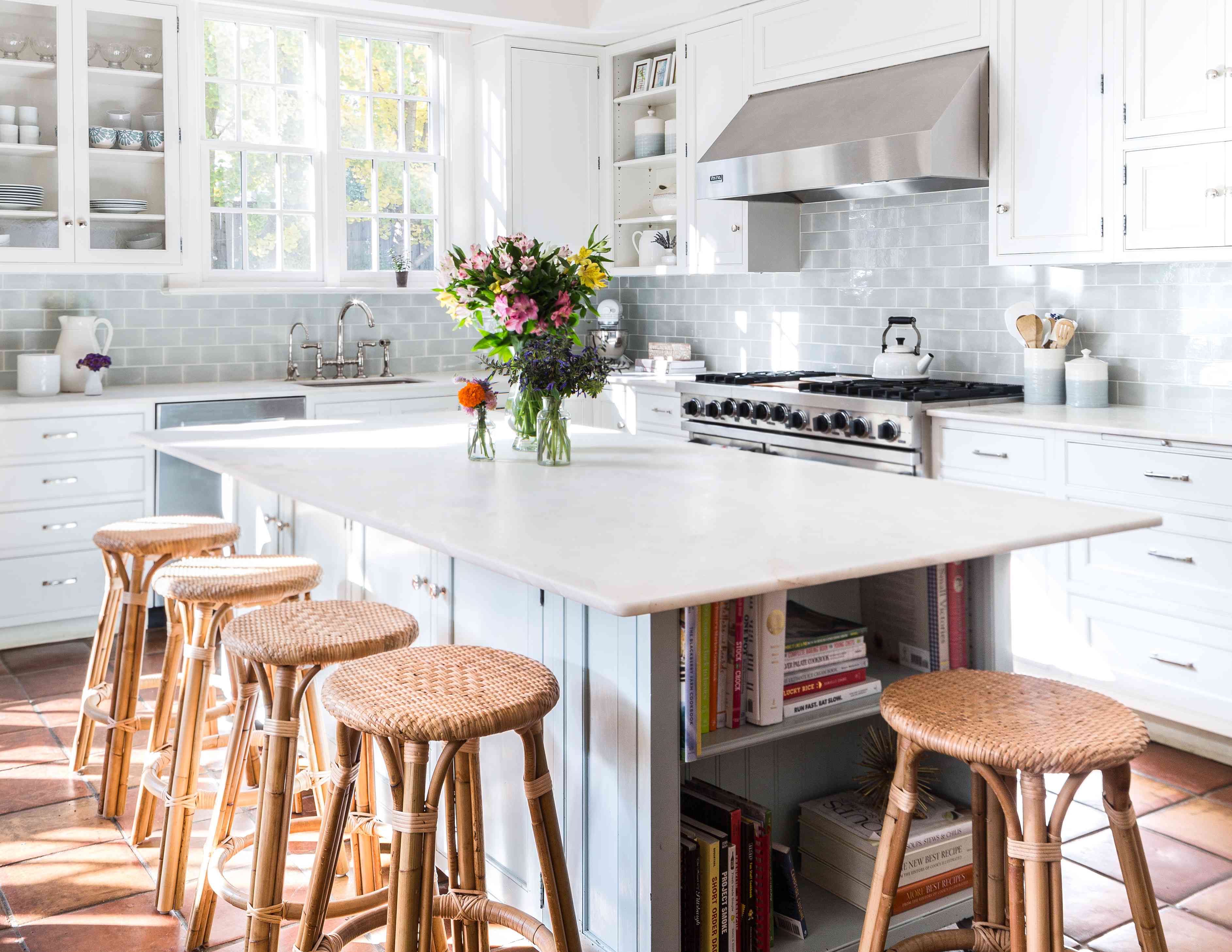
For a kitchen backsplash, warm white is the safest and most flexible choice. Soft green adds personality while staying calm. Deep blue creates contrast with white or wood cabinets. Terracotta warms up neutral cabinetry and makes the kitchen feel more collected.
Bathroom floors
For bathroom floors, greige, taupe, charcoal, and terracotta are especially practical because they ground the room and hide everyday wear better than bright white. A checkerboard floor in black and cream or taupe and white gives a timeless look with extra character.
Shower walls
For shower walls, warm white, soft green, blue, and stone tones are designer favorites. Glossy finishes reflect light, while matte finishes feel quieter and more spa-like. In small showers, lighter colors can help the space feel open. In larger showers, deeper shades can create a cocooning effect.
Powder rooms
Powder rooms are perfect for riskier tile colors because they are small and separate from the main living areas. Designers often use navy, black, emerald, clay, or patterned tile here. It is the one room where guests expect a little drama, and the room is too small to argue back.
Common Tile Color Mistakes Designers Avoid
The first mistake is choosing a tile color only because it is trending. Trends are useful for inspiration, but tile is expensive and labor-intensive to replace. Designers ask whether they would still like the color if it were not currently popular.
The second mistake is ignoring maintenance. Stark white floors, very dark shower tile, and high-contrast grout can all look beautiful, but they may require more cleaning depending on the room. Designers match color to lifestyle, which is why a busy family mudroom may get warm stone tile instead of polished white marble.
The third mistake is forgetting the rest of the house. A tile color should connect with nearby materials. If your home has warm woods, cream walls, and brass hardware, an icy gray tile may feel out of place. If your home is sleek and modern, rustic terracotta might need a cleaner shape to fit in.
The fourth mistake is choosing a flat color when texture would do more. A handmade-look white tile, a tonal green glaze, or a stone-look taupe porcelain can add richness without adding visual clutter. Designers often rely on subtle variation because it makes a surface feel alive.
Extra Experience Section: Real-Life Lessons From Choosing Tile Colors
After looking at many designer spaces and real-world renovation choices, one lesson becomes clear: tile color is emotional before it is technical. People often think they are choosing “white” or “green,” but what they are really choosing is how they want to feel every morning when they walk into the bathroom or every evening when they stand in the kitchen pretending that reheating leftovers counts as cooking.
Warm white tile is the color that rarely causes regret when it has texture. A perfectly flat, cold white can feel harsh, but a creamy handmade-look tile has softness. In a real kitchen, that subtle variation matters. It hides tiny splashes, reflects light beautifully, and works with seasonal decor. You can put a bowl of lemons, a wood cutting board, or a vase of branches in front of it, and suddenly the backsplash looks styled. The tile is doing background vocals, not trying to launch a solo career.
Green tile is the color that often surprises people. On a sample board, sage or olive may seem too specific. Installed across a backsplash or shower wall, it can feel incredibly natural. The trick is restraint. A muted green tile with cream walls and wood accents feels calm. A very bright green tile with shiny chrome, bold wallpaper, and colorful cabinets can be fun, but it is a bigger commitment. Designers tend to choose the greens that appear in nature because those shades are easier for the eye to accept over time.
Terracotta is the color that makes a home feel warm immediately. It is especially helpful in spaces that feel too new, too gray, or too builder-basic. A clay tile floor in an entry or kitchen adds age and character, even when everything else is simple. But terracotta needs balance. Pair it with too many orange woods and it can become heavy. Pair it with cream, black, olive, or natural stone and it suddenly feels intentional and sophisticated.
Blue tile is the confidence color. It is familiar enough to feel safe, but colorful enough to feel designed. A deep blue backsplash can make basic white cabinets look custom. A pale blue bathroom can feel cheerful without being childish. The best real-life advice is to choose blue based on the room’s light. In a dark room, navy may become almost black. In a bright room, powder blue may become more playful than expected. Samples are not optional; they are tiny ceramic fortune tellers.
Black tile is powerful, but it needs a plan. In real homes, black tile looks best when it has contrast, reflection, or texture. A glossy black wall in a powder room can feel elegant. A matte black shower in a room with poor lighting can feel cave-like. Charcoal is often easier than pure black because it gives the same grounding effect with less severity. Designers also know that dark tile in wet areas may show water marks, so placement matters as much as color.
Greige and taupe tile are the quiet heroes. They may not cause dramatic gasps at first glance, but they make a home easier to decorate. A warm stone-colored floor can handle kids, pets, guests, and changing decor styles without looking tired. These colors are especially valuable when you want the permanent surfaces to stay calm and let furniture, art, mirrors, or lighting bring the personality.
The biggest experience-based tip is simple: never choose tile from one tiny sample viewed under one light. Order several samples. Place them vertically and horizontally. Look at them next to the cabinets, counters, wall paint, trim, and flooring. Check them in the morning, afternoon, and evening. Spill a little water near them if they are going in a bathroom or kitchen. Look at the grout options early. Then choose the tile that still looks good when the room is not perfectly clean, perfectly lit, or perfectly staged. That is the tile color designers want in their own homesthe one that keeps looking beautiful during real life, not just during photo day.
Conclusion
The tile colors designers always use in their own homes are not chosen by accident. Warm white, soft green, terracotta, deep blue, black, and greige or taupe all earn their place because they combine beauty, flexibility, and staying power. They can be quiet or dramatic, traditional or modern, simple or richly layered. Most importantly, they work in real homes where people cook, shower, spill coffee, forget laundry, and occasionally decide that a powder room deserves the personality of a boutique hotel.
If you want tile that feels designer-approved without becoming dated too quickly, start with these six colors. Then pay attention to finish, grout, layout, and lighting. A smart tile color does more than cover a wall or floor. It sets the mood for the entire roomand when chosen well, it keeps doing that beautifully for years.
Note: This article was created for web publishing and synthesized from current U.S. home-design guidance, designer trend reporting, and tile industry insights on warm neutrals, zellige-style texture, earth tones, green palettes, blue tile, checkerboard patterns, and timeless bathroom and kitchen surfaces.